
One of the myths about temperature data is the ludicrous notion that the data for atmospheric temperature from satellites are better than the surface data from thermometers. We’ve heard this from people who should know better, like John Christy and Judith Curry, and climate denier politicians like Ted Cruz. The problem is, it just ain’t so.
But before I get to that —
I know I’ve posted about the “pause that never was” quite a bit lately, and how desperate climate deniers are to hold on to this figment of their imagination. I can’t help but share with you the most revealing comment about the “pause that never was” that I’ve seen in a long time (maybe ever). In a post on the WUWT blog about the latest satellite data from UAH, the very first comment was this:
RH February 1, 2018 at 10:03 amDo we start a new pause? Or does the temperature lower enough to continue the old pause?
God forbid you should wait for enough actual data before declaring a new pause. Even if this is a case of “Poe’s Law,” it worked … as the follow-up comments illustrate. Climate deniers aren’t just desperate. They’re delusional.
Let’s compare surface temperature data (from thermometers) to atmospheric data (from satellites) during their period of common coverage, from 1979 to the present. I’ll compare two surface temperature data sets that have definite differences: NASA GISS (from NASA’s Goddard Institude for Space Studies) and HadCRU (from the Hadley Centre/Climate Research Unit in the U.K.), and two satellite data sets that have definite differences: RSS TLTv4 (lower-troposphere data from Remote Sensing Systems) and UAH TLTv6 (lower-troposphere data from Univ. of Alabama at Huntsville).
Let’s compare yearly average global temperature from the surface data sets, using 1979 through 1999 as a common baseline to see how they’ve diverged since then:
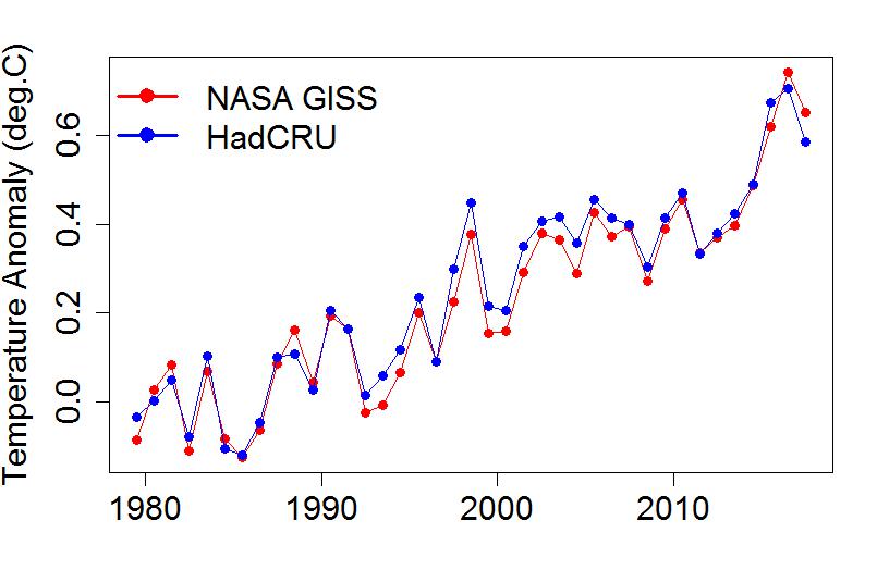
In spite of their differences, they agree quite well. This is even clearer if we plot the differences between these two surface temperature data sets:

The differences range from -0.075°C to +0.064°C, but the most important thing is that there’s not really any substantial drift between them; they agree quite well on what the relentless trend is.
When we compare satellite data sets, they are definitely drifting apart:

Again, this is even clearer when we plot the differences:

They range from -0.21°C to +0.064°C. Most important, there is undeniable drift between them, with the UAH data consistently getting lower compared to RSS data.
On that basis — which data sets agree with each other better — the surface data are consistently in agreement, the satellite data consistently diverge.
The real kicker, showing how silly is the claim that satellite temperature data are somehow “better,” is that updated versions of satellite data don’t agree very well even from the same source. The data from UAH are up to version 6 now; I have a not-too-old copy of their version 5 data (actually version 5.6). Here’s how they compare:

Again they seem to be drifting apart, again confirmed by the differences:

The differences range from -0.12°C to +0.12°C, and more important, there once again is that persistent drift showing how the trend estimate changes from version to version.
Once again, the surface temperature data look a lot more reliable than the satellite data.
The satellite temperature data sets don’t agree with each other, and they don’t agree with themselves from one version to the next. That hardly seems like “better than the surface temperature data” unless you’re in denial.
Yet another thing — if you ask Carl Mears (one of the leaders of the team that creates the RSS data), he’ll offer his opinion: the surface data are better. If you ask John Christy (one of the leaders of the team that creates the UAH data) he’ll say the opposite. Given the large version-to-version changes and the large disagreement among satellite data sets, the idea smacks of hubris.
Yet another question arises: of the two satellite data sets considered here, which one of those is more reliable? In my opinion, it’s clearly the data from RSS. For one thing, I’ve read the papers describing their latest updates, and to me, the RSS update makes sense, even seems necessary, while the UAH update doesn’t.
For another thing, the RSS atmospheric-temperature data are in far better agreement with the surface temperature data than are UAH data. No doubt, UAH is the “odd man out.”
An interesting summary of the history of UAH satellite data was given in a comment at RC:
Hurrell and Trenberth 1997 found that UAH merged different satellite records incorrectly, which resulted in a spurious cooling trend.
http://www.cgd.ucar.edu/cas/abstracts/files/Hurrell1997_1.htmlWentz and Schabel 1998 found that UAH didn’t account for orbital decay of the satellites, which resulted in a spurious cooling trend.
http://www.nature.com/nature/journal/v394/n6694/abs/394661a0.htmlFu et al. 2004 found that stratospheric cooling (which is also a result of greenhouse gas forcing) had contaminated the UAH analysis, which resulted in a spurious cooling trend.
http://www.atmos.washington.edu/~qfu/Publications/nature.fu.2004a.pdfMears and Wentz 2005 found that UAH didn’t account for drifts in the time of measurement each day, which resulted in a spurious cooling trend.
http://science.sciencemag.org/content/309/5740/1548.abstract
My opinion: surface temperature data are more reliable than satellite atmospheric temperature data, for satellite data, RSS is far more reliable than UAH, and the notion that satellite data are “better” is just nonsense.
This blog is made possible by readers like you; join others by donating at My Wee Dragon.


Exactly how do you know that it isn´t RSS that has been drifted apart?
[Response: I’m not sure what “RSS that has been drifted apart” means. Certainly RSS and UAH have drifted apart.
As for which is closer to the truth, I expect it’s RSS for many reasons (given in the post).]
Comparing RSS with surface data would probably give a hint
@Marten: I have done that. RSS4 TLT averages about 0.3C cooler than NASA GISS (which is to be expected) and there’s no meaningful “drift” between them. From 1979-present, the trend in the differences is -0.002C/year, i.e., effectively zero.
chrisd, others:
Perhaps it is already known, but because it’s not clearly implicated from what you said, the reason RSS4 TLT tracks lower than GISTEMP is due to their difference in baseline periods. GISTEMP’s covers an earlier time period, when temperatures were lower, so anomalies of modern months relative to that baseline are correspondingly higher than corresponding anomalies in RSS.
@Alex: Correct. The baseline issue is briefly alluded to in Tamino’s post, so I didn’t mention it, thinking “to be expected” was enough. I should have been more clear.
And, as WC points out, they aren’t measuring the same thing anyway, so there is no reason to expect the same anomalies even with the same baseline.
In any event, the intent here was to show whether or not RSS is “drifting” wrt GISTEMP.
A second example of the problems that can beset TLT records is the update from RSS TLTv3.3 to TLTv4.0. It was dramatic as the UAH update from TLTv5.6 to TLTv6.0.
Strangely, I was just comparing the regional records of RSS TLTv4.0 & UAH TLTv6.0. Extra-tropical latitudes both North & South have divered by about 0.3ºC over the 4-decade, the North mostly prior to 2000 and the South mostly after 2000. And the Arctic readings have diverged throughout, by a whopping 0.7ºC. The remaining regions also show divergence over the record (all in the same direction) but the divergence is of less magnitude. (The suspicion that this could be because these regions represent significantly differing global areas in the two records is dispelled when the same comparison for UAH TLTv5.6 with RSS TLT gave far less divergence and divergence which shows no similarity.)
(An OLS through the RSSv4.0-UAHv6.0 differences gave a linear divergence over the period of record of:-
Tropics … … … … 0.03ºC/decade,
Northern Ex-Tropics … … 0.09C/decade,
Southern Ex-Tropics …… 0.07ºC/dacade,
N Pole … … … … 0.20ºC/decade,
S Pole … … … … 0.03ºC/decade,
which are all pretty meaty values to go uncommented given that AGW is running at 0.18ºC/decade in the surface records. RSS TLT is showing 0.19ºC/decade).
Aye, but doesn’t UAH have God on its side?
You misspelled Koch
I did a post here comparing the changes made in RSS (from V3.3 to V4) and UAH (V5.6 to V6), and compared them with changes to GISS since 2005 over the ame period. The satellite changes are enormous in comparison. Here is the plot of version differences, on a 1979-2008 anomaly base:
“…resulted in a spurious cooling trend.”
There’s a common denominator in the history of the UAH satellite data set. All their errors “…resulted in a spurious cooling trend.” What a coincidence.
One of the curious aspects of this to me is that UAH v.6 actually increased its divergence from the other data sets. For some years, prior to the latest update, it was RSS which was the real ‘odd man out’–and Dr. Spencer at the time was not above twitting the RSS team about the emerging ‘cool’ bias. It’s a good thing, I suppose, to have confidence in your methods, but one would expect results to converge eventually as everyone works in good faith to improve the records–as presumably Dr. Spencer was expecting in the case of RSS. So why no visible discomfort now on the part of Spencer and Christy, when the pinching shoe is on their collective foot?
(To be clear, I’m not making any insinuation here–I just really do find it, as I said above, “curious.”)
Still, per the January update, UAH is reporting a 0.13 C trend since inception, so even their lower warming trend is, I at least would say, “relentless.”
FWIW, although you’ve done what everyone does – compared sfc to satellite – it isn’t actually the case that we’d expect them to match, if both were exact. They don’t measure the same thing, and we don’t expect the sfc and the mid-troposphere to warm at the same rate.
Also FWIW, the code for older versions of UAH was primitive [https://wmconnolley.wordpress.com/2015/04/26/now-we-know-why-uah-v6-is-so-late/]; even they say stuff like “There is little use of subroutines in Spencer’s code, but more in Christy’s. Continuity of operational procedures has taken precedence over elegance or speed of execution… Most of the programs have array dimensioning and assignments which must be manually updated every month and year” and so on.
WMC, here I provided a handy comparison of RSS TTT v4, UAH LT v6, and the RATPAC radiosonde record, all for the lower to middle troposphere. (I should update it with RSS TLT v4 now that it’s available…)
CO2 versus temperature: troposphere examples
RSS has been increasing at 2.7 K/doubling of CO2. Radiosondes are slightly warmer (2.9 K/doubling). UAH is the freakish outlier at 1.8 K/doubling.
The satellite data sets use the same original data. So the differences between them has to be due to processing such as adjustments to account for inhomogeneities. Homogeneity adjustments to 10,000 different in situ thermometers is quite a different problem than accounting for inhomogeneities when you only have one or two “thermometers” flying in outer space at the same time.
William is right that they should be different. But proponents of each argue the same thing: that their data set should be used to assess how the planet is warming. So perhaps the best metric would be to different non-temperature measurements of warming such as sea ice or, perhaps more appropriately for satellite tropospheric temperatures, alpine glaciers.
Concerning the “new pause” — Using short snippets of data doesn’t really favor contrarians. Try fitting the satellite monthly lower-troposphere temperature anomalies (either RSS or UAH) with two linear segments. Use all the data, through January 2018. The later segment begins at the break point where the earlier ends. Test all break points between the beginning of 1985 and the beginning of 2017. If you allow a discontinuity of temperature at the break point, the lowest variance of the residual occurs for a break point at the beginning of 2011. The slope of the later segment is +7C per century, for either data set! Note that the atmosphere instantaneously cooled by almost 0.25C at the breakpoint!!
If you require the two segments to have the same temperature at the break point, the minimum variance occurs at the beginning of 2014 and the slope of the later segment is … +7C per century! At the minimum variance, the slope of the earlier segment is about the same as the slope for a single linear fit of all the data, for either case.
I leave the estimation of uncertainties “as an exercise for the student” :-)
Instead of Poe’s Law you have discovered Pause Law.
Just dropping by after a long pause…
In psychology, physiology, and so on we often make a distinction between reliability and validity. Reliability refers to the degree to which different measurements of the same thing produce similar results. Validity refers to how well the measurement reflects the thing/construct it’s supposed to measure. See here
https://en.wikipedia.org/wiki/Reliability_(statistics)
https://en.wikipedia.org/wiki/Validity_(statistics)
You can think about measuring validity in different ways, but one way is to consider Part of validity is what’s called “concurrent validity,” the degree to which one measure of the construct agrees with another measure of the construct.
Simply put, different ways of computing the mean global surface temps based on thermometer measurements are more similar to one another than the different ways of computing lower troposphere temps based on satellite measurements. The former is therefore more reliable than satellite measurements, by definition–that’s a fact, not an opinion.
Different ways of measuring lower troposphere data also don’t agree with one another because the satellite data don’t completely agree with the radiosonde data. Thus, their concurrent validity isn’t as high as thermometer data. Again: fact, not opinion.
Satellite data are therefore less reliable AND less valid than surface thermometer data.