
After my last post, a reader asked:
What’s most noticeable about this is the massive change in variability since 2007. Could you do some analysis of that?
Sure.
I’ve done this before, but it bears repeating because it is a common point of confusion (as in, “What’s going on?”). The graph he refers to is of sea ice extent anomaly

and the dramatic increase in fluctuation since about 2007 is rather obvious.
But we need to keep in mind what anomaly is, and how it’s calculated. Anomaly is the difference between what a given day’s (or month’s) value, and what has historically been typical for that same time of year. Essentially, we subtract away the average annual cycle, so if a given year shows an annual cycle which is different from average, that difference — despite being part of the annual cycle during that year — will remain.
To define that “average” annual cycle, we first choose a baseline period; the time span we select to define what average means. For the above graph, the baseline period is from 1979 to 2000. What if we made a different choice? What if we used the data from 2007 up to now to define our baseline? With a different baseline period we’ll get different anomaly values, namely these:

That’s different! Suddenly it look like there was much more variation before 2007. Why? Because the annual cycle itself changed significantly in 2007. What we’ve really observed “since 2007” isn’t an increase in variability, it’s a change in the average annual cycle.
There are ways to estimate the annual cycle all by itself. One way to estimate its size is something called “windowed Fourier analysis,” and it gives something like this:

It shows “semi-amplitude,” which is just half the amplitude. Clearly it changed about 2007, and has remained higher than before since that time.
There are ways to estimate anomaly by subtracting an annual cycle which itself is allowed to change over time. This is done, for instance, with the CO2 data from Mauna Loa. Over the years, the size of the annual cycle in CO2 concentration has also increased, so the good folks at Mauna Loa base their “average annual cycle” on its average for the immediately past several years. Another way, which I’ve used many times, is to allow frequency/amplitude modulation of the annual cycle using Fourier analysis, and it gives me this:

When I subtract that from the original data, I get what I like to call “adaptive anomaly”:
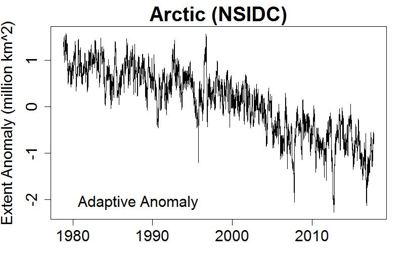
With anomaly adapted to account for a changing annual cycle, it no longer looks like a dramatic increase in variability at 2007. Statistical tests bear this out; the variability has fluctuated (as it always does) but hasn’t shown any significant change.
What we do have, of course, is a genuine, and sizeable, change in the annual cycle; it got bigger. A close look reveals that this is because the annual minimum declined dramatically at that time, while the annual maximum simply continued declining at its existing rate. You can see this plainly in graphs of each year’s maximum and minimum values.
What brought about the sudden change? I don’t know, but I suspect it’s related to the fact that the extent of sea ice also depends on how much land area is available at given latitudes — land areas can’t hold sea ice! When sea ice retreats above the latitude where there’s no more land, a small change in the latitude of the sea ice corresponds to a bigger change in extent. You can read more about that here.
At this point, I’d like to congratulate all the readers who have read the last two posts. You now know a helluva lot more about Arctic sea ice and how it has changed, than most people. You know:
I’d guess that you are now prepared to discuss the issue intelligently. I’ll opine that you are far better prepared to discuss it intelligently than any of those who have recently been claiming it isn’t still declining.
And if you’re a regular reader here, you already know better than to trust any claims about “trend” based on ridiculously short time spans.
This blog is made possible by readers like you; join others by donating at My Wee Dragon.


Area/extent is only two of the three dimensions of the Arctic sea ice. Thickness is the third, and often overlooked.
As the sea ice becomes thinner we should expect more variability in amount of surface covered by ice. Thin ice can be melted quicker and open water can quickly freeze with short term weather changes. A large storm as we observed in 2012 can wipe out a lot of the thin ice and a period of extended cold can cover a lot of open water with ice.
We no longer have an abundance of thick ice to act as a ‘flywheel’ and moderate weather events. In past years those sorts of weather events would have thinned or thickened the ice but had less impact on surface area covered by ice.
Area/extent are only two…
Fascinating and informative.
Thanks for that – I asked that question and it’s very good of you to devote a post to answering it. I certainly hadn’t realised how the baseline could affect the apparent variability in an anomaly chart, so that’s a useful addition to my box of statistical tools.
Full of admiration for this analysis. And as a long-time lurker here and at Neven’s I give hearty thanks to you both.
Your adaptive anomaly now “appears” (sorry for the eye-ball interpretation) to have no trend change around 2007. If so, does this imply the apparent trend change in the minimum graph is only an artefact of the averaging method?
[Response: Thank you for an intelligent question. Here we are having a discussion of actual science … what a concept.
I so often emphasize that just because it “looks like” it isn’t necessarily real, but I rarely emphasize that just because it doesn’t look like, it might still be there and real. This is one of those cases.
There is also a change, not only in the amplitude of the annual cycle, but its *shape* (i.e. waveform) as well. The summer minimum has become more pronounced and the waveform is more “pointy” at its minimum. This is part of the notable changes, but isn’t something I discussed in the post.]
Tamino, I heard that some of the latter years- including this one- were showing long, i.e. not pointy shaped, minimums.
I think Jim was saying this over on his great white con blog. Iff I’m right then what could this mean?
(Basically I’m trying to support the idea of MYI being very sick and I’m looking for anything that could help indicate, or reinforce the indication of, it.)
[Response: Beware of the most common and most human bias in scientific inquiry. Instead of seeking anything that could reinforce your idea, look for what will *test* the idea. If you only look for supportive evidence, that’s all you’re going to find. If you’re looking for all the evidence, both pro and con, it’s often the surprises that lead to the most enlightenment.]
Using your basic response to louploup2 I could say Jim is pointing out that the trend of rebound from minimum getting faster that you point out in this article is infact reversing itself!
The trouble is I wouldn’t have a clue what it means… but I’m intrigued by it!!
Yes, seeing the sign of the apparent variability ‘flip’ was (to me, anyway) a startling experience. Perhaps it shouldn’t have been; I recall several discussions here in which changes in annual cycles left residuals showing up in anomaly time series. But this was a pretty dramatic example of the principle.
OK, another lurker with a question: Just above in response to Robert Bridge you wrote, “the waveform is more “pointy” at its minimum.” Does this mean the rebound from the minimum is getting quicker?
[Response: I haven’t checked the details, but basically yes.]
I would nominally expect the rebound to be quicker on average as the annual minimum retreats over the years. Insolation cycle is constant over Arctic, so even as sea ice minimum retreats over the years, the same regions get cold enough to form sea ice at the same time each year. The ‘freezing point’, if you will, sweeps across the Arctic at the same point at the same time every year, so sea ice recovers to that beat but now with more area to grow into. Thus, extent recovers more quickly.
There are countervailing factors, I guess, due to the fact of warmer Autumn/Winters over the years – warmer air temps over the years could slow the pace of regrowth. There’s also less reflectivity from the sea ice, so the sun warms a bit more of the ocean for a bit longer as sea ice minimums get reduced. But I’d wager the steady insolation geometry is the dominant factor in the speed of regrowth in this era of declining sea ice.
Yes, extent minima are lower, on average, but not later (at least discernibly so; variability is pretty high.) And the timing of maxima hasn’t shifted, either, though the actual maximum numbers are decreasing (albeit more slowly than for the minima.)
So with more open water to freeze, freeze rates (km2 per day or the equivalent) are higher, hence there’s a steeper slope on the graph. (One unfortunate result is denialati crowing about how ‘ice has never grown this fast!’ Of course, it’s also melting faster in the spring, but somehow that part gets overlooked.)
Volume is a different story; with winter temps a *lot* higher, thickness freeze rates (cm of ice thickness per day or equivalent) are *lower* than in the past.
I just updated a PIOMAS volume graph (here -2 clicks) and did a quick calc on the spread sheet on the size of the Arctic SIVol cycle. The ampitude is pretty much fixed over the 1978-to-2007 period at 16 million cu km peak-to-peak. After that it rises through the years to 2012 when the cycle reached 19 million after which it drops again reaching 16 million again in 2017. So without the cycle being stretched, it is unlikely it has got significantly more slopy or pointy.
Thanks, Al; appreciate that. Apparently the extent cycle is ‘stretching’, but the volume cycle is not. Since volume = extent x thickness, then presumably the trend in ice *thickness* is more or less offsetting the changes in extent.
“I’d guess that you are now prepared to discuss the issue intelligently?”
Yes it has gone down.
I hope it goes back up.
Not intelligent the hoping part.
Still a bit out of my depth with the variations dependent on the baseline.
I guess if you start at different ends and have an abrupt change in the middle then the other end must be quite variable to the now newly defined and different base?
Thanks for both posts.
–
Bob Wallace, ” As the sea ice becomes thinner we should expect more variability in amount of surface covered by ice” is an interesting concept. Not sure that this is important but just a natural mathematical size issue that is expected.
A patch of ice 1 sq meter growing to 1000 sq K is a 10 to 6 th variation but 1000 sq K to 2000 sq K is only a doubling. The variability does not seem to signify anything else climate related.
Again Doc Snow’s rate observations, both ways, are related to this phenomenon.
Regarding potential reason to the change, how about the proposed increase in waviness of the jet stream by Francis et Vavrus 2015¹?
If we take as a first order approximation that prior to 2007 the jet stream has had smoother and regular (temporally speaking), then would it not be reasonable to deduce that a more wavy and out-of-sync jet stream would result in an increased amplitude when the warm heights and cold trenches passes land masses and oceans at different points within the year?
I guess of the volume-area-extent trio the extent would be most affected by the change in jet stream as this is proposed to create more extreme weather events which would disperse the sea ice.
¹ http://iopscience.iop.org/article/10.1088/1748-9326/10/1/014005/pdf
The value of “rebound from the minimum” perhaps rerquires a bit of definition.
At a simplistic level the ‘rebound’ must be greater as the minimum remains in mid-September* and the annual average SIE level has not dropped as much as the annual average. Thus there is more freeze required in the same number of months, thus “the rebound from the minimum is getting quicker.”
(*It may be possible to say the minimum now occurs half a week later in the month since when records began, but only with big error bars)
Then there is the 2016 phenomenon, 2016 showing a massively early melt and a massively late freeze, perhaps indications that through the minimum, the last-few-weeks-of-melt-plus-‘rebound’ was becoming more U-shaped than V-shaped. (The spring of 2017 did not repeat this ‘massively early melt’ although the freeze is now upon us and there is perhaps signs of 2017 repeating the ‘massively late freeze’, although kick-off was a bit delayed. See here (usually 2 ciicks to ‘download your attachment’) for a graph of JAXA Daily Arctic SIE anomaly.
And finally, examining the moment of minimum, September SIE is getting more ‘pointy’ in that the minimum is becoming (slowly) lower relative to the average daily SIE for September. And also the 20 days following the minimum is showing a little more freeze. However, as this is very sensitive to the timing of the minumum within the month, the slightly quicker ‘rebound’ in those 20-dys following the minimum appears more to do with the timing of the freeze, this only when the full 30 year record is examined but not when the last 15 years is considered in isolation.
Whoops…the comment I left in the previous blog entry really belongs here…
Truly fascinating way to calibrate the baseline annual seasonal cycle. Brilliant even. I’ve never seen it in any peer reviewed literature I’ve ever consulted, but then it wouldn’t have come up in my field, really. Is it in common use? Where?
I do suspect you have or will receive commentary that you are essentially engaging in some form of cherrypicking by those seeking to “debunk” it.
Allowing the annual seasonal cycle to vary is a common option of the R command stats:::stl() which cite R. B. Cleveland, W. S. Cleveland, J.E. McRae, and I. Terpenning (1990) STL: A Seasonal-Trend Decomposition Procedure Based on Loess. Journal of Official Statistics, 6, 3–73.
Random Question: it’s commonly regarded as taking two years to fully reject the salt from sea ice as it forms, hence why MYI is classed as lasting atleast two melt seasons.
So, the question(s) become(s), is their an identifiable two year cycle seen within the statistics or should we even expect their to be?
(The question comes from thinking about the 11 year solar cycle and whether that can be seen in the statistics or not: for instance, can we see the point where the 11 year pattern appeared and then identify the moment it suddenly disappeared?)(I can’t answer these questions of course but it would be cool to!)
Perhaps, simplifying the matter, I should ask first of all if 11 year cycles were ever observed in sea ice?
If they were, did they disappear at some point?
[Response: I’ve never seen evidence of 11-year cycles (or solar cycles) in sea ice data, even though I’ve looked for it — but not so rigorously as to publish the result.]