
Since 1979 we’ve been measuring the extent and area of sea ice in the Arctic using satellites. This is what we’ve found (data from NSIDC, the National Snow and Ice Data Center):

Obviously there’s a strong seasonal cycle, with more ice in winter/spring and less in summer/fall. No surprise there. If we want to know how it’s changing from year to year, it’s best to remove the seasonal cycle and compute anomaly — the difference between a given moment’s sea ice extent (or area if that’s what you’re studying) and what is historically “typical” for that same time of year. There are many ways to do this, but they all give essentially the same result, which is this:

The red line is an estimate of the trend (with a modified lowess smooth).
To the naked eye, that graph suggests Arctic sea ice has been dramatically declining and continues to do so. There was a period of even-more-rapid decline from about 2001 to 2007, it hasn’t declined at a constant rate, but its decline is undeniable and there’s no evidence it has alleviated. The the trained statistician, the data suggest exactly the same.
Yet I keep hearing lately from certain sources that it has somehow changed its behavior in a way that casts doubt on the reality of man-made climate change being the cause. One, is the claim that Arctic sea ice hasn’t declined at all for the last 10 years. The claim is based on the fact that the annual minimum of Arctic sea ice (which usually happens some time in September) shows no apparent decline for the last 10 years.
If you want to play that game, you should claim 11 years instead because we have an additional year’s data. Here are the annual minimum values from satellite data:

Notice the red box, which is all they usually mention. In fact it’s rare for them even to show any previous data — it might give some actual context to what they’re talking about. The blue line is an estimate of the trend using those 11 years’ data only. It sure doesn’t look like sea ice is still declining!
There are two giant problems with this “analysis.”
First, they don’t interpret the last 11 years’ data properly. The time span is so short that the uncertainty in any trend estimate is gigantic. In this case, it’s so big that there’s really no evidence sea ice is declining any more slowly than it was before. There’s no evidence that the recent apparent trend change is anything more than a fluctuation which looks like one.
As I’ve so often stressed, one of the great lessons learned in the history of statistics is that “looks like” is a terrific way to get some interesting ideas, and a completely wrongheaded way to draw conclusions. You need to “do the math” to test what “looks like” before drawing a conclusion. For some people, as the dumbest talking-Barbie-doll commercial ever said, “Math is hard.”
Let’s estimate the uncertainty in the rate over those last 11 years, and show the probable range of what the trend might actually be doing:

Any claim that the trend of ice loss has changed, reduced since 2006, based on annual minimum values, has no basis in evidence.
We should also note that the reason it “looks” flat isn’t that it suddenly stopped rising, it’s that it fell so far in 2007 that the return to the pre-existing trend makes it “look like” it’s flat. We can get a better idea of this if we take what happened before then, use that to predict what we might have expected, and compare to what actually happened. Here it is, with the pre-existing linear trend as a blue line, and its continuation (i.e. the forecast) a red dashed line:

The important lesson is: since 2007, the yearly minimum of Arctic sea ice hasn’t “recovered” or “paused” or told us not to worry — instead, it has been well below where it would have been if it had just kept sinking at the same rate as before. That is not good news.
The second giant problem with the analysis is that it ignores what’s been happening to Arctic sea ice throughout the rest of the year. The annual minimum is quite interesting, very well worth studying, but it’s not the whole story. If it were changing — or not changing as it was expected to — while the rest of the year showed stability, then one would be justified in talking only about the annual minimum. Of course, it would still be misleading to ignore the huge uncertainty, but at least I wouldn’t blame you for not talking about the rest of the time when that wasn’t really relevant to the issue.
But the rest of the time is relevant to the issue, because it has not shown stability. Here, for instance, is the yearly maximum value of Arctic sea ice:
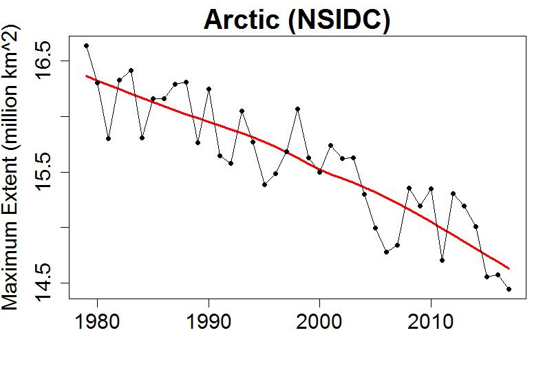
It doesn’t even “look like” it stopped declining recently. The lowest value so far is the most recent (this year’s), in fact the three lowest values are the last three values.
Perhaps the most relevant once-per-year metric is the yearly average of sea ice extent (I’ll average October-through-September so the most recent year will be a complete one).

It should come as no surprise that it mimics the trend estimated from the daily data. Note again that the lowest value is the most recent one.
Perhaps my most persistent theme has been that data are usually the sum of signal and noise, and that the noise can be very, very very very misleading. It’s ridiculously easy for noise to “look like” trend, or trend reversal, or something else meaningful, but the math just doesn’t agree.
It’s entirely natural for us to “see” patterns that aren’t really there, there’s even a suggestion that this is a survival advantage in prehistoric conditions, but we don’t have to limit ourselves to “looks like” any more.
And it’s too too easy to draw conclusions based on short time spans. Perhaps the best single warning I can give to the non-scientist (and even some scientists) is: if you see something which claims to be “evidence” against global warming, and it includes a graph of temperature data which starts in 1997 or 1998, be suspicious … be very suspicious.
This blog is made possible by readers like you; join others by donating at Peaseblossom’s Closet.


Indeed, and this analysis looks only at sea ice extent, it would be nice if you could do a similar analysis about volume. Thanks for this though..
What’s most noticeable about this is the massive change in variability since 2007. Could you do some analysis of that?
Typo: “The the trained statistician”.
The usual suspects continue to *love* their cherry ice, don’t they?
I like the last graph, the yearly average; it’s obviously an integrative metric, and one rarely seen.
I’m reminded of online controversies past, in which I labored, mostly in vain, to get various denialati to consider that yes, winter temperatures matter for Arctic ice cover. They wanted to believe that only summer temps could possibly matter, since that’s the only time that ice melt occurs–and there was no trend in summer temps, at least then, and by the metrics they chose. (DMI ‘north of 80’ mean 2-meter temp, per ERA reanalysis data.) Ergo, the whole thing was obviously a conspiracy.
What they wouldn’t look at, no matter how often they were pointed to it, was the fact that *winter* temps did have a trend–a huge warming one. And it’s temperature differentials that drive heat flux, and thereby freeze rates, ultimately modulating sea ice thickness. The accumulation equation isn’t one-sided–even if the denialati case was.
[Response: I almost deleted your comment because of your mention of “conspiracy.” I know it’s a real element, and some day I might even post about it, but for this post it’s not relevant, and feeds the kind of “us-vs-them” mentality I’m trying to avoid.
Please don’t take it personally, you’re the victim of my likely over-compensation in a hostile internet environment. But, at least at the start, I think I need to be strict — with my regular readers as well as newcomers..]
I wonder what an expectile regression would look like here? For example, here’s what an expectile regression looks like for some Web traffic for the month of July 2017:
Truly fascinating way to calibrate the baseline annual seasonal cycle. Brilliant even. I’ve never seen it in any peer reviewed literature I’ve ever consulted, but then it wouldn’t have come up in my field, really. Is it in common use? Where?
I do suspect you have or will receive commentary that you are essentially engaging in some form of cherrypicking by those seeking to “debunk” it.
“Please don’t take it personally, you’re the victim of my likely over-compensation in a hostile internet environment. But, at least at the start, I think I need to be strict — with my regular readers as well as newcomers.”
Again, fair enough. Will try to re-calibrate… particularly since more civility would be good. (Always hard to see your own contributions to the problem.)
Re-reading this quickly… is there anything interesting vis a vis trends in the annual Arctic temperature cycle? If you look at the curves for DMI ‘north of 80’ over the years, it certainly looks as though the probability of winter temps above climatology increases considerably.
http://ocean.dmi.dk/arctic/meant80n.uk.php
Of course this is reanalysis data, which is only supposed to be used for climatological analysis with great care–and there’s another wrinkle in this particular product, as they switched the reanalysis model in 2002 (and their climatological norm is 1958-2002.)
But it might still be at least indicative of what’s going on.
Also, perhaps something along that line could be done with, say, the GISTEMP gridded data? I know the high Arctic coverage isn’t great, but…
Speaking, as I was earlier, of winter trends in the central Arctic, I came across this, which I think is interesting, if you like that sort of thing:
http://onlinelibrary.wiley.com/doi/10.1002/2017GL073395/full
Abstract:
“Here we use in situ winter (December–March) temperature observations, such as those from Soviet North Pole drifting stations and ocean buoys, to determine how common Arctic winter warming events are. Observations of winter warming events exist over most of the Arctic Basin. Temperatures exceeding −5°C were observed during >30% of winters from 1954 to 2010 by North Pole drifting stations or ocean buoys. Using the ERA-Interim record (1979–2016), we show that the North Pole (NP) region typically experiences 10 warming events (T2m > −10°C) per winter, compared with only five in the Pacific Central Arctic (PCA). There is a positive trend in the overall duration of winter warming events for both the NP region (4.25 days/decade) and PCA (1.16 days/decade), due to an increased number of events of longer duration.”