
Global temperature data, like most data, is a combination of trend and fluctuation. The trend is climate change, the fluctuations are noise.
Fluctuations go up and down and down and up and up and down, but they never really get anywhere. The trend does; it changes the background level around which the fluctuations fluctuate. For some time now, the trend has been upward. We sometimes call it global warming.
One of the more obvious fluctuation factors is the el Niño southern oscillation (ENSO). In its el Niño phase it transfers heat from ocean to atmosphere, raising Earth’s surface temperature (especially in the atmosphere) not by creating heat out of nothing, but by moving it around. In the complementary la Niña phase Earth’s surface cools down. At least, that’s the fluctuation it creates.
Which raises some interesting questions: how much does el Niño warm the planet? How do we characterize el Niño anyway? There are no perfect answers of course, but let’s take a stab at it.
One way to characterize el Niño is sea surface temperature near the equator in regions of the Pacific ocean. But there are also ways not depending on temperature data, such as pressure differences between different areas (often called the southern oscillation index or SOI). Probably best is the multivariate el Niño index (MEI) which combines a number of different factors to encode what the el Niño southern oscillation is really up to. We’ll use that, which looks like this since 1950:

Three strong peaks stand out, in 1982-1983, 1997-1998, and 2015-2016. We might expect that temperature would show peaks at those times, since a strong el Niño raises global surface temperature. But there are some complicating factors we should take into account.
One important consideration is that when el Niño happens, its impact on global temperature isn’t entirely instantaneous. There’s a delay, a lag, in part of its effect. As a result, the 1997-1998 el Niño had most of its effect in 1998 and the 2015-2016 el Niño most of its effect in 2016. We could even call them the “1998 el Niño” and “2016 el Niño” in spite of their happening across pairs of years.
Another complication is that el Niño isn’t the only factor which makes global temperature fluctuate. Volcanic eruptions, for instance, sometimes inject large quantities of sulphate aerosols into the atmosphere, which scatter incoming sunlight back to space and therefore cool us off. It just so happens that while the 1982-1983 el Niño was warming Earth up, the eruption of the el Chicon volcano was cooling it down; the two factors partly cancelled each other so there’s less fluctuation at that time than there would have been with either one alone.
There are ways to estimate how some of the fluctuating factors have affected Earth’s temperature. A pretty good one takes into account el Niño, volcanic eruptions, and variations in the output of the sun. Estimating their combined effect (in °C change to global temperature) gives this:

Of course this estimate isn’t perfect, and of course global temperature fluctuates for other reasons too (some of which are quite the mystery), but at least we’ve accounted for a good bit of the influence of these known factors. The two most extreme peaks are in 1998 (from the 1997-1998 el Niño) and 2016 (from the 2015-2016 el Niño).
Using the same methodology, we can isolate which part of the effect is due to el Niño rather than volcanoes or solar variation. That looks like this:

These are estimates of its effect on monthly temperature averages; a better idea of how yearly temperature averages are affected comes from yearly averages of the el Niño influence:

Now we can see that el Niño had a big effect on the 2016 yearly average temperature (so far), but had an even bigger effect on 1998. It also affected 1983 but don’t forget that was partly cancelled out by the large cooling effect of the el Chicon volcanic explosion.
Does global temperature show the signs of these influences? Yes it does, both in monthly data:

and in annual averages:
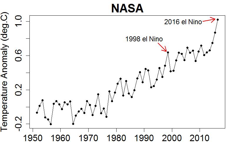
Now to the important stuff.
The 1998 el Niño was responsible for about 0.2 °C extra in the annual average global temperature for that year. The 2016 el Niño has added a shade less than 0.2 °C to this year’s average-so-far, a wee bit less than 1998’s el Niño. And do note that I’m talking about annual averages not the month-to-month influence, whole-Earth not land-only, and surface temperature not atmospheric-layer temperature, all of which can be quite a bit larger. Climate deniers often conflate all these conditions, and it seems to me they do so deliberately.
As for 2015, using this estimate el Niño contributed a mere 0.08 °C to the annual average. And when it comes to 2014, its influence only amounted to about 0.01 °C.
This blog is made possible by readers like you; join others by donating at Peaseblossom’s Closet.


Just an aside…
Isn’t it interesting as far as the Denialati go that when it’s the warmest year on record it’s “el Niño(!!!eleventy-one)!”, and when it’s the year after a record warm year it’s ” the ice-age cometh (what do you mean, “el Niño“?).”
Handy to be able to to leap from one statistical fallacy to a diametrically-opposed one without even blinking.
Handy, yes… but not for convincing those with functional memories.