
Lamar Smith, chairman of the U.S. House of Representatives committee on science, space, and technology, allowed his committee to tweet this:

It refers to an article in Breitbart News by “journalist” James Delingpole. Delingpole’s complaint is that after temperature dropped following the recent monster el Niño, the press didn’t herald that event.
You might as well complain that after news outlets report flooding in Miami because sea level rise has made high tide so much higher, they didn’t do a special report about the return from high tide to low tide.
This particular exercise in nonsense didn’t start with Delingpole. He was echoing David Rose in the U.K. Daily Mail, who got the ball rolling. The same idea was given a snappier title by Ross Clark in the U.K. Spectator.
The sordid little episode doesn’t end there. Enter WUWT commentator Eric Worrall. He actually claims that the 1°C temperature drop isn’t a return from el Niño conditions because Mike Mann said that it “was responsible for less than 0.1C of the anomalous warmth.”
Read the rest of what Worrall quotes, and you might pick up on the fact that Mann was talking about 2015, not 2016 when the el Niño warmth really kicked in. Look deeper, you’ll find out that Mann was talking about its effect on the yearly average, not the monthly values which are the basis for this whole “temperatures plunge” thing. Monthly excursions are bigger than yearly, after all.
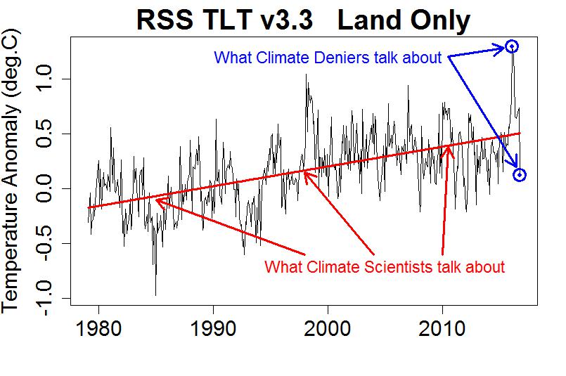
For those who are interested in facts, here’s the data on which the whole brouhaha is based:
I’ll close with a comment from someone we should actually be proud of: Bernie Sanders, for responding to the House committee’s tweet with this:
Where’d you get your PhD? Trump University?
UPDATE: Some extra graphs, for a special guest:


This blog is made possible by readers like you; join others by donating at Peaseblossom’s Closet.


NASA transition will be led by Lamar Smith staffer. We’ve not seen stupid, yet.
“Read the rest of what Worrall quotes, and you might pick up on the fact that Mann was talking about 2015, not 2016 when the el Niño warmth really kicked in. Look deeper, you’ll find out that Mann was talking about its effect on the yearly average, not the monthly values which are the basis for this whole “temperatures plunge” thing. Monthly excursions are bigger than yearly, after all.”
David Rose in the “newspaper” the Daily Mail did the same two tricks with Gavin Schmidt.
Desperate Denial would have been a perfect title had you not used it already.
‘Proud to be fooling stupid people’ is probably nearer the truth. I think that people who can win an election, or hold down a job involving writing in public, do actually know the “1 degree plummet!!!” claim is ridiculous. But they know that plenty of people who read them are stupid enough to fall for it; and more of their readers are trolls who are happy for any ‘factoid’ they can use to derail climate change discussions. ‘Proud to be unembarrassable’ may fit too; part of the strength of professional trolls like Delingpole is that he never cares if he’s shown to have lied, or to have no idea what reality or logic is. He just ploughs on, secure in the knowledge he gets paid for fake news even if it’s exposed.
I start hearing people comparing Smith with Saddam Hussein’s secretary of Information al Sahaf (“Comical Ali”). “Everything is fine, there are no bombs falling”
Hat dies auf Anmerkungen und Beobachtungen rebloggt und kommentierte:
Trumps Regierungszeit wirft ihre Schatten voraus…
You are too nice to Rep. Lamar Smith. I doubt very much that he “allowed” the committee to retweet that; he would more likely have “encouraged” it.
Smith sends out subpoenas by himself in the name of the Science Committee, surely he or his staff tweeted that.
He is also a contributor to Breitbart since 2010 and an early endorser of Trump.
Tip: the illustration would be more illustrative if it showed a “plunge line” (segment), not the “plunge endpoints”.
Reblogged this on sonofbluerobot.
I recently had a dialogue with a person who claims that Malcolm Roberts is a Climate Scientist this is the level of NEWSPEAK or POST TRUTH we are at where any IDIOT can claim any thing as being correct.
It would appear that 30 years of rubbish shown mainly on TV has had the desired effect people actually have no idea about fact of fiction.
I am honestly worried about the future.
We are going to be lead by idiots it seems.
There is a climate scientist at the Met Office called Malcolm Roberts.
http://www.metoffice.gov.uk/research/people/malcolm-roberts
He’s a clever chap.
I worry when “post truth” as George Orwell pointed out in his book 1984 and called it “Newspeak” is now common usage.
We have a very serious problem people.
We are in the age of Newspeak no other word other than the new one post truth i really am some what not happy with the direction of society.
At the beginning of the year I commented on the denialist ratchet. Another way of thinking about it would be to postulate a Maxwell’s denialist demon that only permits for consideration lies, misrepresentations, and other carnards suitable for reinforcing their denialist ideology, and that excludes truth, science, objectivity and parsimony.
Either way, the Denialati are hell-bent on twisting the world so that it appears to agree with the pretzel image that they believe should apply. And these cretins are now in charge of the most influential country in the modern world…
Houston, we have a problem.
Soon they will be talking about the coming ice age and how more fossil fuels should be burnt, to counter cooling, even though fossil fuels don’t cause warming
The world is a cruel cruel place. Pity the poor denialist idiot.
Given that Delingprat was posting his nonsense just four days ago, having picked up on that scallywag Davey Rose of the Daily Rail who took a whole three weeks to notice the October RSS TLT land temperatures were a tad chilly; given such delays, how long will they take to notice that RSS have published the November anomaly.
Their grand analyses are barely more than a week old, the ink hardily dry in their brave predictions, (like Delingprat’s “The last three years may eventually come to be seen as the final death rattle of the global warming scare,” or Rose that ”Experts will be forced to eat their words,”) and, darn it, the following month RSS TLT temperature is published just days later showing the temperature bouncing back up and, globally, despite that ocean anomaly now surely freezing the blood of all the poor wee fishes, RSS TLT returns the second warmest November on record.
Darn it!!! Who would have seen that one coming??
Yes,it’s so so difficult being a denialist idiot living in the real world.
Apparently “climate scientists” do not understand anything more complex than linear regression. Sad.
[Response: LOL! Clearly, you don’t read this blog.]
I am reminded of someone else a long time ago who said Tamino needed to get a statistician to look over his calculations to see if he had done it correctly.
Also apparently, terastienstra doesn’t understand anything more complex than a campaign slogan.
What we’re seeing here is indeed what we can expect in the “post-truth” world. I heard Scottie Nell Hughes recently say that there are no such things as facts. At the same time, we have Steve Bannon saying that Breitbart only deals in facts.
Both are partially right. Bannon and Breitbart specialize in taking facts out of context and using them to distort whatever subject they are addressing. Scottie Nell Hughes contends that all the rightwing nutjobs are doing is interpreting facts in a different context.
What both choose to ignore is that there is a proper context for facts, and science has spent centuries determining what that context is. Perhaps a better term for the alt-assholes is post-reality. They’ve already admitted that reality has a liberal bias.
“Global warming stopped in 2016”. You’ll hear a lot about this one in the coming several years.
Maybe, maybe not. A similar trajectory to the post-1998 one is, as far as we can tell, not a given.
But if we do get it, the denialati will certainly try to milk it.
Even if/when the long-term trend increases to +0.4C per decade, that is still only +0.04C per year. Random fluctuations due to incomplete spatial coverage are enough to overcome that in the short-term, let alone physical fluctuations such as those caused by ENSO, volcanoes and the sun.
How juvenile. All this talk about “denialists,” “denialati” and whatnot. If so many climate alarmists didn’t express themselves in such an immature manner, more people would take them seriously.
Oh and by the way: the graph you present shows a distinct downward trend from the late 90’s through 2014, a trend you’ve masked by conveniently selecting endpoints. It’s all too easy to produce any desired trend in this manner, Tamino, as you, as a scientist, should be aware.
[Response: Reeeeeeally?
If we take “late 90’s through 2014” to mean Jan. 1998 through Dec. 2014, then the estimated trend in deg.C/yr is about -0.006 +/- 0.019 (95% confidence). Notice how much bigger the uncertainty is than the estimated rate? That means that your purported “distinct downward trend” is nowhere near “distinct” — there isn’t even reliable evidence of “downward.” Oh, and the only reason you even got *that* close (as in, not even close) is cherry-picking: you deliberately chose endpoints to give the impression you wanted to give. If we compensate for *that* statistically, your claim of “distinctly downward” goes from ludicrous to world-record olympic gold-medal ludicrous.
But we should put that “distinctly downward” in some context. It amounts to treating that time span as completely independent of what came before and after, which amounts to a “broken trend” model. You can see what it looks like in the first of the two extra graphs I’ve put in the update at the end of the post. Does it look sensible to you? Perhaps you can explain why your “distinctly downward” trend begins with a sudden upward jump of 0.31 °C, equivalent to warming at the overall trend rate for 17+ years?
Or maybe we could allow for a different trend rate from 1998 through 2014 but not allow such “jump discontinuities.” But then, poor fellow, we get the model in the second of the two extra graphs I’ve put in the update at the end of the post — and your “downward” becomes “upward.” Alas! Woe is you!
As for your accusation that *I* did the cherry-picking so the trend would be “masked by conveniently selecting endpoints,” I guess you don’t know that I didn’t select endpoints at all. These are RSS satellite data, they don’t start until 1979, and I showed all of it. I didn’t choose the data set, David Rose did — but for some reason he did not show all of it. I wonder why that is? Ross Clark didn’t either, nor did James Delingpole. And now you want everybody to ingore both the earlier and the later parts of it by cherry-picking your favorite “looks like” time span. How juvenile!
And you wonder why you’re called a “denier.”
Go on, have another go … sometimes I have more fun with hecklers than Jimmy Carr]
Really? Well, you’ve certainly forfeited any claim to be taken seriously.
Did it escape your attention that when you wrote “distinct downward trend from the late 90’s through 2014”, you were in fact “conveniently selecting endpoints”–the very behavior for which you falsely chastise Tamino in the next sentence?
Tamino and many others have, for many years, been pointing out the exact statistical error that you have repeated again in your post. Your refractoriness to learning and understanding is exactly why you’re referred to as a denialist, because only denial can lead to the counterfactual misapprehensions that your are attempting to promulgate.
Of course if you disagree you could simply post here the statistical analysis that supports your assertion and refutes Tamino’s demonstration of consistent underlying global warming. Go on – I dare you.
Hello,
I just saw this graph on Twitter. I am not involved in the whole global warming debate but there are a couple of things that are bugging me about the data and the fits presented here. I would appreciate it if you could inform me on these.
1) The black curve that you call data: Is this a spatial/temporal average of a more finely sampled data set? If so, why don’t you have confidence intervals (i.e uncertainty) for it?
[Response: If you know where to get the confidence intervals for the underlying data, do let us know. They don’t really matter for trend analysis.]
2) You show three different models that fit the data. I disregard the discontinuous one since you would expect a continuous behaviour in a system with large inertia. Thus the question is how did you decide to fit a single or three linear trends? Why not two for instance? Surely the proper way is to employ some optimal complexity criterion.
[Response: I didn’t decide. The two graphs in the update are a response to a comment from “docgee” who insisted there was a different trend during the middle time span — he decided.]
3) How did you decide on the breakpoints for the case with the three linear trends? Are they optimized for L1 or L2 norm.
[Response: As far as I know the breakpoints aren’t optimized for anything, they were chose by “docgee”, probably because to him the choice made it “look like” the trend was different.]
Kind Regards,
Y. Kamer
I don’t get it. I assumed you made the first plot with the single trend? So my question is how was this data obtained, averaging, downsampling…? Why are you fitting a single trend instead of using a data-driven approach to find the optimal number of trends and their respective breakpoints?
[Response: Because I have already done so, many times. I’ve published research on that exact topic. And it’s not what this post is about. The extra graphs were only made to show how silly “docgee” was in claiming evidence for a different trend in the middle time span.
Please stop being silly yourself about the “averaging/downsampling” thing. It doesn’t matter, and if you understood trend analysis as well as I suspect you think you do, you’d know that.]
I already told you I just landed here from twitter. I know neither you nor your research. Obviously I am interested in your assumptions and data. So if you have some published research on the optimal number of trends just put a reference so that I can go and check it out. No need to be arrogant.
[Response: You can start here.]
Your paper is not exactly a boasting material. The way you try to tackle autocorrelation is crude. I can recommend you Seidel & Lanzante 2004 [http://doi.wiley.com/10.1029/2003JD004414]. Have used it myself on other problems, works nicely.
[Response: Your reference is not exactly a “boasting material.” Odd that they settle on a model for surface temperature which is piecewise linear (both with and without step changes) + AR(0) noise, when the noise is demonstrably not AR(0) (perhaps they should have applied the Box-Ljung or Box-Pierce tests).
But their methodology is still informative, and seems to come to the same conclusion I did: that after the 1970s there’s no evidence for any trend change. Imagine that.
I wonder: did you know that all along and just come here because you are an obnoxious troll? Or were you utterly ignorant of it but after you felt rebuffed you dug up some reference you thought you could “throw in my face”, therefore *becoming* an obnoxious troll?]
YKamer,
Hello YKamer. With the twitt-o-sphere so well connected to the rest of the internet, you will be aware of “the whole global warming debate” and, even if you are “not involved,” you would have to be a bit stupid not to have picked up that “the whole global warming debate” suffers from poorly informed idiots injecting wanton ignorance into that “debate.” Give such a situation, do you think it is appropriate to respond to a “graph on Twitter” that you had just happened upon and rush in to investigate? Would you rush into a war zone to ask what ammunition they are firing and complain that, having “just landed here from twitter,” there was “no need to be” hostile, no need to be shot dead?
So do grow up. Either you have acted as a fool or as a troll. Both ways, arrogance is a pretty mild response for you to encounter.
Ykamer,
Tamino has donated a great deal of time to do analysis like you are asking for. Frequently he gets spammers like Docgee just above your post. Sometimes he gets tired from dealing with all the crap.Spammers are much more common than informed people who have not read about AGW yet like you appear to be.
It is difficult to summarize detailed data analysis is a single response to a blog post. If you read some more of Tamino’s posts you will find what you want, it just won’t be the first post you read. Other blogs linked from Tamino like Skeptical Science or And then there’s Physics go into more detail about some specifics From your questions I think Tamino has what you seek if you look through back posts.
Try not to be judgmental before you read the background. Deniers (like Docgee) post all the time and that makes people get short fuses with people who have not read the background. People are happy to answer honest questions.
YK: Is it possible you are unaware that Tamino has a couple score of publications in major journals often collaborating with top researchers? Is it possible you do not know he also has publications contributing to the theory of time series analysis?
Is it possible you think throwing about a few out-of-context studies and terms will totally baffle him?
Guys take a chill pill and when somebody asks you a question just answer it. Don’t start name calling based on your assumptions on why it was asked. With that attitude not only you won’t spread much wisdom, neither will you get any. I knew about the Seidel paper because it’s old and I used it before (as I already wrote). I wanted to know if something similar or even better was used here. You tell me it doesn’t matter which method is better because you have similar conclusions. This is not an argument and therefore I am happy to leave.
Happy debating and try not having a stroke while you are at it.
YKamer.
Oh dear.
Oh dear oh dear oh dear!!
My deepest apologies. I said that “either you have acted as a fool or as a troll.” I am terribly sorry to have made such a statement. I can see now I was incorrect. You were after all acting as a foolish troll; indeed, a very foolish troll who cannot get his lies straight. ” I knew about the Seidel paper because it’s old and I used it before (as I already wrote [at the fourth attempt]). I wanted to know if something similar or even better was used here.” Perhaps it would help your position here if you stopped making such silly comments (assuming you haven’t already left the building). We cannot swallow our chill-pills as you wish if we are laughing so much at your continuing gross stupidity.
There is a Y. Kamer who is a scientist… lots of publications about earthquakes.
YKramer:
No need to be ignorant, either. If you just landed here, why would assume your questions haven’t already been answered? Do you know how to perform an Internet search?
YK:
Well, I call that arrogant. If you’re “not involved in the whole global warming debate”, why wouldn’t you expect do some research on your own first? You’ve got a lot of homework to do before you can even ask an intelligent question. Be warned that adequate answers will nearly always be longer than 140 characters.
YK:
You raised our suspicions by referring to “the whole global warming debate”. As Michael Sweet politely explained, regular readers of Tamino’s blog know that very little of the so-called debate has anything to do with science. Pseudo-skeptical AGW deniers commonly challenge the consensus of working climate scientists from a position of ignorance, claiming they’re Just Asking Questions. From your first comment, it looked like you were “JAQing off”. So take responsibility for your own attitude.
Tamino gets a mention in this related Guardian article.
Sheesh, docgee’s comment is incredibly juvenile yet he/she accuses others of being so.
I’ll stand by what I wrote. Actually, if you look at the temp. data and the data representing CO2 emissions, starting from ca. 1900 and continuing to the present, you see NO correlation whatsoever, aside from that one period from the late 70’s through 1998. No amount of statistical legerdemain can change that. Yes, it is now warmer than it was in 1900. But there was no long term “trend” from that time to this. No need for cherry picking — it’s obvious from any objective representation of the data from then to now.
[Response: Congratulations: your membership is approved.]
docgee appears to be an example of stupidity sent to college.
Docgee,
Also…
Uh, dude, you do realize that if you insist on your piecewise fit to the data the trend over the past 3 years is 12.2 to 13.5 degrees per century, right? Talk about alarmist!
I’ll leave it as an exercise to the reader to determine how physically reasonable this is.
He lives on a planet with no oceans, seas, lakes, streams, ponds, or mud puddles.
docgee.
Will you really ‘stand by what you wrote’?
Go on, let’s see you standing there!!
I for one would be most interested to see this lack of correlation, this “NO correlation whatsoever, aside from that one period from the late 70’s through 1998” between “temp. data and the data representing CO2 emissions, starting from ca. 1900 and continuing to the present.”
I say this as the data we all assume you will be talking about does indeed have a very strong correlation. Putting the prime suspects (GISTEMP LOTI & GISS CO2 atmos [as emissions data is a little lacking for the first few decades of this period]) through OLS yields a linear trend of between +0.0097ºC/ppmv(CO2) to +0.0112ºC/ppmv(CO2) (±(2sd). This you are telling us represents “NO correlation whatsoever.” Yet you consider, apparently, the shorter period ” late 70’s through 1998″ does have some sort of correlation. Strange that repeating the OLS using these same usual suspects for 1978-98 yields +0.0065ºC/ppmv(CO2) to +0.0160ºC/ppmv(CO2) (±(2sd) which is surely a weaker correlation in anyones money – at least in this area of the known universe it is.
So please, go on, let’s see you standing there!!
d: if you look at the temp. data and the data representing CO2 emissions, starting from ca. 1900 and continuing to the present, you see NO correlation whatsoever,
BPL: Do you even understand what a “correlation” is? Hint: It’s something that can be measured and has a numerical value. Here’s a quick review. BTW, the CO2-temperature correlation since 1900 is extremely high.
http://bartonlevenson.com/Correlation.html
Someone tell Lamar Smith that Spencer and Christy are part of the conspiracy. UAHv6 TLT for November was a record high! Oh and UAH TLT for October tied the previous record high.
Hi Barton. Interesting paper. Where did your numbers come from? When I go to the NASA site, at http://data.giss.nasa.gov/gistemp/graphs_v3/Fig.A2.txt
I see a different set of numbers. I’m not accusing you of anything, but I’m just curious as to the source of your data. I have other problems with your correlation, but I’d rather wait until we’re on the same page, datawise. Thanks.
Hi Al. Well, here’s the graph, straight from the horse’s mouth: http://data.giss.nasa.gov/gistemp/graphs_v3/Fig.A2.gif
Dig: from 1880 to 1910, temps are generally moving downward. From 1910 through ca. 1945 we see a strong upward trend, at a time when CO2 level increase is only a fraction of what it is today. From 1945 to ca. 1979 temps are either dropping or remaining roughly level, at a time when CO2 levels are really beginning to take off. From ca. 1979 to ca 1998 we (finally) see a clear correlation between temps. and CO2 levels, which are both increasing rapidly. From 1998 to ca. 2014, temperature levels continue to increase, but at a level only a fraction of the previous increase (as noted by Fyfe et al.), while the increase in CO2 levels continues at an ever more rapid pace. After 2014 we see a sudden leap upward, due most likely to an especially intense El Nino. Whether this is a singularity or not remains to be seen.
So yes, if you take the entire period from 1880 to the present, you can produce what looks like a correlation, statistically, but what is in fact nothing more than an overall increase in temperature from then to now. If there had been a steadily upward trend in temperature rise from then to now, that would correlate nicely with the steady rise in CO2 levels. But that is NOT what we see.
And by the way: what’s with the sarcasm?
Why do you recognise the 2015 El Nino and not the 1998 one as having an effect on temperatures?
Not sure, but this may be docgee’s book:
The Unsettled Science of Climate Change: A Primer for Critical Thinkers
See 2nd comment.
I don’t see a second comment, or any at all, but look inside tells you enough to know that the author, whoever they are, needs to go and read and think some more.
Sorry, see 2nd comment.
Ah yes, I see. They really are scientifically illiterate.
docgee: A correlation is a value that calculated by any one of a number of formulas. A correlation is not developed by looking at a graph and deciding subjectively whether there is one or not.
If you can find any formula for any correlation coefficient you desire that does not show a positive correlation between CO2 values and temperature values since 1880 or 1900 (take your pick) you win a whole case of lollipops.
But you will never see even one lollipop, I fear.
Hi docgee.
You ask “And by the way: what’s with the sarcasm?”
This is not sarcasm as such. It is riducule. You see, as you choose to present yourself here as some form of Village Idiot, others here will respond with mechanisms to compensate for you silly behaviour.
Let us examine some of that silliness.
Above you respond to Barton Paul Levenson saying you “see a different set of numbers” being used in his analysis. You ask “Where did your numbers come from?”
You were provided not just with a graphical representation of Temp v CO2 but a table of the data used. And data within the table is described. So everybody but docgee knows where the numbers came from!! Plot out the temperature data, for instance, and we see GISS LOTI. For some reason docgee doesn’t. Have you got your eyes shut, docgee? Are you hiding behind the sofa? Or are you more intent on obtaining jgnfld’s lillipops?
Do pay attention, docgee!! The temperature data in the graphic linked by Barton Paul Levenson is the same as the temperature data you yourself present, (abet that it is almost a decade old).
The other problem we have with you (or should that be another problem, as there are far more than two) is your refusal to do what you so boldly said you would.
So we now face a situation where the whole of this comment of yours has become arrant bullshit. You don’t even have the ability to “stand by what I wrote.”
Where is this plot demonstrating “NO correlation whatsoever”? Where is the “objective representation of the data from then to now?” Oh, look!!! There it is!!!! On Barton Paul Levenson’s web-page!!!!! (And perhaps it is worth another go at trying to get through to codgee. Even the Village Idiot is not beyond learning simple stuff.) And even more clearly here!!!!!!!! (usually two clicks to ‘download your attachment’)
So docgee, where is this plot demonstrating “NO correlation whatsoever”? Where is the “objective representation of the data from then to now?” Where are you? Are we yet even on the same planet? Buck up man!!! Do stop playing the fool!!!!!!
Good lord, docgee! Did you even look at the data. OK, let’s make it simple. Take LN(CO2) averaged over the year. Plot the temperature anomaly vs. this quantity. Do a linear regression. I get R2=.87! Maybe now you get the sarcasm.
docgee is taking this thread wildly of topic. Instead of continually obfuscating, Will s/he acknowledge that what Smith and Rose did was grossly misleading and unethical, or at the very least, stupid?
As for CO2 and ACC, I suggest s/he start here:
http://history.aip.org/climate/index.htm#contents
Also, for what it is worth, this might address her/his confusion:
http://www.skepticalscience.com/co2-temperature-correlation-intermediate.html
Please don’t post my previous, Tamino – wrong link.
Here is the unbroken link to the skepticalscience CO2 correlation article.
http://www.skepticalscience.com/co2-temperature-correlation-intermediate.htm
doc: if you take the entire period from 1880 to the present, you can produce what looks like a correlation, statistically, but what is in fact nothing more than an overall increase in temperature from then to now.
BPL: [Facepalm]
Your problem, BPL, is that you actually calculate correlations rather than “seeing” them.
Al Rodger: I’ve presented perfectly valid data, in graphic form, to support a reasoned argument. If you have a problem with my argument you are free to dispute it. Instead it is you who have chosen to play the fool — and I see no reason to respond, as your bias is both obvious and embarrassing. If you can pull yourself together and present a reasoned argument of your own, I’ll be happy to respond in kind.
[Response: When I thoroughly refuted your claim of a “distinct downward trend,” the sum total of your ‘reasoned argument’ in response was “I’ll stand by what I wrote.” Then you changed the subject and added “No amount of statistical legerdemain can change that.”
It’s not uncommon of those who can’t do statistics right and don’t really understand it, to disparage it.]
docgee says ” I’ve presented perfectly valid data, in graphic form, to support a reasoned argument. If you have a problem with my argument you are free to dispute it.” But which “reasoned argument”?
The missing substance docgee ignores is that the “argument” docgee purports to present involves the relationship between global temperature and CO2, a sort of poorman’s climate model. If his “perfectly valid data, in graphic form” were to support such an “argument” there should be some reference to the levels of CO2 associated with the temperature data. Yet docgee’s “perfectly valid data, in graphic form” appears to be entirely lacking in that respect.
docgee says (refering to me) “Instead it is you who have chosen to play the fool — and I see no reason to respond, as your bias is both obvious and embarrassing. If you can pull yourself together and present a reasoned argument of your own, I’ll be happy to respond in kind.”
While we are familiar with the Charles Colton quote “Imitation is the sincerest of flattery,” docgee fails to note that, while I do brand him the Village Idiot (and deservedly so), I also provide some substance to my comment. docgee fails to respond to that substantive comment or provide any himself. His “imitation” is thus beset with ‘limitation’ preventing a ‘happy responce in kind’ Whether such a ‘limitation’ extends to docgee’s “sincerety” is more difficult to assess – docgee says he has no reason to respond to me when, goodness, he is evidently responding to me. But then again, denial does play funny tricks on folk.
You’ve seen my responses, Tamino. Why are you afraid to post them?
[Response: You’ve posted nonsense and links to nonsense. Your “analysis” isn’t. I was trying to save us the annoyance, and maybe even save you some embarrassment.]
“You’ve posted nonsense and links to nonsense.”
Ok, fine, if that’s what you think, you’re the expert and I won’t argue. However: if the results of any statistical analysis are inconsistent with the actual data, as represented either numerically OR in graph form, then, as should be obvious, there is a problem.
Experts at the European Centre for Medium-Range Weather Forecasts (ECMWF) have issued a new assessment of temperature trends and variations from the latest available data and analyses. They present evidence that global warming slowed less from 1998 to 2012 than first thought.
The experts also document substantial warming since then: global temperature peaked in February 2016 at a level around 1.5ºC above its level early in the Industrial Revolution. Pursuing efforts to limit the long-term temperature increase to 1.5ºC was a goal set in the Paris Agreement in 2015.
“It is salutary that the world touched the 1.5ºC level less than twenty years after touching the 1ºC level in the record-breaking year of 1998, following a strong El Niño,” said Prof. Adrian Simmons, lead author of the Quarterly Journal of the Royal Meteorological Society article. …
Feynman had a name for what you do… cargo cult. Looks like science. Acts like science. Talks like science. Ain’t science.
“However: if the results of any statistical analysis are inconsistent with the actual data”
You are clearly ill equipped to make that judgement.
“However: if the results of any statistical analysis are inconsistent with the actual data, as represented … in graph form,…”
More of your “I don’t think that looks like a correlation therefore it isn’t” nonsense?
“More of your “I don’t think that looks like a correlation therefore it isn’t” nonsense?”
No. More like: if it’s inconsistent with the data, then it’s likely to be a statistical artifact.
[Response: Do you know how statistics works? I think not.]
Docgee is rehashing the infamous Victor. It’s like they think there’s nothing influencing temperatures besides CO2 and other greenhouse gasses. It is very rare indeed to find a relationship in a complex system where the correlation is equally evident over all periods. They demonstrate an utter misunderstanding of both statistics and the physical system.
Hey, they don’t even bother adressing my point about CO2 or El nino. It’s as if they are cherry picking dates and don’t want to know about the physical mechanisms at all.
You just proved my point quite nicely, thanks.