
Not long ago I posted about how multiple factors, including in particular the use of “broken trends,” can lead us astray about what the trend really is by allowing distinctly non-physical changes. It also amounts to ignoring evidence about the trend, namely all the data that comes before a chosen start time. Let me illustrate.
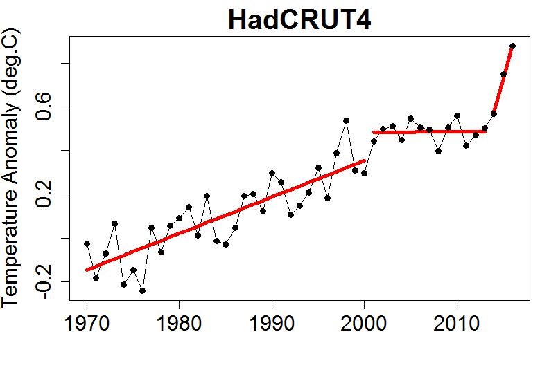
Let’s use annual average global temperature data from HadCRUT4 (the Hadley Centre/Climate Research Unit in the U.K.) for the period from 1970 through 2013. It looks like this:

Of all the global surface temperature data sets, this is the one which most “looks” like it may have shown a slowdown, especially from 2001 through 2013. If we fit a straight line to the data using only that time span, we get this:

That certainly gives the visual impression of no warming, covering a period of 13 years.
However that impression quite ignores all the data which came before. It amounts to this model of the “trend”:

In addition to the un-physical nature of such a “broken trend,” the model does not pass statistical muster; there’s insufficient evidence that the change of trend in 2001 is real. The broken trend only accomplishes one thing: it gives the visual impression of a trend which is much lower than what came before, by completely ignoring what came before.
If all we had was the data from 2001 through 2013, then that’s all we could do — you can’t include information from data you don’t have. But we do have data on what came before. Ignoring that data is a mistake. Ignoring that data specifically because 2001 is the starting point of the strongest visual impression of trend change, is cherry-picking. Doing so because you want to believe, or to make others believe, that the trend is lower than reality, is dishonest.
I know that fitting a trend line to a limited time span is very common. Most of the time, it’s an innocent mistake, not a deliberate one. If one suspects that the trend changed in 2001, then estimating it separately and independently for the “before” and “after” data is a very natural thing to do … but unless you have evidence that there was a “jump discontinuity” as well as a trend change, it’s a mistake.
It also, far too often (perhaps even most of the time), includes a purely statistical mistake. When comparing those “before” and “after” trends, the usual way is to allow for the fact that the “two different trends rather than just one” model includes a single additional degree of freedom: the trend difference between the two time spans. But in fact it includes two additional degrees of freedom: the trend difference and the jump discontinuity. This is rarely accounted for, but must be for a valid treatment (it’s one of the reasons the Chow test was devised).
There is a way to include a trend change at a particular time but avoid a non-physical jump discontinuity. We simply fit a model which allows for a trend change but is still continuous, i.e. no discontinuity (jump or otherwise). We can, for example, do that with the HadCRUT4 data 1970-2013 with a trend change in 2001. That yields this model (in blue, compared to the “broken trend” model in red):

Suddenly the estimated trend change isn’t nearly so impressive, and no longer gives the visual impression of 13 years with no increase. And it still doesn’t pass muster statistically; there’s just no solid evidence of a trend change at that time.
Another extremely important statistical consideration is that if one goes searching for a trend change, there are a great many places at which it might have happened. This means we have many, many “changepoint” times to choose from. And that means we have many, many more chances to get an apparently significant result just by accident. It’s like buying a lot of lottery tickets; your chance of getting a win, just by accident mind you, are much improved because you have so many more chances. All of which drives home the lack of evidence for a recent trend change … the test models don’t pass muster, even before we compensate for the large number of chances we have from the free choice of when to start.
And then there’s the issue of when to end a purported “trend change” period. So far, I’ve ignored (I haven’t even shown) the data after the potential “trend change” interval. When we include information from what came after, as well as what came before (when we include real context about claims of trend change), the case for a “slowdown” or “pause” or “hiatus” is even more paltry:
In order to claim a “slowdown/pause/hiatus,” we have to believe in broken trends, ignoring what came before and after, followed by the trend taking off like the proverbial bat out of hell. And, of course, we kinda have to ignore the data from NASA, from NOAA, from Cowtan & Way, and from the Berkeley Earth Surface Temperature project, all of which show nowhere near as much visual impression of a “slowdown” as the HadCRUT4 data.
If you look at nothing but 2001-2013, from HadCRUT4 data only, then it’s easy to get the idea that global temperature showed a recent slowdown. But what’s really impressive is the array of things you have to hide from view to maintain that impression. Such a limited perspective is not very scientific. Neither are the claims from those who deny the danger of man-made global warming.
This blog is made possible by readers like you; join others by donating at Peaseblossom’s Closet.


And yet, despite all this, the deniers still managed to get the IPCC to include talk of a hiatus in the last assessment report.
Their statistics and science is evidently crap, as you have do often demonstrated, but their control of the media narrative is frighteningly good. And the media narrative is capable of influencing even the scientists who are, after all, only human.
IMO, part of the problem is the ambiguity of natural language. Scientists, reputable ones, have studied the ‘slowdown’ period and used similar terms to label it. Yet they did not assert that there was a change in the underlying trend; often enough they explicitly cautioned readers or reporters that warming should be expected to continue because of well-understood physical forcings, especially GHGs. So it would seem that when such people used the term ‘slowdown’, it did not imply a change in the underlying trend.
Rather, they were generally investigating the specific reasons contributing to the ‘downward wobble’ (as our friend Al Rodger would probably put it). In statistical models, these are often modeled as just ‘noise’. But from a physical and meteorological point of view, they may well have traceable causes, the investigation of which is a scientifically interesting question.
However, you can rely on denialati to ignore all that, and just seize on the apparent ‘admission.’ In doing so, they tacitly assert a definition of ‘slowdown’ which necessarily includes a change in the underlying trend.
Or so I see it, at least.
I think the ultimate problem is that the IPCC reports are a political document written by scientists. The “pause” represents a fluctuation about the ongoing trend. Fluctuations are VERY interesting to scientists. They can provide important insights into the systems under study. There are very good reasons to want to understand the “pause” as an example of a large-scale fluctuation. However, the scientists understand that the fluctuations do not change the underlying physics. The people and the press…not so much.
As valuable – essential even – as statistical analysis is to revealing the extent and course of climate change it isn’t a statistical phenomena – and the physical phenomena, on these time scales, appear to be dominated by known, identifiable phenomena that includes a lot of internal variability that won’t affect the longer term trend. Which is why I appreciate what’s been done to account for ENSO, volcanic aerosols and solar intensity. A real change in statistical trend should accompany real changes in physical phenomena. That the alleged statistical changes can be shown to be statistically spurious is exactly what I would expect in the absence of observable changes in those physical inputs and processes.
I would like to see as much of the remaining variability attributed to specific phenomena as is possible – and dealt with in similar ways but for practical purposes the understanding of how serious messing with the GHG concentrations of the atmosphere is more than reliable enough; insisting on delaying and deferring appropriate policy responses in order to have greater certainty – especially for those who hold positions of public trust and responsibility – is already well into the realms of negligence.
Excellent, again, Tamino. I wish those scientists who have been duped into believing in a slowdown would read this blog.
But which definition of ‘slowdown’? (See my comment, above.)
One man’s noise is the other man’s signal.
The decisive question is: What comes next? (i.e. in the future) A “trend” is a linear approximation with some predictive value, and its existence has a precondition: that the system is sufficiently well behaved to allow a linear approximation in the time span considered. This time span of interest is about 100 years or so in this case. The earth atmosphere plus ocean system is well behaved in this sense.
It is actually interesting to investigate w h y it is so well behaved. The answer is to be found partly in the thermal inertia of the oceans and partly in the feedback strengths and time constants, which are not strong and not fast enough to create either runaway or wildly chaotic behaviour in this timescale.
Other timescales are another matter.
Basically, a statistically produced trend has only any predictive power for a time span not longer than the timespan used to establish it, possibly much shorter. This holds, if i do not have any further information about system behaviour, e.g. truly physical models. So a “trend” got from a 13-year-period delivers valid predictions for time spans shorter than 13 years without any further information. Problem is, the system is not “well behaved” in this short period. The fluctuations from nonlinearity more or less destroy the predictive power of such short trends.
So we have three regions: short term (10 years), medium term (100 years) long term (1000 years). Interestingly, in the first and last, the nonlinearities make the use of trends problematic, while they seem to work fine in the middle range.
A good illustration of the oddness of broken trends would be to take the last graph, and remove the 2001 to 2013 trend line. Then ask how the gap between the trendlines should be filled in.
I’m will to bet that almost everyone would default to joining the ends of the two remaining lines (not that that’s really correct – there’s a large uncertainty on the 2013-2016 trend line).
OT, but:
http://onlinelibrary.wiley.com/doi/10.1002/slct.201601169/full
is this for real? any thoughts on nanotechnology capture of CO2 and conversion to ethanol fuel? Seems to good to be true, there must be issues with scaling up, etc.
A carbon neutral fuel for ICE engines would be a good thing, but I think the ICE engines are giving way to electric propulsion, so this would appear to be more useful for creating electricity for all the things that we plug in and use, including cars.
Mike
Imagine that it is the middle of January 2013. The official 2012 Hadcrut4 temperature anomaly has just been published, and a wealthy person decides to run a contest based on what the official 2013 Hadcrut4 temperature anomaly will be. Each person entering the contest is allowed one guess, and the person whose guess is nearest to the official value wins $1,000,000.
We need to decide which type of model to use to calculate our guess. Do we use the broken trend model, or the continuous trend model?
To me, the continuous trend model looks like a poor fit to the data after 2000. But the broken trend model looks like a good fit to the data after 2000. I don’t care about the arguments about which type of model is theoretically superior. I want to win the $1,000,000, and I think that the broken trend model would give me a better chance.
Do people agree or disagree with my choice of the broken trend model?
[Response: Imagine that it is the middle of January 2014 … or 2015 … or 2016 …]
Disagree. The broken trend model represents a physical un-reality. Energy doesn’t spontaneously enter or leave a system (the breaks in the trend). What makes the continuous trend model “theoretically superior” is really just its mathematical reflection of physical reality.
if energy doesn’t spontaneously enter or leave a system (the breaks in the trend), then why did it suddenly start warming in 1975 (the start of the most recent warming trend)?
Hint: the CO2 level did NOT suddenly change.
[Response: A sudden change in the *slope* is not the same as a sudden change in the *value*. The former still makes for a continuous function, the latter does not.
It was during the 1970s that Europe and America finally instituted legislation requiring less sulfate emissions (esp. from coal burning). This stopped the increasing atmospheric sulfate load, hence stopped its increasing cooling effect.
I suspect you’ve been told this before, possibly many times. Pay attention.]
Tamino said:
“It was during the 1970s that Europe and America finally instituted legislation requiring less sulfate emissions (esp. from coal burning). This stopped the increasing atmospheric sulfate load, hence stopped its increasing cooling effect.
I suspect you’ve been told this before, possibly many times. Pay attention.]”
Yes, I have seen this explanation before. However, it has always seemed inadequate to me, because it would likely take decades before this legislation resulted in a change to the climate. Everybody didn’t suddenly change their emissions over-night. And you are only talking about the Americans and some Europeans. What did the rest of the world do (the rest of the Western world, China, India, the rest of Asia)?
Please note: I always pay attention, you don’t need to make snide comments.
[Response: You keep repeating the same nonsense after you’ve been shown the error of your ways. An unwillingness to learn suggests that “snide” is better than you deserve.
It certainly did not take *decades* for legislation to halt the increase of atmospheric sulfates. There’s actual data about sulfate emissions, which shows the rapid cessation of its increase. And at that time, the U.S. and Europe had most of the world’s industrial activity.]
@Sheldon: Tamino beat me to it, conveying more or less exactly what I was gonna say. (Which, I gotta say, makes me pretty happy!)
Look, I suspect you’ve had little math/stats/physics education or experience. (If you have, then I suggest getting a refund on the education…) You don’t seem to be connecting the numbers to the real world. They don’t exist in a vacuum! But this a good place to read and learn. Assuming you’re willing.
Oh, and hint: Don’t come to a forum populated by professional quants and drop hints. It doesn’t ingratiate you. All you’ll get back is snark (at the best).
Sheldon Walker:
Bravo, Tamino, for demonstrating the appropriate response to tone trolling by a resolute AGW-denier. We might be sympathetic to denial as a psychological response to severe personal trauma, but the
AGW-denier’s sheer refusal to accept responsibility for the full costs of his comfort and convenience deserves neither sympathy nor respect. Public scorn may not convince Mr. Walker of his errors, but we can hope it will discourage less aggressive AGW-deniers from publicly repeating the same nonsense. Regardless, we should feel at least as free to mock Mr. Walker’s clueless confidence as he is to express it.
Well, as I live in a physical Universe, I would go with the model that best conforms to the known physics of the system. As the physics has not changed, I’d go with the trend that fits the past data.
What kind of universe do you live in Sheldon?
I live in a universe where things are not forced to follow straight lines.
If the only tool that you have is a hammer, then you treat everything as if it were a nail.
If the only tool that you have is a linear regression, then you end up with the problem of broken trends, and may feel the need to make more unrealistic assumptions (like continuous trends) to avoid them.
My preference is to use something like a LOESS smooth. It gives a good continuous approximation to the data, without giving “broken trends”.
A LOESS smooth of the Hadcrut4 data shows a nice slowdown from about 2004 to about 2010. It even has a negative slope, so maybe I should call it a pause or hiatus.
In answer to Jim Eager below, give me practical superiority over theoretical superiority every time. Bingo.
[Response: Nobody seriously believes in a perfectly linear trend. But the statistical evidence that it departs from a straight line doesn’t exist.
Whether or not a loess smooth shows a decline, or even a levelling off, depends on the time scale one chooses. Time scales short enough to show a “hiatus” also show many unrealistic wiggles. In fact such time scales are obviously too quick to give realistic trend estimates — they certainly don’t pass muster statistically, not even close. You need to “up your game.”]
Sheldon,
Utter horsecrap. You live in a universe where you don’t know how to fit data. Look up, for example, Akaike’s Information Criterion (AIC) and related measures.
As to the explanation of sulfate aerosols–you are aware that such aerosols have a very short residence time in the atmosphere, are you not? It’s on the order of months. If you don’t keep replacing them, they rain out, and you let the sun in. I’d suggest you follow their example wrt evidence.
A normal year followed by a la Nina year normally has a negative slope so maybe we should call them pauses or hiatuses. Pretty stupid argument.
I know that this is not a perfect test, but if we look at Tamino’s graph of Hadcrut4 showing the broken trends and the continuous trends, which trend method is closer to the actual value for the years 1990 to 1913.
Note: I started in 1990 because this is about where the two trend methods give a different result (they are similar before 1990). Also, it gives the continuous trends an initial advantage, because it wins 1990 and 1991.
Note: this has been done by me estimating which trend method is closest, I don’t have the actual numbers. Tamino may want to check my results.
Year Winner
==== =====
1990 continuous
1991 continuous
1992 broken
1993 broken
1994 broken
1995 continuous
1996 broken
1997 continuous
1998 continuous
1999 broken
2000 broken
2001 continuous
2002 broken
2003 broken
2004 continuous
2005 broken
2006 broken
2007 broken
2008 continuous
2009 broken
2010 continuous
2011 broken
2012 broken
2013 broken
Summary:
the broken trends method wins 15 times
the continuous trends method wins 9 times
To me this seems logical. The broken trends method fits lines which match how the data looks, it has more degrees of freedom. The continuous trends method forces additional assumptions onto the fitted lines, and has less degrees of freedom.
[Response: What you’re evidently not aware of is that “better fit” does not mean “better” or “more realistic” model. The broken trend model includes additional degrees of freedom in the fit, so *of course* it will generally give a better fit. You get a perfect fit if you allow a “trend” which connects each data point to the next one — but that’s rather obviously not a realistic trend estimate. You can likewise get a perfect fit with a polynomial of degree one less than the number of data points, but again it’s a nonsense trend estimate.
I suggest you research the topic “overfitting.”]
“give me practical superiority over theoretical superiority every time”
Give me the physics. Got any?
“I don’t care about the arguments about which type of model is theoretically superior.”
We have a Bingo.
Jim’s pre-empted the very same comment that I was going to make.
As we’ve all seen interminably many times in the past, in the cases of countless deniers of physical reality, Sheldon Walker isn’t interested in the facts and the constraints of the data, he simply desires to fiddle with them until he can extract a non-scientific ‘result’ that meshes with his a priori ideology.
Sheldon Walker, the planet’s temperature record contains a human-caused global warming signal with superimposed natural forcings that create ‘noise’ around that signal. Do you understand what is the magnitude of the short-tern ‘noise’ in the global temperature trajectory, and do you understand how this noise affects the minimum time (in years) that it takes to see the human-caused global warming signal emerge from said noise?
Demonstrate that you do.
And do you understand how this minimum amount of time required to see the signal of human-caused global warming constrains how one chooses to apply local modelling to the temperature trajectory?
Demonstrate that you do.
And if you can’t, then accept that you’re vocalising from the wrong end of your alimentary canal.
Before anyone wastes too much time with Sheldon peruse
http://blog.hotwhopper.com/2016/02/sheldon-walker-gets-into-pickle-picking.html
which describes his WUWT article “debunking” pause denial by developing an entirely new method of statistical analysis :-o ! This unique method–dubbed “Multi Trend Analysis” (MTA)–is to use moving windows to look at successive subsets of the time series and has never been thought of before!
Further as to his cred he assures Sou in the comments there under her entry that “This shows that the quality of my work, is on a par with professional climate scientists.” A remarkable self assertion indeed!
Anyway he belongs in the crank category rather than the fellow discussant category.