RealClimate has published their latest 2012 Updates to model-observation comparisons. I’ll take a different twist. Instead of comparing observations to computer model projections, I’ll compare them to very simple statistical projections.
In a year gone by I posted about what kind of betting terms I might consider appropriate for the reality of global warming (incidentally, that post contained an error which was corrected in an update, but the archived copy doesn’t include the update). The idea is to take annual average data (for global temperature) from 1975 through the end of 1999, then fit a trend line by linear regression. If the trend continues, then future data should probably be within two standard deviations of the extrapolated trend line. This is the “projected range” according to the existing trend. The “projected range” according to the not-still-warming theory is that future values should be within two standard deviations of the existing average (in that case, from 2001 through 2007).
I also mentioned that since it would be unlikely but far from shocking if a single future value were outside either range, I would require two (not necessarily consecutive) future years outside the range to decided against either claim — if I were a betting man.
Since the post was made (early 2008), subsequent global temperature data have fallen within the projected range, for both the “still-warming” and “not-still-warming” claims.
Other things have changed too. We have more data now, and not just since that post was made. Many temperature stations report late, and the methods of calculation for global averages keep getting better. So even data for past years isn’t quite identical to what it used to be. Also, that post looked only at global temperature, mainly from NASA GISS. But the method itself — compare the 1975-through-1999 trend with what followed — is a good way to visualize whether or not the existing trend is likely to have continued or not. It’s not a rigorous statistical test, but it gives a good visual impression. So … let’s do it again, for global temperature from all 5 main sources, and for a few other variables too.
First up is global temperature, from NASA GISS, for which all the post-2000 data are within the projected range:
Then there’s global temperature according to HadCRUT4. Again all the post-2000 data are within the projected range, although it’s on the low end for the last couple of years:
The same can be said for global temperature from NCDC:
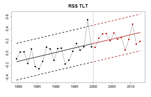
For satellite data on global temperature in the lower atmosphere from RSS, everything has proceeded according to projection.
For satellite data on global temperature in the lower atmosphere from UAH, the last decade has actually been running a bit hot but still well within the projected range:
It turns out that all 5 major global temperature records have remained within the projected range since 2000.
Although it’s not a very good indicator of global warming, a lot of people are interested in temperature in the USA (the 48 contiguous states). It too is within the projected range:
If however we had projected that 1975-through-1999 temperature would persist into the 21st century, then we have definitely gone outside that projected range:
Of course there are other data related to man-made climate change, and it’s interesting to see whether or not they have strayed outside the projected range according to this method. First up is Arctic sea ice extent during its minimum month of September:
Clearly this has strayed outside the projected range, but the divergence is on the low end which would indicate that global warming has proceeded faster than projected. For March the post-2000 data has remained within the projected range:
For the annual average, again post-2000 data has exceeded the projected range on the low end, indicating faster warming than projected:
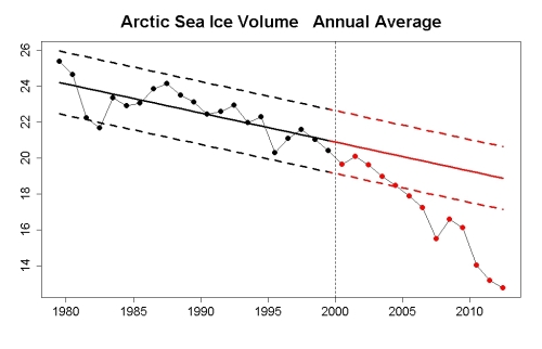
If we look at annual average Arctic sea ice volume rather than extent, again we have strayed outside the projected range on the low end, indicating faster-than-expected warming. In fact we’ve been below the projected range now for 8 years running:
Annual average snow cover in the northern hemisphere is within the projected range:
It is also within the projected range if we had simply extended the 1975-through-1999 average value:
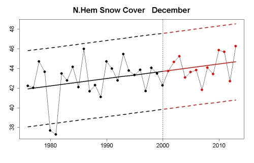
For snow cover during December, we are within the projected range from extending the trend, and from extending the 1975-through-1999 average:
For snow cover in the month of June, we are well outside the extension of the 1975-through-1999 average:
but well within the extension of the 1975-through-1999 trend:
Sea level has been a bit above the projected range:
Why have these global warming indicators continued or exceeded their existing trends? Because of this:


striking.
Very nice. Could you add the graphs for estimated climate forcing?
Wonderful summary up until the last point IMO.
Is an excess of 10 ppm CO2 over the past decade or so enough to cause global temperatures or Arctic sea ice to change beyond expected ranges? I’m skeptical about that. Uncertainties in our model from elsewhere or natural changes are a much more likely candidate to explain the short term variation.
How would you demonstrate that statistically?
Noting by the way that Tamino referred to the ensemble of indicators, rather than just one, to support to his conclusion.
The response includes catching up with the effect of the earlier CO2 increases. It’s by no means immediate
Its worth pointing out that I made a bet with Joe Bastardi along these lines awhile back using UAH as the metric: http://rankexploits.com/musings/2011/bastardis-wager-you-bet/
Unfortunately we settled on steak dinners rather than money. I should post an update based on 2012 temperatures at some point.
Excellent presentation Tamino, right up until the final graph the message of which I think may be a bit ambiguous. For instance were the red trend line from 2000 to be inverted and trending down, rather than up, we’d nonetheless expect little visible change in any of the other trends – right? The CO2 effect on climate over any decade or other is expected to be almost entirely due to absolute concentration, not trend. IOW the warming problem we face is harder to address than just tackling the CO2 trend line, it requires significant reduction of the absolute level.of atmospheric CO2, almost certainly requiring a multi-decadal downward trending extension to that graph.
That’s my only question – ie great work!
OK apologies to MieScatter who I now see has made the same point.
Great update, thanks!
thanks, it’s good to see the boundaries of the expected so clearly presented.
Isn’t snow cover a somewhat problematic indicator of global warming? After all higher temperatures give more moisture in the air and more precipitation, leading to more snowfall. So maybe we should subtract something from the graph values, making the decline even larger.
I suppose you could add in atmospheric humidity as a covariate, if a time series existed… but the problem with this kind of thing is that if you ‘know what the result should be’ it creates a very real danger that you’ll start making assumptions that all lead in that direction.
It would be fair enough to calculate the albedo-feedback of snow anomalies year round.. noting that there is very little sunlight to reflect in December.
[Response: Here.]
Is it worth considering using Statistical Process Control methodology here?
I’m struck by the resemblance of these charts to “control charts”.
http://en.wikipedia.org/wiki/Control_chart
And then I wonder if it is relevant to suggest the application of ‘decision rules’ such as this:
http://en.wikipedia.org/wiki/Western_Electric_rules
The writers do emphasis that unless the rules are determined before the data is seen there is an increased probability of ‘false positive’ Type 1 errors.
Hi Tamino,
Thank you for the great analyses and presentation. I have a few diagnostic questions about your regressions. For the regressions of temperature, could you possibly post graphs showing normal probability plots for the functions but also including the residuals between observed and predicted values after 2000? Are your intervals actually prediction intervals for new values of “X” (time) or do they represent the standard errors of the model estimates of temperature for the time series before 2000 (the time series you used to create the models)? Finally, and please pardon my naivete, has anyone done a simple cross-correlation function for cumulative atmospheric CO2 and any of the observed temperature trends? Theoretically, a CCF should be able to take into account the time lags between CO2 levels and changes in temperature.
Thanks,
dave
Graph #1 seems very similar to a graph that Pat Michaels had in his book “Satanic Gases” back around 2000 or so, if I recall correctly. I wonder how his graph compares to these nowadays?
Nice compendium. I would like to see lake “ice-out” date trends added to the mix.
I did this one for Minnesota:
http://theoilconundrum.blogspot.com/2012/09/lake-ice-out-dates-earlier-and-earlier.html
Lots of noise, but getting at the real signal is Tamino’s forte.
The remainder of the hard work is in collecting a comprehensive set of ice-out dates for the northern hemisphere. One location isn’t enough but if this data is gathered over USA, Canada, Scandinavia, Baltics, and Russia, it becomes very impressive.
This is a paper describing the Baltic region ice-out dates:
PDF
What’s so special about 1975?
I see graphs depicting temperature trends starting halfway the 70’s everywhere.
Why not fit a trend from 1945?
What’s so special about 1945?
Mike,
It is easy to show that there was a change in slope in 1975. Taking 1975 as a breakpoint in the trend improves the fit to the data in a statistically significant manner. What is more, it represents a significant improvement in predictive power. Tamino has done this analysis. Why not try it yourself using Akaike Information Criterion?
I apologise. I didn’t think it should be a yes-no question, but rather, what (part of) the slope is forced vs noise.
But taking the best fitting slope (75-99) does also reduce the bandwith of two sigma, therefore making the test more rigid.
Somehow I was confused. Somebody fits from 1998 onwards (“standstill”), it’s cherrypicking, from 1975-1999 is ok.
Allways did seem like picking other fruit to me.
Now I see, that for the purpose of the test, the time interval with the best fit is a fair choice. If 75-99 is overstating the expected increase in the 21st century (I hope so) this test will show it. Starting earlier will not only decrease the slope, but als increase the standard deviation.
@doc snow: around the 1940’s there seems to be another change in slope. 75-99 gives highest, 41-99 lower slope.
But for the purpose of the test (as I acknowledged above) this is lacking in relevance.
I’ll go back to “reading only” and thanks for the answer.
Tamino, a clear presentation as always. This is an excellent response to the misused null hypothesis in the ‘no global warming for a period too short to show global warming’ theme.
This makes me wonder: since the null hypothesis doesn’t have to be 0 (but could instead be no change in slope since the modern warming regime in 1975), perhaps a more useful response to the ‘no warming since….’, in addition to pointing to your graph, is an odds calculation. What’s the probability of the null (warming since 1999 being consistent with past warming) versus the ‘skeptic’s’ alternative (no systematic change since 1999)? Given the relative fit of the data as you’ve shown, it’s currently much more likely, and gives a better response than the binary ‘.05 or not’ decision. I’m a little vague about how to construct the odds ratio (area excluded under the null versus the non change?) but I think it might be a good, and readily updatable, response.
Perhaps useful?
Dakos V, Carpenter SR, Brock WA, Ellison AM, Guttal V, et al. (2012) Methods for Detecting Early Warnings of Critical Transitions in Time Series Illustrated Using Simulated Ecological Data. PLoS ONE 7(7): e41010. doi:10.1371/journal.pone.0041010
“… while the range of proposed methods for predicting critical transitions is rapidly expanding, opinions on their practical use differ widely, and there is no comparative study that tests the limitations of the different methods to identify approaching critical transitions using time-series data. Here, we summarize a range of currently available early warning methods and apply them to two simulated time series that are typical of systems undergoing a critical transition. In addition to a methodological guide, our work offers a practical toolbox that may be used in a wide range of fields to help detect early warning signals of critical transitions in time series data.”
I have a question about Granger causality.
It relates to the paper Triacca 2005 “Is Granger causality analysis appropriate to investigate the relationship between atmospheric concentration of carbon dioxide and global surface air temperature?” If you look at the equation at the bottom of left column page 134, you see that it fits a linear time trend separately to each of the time series, one of CO2 radiative forcing, and one of global mean temperature. The reason for doing so is given as the non-stationarity of these time series (so I suppose that for integration order d=2, a term ct^2 is added to this equation).
No my question is: is this correct? Isn’t what is happening here that the causality is tested between the residuals of CO2 RF and temperature respectively, the wiggles remaining after the removal of this temporal trend which however contains most of the interesting (i.e., anthropogenic) signal?
I suspect that the situation here is different from that in econometry, that here we know from physics that pre-industrially the CO2 and T time series must have been stationary (and equilibrium seeking), and that it was us causing the non-stationarity.
Triacca points out that Granger causality can not be relied upon here, but he is unclear about the reasons. This would be an obvious reason, right?
[Response: I haven’t looked at the paper or given this issue much thought. But my intuition is that you’ve hit the nail on the head.]
Thanks tamino!
See http://agwobserver.wordpress.com/2010/02/18/papers-on-co2-temperature-correlation/ for a number of papers on Granger causality with respect to anthropogenic forcings (Granger causality checks for the strength of a predictive relationship between two variables).
The majority of the papers, which don’t assume nonstationary time series, find Granger causality for natural forcings only up to the mid-20th century, with the relationship breaking down ~1960, while anthropogenic forcings acquire Granger causality at roughly that time point. In other words, past roughly 1960 anthropogenic forcings have more explanatory/predictive power for temperatures than natural forcings and variations.
Triacca has expressed his opinions on the matter in several papers, but his work is generally considered an outlier. If he’s detrending and looking at residuals (I haven’t read the 2005 paper), that would definitely indicate errors of analysis. And if he’s assuming non-stationary (random walk) data, that would invalidate his papers entirely – as per discussions here on Beenstock et al 2012, temperatures are demonstrably trend-stationary with respect to forcings.
Thanks KR, great links
Here are the last sentences of the concluding paragraph:
Given the physics involved, we should expect forcing due to carbon dioxide to have essentially no appreciable effect upon year-to-year temperatures. But the thing is that carbon dioxide has a long residence time in the atmosphere, with much of it staying there for the next hundred, thousand or even hundred thousand years, and the forcing that it is responsible for is all in one direction.
0.005% doesn’t seem like much until you realize that it keeps adding up in the same direction, year after year. Reminds me of the Vancouver Stock Exchange index , that kept dropping month after month, even though stock prices were rising. After each transaction, they were truncating the result to three decimal places – and losing value by throwing away the “insignificant” figures after it.
“Economical Q.E.D.”
— by Horatio Algeranon
The math is simple as can be
Remove the trend and you will see
That global temp is clearly free
Of carbon dioxide, Q.E.D
Eureka! He has found it!
Tamino: I hope you are following this discussion:
This is obviously intended to be a pretty rough test, but strictly speaking, if the warming actually had “stopped” at the beginning of 2000(if there had been an actual breakpoint in the trend — no further warming or even possibly cooling), wouldn’t one want to test whether future values are within two standard deviations of the “ending” value (for end 1999) for the long term trend line?
Basically, bend the trend line flat in the end of 1999 — ie, require that subsequent trends should somehow be “continuous” and not show a jump.
After all, it could be (for certain data sets) that the average 2001-2007 is actually above the ending value for the long term trend.
In fact, that is actually the case for GISTEMP: the long term trend line (1975-end 1999) has value is 0.42C at end 1999, but the average of the values for the years 2001-2007 inclusive is 0.55C
If one were to use the average from 2000-2007 inclusive (0.53), the difference would be slightly less, though it would still be about 0.1C (1-sigma), so the anomaly for 2010 (0.63) would have been about 2-sigma above the 0.42C value (for end long term trend)
Of course, one can’t change the rules of the poker game part way through (at least not if one wishes to remain alive to collect the winnings), but it does seem to make slightly more sense to set things up as described.