
Ice is one of nature’s thermometers, telling us whether or not the temperature of water is above or below 0°C (32°F). When things get hotter, it melts more and faster; when things cool down, water can freeze and ice accumulate. In general: more heat = less ice; less heat = more ice.
One of the places on Earth we find lots of ice is the sea surface in the Arctic, and when we graph its extent the first thing we notice is the seasonal pattern: in summer/fall there’s more heat, less ice; in winter/spring less heat, more ice.
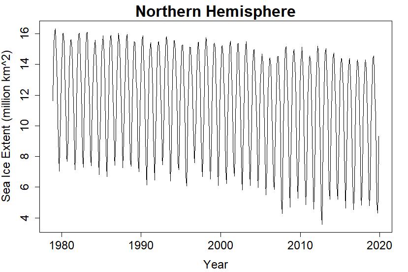
But we also notice an overall decline, visible in spite of the gian size of the seasonal melt. We can make it even more visible if we transform extent values into extent anomaly values. To do that, we figure out the the “average” extent for each time of year. Then we take each value and subtract the average for the same time of year to get anomaly values. Essentially, we’re subtracting out the seasonal cycle, leaving the secular trend in place. We get this:

It’s true that the overall decline is more plainly visible. But now we see another visible change: around the year 2007, the anomaly values go crazy, showing what looks like a seasonal pattern of their own. Did Arctic sea ice take on some strange fluctuation pattern all its own?
The answer is no. The apparently immense fluctuations after 2007 are indeed an annual cycle — but didn’t we subtract away the annual cycle? No, we subtracted away the average annual cycle. If the seasonal cycle after 2007 was different enough from that average, then what’s left is the residual difference between the seasonal cycle at the time and the average seasonal cycle.
And indeed, the seasonal cycle itself changed after 2007; it got bigger. What’s left over after subtracting away the average seasonal cycle, is still evident. You might mistake it for the onset of some bizarre fluctuation, but it’s really just a change in the size of the seasonal cycle; whether or not you call that a “bizarre fluctuation” is up to you.
The “average” seasonal cycle doesn’t change from year to year — at least, not as far as anomaly calculation is concerned. What if we broke that rule? What if we subtract away a seasonal cycle which does change over time? Maybe, this one:

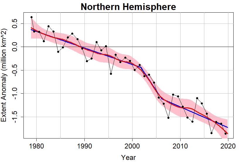
It’s tailored to mimic the changing seasonal cycle in Arctic sea ice extent. If we subtract this from the original data, we can define what I call adaptive anomaly values:

Now the overall decline “jumps off the page” to grab your attention, and we note the absence of that crazy behavior after 2007. But we also note two extreme events, two times the Arctic sea ice extent took a nosedive and dipped to new lows, one in 2007 and the other in 2012. As it turns out, both events happened during September, when Arctic sea ice tends to be at its yearly low.
I calculated a lowess smooth of the Arctic sea ice “adaptive anomaly” values, and I also computed a piecewise linear fit (PLF), a model consisting of straight lines meeting at their endpoints (it could also be called a “linear spline”). The times to transition from one straight line to the next, were chosen to give the “best fit” (least squares) while insisting the changes passed statistical significance tests. The two ways of modeling the data, by lowess smooth and by PLF, agree rather well. Here are yearly averages of Arctic sea ice extent anomaly as black dots, with the PLF as a thick blue line and the lowess smooth as a thick red line (the pink band is the uncertainty range of the lowess smooth):
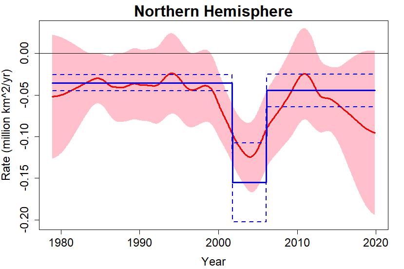
The interesting result is that there have been three “episodes” of Arctice sea ice loss. The first extends to about October of the year 2001, with sea ice declining at about 35,000 km^2/yr. During the second episode, up to around February 2007, it declined faster at about 155,000 km^2/yr. Since then it has returned to very near its previous rate of decline at 46,000 km^2/yr (faster loss than the first episode, but the difference is not “statistically significant.”)
I can even plot the rate of sea ice loss over time, according to both models (PLF and lowess). The PLF actually estimates the average rate during each episode, while lowess can estimate the instantaneous rate. Here they are, lowess in red, PLF in blue, with pink shading for the lowess uncertainty range and blue dashed lines marking the PLF uncertainty range:
Some climate deniers claim that Arctic sea ice is in “recovery.” They base this on the fact that it’s not declining as fast now as it was from 2001-2007, and that with the clever presentation of graphs they can make it look like the decline has subsided (but there’s a lot they must not show, to make that happen).
The total decline of Arctic sea ice extent since we began satellite observations in the late 1970s has been around 2.3 million square kilometers — bigger than the state of Alaska and two states of Texas combined. Draw your own conclusions.
Thanks to Colin Letham for his generous donation to the blog. If you’d like to help, please visit the donation link below.
This blog is made possible by readers like you; join others by donating at My Wee Dragon.


This is really nice: Adjusting to local non-stationarity using adaptation.
Question though: If this kind of thing happens in these signals, doesn’t it challenge the assumptions underlying significance tests?
[Response: Yes it does. In this case, the significance is so strong that it’s overwhelmingly likely to stand up to that challenge. And after adaptive anomaly, the noise itself doesn’t show signs of non-stationarity. But yeah.]
Thanks one more time, Tamino for this interesting exercise explaining what I did not understand:
https://drive.google.com/file/d/1uMFrTs2tAILeE4CVCNbU2-5Ad7OuM7Fi/view
namely these increasing ups and downs which have let me think all the time I did the anomaly computations ‘plain wrong’.
*
What I recently found amazing is that while so many people talk about sea ice melting levels in September, few talk about sea ice reconstruction levels in March.
Some months ago, WUWT guest posters and commenters were telling about a stagnating Arctic ice melt level in September since 2007.
This is at a first glance correct, under the condition that you can live, in your linear estimates, with a standard error far bigger than the estimate itself. Yes they can!
It is easy to download Colorado’s monthly data for the Arctic:
ftp://sidads.colorado.edu/DATASETS/NOAA/G02135/north/monthly/data/
and let a spreadsheet calculator do the rest.
For the sum of Arctic sea ice extent and area (aka 100% pack ice) you obtain indeed, for the September months since 2007, the trend: 0.01 ± 0.65 (!!!) Mkm² / decade.
But for the March months, you obtain: -1.26 ± 0.55 Mkm² / decade.
So, if I did the job right, it seems that the main cause for the (real) sea ice loss in the Arctic since 2007 is not so much the melting during the summer months, but rather the lack of re-freezing during the winter months!
I suppose that if Tamino would do the same job, by additionally including his nice seasonal cycle shift correction, he would obtain similar trends but with a strongly reduced standard error, btw making these trends more significant.
Merci beaucoup.
“…it seems that the main cause for the (real) sea ice loss in the Arctic since 2007 is not so much the melting during the summer months, but rather the lack of re-freezing during the winter months!”
I think so. If you look at temperature trends for the central Arctic basin, you’ll find little or no increase in summer temperatures. That’s because the ice ‘clamps’ surface temps pretty closely; additional energy from warmer air melts more ice, but doesn’t raise the temperature much. (The D
By contrast, during colder months of the year, temperatures are consistently warmer, and sometimes a *lot* warmer. Since the ocean temperature is pretty stable under the ice, that means that the temperature differential through the ice is reduced, and that in turn means less energy lost at the bottom of the ice–which means less refreezing. Less refreezing, less ice to melt in the spring and summer.
You can see this quite clearly in the DMI ‘north of 80’ temperature plots:
http://ocean.dmi.dk/arctic/meant80n.uk.php
(By the way, that’s reanalysis data and should only be used with caution for climatological purposes, and there are geographical weighting issues with it, too. But as a rough and ready visualization tool, I’m kinda fond of it.)
Ignoring the reanalysis ‘caviat’, if you plot out the 80N DMI data (see here – usually two clicks to ‘download your attachment’), the summers are coming out a little bit colder, this perhaps because of the increase volume of melt.
Al, thanks for that. Pondering the possible physical mechanisms that could exist is interesting, if not very conducive to firm conclusions. I wonder about statistical significance in that plot, though. Any light you can shed on that side of it?
Meanwhile, next door over in Greenland, a tipped over point:
https://m.phys.org/news/2019-12-drone-images-greenland-ice-sheet.html
Thanks Tamino.
I have posted a link to this on the ASIF.
Your statistical skills are widely respected, many on there have been hoping you would look at the change in extent trend.
Interestingly the same pattern is not as apparent in the volume decline.
Either way a Blue Ocean Event is only a matter of time.
I’m a bit dubious about the enhanced maximum in the adaptive seasonal cycle. Climate model expectations are that Arctic sea ice minima should decline faster than maxima, and therefore we expect a growth in the seasonal cycle amplitude. But I don’t believe there is any expectation for a relative increase at the maximum, as your adaptive cycle assumes.
While there appears to be a recent relative increase at the maximum compared to the mid-2000s, looking over the whole record the maximum seems to follow a fairly linear trend. I think there’s a danger that the adaptive seasonal cycle is removing variability rather than an alteration in the underlying cycle amplitude.
I wonder if it would be possible to produce some sort of empirical-model hybrid for an adaptive seasonal cycle?
[Response: The increased maximum in the adaptive seasonal cycle simply reflects the fact that the max-min difference has increased, and I constrained the annual average to remain constant. In retrospect, it seems interesting to try an adaptive seasonal cycle for which the waveform itself can change, not just its amplitude.]
paulski0
“While there appears to be a recent relative increase at the maximum compared to the mid-2000s, looking over the whole record the maximum seems to follow a fairly linear trend.”
Here is a chart comparing the yearly maxima in March with the minima in September:
https://drive.google.com/file/d/1njGP94XZOg0CMky7h8U4lvM7NsadtJDt/view
What exactly do you mean?
Anybody have a plausible guess at why the rate accelerated 2001-2007 and then return to near the pre-2001 rate after 2007?
Very nicely done. Thanks for sharing this with us.
I have one minor nitpick/question. It appears that for a very brief period just before the Oct 2001 breakpoint, the uncertainty ranges of the two methods don’t overlap. I suppose that could be because these are 2 sigma uncertainty ranges, and it’s expected that 5% of the time it would be outside one of those ranges.
But could part of it also be that you aren’t modeling any uncertainty in the timing of the breakpoints? It looks like the uncertainty bounds drop vertically at the breakpoints. I assume there must be some uncertainty in their timing, though, and not just the uncertainty in the mean value during each time period, which I think is what you’re showing.
Sorry to be a troublemaker, I’m just trying to improve my own understanding. Like many other people I’ve learned an immense amount from reading your blog over the years.
Natural Periodicities for NH sea ice are clearly evident on Wavelet analysis. https://imgur.com/a/82ctaQs