
I started the “Global Warming Basics” posts specifically to help people who are interested in what’s going on, wondering whether we should do something about it and what, but want to keep things simple. My purpose isn’t to turn you into a scientist — it’s just to give you enough information to make sense out of what you hear about the subject. Alas, that can be all too difficult, because so many people, and politicians, are willing to distort the truth.
Perhaps the most basic question for a lot of people is “What has changed?” Has climate changed already? In what way? What have we seen in the last few decades that concerns us? What did we see last year? Last month? What’s been going on, really?
Let’s take a look.
The most obvious answer to the question “What’s Up?” is: temperature. Here’s the global average temperature each month from January 1880 through January 2016, according to data from NASA:
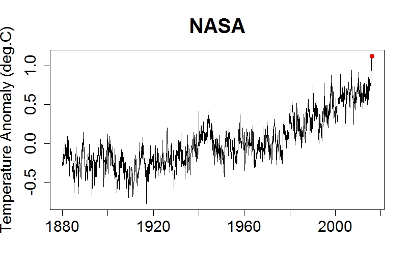
The red dot marks the most recent value, January 2016. It’s the hottest yet.
The graph actually shows temperature anomaly. That’s the difference between a given month’s average temperature, and what’s usual for that month. That way, we can remove the seasonal cycle. After all, a hotter-than-normal January isn’t going to be as hot as a colder-than-normal July — but it still means hotter than normal, i.e. that we’ve warmed up.
Here’s the same data from 1970 to now, a period during which Earth has warmed steadily:
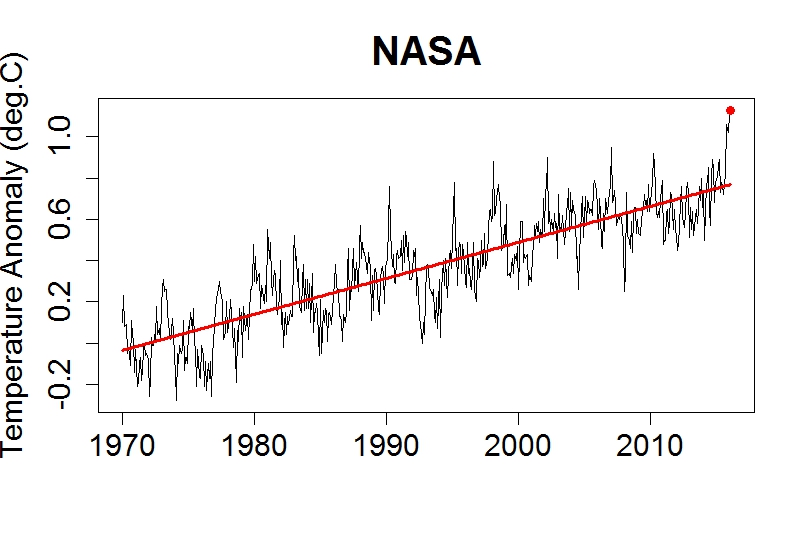
The red line is the trend. That’s extremely important because it helps us understand what to expect.
It’s obvious from looking at the graph that temperature fluctuates — a lot, and in mainly unpredictable fashion. But there’s more going on than just the fluctuations; there’s also a trend. On the planet we call Earth, that trend lately has been steadily upward. The fluctuations have most decidedly not been steady! And we can’t expect them to be, ever. But we have every reason to believe — from theory, from computer simulations, and from observations — that the trend will continue. Upward.
There’s a very powerful consensus among scientists, especially those who specialize in climate, that it’s really happening and it’s because of us. The world has already warmed 1C (degree Celsius, equal to 1.8 degrees Fahrenheit) above what it was before the industrial revolution, usually called “pre-industrial.” The prevailing view is that warming by 2C above pre-industrial means dangerous climate change, although lately many are coming to believe that even going 1.5C above pre-industrial is dangerous. Even less warming is trouble — but 1.5C or 2C is a real danger.
Even more than 2C is even more danger; some would warn that it brings disaster. But we’re already half-way there, and at the rate we’re going we’ll reach 2C before this century is out, well within the lifetime of people living today.
NASA isn’t the only organization that tracks global temperature. There’s also the National Climate Data Center, the Hadley Centre/Climate Research Unit in the U.K., a modified form from the Univ. of York in the U.K., independent data from a team organized by researchers from Berkeley Univ. in California, and the Japan Meteorological Agency, just to name the best-known. It would be redundant to show you data from all these organizations, because they all tell the same story: lots of fluctuation, record hottest recently, and most important: the trend is going up.
Those temperature estimates are for surface temperature, i.e. what’s happening near Earth’s surface. That’s particularly relevant because it’s where we live. But there’s also data, from both satellites and from balloon-borne instruments, of temperature in the atmosphere above the ground. Here’s the data for the lower atmosphere, called the troposphere (where most of our weather happens), from satellite data according to Remote Sensing Systems, an organization usually just called “RSS” (it’s the data for the middle-troposphere):

Again, the red dot is the latest value (February 2016), and it’s the hottest yet. Again, the red line is the trend, and it’s upward. Again, there’s plenty of fluctuation (a really big one in 1998, a really big one last month), lots of jiggling around, but again, the trend is a clue what’s to come.
The satellite data for temperature in the troposphere is what senator Ted Cruz likes to use when he claims global warming isn’t happening. But he doesn’t show all of it — just the part after 1997. That way, he can start his graphs with that big fluctuation in 1997-1998, so that fluctuation will look like it’s part of the trend. It isn’t. But Ted Cruz wants you to think it is, so he won’t show you what happened before that — proper context would reveal how shallow his argument is.
Of course, now that we’ve got another big fluctuation (the most recent month) it’s a lot harder to give the false impression of no warming. The fluctuation right now is big, about the same size as the fluctuation was in 1998. But the trend value is significantly higher than it was, so the temperature — trend plus fluctuation — is the hottest we’ve seen yet.
We’re seeing increased heat, not just at Earth’s surface and in the atmosphere, but in the oceans as well. Scientists don’t usually report deep-ocean temperature, instead they report the heat content itself, something called (appropriately) “ocean heat content.” Here’s what they get for the top 700 meters (about 2300 feet) of the ocean:
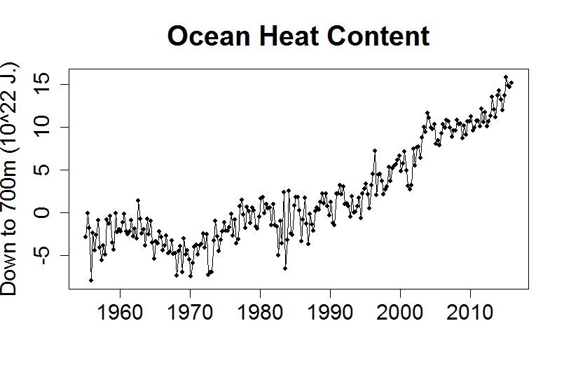
These aren’t averages for each month, they’re for each quarter-year. Again we see constant fluctuation, but again we see a trend — and it’s upward.
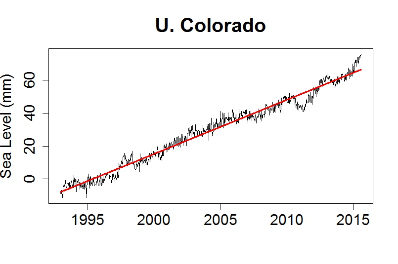
Yet another rising trend is of the height of the ocean itself: sea level. The melting of land-based ice puts more water in the oceans, and heating the oceans causes thermal expansion of seawater; both effects have caused the sea to rise. Here’s sea level since 1880, based on measurements by tide gauges around the world:

In a now-familiar story, you can see fluctuations but there’s also a trend. Upward.
Note that the trend doesn’t follow a straight line. Sea level has risen sometimes faster, sometimes slower, but it’s faster now, and in fact is faster than it has been for at least 2500 years (perhaps a lot longer). Since 1993 we’ve been measuring the height of the sea surface with satellites, which tell this story:
Fluctuations. Trend. Upward.
The effect of sea level rise is already being felt. Coastal cities are now prone to flooding, not just because of storms and torrential rainfall, but simply because of a very high tide. Miami has already spent hundreds of millions of dollars trying to combat it. They’re also threatened by seawater intruding into groundwater supplies, making them unfit for drinking and agriculture. And it’s not just Miami, flooding has increased all up and down the U.S. east coast, from Boston …

… to Atlantic City …

… to Texas.

What’s more, when storms and torrential rainfall do happen, sea level rise makes the flooding at coastal regions worse. A lot worse. The folks who live near the coast in New York, New Jersey, New Orleans, know what I mean.
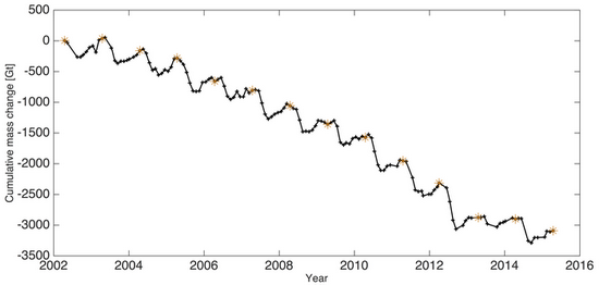
Not everything is up; some things are down. Most notable is the amount of ice in the world. Most of that is in the great ice sheets of Antarctica and Greenland, but they’ve been losing many billions of tons of ice each year. Here’s the change in the amount of ice in the Greenland ice sheet, measured by a satellite mission called “GRACE” (for “Gravity Recovery And Climate Experiment”):
It’s not just the great ice sheets that are melting, so are the world’s glaciers. Not all of them are wasting away, you can find a few that are actually growing … but the vast majority are disappearing right before our eyes. A recent survey by the world glacier monitoring service produced this summary for different regions of the world:

Not only are the vast majority of the world’s glaciers melting, they’ve recently been shrinking even faster.
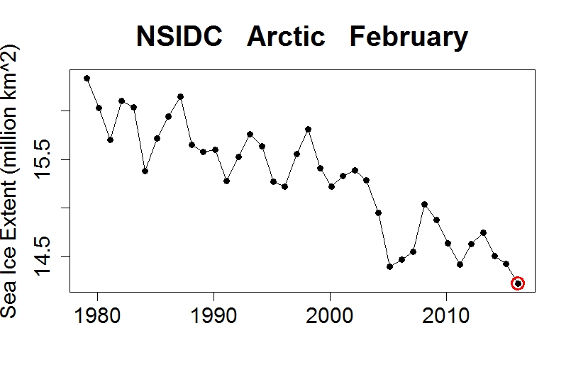
Earth doesn’t just have ice in the great ice sheets and thousands of glacier, it also has sea ice, areas (mostly in the Arctic ocean and around Antarctica) in which the sea surface is frozen over (some places just during winter, in some places year-round).
Sea ice is one thing for which the seasonal cycle is obvious. Here’s the extent of sea ice in the Arctic:
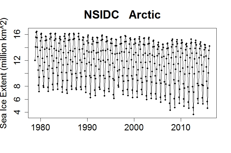
It peaks around March and bottoms out in September. Even with the seasonal cycle so obvious, it’s also obvious that Arctic sea ice is in decline. We can isolate the changes from the seasonal cycle by once again computing anomaly, the difference between each month’s value and what’s average for that month. That gives this:
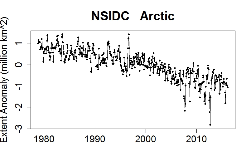
It makes the decline even more obvious. Lots of fluctuation, but also a sizeable trend, downward.
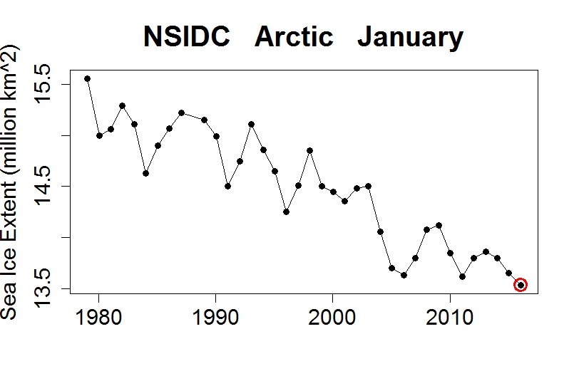
For many years the most startling thing was the end-of-summer decline in September Arctic sea ice. But it’s been declining year-round, and this year (2016) brought the lowest sea ice extent on record for the months of both January and February:
The southern hemisphere, Antarctic sea ice, tells a different story. If we plot sea ice extent anomaly (to shed the seasonal cycle), we can see that in the early 2010s it actually increased, although it has recently come back down:
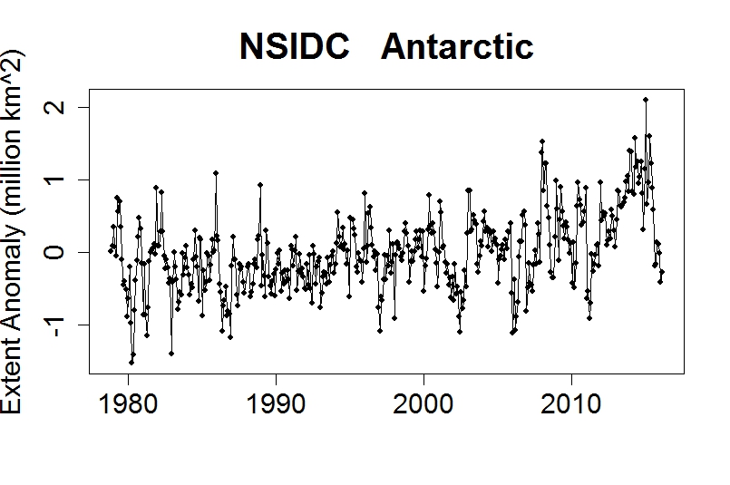
There are many theories about why this might be happening. One (probably at least part of the reason) is the melting of the Antarctic ice sheet! That dumps more fresh water into the ocean around Antarctica, and fresher water freezes more easily than saltier water. In any case, sea ice in the Antarctic has “bucked the trend” shown by the Arctic. It illustrates that, even in a rapidly warming world, things aren’t always quite so simple.
Many other changes have been seen. Species are migrating to higher latitudes and elevations because areas that used to be the right temperature for them, are no longer. Plants are blooming earlier than before. Heat waves have increased dramatically in some regions, too often exacting a heavy death toll. Some places have become more prone to severe drought, while others are more prone to severe flooding. The list goes on and on; the changes I’ve shown include many of the most important, but really only represent the “tip of the iceberg.”
In case you’re wondering why all these changes are taking place, there are many reasons. But the most important, by far, is the fact that we’re adding greenhouse gases to the atmosphere. The one we’re having the biggest impact on is carbon dioxide (CO2). Here’s the concentration of CO2 in our atmosphere, in “parts per million by volume” (ppmv), measured at the atmospheric observatory at Mauna Loa in Hawaii:
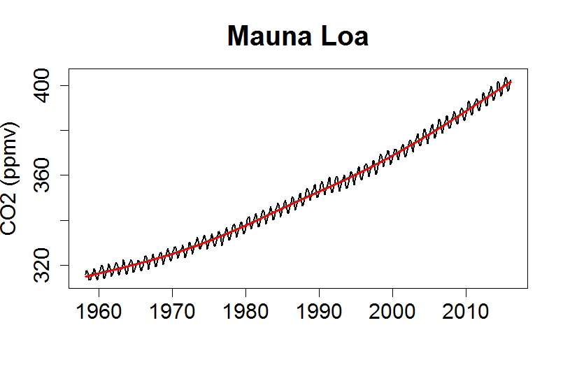
There are fluctuations, which are dominated by a seasonal cycle. But again, there’s also a trend. This particular trend isn’t following a straight line; the rate at which CO2 is increasing has been getting faster and faster.
Atmospheric CO2 is now higher than it has been in at least 800,000 years, possibly as long as 20 million years. CO2 is rising because we’re burning fossil fuels. It has carbon that’s been buried underground for millions of years, but now we’re digging it up and burning it, which results in CO2 that gets dumped in the easiest and cheapest way possible: in the atmosphere.
Despite certainty about why CO2 is on the rise, there are those who will dispute anything and everything, and a handful have even disputed that the atmosphere’s CO2 increase is because of us! There are a lot of crackpot ideas floated in the public discussion of climate change, but this is perhaps the crackpottiest of all. You can’t dig up billions of tons of carbon, burn it, dump all the CO2 into the air, then say that the rise of CO2 has nothing to do with us — unless you’re just not willing to accept the truth.
The more you investigate climate change, the more you’re bound to hear contrary claims. There are those who will tell you that global warming stopped, or that it’s about to stop, or that it never happened at all. Some will say it’s happening, but it’s not because of us. Others will admit it’s happening because of us, but insist it isn’t dangerous and won’t be. Every bit of evidence, including all that I’ve shown you, will be disputed by those who simply don’t wish it to be true. You’ll often hear the scientists who uncover this evidence accused of fraud — because attacking the messenger is an all-too-effective way to undermine the message.
But probably the most pernicious lie about global warming is the false claim, the scare tactic, that doing anything about it will “ruin the economy.” In truth, the surest way to ruin the economy is not doing anything about it.
If you found this essay helpful, please help by donating at Peaseblossom’s Closet.


A superb analysis
+ 1 Fantastic post, thank you for taking the time to give a simple explanation of where we are
Great article.. thanks… and just now played a 2013 YouTube interview with NYTimes reporter Justin Gillis. Global warming is his beat and he does it so well. This interview covers some of the fundamentals from a science journalist point of view.. worth it. https://www.youtube.com/watch?v=2NV-pbcIhXg
Economics says that renewable energy generates more jobs. Economics says that the only way to protect the economy is a reasonably stable climate.
The claim that protecting the environment will damage jobs and the economy is advocacy oratory by folks that had over “invested” in carbon fuels and were/are trying to protect that sunk investment. Folks that are (emotionally) invested in obsolete technologies lie.
Facts and good math do not change their mind set. We have to fined a way to get them emotionally invested in the truth.
Reblogged this on mt's Science Blog.
Both essays are fantastic resources and should be turned into an animation. (Peter Sinclair maybe??)
BTW the NYT today published a blistering editorial (by it’s Editorial Board) on the gutting of CSIRO.
http://www.nytimes.com/2016/03/04/opinion/australia-turns-its-back-on-climate-science.html?
Larry Marshall says that “the new question is what do we do about it and how do we find solutions for the climate we will be living with.”
I have a couple of questions for Larry Marshall – what exactly is “the climate we will be living with?” And how does he know?
Bernard, The fact is that people who claim we need to adapt do not expect to be among the future generations trying to and having to deal with the problems. They also do not care about the troubles any other humans (or other life) face as a result the way they want to get away with personally enjoying ‘their’ life. They need to be asked if it is decent to be so callous.
First chart’s explanation of monthly anomaly. Why should Jan and July not be directly comparable, globally? July hotter than January only from a northern hemisphere POV. Is there really seasonal variation in global temps, if so why?
[Response: Yes. The southern hemisphere is mostly ocean, so it heats and cools much more slowely, while the northern hemisphere with its much greater land area heats and cools more quickly. Hence there is a strong annual cycle in global temperature.]
@Graham Perks:
Here can you see the seasonal variation in global temps, land and sea.
http://www.ncdc.noaa.gov/monitoring-references/faq/anomalies.php
Very well done!
Great post/series. To keep the article self-contained it would be useful to indicate the anomaly baseline for the graphs.
Reblogged this on Philadelphia's Plastic Litter and commented:
Climate change in a clear, concise set of charts. Please pass on.
Very clear, yet comprehensive. Thanks.
Found helpful, donation sent, pointers posted elsewhere.
You’re doing what I can’t do.
Those who can’t teach, point to good teachers.
[Response: High praise indeed. Thank you very much.]
Very well done, and quite comprehensive. Thank you!
More applause from me.
Reblogged this on Vague ramblings and commented:
For those interested in the science behind climate change, here is a superb and easy to read explanation of why you should be scared shitless for the world your children are going to grow up into.
Nice.
It might be useful to take some of those graphs back further. That would illustrate how unusual they are in the context of the past few thousand years, and how much further we potentially have to go (e.g. tens of metres of sea level change).
Tamino, if you will permit a question – I am trying to fact check an alarmist notion about rapid heating. So from http://www.nasa.gov/press-release/nasa-noaa-analyses-reveal-record-shattering-global-warm-temperatures-in-2015
“The planet’s average surface temperature has risen about 1.8 degrees Fahrenheit (1.0 degree Celsius) since the late-19th century, a change largely driven by increased carbon dioxide and other human-made emissions into the atmosphere.”…
…
“Globally-averaged temperatures in 2015 shattered the previous mark set in 2014 by 0.23 degrees Fahrenheit (0.13 Celsius). Only once before, in 1998, has the new record been greater than the old record by this much.”
Do I interpret this as over the last century this represents a 13% temperature rise in just the last year?
[Response: Technically you could, but I wouldn’t. In addition to trend, temperature fluctuates. 2015 was the combination of a continuing upward trend and a very large fluctuation (which was partly due to the el Nino). We can’t expect the fluctuation to persist, so referring to it as part of the “rise” might mislead some into thinking it’s part of the upward trend. It also exaggerates the importance of a single year’s temperature, when what matters is what will last — the trend.]
When the temperature for 1998 came in, there was alarm at the rapid increase in temperature. But it was a blip in the trend. The trend is worrying enough on its own, without thinking that the occasional sudden upward blip is the start of a dramatic acceleration.
What is concerning is that as the shock of 1998 faded, the urgency to do something about global warming faded.
When the temperature for 1998 came in, there was alarm at the rapid increase in temperature.
Was there? I went googling for such once upon a webchat and concluded that not much fuss was made about that single year. My point then was that realists look at the long-term trend.
Could you provide a pointer or two, John?
gosh golly, Barry, I found a bunch. Of course you won’t find all that much by googling because the Internet was still young and much data printed on newsprint paper. So the press releases were aimed at printed press.
“… using google.com/trends or google.com/insights/search for graphs of search results over time, but those tools only go back to 2004, and they aren’t a part of Web search. ”
However much is reprinted with the dates of the publication… of course, you will want to visit your library to confirm the accuracy But, here’s a few:
The World Meteorological Association in 1998 http://reliefweb.int/report/bangladesh/el-ni%C3%B1o-1998-global-surface-temperature-highest-wide-margin This is a great overview.
Dec 1998 http://www.nytimes.com/1998/12/18/us/earth-temperature-in-1998-is-reported-at-record-high.html
NOAA 1999 http://www.publicaffairs.noaa.gov/releases99/jan99/noaa99-1.html
Wow – This one from NASA has Dr Roy Spencer http://science.nasa.gov/science-news/science-at-nasa/1999/essd12jan99_1/
There is plenty more if you drop down past the first 2 pages of search results.
Barry, I’m relying on my memory. I remember much being made of the warmth in 1998.
Thanks richard, appreciate the links. I didn’t search under those parameters.
I’m not sure if I should be disappointed or not. Critics are derided for taking a low annual anomaly and sarcastically asking where the warming is. When we call them on it, emphasising the importance of long-term trends and playing down the spikes, they reply that ‘we’ do exactly the same every time there’s a hot year. Maybe they’re right.
While I sympathise with getting the message out that the world’s surface is warming rapidly, I can’t help feeling we concede the high ground when we lean on a short-term event, just as critics do for their agenda. It’s inconsistent, if not plainly hypocritical.
“I remember much being made of the warmth in 1998.”
As indeed it should have been. After all, it started 17 years worth of ‘it’s been cooling since…’ memes. (Wry grimace.)
Although… I don’t really see the “shock” that John refers to in those articles. WMO said to “heed the anomalies,” whatever that means, and take action. But these are mostly scientific reports. I’ve no doubt that the record was reported, I had doubted that the single year’s anomaly was a source of “alarmism.” But I wasn’t tracking the topic back then. Perhaps there are other articles that do just that.
And don’t forget that absolute temperature is the only type of temperature scale in which percentage increases are meaningful. Earth’s temperature has risen to 288 from 287, which would be a 0.35% increase.
The melting of the Antarctic land ice is much too small in extent to account for the increase in the Antarctic sea ice extent over the course of the southern hemisphere winter (almost all of it melts during the southern hemisphere summer). The main factor is the increase in the circumpolar winds in the Southern Ocean around the Antarctic continent. Due to the coriolis effect, a portion of these westerlies tend to drive the ice to the north. In the cracks which are so caused in the ice the air is so cold in the winter that new ice forms right away.
So the question is what has caused the circumpolar winds to increase in recent years. The papers which I have summarized in the previous paragraph do not seem to provide consistent answers, but possibly the ozone hole above the South Pole contributes.
A day or so I was about to respond with a comment speculating on whether or not Matt England’s intensified trade winds might have something to do with it, but I deleted it. this morning I was surfing through subjects on google Scholar and came across this paper on models, and England is a co-author:
Despite global warming, total Antarctic sea ice coverage increased over 1979–2013. However, the majority of Coupled Model Intercomparison Project phase 5 models simulate a decline. Mechanisms causing this discrepancy have so far remained elusive. …
David B. Benson on March 8, 2016 at 3:26 am wrote:
“The melting of the Antarctic land ice is much too small in extent to account for the increase in the Antarctic sea ice extent over the course of the southern hemisphere winter (almost all of it melts during the southern hemisphere summer).”
Please see this paper:
“Modeled Trends in Antarctic Sea Ice Thickness”
http://journals.ametsoc.org/doi/abs/10.1175/JCLI-D-13-00301.1?af=R&#.Uvnt2RsanUw.twitter
Quote from the abstract:
“The model suggests that overall Antarctic sea ice volume has increased by approximately 30km3/y (0.4%/y) as an equal result of areal expansion (20x103km2/y, or 0.2%/y) and thickening (1.5mm/y, or 0.2%/y). This ice volume increase is an order of magnitude smaller than the Arctic decrease, and about half the size of the increased freshwater supply from the Antarctic Ice Sheet.”
Please note the “half the size of the increased freshwater supply from the Antarctic Ice Sheet” part. Ocean salt water freezes at about 28 degree F, while fresh water freezes at about 32 degrees F. This massive increase in the fresh water supply (roughly twice the increase in Antarctic sea ice volume) makes the water ever less saline and thus allows it to freeze ever more easily at ever higher temperatures (up to a point, of course).
And please don’t forget that none other than Judith Curry herself published a coauthored 2010 paper that is an attempt to explain the Antarctic sea ice increase and that she has not retracted this paper. This is important, since she and her coauthor Jiping Liu explicitly and implicitly say here
“Resolving the paradox of the Antarctic sea ice”
https://www.sciencedaily.com/releases/2010/08/100816154958.htm
in quotes from them that not only are those who say that this increase in Antarctic sea ice argues against global warming are wrong, but that we can actually *expect* greenhouse warming of the globe to increase Antarctic sea ice for decades before finally reversing itself.
I stand by what I wrote but am not going to provide more details just now from this mobile device. I’ll just state that the situation is more complex than your comment seems to indicate.
Roughly, the extra thickness might well be due to fresh water but not the area.
Here is something I think might be helpful to add:
Freshwater is less dense than saltwater, which means that freshwater can “float” on saltwater. This means that if the ever increasing and very large supply of freshwater can at least help explain the increase in the volume, then of course it can at least help explain the increase in the extent as well. That is, to a sufficient degree, the ever increasing and very large supply of freshwater (whose volume at the time of that study a couple of years ago was twice the increase in Antarctic sea ice volume) can essentially stay at the surface and thus eventually fan out over an ever larger area and decrease the salinity of the saltwater at the surface with which it mixes, and thus raise the temperature at which it freezes. And so we have not just more volume but greater extent as well.
“Why is southern sea ice increasing?” on Skeptical Science is quite thorough and offers a most helpful commentary.
I will point out that with a typical wintertime temperature of -20 °C at the Antarctic coast it doesn’t matter much whether the surface water is fresh or salt; other factors are in play.
It is so cold in the Antarctic even in summer that there is little surface melt. The melt occurs at the base of the glaciers from warm sea water coming in contact with the ice. This melt occurs all year so it can potentially provide a fresh water source even in the winter. My understanding is that scientists are still working on the relative contributions of fresh water supply and wind as causes of increase in sea ice.
Hansen claims: http://csas.ei.columbia.edu/2015/09/21/predictions-implicit-in-ice-melt-paper-and-global-implications/ that increased subsurface ice melt causes decreased ocean surface temperature in addition to decreasing salinity. Both these effects increase sea ice. The measured sea surface temperatures around both Antarctic and south east of Greenland are cooling. He thinks that the measured increase in ice implies that the Antarctic is melting faster than expected and sea level rise will be worse. We can all hope he is incorrect.
One nit: “Berkeley Univ. in California” => University of California, Berkeley
Question for you.
During northern hemisphere summer the Earth is farther away from the sun and solar irradiance is 6% lower than Austral summer. We don’t see any difference in the anomalies because they take out seasonal variation.
However, is there a difference in the actual global temperature between aphelion and perihelion? The difference in irradiance suggests there should be, but my impression is that there is not.
2nd question, if not, why not?!
[Response: The different incoming solar radiation does cause a difference, but it’s overwhelmed by the different thermal inertia of the two hemispheres. Dominated by ocean, the southern hemisphere reacts slowly and doesn’t show as much seasonal cycle. So overall, earth is warmer in N.Hem summer rather than S.Hem summer.]
Another factor is that when the earth is closer to the sun it moves faster so the extra light is compensated for by the shorter days and shorter season.
University of Colorado have released the latest sea level data to the end of 2015.
http://sealevel.colorado.edu/
[Global] Sea level has risen sometimes faster, sometimes slower, but it’s faster now, and in fact is faster than it has been for at least 2500 years (perhaps a lot longer).
To statistical significance? Particularly regarding the tide gauge/satellite period/s.
I understand and accept all of the plots showing an upward trend in temperature, etc. and downward trend in ice, etc. I also accept that humans have increased the amount of CO2 in the atmosphere. My question is: What is the evidence that the increased CO2 is causing the warming/thawing? Is it possible that we are just in a “warming trend” and there’s nothing we did to cause it and nothing we can do about it?
[Response: Law of physics. 1) CO2 (and methane and water vapor and others) is an infrared-active gas, and that inhibits Earth’s cooling radiation to space. 2) Earth’s global temperature doesn’t change dramatically for no reason.
The phrase “just in a warming trend” begs the question “why?” All known possibilities have been investigated, and the only one consistent with observations is the increase in greenhouse gases. Meanwhile, the increase in greenhouse gases matches the observed warming. For us *not* to be responsible, you’d have to explain why we’re in a warming trend, and why CO2 (and others) is *not* bringing this about. What do you conclude?]
Thank you for taking the time to answer my question. This is exactly what I was looking for … the fact that there are not just random warming trends and that there needs to be a reason. A naive question: what brought about warming trends through out history?
[Response: There are very many reasons.
Example: the sun’s energy output has been variable by quite a bit over the very long haul. It’s sometimes referred to as the “faint young sun,” because, as astrophysicists have learned, the sun has slowly heated up as it has aged. There are also shorter-term fluctuations, but there’s no solid evidence they are an important influence today.
Another example: Earth’s axial tilt, and the orientation/shape of its orbit. These are subject to fluctuations (on time scales of tens of thousands of years), and are a primary trigger for the onset of glaciations and deglaciations. They have only a minor influence on the total solar energy we receive, but strongly influence how it’s distributed. That can cause the buildup or decay of polar ice masses, which alters Earth’s reflectivity, which *does* alter the total solar energy we absorb.
Another example: episodes of tremendously enhanced volcanic activity can alter the concentration of greenhouse gases (esp. CO2), with its concomitant climate effect. Note that even these events (which are linked with past extinction events) aren’t changing atmospheric CO2 as fast as we are.
Another example: as the continents drift, they alter the patterns of global ocean circulation.
There are indeed many many factors which can cause climate to change. But the same people (climate scientists) who identified those, and study them in detail, are now telling us that the biggest influence by far is: us.]
Not:
Keep in mind that in 1825 scientists predicted that CO2 would cause the globe to warm. At that time the globe was cooling, although no data was available to show it. In 1896 Arhenius predicted how muc hit would warm and was pretty accurate. So in addition to explaining what is causing the warming and why CO2 is not causing it, you have to explain why scientists correctly predicted that it would start to warm (and how much it would warm) when they had all the science wrong.
Got to quibble a bit there. 1825 was the approximate date that Fourier inferred the existence of what we now call the greenhouse effect. But though he knew it was caused by the atmosphere somehow, he had no idea of the mechanism. The discovery of the role 9f CO2 (and water vapor) had to wait for John Tyndall in 1859.
I wrote about both of these, as well as Arrhenius and several others who did early climate-related research:
http://hubpages.com/education/The-Science-Of-Global-Warming-In-The-Age-Of-Napoleon
http://hubpages.com/education/Global-Warming-Science-In-The-Age-Of-Queen-Victoria
http://hubpages.com/education/Global-Warming-Science-And-The-Dawn-Of-Flight
I read recently on some pro-CO@ denier site that the CO2 greenhouse effect drops off quickly after a certain point. Is that true?
[Response: The warming effect of increasing CO2 declines logarithmically. I don’t think “drops off quickly after a certain point” is a fair characterization, and suggestions that further increase will have negligible effect is definitely not a fair characterization. Attempts are also made to suggest that the atmospheric effect is already saturated, but this too is false, quite ignoring how the physics really works. Perhaps a reader will supply a succinct explanation, or maybe I’ll post about it some time.]
This is about the simplest I’ve found, it’s known as the ‘Curve of Growth’.
http://spiff.rit.edu/classes/phys440/lectures/curve/curve.html
Do any of your graphs go back further? I know part of the problem with that is it may pre-date direct measuring and rely on other, possibly less exact methods. But I thought I have seen some graphs which try to diminish certain trends when viewed over hundreds or thousands of years. For example, a version of your first graph that make it look like a normal sine wave for millennia. Always want to have the most information.
Great post! Very well put: calmly, clearly, and concisely.
[Response: Generally, versions of global temperature which “make it look like a normal sine wave for millenia” are either grotesquely in error, or downright fraudulent. It’s because of concerted efforts to discredit the work of climate scientists. Genuine estimates of temperature on time scales of several millenia make it look like modern warming is unprecedented, downright alarming. That’s why they’re so often attacked.
Just about every piece of evidence has been attacked, often viciously. It amazes me the depths to which some will sink to deny what’s true. Two excellent sites for reliable information are RealClimate (by actual climate scientists) and Skeptical Science (which focuses on debunking misinformation).
Most of the graphs can be extended further back in time, but uncertainty increases the farther back one goes. Other choices could be made of course; this is what I decided on.]
I think you can get graphics from a wide variety of sources over different timeframes with a simple search. Like this:
“graphics temperature record”
Which got me a choice to go directly to the picture (i like pictures). Near the top was a good SkepticalScience collection and my favorite NASA climate change, which is doing a good job with visuals and clarity, focus, and clearly labeled coverage of all the different things that are going on.
I suppose if one regards the other five great extinctions (over the last million years) as peaks on a wave (though they are not regular) and ignores the absence of life supporting conditions during those peaks, one might pretend this is something other than what it is.
tamino, this is the most layperson-accessible explanation I’ve ever read on why the greenhouse effect can never saturate:
http://www.realclimate.org/index.php/archives/2007/06/a-saturated-gassy-argument/
Takeaway para from that article:
What happens if we add more carbon dioxide? In the layers so high and thin that much of the heat radiation from lower down slips through, adding more greenhouse gas molecules means the layer will absorb more of the rays. So the place from which most of the heat energy finally leaves the Earth will shift to higher layers. Those are colder layers, so they do not radiate heat as well. The planet as a whole is now taking in more energy than it radiates (which is in fact our current situation). As the higher levels radiate some of the excess downwards, all the lower levels down to the surface warm up. The imbalance must continue until the high levels get hot enough to radiate as much energy back out as the planet is receiving.
Great post. A pet peeve of mine is graphs labelled in some giga-incomprehensible unit. The ice sheet melting graph should be labelled in mm of SLR equivalent (and please, not in volumes of Lake Huron, as one “science journalist” did). The ocean heat content should be in units of the amount of heat required to warm the atmosphere one degree. This is actually quite shocking – it is equivalent to dozens of degrees of atmospheric warming.
Is there somewhere a readable presentation of the calculation of extra retained heat per doubling of CO2 ? Starting from the infrared cross-section, setting up a 1-dim model, and getting the logarithmic formula,
as done by Fourier and Arrhenius. This concrete calculation I think would help, in arguments with scientists/engineeers, even without any attempt to calculate the temperature rise from the heat.
I have a question, because I’m confused about the long term trends, in particular in the troposphere data. Although you emphasize the long term trend line in the chart showing 1980 through 2016, the data goes back much further than this and in fact shows a flat trend when the troposphere cooling from the 1950s through the 1970s is included. This is outlined in a recent article at http://realclimatescience.com/2016/03/noaa-radiosonde-data-shows-no-warming-for-58-years/ about the NOAA troposphere data. I haven’t heard any convincing explanation of why there would be over 20 years of cooling in the 1950s through the 1970s (during which there was obviously a lot of fossil fuels being burned and a lot of CO2 being produced) if the current theory about the cause and effect of global warming is correct. How can we be sure of the theory if evidence from our own lifetime seems to contradict the theory?
[Response: Satellite data only begin in 1979. Data from weather balloons (radiosonde data) contradict the claims in that post. You can see a sample of the entire time span according to radiosondes here (data from RATPAC, for “Radiosonde Atmospheric Temperature Products for Assessing Climate”), from this post.
And by the way, the atmospheric layer from surface to 100mb includes a goodly portion of the stratosphere (which is cooling because of CO2), not the troposphere. You might consider why he splices an old version of that with modern data from different atmospheric layers.
My advice: the site you refer to is that of a notorious climate denier, don’t trust anything from it.
As for the 1950-1970 period, actual climate scientists understand it better than you imagine. Cooling from the dramatic increase of aerosols in the atmosphere (another human impact) offset the warming one would expect from CO2. Those who try to tell you that “CO2 was increasing but temperature didn’t so the scientists are wrong!” are pulling the wool over your eyes.]
I noticed that, too. My comment at that deity-forsaken site has been in moderation for a while.
Splicing surface-100mb with lower layer atmospheric temp profiles?
100mb is well up in the lower stratosphere, which as we know has a long-term cooling trend (predicted from GHG warming). This splice throws a few oranges in the basket of apples.
Goddard’s post was brought up in the comments at realclimate, where a different reply was given.
http://www.realclimate.org/index.php/archives/2016/03/unforced-variations-mar-2016/comment-page-2/#comment-644681
I had heard the aerosol response before but it always left me wondering if that’s really the answer and aerosols have such a massive cooling effect, why wouldn’t we just go back to using aerosols??
[Response: The problem with the aerosols from industrial activity is that they’re sulfate aerosols. This leads to the problem of “acid rain,” which is why Europe and the U.S. enacted laws to limit their increase in the 1970s. They also settle out of the atmosphere quickly, so they’d have to be constantly replenished.
But the idea of injecting aerosols has been suggested, under the broad umbrella of “geoengineering.” This can have unanticipated undesirable consequences. I consider it ill-adivsed to tamper further with a system we don’t sufficiently understand.
And warming isn’t the only problem from CO2 increase, there’s also ocean acidification.]
If one is going to deny that global warming is caused by humans their argument will follow something like – we are so small and the earth’s atmosphere is so large how can we possible fill it with enough of anything to make a difference. So as I read your post I was hoping to see some real mathematical-based arguments on this – but I was disappointed when I got to that part in your post where you glossed over it with hyperbole and said “You can’t dig up billions of tons of carbon, burn it, dump all the CO2 into the air, then say that the rise of CO2 has nothing to do with us…”.
Has anyone actually done some math like this that computes the amount of Carbon burned by the industrial word over the last 100 years or so and shown the result in terms of the amount/volume of CO2 released – and then compared to the total amount of CO2 in the atmosphere, figured the increase is CO2 concentration and then the result in increased temperatures.
[Response: Yes.]
And when were shown graphs of climbing CO2 (like the one above) there is never any reference to the total. Is the amount of CO2 going up by 1% a year, .0005% a year or 10% a year or something else? Clearly the thermal properties of a “CO2 blanket” wrapped around the earth are related to CO2 concentrations in the atmosphere – not the raw amount of CO2.
In other words I would love to see something that says – Since the start of the industrial revolution we’ve burned roughly X tons of carbon resulting in Y amount of CO2 gas being released. This is Z% of the total COS that was in the atmosphere pre-industrial revolution. We estimate B% has dissipated and we are therefore left with a net increase (versus pre-industrial times) of X amount of COS which is X% on a parts-per-million basis more than pre-industrial times. The thermal properties of such an increase in COS concentrations, based on the physics, would make the atmosphere X% more efficient at retaining heat. With this we would expect to see an average temperature increase of between A and B degrees Celsius. Compared to actual observations of an increase of X degrees Celsius.
[Response: Short answer: Humans are responsible for increasing the amount of atmospheric CO2 by 40% over its pre-industrial concentration. This despite the fact that only about half of what we’ve emitted has stayed in the atmosphere; the rest has been absorbed by the oceans and the biosphere. The increase in temperature is in excellent agreement with what the best climate models compute should be the result. Also, there’s more to climate, and to mankind’s effect on it, than just CO2.]
Without something like the above its hard to show this to be a man made event.
I know its complicated – but again you guys are weather scientists.
Sorry for the long post.
[Response: If you want the details, I suggest you start with “The Discovery of Global Warming” by Spencer Weart. There’s a link on this site, and you can find it through Google.]
Not exactly what you ask for, Doug, but perhaps relevant enough to be of interest–this article summarizes the main lines of evidence that the rise in CO2 is indeed anthropogenic:
http://hubpages.com/politics/How-Do-We-Know-That-Humans-Are-Responsible-For-Rising-CO2
Don’t have the numbers handy, but a good illustrative analogy on the optic disruption 400 ppm can potentially cause is to calculate how many ounces of house paint you have to pour into an Olympic-size pool to reach 400 ppm.
Doug Sanborn,
It is quite a different thing to say “I haven’t found anything” than it is to say “it doesn’t exist. Perhaps you haven’t looked hard enough, or perhaps you don’t know how to interpret the information you are finding to get the information you want. I’ll get you started.
The mass of Earth’s atmosphere is about 5.1E18 kg. The concentration of CO2 increased roughly 4 parts per million by volume (ppmv) out of about 400 ppmv, or about 1% in a year (note, this was somewhat anomalously high, due to the ongoing El Nino, but it gives you the order of magnitude). A 1% yearly increase equates to a doubling time of about 70 years, which equates to about 2.8 degrees warming globally.
All this stuff is out there if you bother to look it up.
Doug, if you want hard data on atmospheric CO2 you might find the US DOE’s Carbon Dioxide Information Analysis Center (CDIAC) webpage useful: http://cdiac.ornl.gov/
Every carbon fueled car has an impact. . Most people drive gasoline powered cars without much of a thought. Opinion manipulation campaigns have us convinced we have little impact – but a very simple rule of thumb is that a typical gas powered auto will put a pound of CO2 into the air per mile traveled.
My old car gets 15 – 20 mpg – (newer cars less – maybe a half lb of CO2 per mile). Gasoline weighs a bit over 6 lbs. – (that will move me 20 miles) Gas has a high carbon density – forgive me for forgetting much of my high-school chemistry — when carbon burns – two parts of oxygen combust with every part of carbon. So the CO2 coming out of the car weighs more than just the carbon going into the cylinder. Carbon atomic weight is 12 and Oxygen is 16 One should figure that a 6.3 lb gallon of gas makes about 20 lbs of CO2 — just about the same as the mileage for my car. A pound per mile. Cough, cough…
https://www.fueleconomy.gov/feg/contentIncludes/co2_inc.htm
A billion cars in the world. cough.
“U.S. daily travel averages 11 billion miles a day”.
https://www.rita.dot.gov/bts/sites/rita.dot.gov.bts/files/subject_areas/national_household_travel_survey/daily_travel.html
Slate explains the chemistry better – http://www.slate.com/articles/news_and_politics/explainer/2006/11/how_gasoline_becomes_co2.html
But CBS is more dramatic with the totals from all sources:: The global rate of CO2 emissions is 23 million pounds per second. http://www.cbsnews.com/news/carbon-dioxide-emissions-rise-to-24-million-pounds-per-second/ That data is a few years ago.
“when carbon burns – two parts of oxygen combust with every part of carbon.”
Which points to another line of evidence: the very small but measurable decline in atmospheric oxygen.
For the ‘ball park’ picture try to superimpose all of those upward trending graphs onto a projection for the slide into the next ice age …
For the ‘ball park’ picture try to superimpose all of those upward trending graphs onto a projection for the slide into the next ice age
Or refer to the geologic record.
Last time the atmosphere gained 100ppm CO2 was from natural causes over ~4200 years, remaining fairly stable ever since the Earth climbed out of the last ice age 10K years ago. The recent rise in CO2 concentrations of 100ppm took ~100 years (from 1910).
40 times faster. We don’t have a geologic analog for a rise that much that fast.
Over the 5000 years climbing out of the last ice age the Earth’s surface warmed by ~5C. (The oceans rose more than 100 meters) It has warmed by about 1C since 1900.
Ten times faster, and we haven’t experienced the lagged effects ‘locked in’ due to the thermal inertia of the oceans. The earth’s heat budget is out of equilibrium and must eventually catch up – some decades after the point that we stop emitting CO2 (slow feedbacks may still occur beyond).
It’s not just the fact that surface temperature changed in the past as it is now – it’s the rate that is the key issue. Our civilizational infrastructure could cope quite well with a 2C warming over 2000 years. But 2C or more over the next 100 years?
Think of it – 100 meters of sea level rise from 5C warming. Another 5C wouldn’t bring another 100 meters (less ice), but it would still devastate the world’s coastlines. And the fact that we can’t pin down the resulting sea level rise is not a case for complacency. The fact that we find it difficult to narrow the range for the response to GHG increase is not a cause for a complacency. It’s not because we don’t know how bad it will be, but that we can’t be sure it won’t be catastrophic that We. Should. Stop. We’re conducting an unguided, planet-scale experiment with the only atmosphere we have. We’re inside the test tube and we can’t get out if things go drastically South.
Stopping will take a little time if we don’t want to wreak havoc with the world’s economies, so the sooner we start hitting the breaks the better, and the smarter we hit the breaks the better. That’s why those arguing for delay or denial, whether tacitly or directly, are reckless, shortsighted, self-serving or worse.
We can quarterback at the end of the century to see who was right and who was wrong, but until then let’s play it as safe as we can because we can’t escape the results, whatever they may be. And we have some precedent that should make us get very, very serious about the issue.
Douglas-san,
http://bartonlevenson.com/GreenhouseEffect.html
http://bartonlevenson.com/AnthropogenicCO2.html
If you want mathematical details, please let me know.
A bit off topic, but is there a way to share this essay on facebook?
I would love to do that.
[Response: All I can suggest is to give a link, or copy-paste part (or all) of it. Perhaps other readers can suggest alternatives. But I don’t do facebook, so wordpress won’t allow a “share” button for it.]
My wife and I don’t do Facebook, either. I mean, I have an account, but it has been months since I posted anything. I loathe Zuckerberg. I might say more, except I wouldn’t want to hurt anyone’s feelings. However, might I suggest creating a Facebook account strictly for the purpose of adding a Facebook share button? Add a little text to your Facebook page that any and all responses should be at your blog and that your account is strictly so that people can share through Facebook. For reasons I can’t quite fathom, a fair number of people use the service and I suspect it might increase traffic.
I have added a link to this indirectly using “How Do We Know Global Warming Is Real?” article in slate.com.
The thing is that climate denialers, gamergaters, racists etc. don´t really care about being right; what they do care about is “winning”. And they “win” by being very LOUD and use all channels possible to drown out other voices. And it works all too well and in the case of climate denialers that is a “win” that spells global disaster.
So it is very important that information like this essay is easy to spread. You don´t really have to be loud, but you have to be there, wether “there” is Facebook, Google+, Reddit or even 4chan.org.
Do you have a FB account? If so, just paste the link into a status box.
Voila! If you like, you can add some comment as a ‘teaser’, but that’s optional. By default FB will display a thumbnail for the link, which is convenient.
Douglas, we have good estimates on how much carbon we’ve burned since the beginning of the industrial revolution. Even better since 1900. The amount of CO2 we’ve pumped out is about twice as much as the atmospheric concentration has risen in the same time.
Pure arithmetic: if we’ve emitted twice as much CO2 as has increased in the atmosphere over time, we must be the cause.
Unless – and here is where the magical thinking starts – there is some mechanism in the biosphere that recognizes anthropogenic CO2 and selectively sequesters all of it, and a different, natural source that happens to have emitted just as much as we did in exactly the same period. Hell of a coincidence.
No such selectively sequestering mechanism has been imagined, much less identified, and no source has been detected that has emitted such a colossal amount of CO2 in such a short time and continues to do so.
We see this rise being played out year after year, as well as the small wiggles from natural variation.
Barton’s cited other lines of evidence (eg change in isotopic ratio) corroborate quantitatively. The CO2 rise is mostly from fossil fuels and partly from human-induced land use changes. We have observed more CO2 in the oceans over the years, so this ever-increasing excess CO2 in the atmosphere isn’t coming from that great reservoir. It’s absorbing some of it.
But you don’t even have to dig that deep. Arithmetic will suffice. It’s because of us. Unless one happens to believe in magic.
Reblogged this on aricardoje.
For comparison, here in southern Australia we have just been through a summer in which record lengths of heatwaves have been experienced. It’s still hot now in mid March which is equivalent to mid September in the Northern Hemisphere.r
Outstanding presentation I live in Puerto Rico and surfed in my younger days, I had a multiyear colection of the satellite pictures from space. In those days(early 70’s) cold fronts would go over the island a reach the Virgin Islands or beyond. Nowdays they rarely do. We all need to prepare for big changes ahead.
The earth is estimated to be 4.54 plus/minus .05 billion years old. What is now referred as The Great Ice Age started approximately one-million years ago. Since then, there have been many glaciations, the last major ice sheet covering the North Central U.S. maxed out about 20,000 years ago. Since then, there have been numerous and significant fluctuations, but with a definite decline in glaciers due to non-anthropological (non-man-made) causes.
Even without the recent exacerbation of sea-level rise caused by man, sea-levels would have risen, but neither as alarming or fast as the current scientific data proves.
One interesting facet of sea-level rise is that when the sea-levels began their natural rise, about 20,000 years ago, an estimated tens of thousands of people lived in a land bridge that connected Great Britain and Europe. This area, now called Doggerland, is now being actively explored by marine anthropologists who have uncovered remnants of ancient civilizations. Best estimates are that present North Sea levels have risen approximately 490 feet since the last glaciation (Interglacial Period).
Since the Earth has been cooling over the last several thousand years, my assumption is that sea levels would be slightly declining without Man’s influence.
If you would like to argue with some diehard climate deniers you might want to take a look at the comment section for this article: http://www.independent.co.uk/news/world/february-smashes-monthly-world-temperature-records-by-shocking-amount-as-climate-emergency-declared-a6929936.html
We will see of any of those find their way to this comment section since I linked to this site.
Pretty appalling. But I’m not going to create an account to argue with that lot, I’m afraid.
So. Plant more trees. A good theory is the earth is try to cool itself. We need more shade.
But probably the most pernicious lie about global warming is the false claim, the scare tactic, that doing anything about it will “ruin the economy.” In truth, the surest way to ruin the economy is not doing anything about it.
This is the point in question. In many ways, the cure seems to be worse than the illness. Maybe a cure is needed, but it must be balanced somehow.
Reducing global warming will “ruin the economy” much as opening your parachute will slow your progress toward the ground.
Superb analogy