
When it comes to temperature at Earth’s surface, with 2014 the hottest year on record and 2015 on pace to exceed even that, things are getting hot for those who deny that global warming is a danger to us all.
In their scramble to find something that looks like global warming has somehow “paused,” they seem to have settled on one particular data set with which, if you wait until just the right moment to start looking, it looks like they want it to look.
The data set du jour for deniers is the lower-troposphere temperature record from RSS (Remote Sensing Systems). It’s an estimate of the temperature in our troposphere, the lower layer of earth’s atmosphere, based on satellite measurements (but not direct temperature measurements). The usual approach is to show this data — but only part of it — then just say “no global warming” loud and long.
The latest incarnation claims that there’s been no global warming for 18 years and 5 months, meaning all the way back to the beginning of 1997. Let’s look at temperature data for the lower troposphere ourselves. But instead of the satellite data, let’s look at temperature data from actual thermometers. The satellites are great, but they measure microwave brightness, not temperature — we have to deduce how hot it is from the microwave data. That’s an extremely complex problem, and splicing together all the records from all the different satellites (there have been many) is a delicate issue. All of which is part of the reason the different groups doing so don’t agree on exactly how, or what the result is, and so often the satellite temperature data have been adjusted and revised.
For decades various organizations have been sending thermometers (and other weather instruments) up in balloons to measure the conditions at altitudes throughout the atmosphere. This has enabled us to combine the results from the long history of balloon-borne data into estimates of the temperature in earth’s troposphere.
I have in the past studied the HadAT2 data from the Hadley Centre/Climate Research Unit in the U.K. Unfortunately that data has not been kept current, it only goes as far as the end of 2012. But there are others, including the RATPAC data designed specifically for climate study and which is current through this year. The data they report which is most relevant, covering pressures from 850 to 300 hPa, is in fact for the heart of the troposphere.
Not only do these data reflect the measurements of actual thermometers, they also cover a longer time span — back to 1958 — than the satellite data which don’t start until about 1979. So here they are:

This definitely does not give the impression of any pause in warming. Of course, the truly relevant question is, has there been any real change in the trend since 1970?
Let’s use least-squares regression on the data since 1970 to see what the trend is since then:

It’s clearly upward, in fact it’s going faster than the surface temperature data. Now let’s compare that to what’s happened since 1997. Again I’ll compute a least-squares regression line and add it to the graph, but that first line was in blue so I’ll plot this one in red:
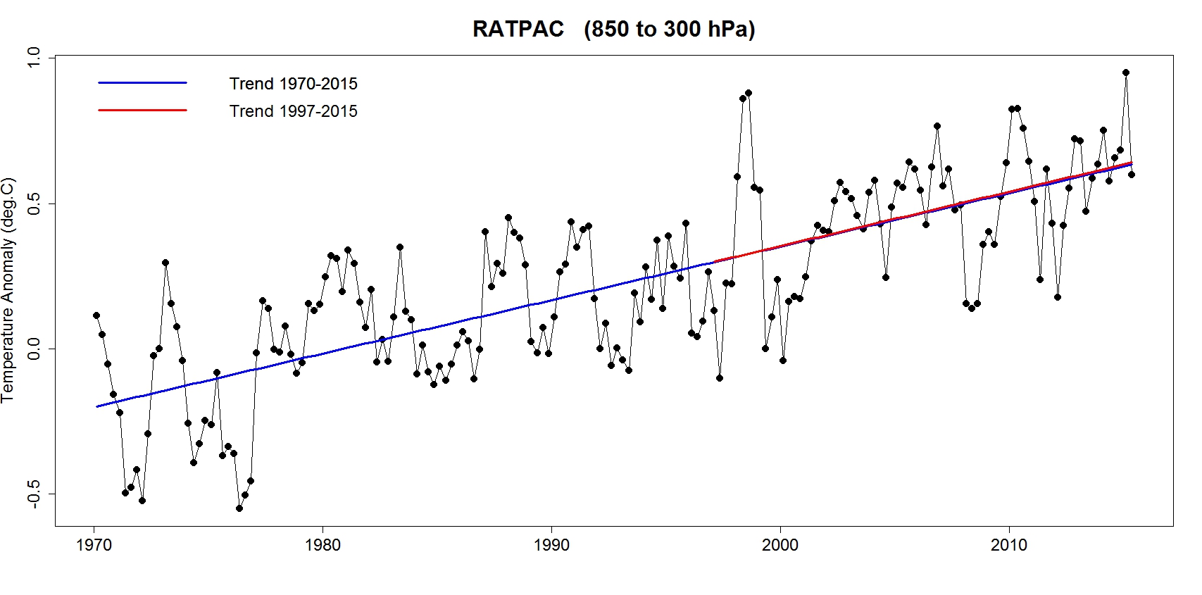
Some of you may have a hard time seeing both lines, simply because the trend-since-1997 line is right on top of the trend-since-1970 line. Their really isn’t any difference in their warming rates. If you’re color-blind it might be hard to see that there are two lines plotted, not just one.


Thanx Tamino. This issue came up a bit ago, as usual, on a Slate Climate Change discussion thread and I was looking for a good link to the baloon data. I’ll stash this in my climate bookmarks!
A bit off-topic, my apologies, but I have a layman question to explain me where I made a mistake on trend estimation.
As a total layman, I went this way : I used the approach that I describe as “Tarantola approach” (don’t even know the proper name …) described in his book “Inverse Problem Theory”, meaning I try to compute the a-posteriori probability function of the values taken by the parameters of a simple linear model a t + b (t being the global temperature anomaly), knowing the data values and assuming that these data have a gaussian probability distribution with sigma.
So I go by the formula aposteriori(a,b) = sum (gaussian((difference between data and value predicted by model)/sigma) for all data points. I dropped the division by the metric (that may be well my mistake !)
I know, I am reinventing the wheel, I did that more as an exercise than a real attempt (otherwise I would just have used R and its inbuilt functions, despite the fact that I despise R syntax). And, if I get the most probable values right, the probability distribution is obviously wrong – I get fat lower sigma than expected. For the record, I used BEST global average dataset with the one-year average, from 1998 (of course) to 2014, and I obtain something like 1.2°C/century +/- 0.6 or something like that … (didn’t go far enough, since I saw there was a problem).
So, could someone point my error, if he manages to understand what happened ? Once again, this is only an exercise out of curiosity to help me master this approach, it is not a matter of life and death.
Thanks a lot if you try to help me, and I won’t be mad if you can’t understand my pathetic attempts to explain what I did :]
I’m happy to try to answer your question, with Tamino’s permission. Whenever this kind of question is asked, however, it is seldom productive to ask it without providing a link to (a) the documented code you are trying to use to model, (b) a trace of a sample run, and (c) the input data used. Given that, and being familiar with many such inferences (see, for instance, https://hypergeometric.wordpress.com/2015/03/02/bayesian-change-point-analysis-for-global-temperatures-1850-2010/ and https://hypergeometric.wordpress.com/2014/12/07/example-of-bayesian-inversion/ ) and Tarantola’s book, I’d be happy to assess and report here.
thanks a lot. I will bring online my code on pastebin – this is a very crude Python code, since I was only curious about how to do that myself (leading me to correct an important error on a subject I happen to be more familiar with, so climate science study is really helpful :] )
here is the pastebin : http://pastebin.com/MRGkLEdK
for the data, the BEST data was extracted directly from their site, I transferred it into an Excel spreadsheet,
I put everything in the dropbox folder :
https://www.dropbox.com/sh/i639guhhu2oesoc/AAAXfdXPyf7hP_9c8PNzOQ-Ea?dl=0
– excel spreadsheet with BEST global average data
– Python code
– pickle dump of the a posteriory density probability matrix for parameters (a,b)
– a picture of the result obtained for the trend. Trend reads as °C/year. I didn’t normalize the probability at all (lazy work of mine)
But I will first follow your links – thanks a lot for your help !
Got the code and the dropbox. I can’t promise an answer on a tight schedule …. Maybe by mid-July. Many other commitments, but it doesn’t look difficult … Just a grid valuation of the posterior, if I understand the Python from a quick look. BTW, I suggest having a look at Kruschke’s Doing Bayesian Data Analysis. Gelman and company are working on an applications book for STAN, too. I’ll need to dig into the docs for BEST, too, since the spreadsheet you provided does not document the units of those values.
Thanks, that is amazingly useful, addressing the problem with pinpoint accuracy.
I read that the satellite temperature record is especially sensitive to ENSO variation. If that’s true, we might see a big jump upward this year as the El Nino progresses. Are troposphere temperatures based on thermometers also especially sensitive to El Nino conditions? Looks like that may be the case given the big spike in temperature around 1998.
This year should be a good verification of the satellite data. If they don’t respond to this el nino, I would think something is definitely up with them.
The slope of that trend line is ~0.9C/4.5 decades = ~0.2C/decade. And that is indeed steeper than most of the surface records where the trend is, what, 0.14 – 0.16C or so (according to Wood for Trees)?
Very interesting.
Leaves the question, why the satellite data look like they look – what went wrong?
Interesting post. I tried my hand with the RATPAC-A annual data, and did simple linear regression of the temp data vs. year individually for all the data columns (didn’t attempt to account for autocorrelation effects, so I don’t know how or if that would effect the results; sorry about that). The slopes of the regression lines decline from 850 hPa (about 0.022/y) to not significant (ca. 0.003) at 150 hPa, and then turn negative at lower pressures (higher elevations). At 50 hPa, I got a slope of -0.054/y (R^2 = 0.84, P=2.27e-23). Seems consistent with the idea that accumulation of greenhouse gases will lead to tropospheric warming and stratospheric cooling (which is observed). I believe the troposphere extends up to about 200 hPa.
metzomagic,
I’m sort of thinking (SWAG) that most of the balloon data is land based, meaning launched from land and not by air or ship.
That ‘could’ explain the higher trendline relative to global (land + sea) SAT?
Don’t really know much about radiosonde data though, something to look into I suppose. Like, are current radiosonde data using near real time telemetry as opposed to DAQ/retrieve recorder/download data?
OK, from Wikipedia:
https://en.wikipedia.org/?title=Radiosonde
“A radiosonde (Sonde is French and German for probe) is a battery-powered telemetry instrument package carried into the atmosphere usually by a weather balloon that measures various atmospheric parameters and transmits them by radio to a ground receiver.”
“The modern radiosonde communicates via radio with a computer that stores all the variables in real time.”
So radio + telemetry + computer = (near) real time.
“Worldwide there are more than 800 radiosonde launch sites. Most countries share data with the rest of the world through international agreements. Nearly all routine radiosonde launches occur 45 minutes before the official observation time of 0000 UTC and 1200 UTC, so as to provide an instantaneous snapshot of the atmosphere.”
“A typical radiosonde flight lasts 60 to 90 minutes.”
However, this file:
http://www1.ncdc.noaa.gov/pub/data/ratpac/ratpac-stations.txt
shows maybe 85 stations (looks like mostly island/coastal locations AFAIK).
Anyways, something to think about.
Regarding my previous post, I just noticed that my original analysis was done on northern hemisphere data. Re-done using global data — result is qualitatively similar — slope turns negative (NS) at 150 hPa and becomes increasingly (and significantly) negative at higher elevations.
OK, so I found a graphic on Integrated Global Radiosonde Archive (IGRA):
https://www.ncdc.noaa.gov/data-access/weather-balloon/integrated-global-radiosonde-archive
Looks to be mostly land/island based observations. I guess it would be kind of nice to have a bunch of ship based released radiosonde data though (for better spatial coverage).
A couple of more links for good measure:
http://www.wmo.int/pages/prog/www/ois/volume-a/vola-home.htm
https://www.wmo.int/pages/prog/www/OSY/Gos-components.html
From the 2nd link:
“In ocean areas, radiosonde observations are taken by about 15 ships, which mainly ply the North Atlantic, fitted with automated shipboard upper-air sounding facilities (ASAP).”
Finally what is ASAP?
http://www.vaisala.com/en/products/soundingsystemsandradiosondes/soundingsystems/Pages/ASAP-Station.aspx
“The Vaisala ASAP Station is a semi-automatic shipboard weather station that is designed for ocean-going ships that participate in the Automated Shipboard Aerological Program (ASAP). The Vaisala ASAP Station allows upper-air observations to be made over the oceans from cargo ships and other marine vessels at reasonable cost.”
More on ASAP:
https://www.wmo.int/pages/prog/amp/mmop/JCOMM/OPA/SOT/asap.html
http://www.jcommops.org/sot/asap/
[Response: In the future, it would help if you organize your thoughts into just a few comments. Verbosity is the sole province of the blogger.]
Thanks for doing the digging on this interesting point.
That’s me screwed…
;-)
Interesting. RSS says radiosonde data corroborates well with the their microwave readings. More to the point, if you do a nonparametric regression analysis, RATPAC does indeed show a downward trend.
[Response: No. It doesn’t.]
Dude, if you’re hoping to intimidate folks who don’t know what a nonparametric analysis is, you came to the wrong blog.
Alan Poirier, that’s the funniest nonsense I’ve read this week. Even better than regressing to a polynomial.
Reblogged this on Hypergeometric and commented:
About more Denier cherry-picking.
Reblogged this on rennydiokno.com.
Thanks for this post. I’ve always wondered about the radiosonde data. How did you process the data for the graphs? I assume they are some kind of global average, via gridding or weighted zonal averages or kriging or … something.
Never mind … I see that RATPAC-A provides a globally averaged data set, so no additional processing is necessary.
Reblogged this on Notes from the Overground .