
As the Rabett points out, there’s a fascinating temperature graph from Kevin Drum at Mother Jones. Here ’tis:

Of course it’s a trick designed to make the trend look waaaaay large. But it’s also turnabout — fair play turnabout, that it … of the way deniers have played exactly that trick for years. And still do!
And they didn’t do it to illustrate a point. They did it to decieve.
For quite a while, they used the trick with surface temperature data. They’d start their graph with 1998 — an extra-hot year — in order to make what follows look not so hot. Problem is, recent years have been so hot, so much hotter than 1998, even diehard climate anti-vaxxers can’t get away with that anymore.
Except for one data set. The satellite lower-troposphere data from RSS still shows 1998 so exaggerated that if you start there, you might give the impression temperatures have levelled off. To hell with a rigorous statistical treatment to test that idea. Just give the impression. So, guess which data set the denialati show the most, almost exclusively, love to death? Hint: it’s the one they can cherry-pick just the right moment to give the wrong impression.
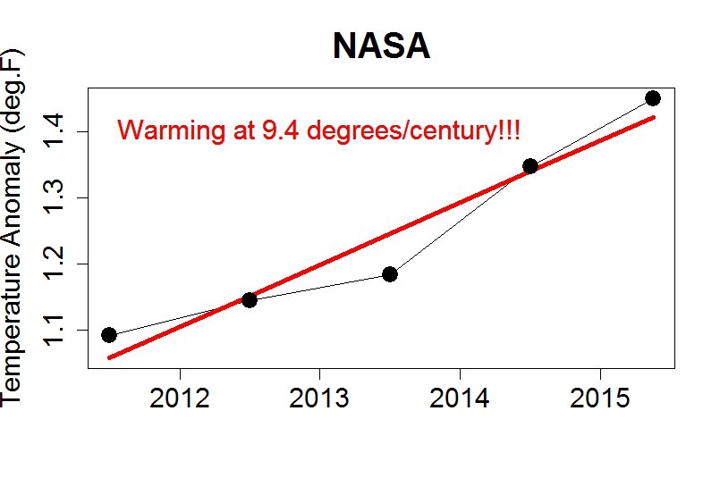
But I can’t let Kevin Drum have all the fun. Here’s another version:
Here’s hoping some fake “skeptic” shows up to tell us all how this graph is cherry-picked, how dishonest it is to start with an extra-low year to make the following look extra-hot, how my stated “trend rate” (calculated by least squares regression — fancy math no less!) is so uncertain it’s meaningless, how short time spans can all too easily give the wrong impression. If some of the climate anti-vaxxers show up, I’d love to discuss that with ’em.
In the meantime, feel free to use this graph.


A snicker akin to the one back in 2010 when a denialist on CBC.CA tried to show that temps were ‘droping’ based on a couple of months worth of data…
Who knows? Maybe he’s now insisting that Stephen Harper is PM.
Well, I’ve been plotting local temperatures since July, based on which I expect the atmosphere to freeze in circa 2035..
Huh! That’s *nothing*!
I’ve been plotting temperatures since 3 PM, based on which the atmosphere will freeze by next Tuesday!
I think people would be better off patiently explaining that any period less than around 25 years is too short of a time for the signal to be clearly seen because of the noise. Why play the same game as the deniers?
The heat that went into the ocean during what Trenberth called the “hiatus” or what Hansen called the “slowdown” is coming out.
They also helpfully point out that ALL the surface data sets are products of the world-wide conspiracy to defraud us.
Ahhh yes, the grand conspiracy. The last bastion of the denialist scoundrel.
When all of the facts are stacked against you then it has to be the one world government cabal pulling the strings. ;)
Deceit should be a trivial act.
Instead, this data manipulation is something different, pretending to deceive about data, the effect is to suppress warnings of a real danger. This amounts to a sabotage to safety systems that should lower risk to all humans.
It is more like treason against the future – since we all share the damage caused by this deceit. The deceit aimed at maximizing profit for the few, instead accelerates doom for all.
.
Actively promoting denialism is more like an act of genocide.
Humans seem too quick to minimize and trivialize and excuse that behavior.
While I have some empathy for what you’re saying and it’a soothing to blame someone else for what ails us, denialist are a small, albeit noisy minority. You seem to be implying deniers are the main thing stopping action on emissions mitigation ? I don’t agree. Deniers are a small, albeit, noisy minority, it’s the vast majority, who by their inaction are the problem. They neither vote for politicians who say they will mitigate via legislation nor do they mitigate their personal emissions.
I seems where high up on our moral horse, blaming everyone but those really responsible for emissions, emitters. We seem to have fallen back on: I have every right to fly for holidays, it’s not my fault business can’t provide me with a CO2e free way of doing it and… Matt Ridley, don’t ya know…rather than, I can’t emit, so I won’t fly
Until that changes, I suspect we’ll see nothing much in the way of action on emissions mitigation, just more of the same hand wringing and blaming of others… oh.. and more COP’s.
Deniers provide politicians with cover and even those who are sympathetic to and “get it” need to respond to them. Professor Michael Mann identified not only deniers and their supporters, but the mainstream media as having responsibility for the present situation. See https://hypergeometric.wordpress.com/2015/10/12/ultimately-the-public-will-understand-that-they-were-being-lied-to-betrayed/
There is another problem where I believe it is correct to say the “vast majority” are responsible. Solar and wind energy have lower energy density per siting area than do fossil fuels or nuclear power. This means, if these are situated near to where power is consumed, in order to limit transmission losses, that they will be located near populations and housing. To the degree that fossil fuel generators and pipelines can be stuck in places where no one sees them (except often the low income people who cannot afford to live anywhere else), visually these are preferred. A number of the faith-based and spiritual base coalitions, such as the Massachusetts Interfaith Coalition on Climate Action (MAICCA), of which I am a member as a UU Humanist, are making the case that this attitude is selfish and we need to take collective responsibility for each other and “the living Earth”. Still, as Cape Wind showed, it’s very much an uphill battle, and the land-based turbines at Falmouth and Scituate continue to be under assault by members of the public, even if land-based turbines have an LCoE which is competitive with and sometimes cheaper than the best methane generators.
Actually, in Australia it’s their action in voting for a global warming denialist government that’s the problem.
I just couldn’t believe the phony fudge factor fiddled surface data trend from NASA (Not A Science Association) from 2011-ish, so I got the pure satellite data from the best data set in the world – Remote Sensory Systems.
To get the latest data possible and avoid autocoriolation (something Tamino has NO IDEA about), I did 12-month mean samples (averages) starting in October 2011, and ending with September 2012. Anal averages void, but don’t completely get rid of this gravitational effect on the data. Maybe you should acquaint yourself with this factoid, GF.
So linked below is the plot done properly. Perfect data, pure math. And the result is a measly 0.025C/year, which is 376 times LESS than the bogus 9.4/century of NARSA!!
But that’s par for the course for Phil Climategate Jones’ “data” set.
http://www.woodfortrees.org/plot/rss/from:2011.74/to:2015.68/mean:12/plot/rss/from:2011.74/to:2015.68/mean:12/trend
Can’t wait to show you warmistas up at Anthony Watts’ record-breaking site.
Typo: least ordinary squares trend ends in September 2015. Nothing else needs adjusting ;-)
:-)
Here’s a bit of marvelless inanity – the graph at the bottom of the post.
http://www.powerlineblog.com/archives/2015/10/the-only-global-warming-chart-you-need-from-now-on.php
It is a marvelous graph, but really, he didn’t try hard enough! Only going down to zero fahrenheit? Surely change the temperature to Kelvin…
That graph is utter oxfaeces – obviously the y axis should start at zero Kelvin.
The other mistake is the CO2 chart. It should have gone from 0 to 100%!
Then the CO2 line would be nearly indistinguishable from 0.
If they are going to lie with charts, why not go all in?
tamino: On the RSS TLT. Have you checked the RSS total water vapor measurements compared to SST and TLT? Rather interesting. Shows the same kind of divergence as you showed between surface, radiosondes vs TLT.
http://www.remss.com/research/climate#vapor
ftp://ftp.remss.com/vapor/monthly_1deg/tpw_v07r00_198801_201508.time_series.txt
My eyeball says you have undercooked that trend considerably and it was very hot yesterday somewhere, so it is definitely true.
Awww. You didn’t work out the statistical significance 2011-2015, internally in the period, global temp has very little apparent variability, It is thus doubly cherry picked. It has a high trend AND a low estimate of climate variability(noise). So it also has cherry picked level of confidence in the trend.
I took that data as sign from god that, she hearts climate scientists too. But hey I guess that is me just imagining, patterns in stuff and pretending its real.
PS you not blindly working out it was naively significant was a good ethical move BTW. I wouldn’t however mind a short explanation of why the stats of 2011 to 2015 say it is more significant than i know it is. I think: There is cherry picking in the variance estimate from the period is that all it is? Perhaps it is also the truth of the matter that the trend in 2011 to 2015 is actually significant, but it is the evidence of the effect of El Nino onset more so than that of CO2. I cant quite get my head around what it means.
I am however a “Climate anti Vaxxer”.
Yes I am against vaccinating Climate with CO2. (does that count?)
That vaccination, may suppress colds, but I have heard I can get dengue fever as just one of it’s myriad side effects.
I prefer the ‘natural’ way, so instead of injecting harmful Co2 into earth’s body to prevent colds (nice one), I think we should plant orange trees. :)
Here’s one from Rob (Bob) Carter in 2005, suggesting that global warming had peaked in 1998, as temperatures had cooled during the ~7 years since then: http://www.theage.com.au/news/Science/Global-warming-cyclical-says-climate-expert/2005/06/12/1118514924793.html
I wonder what conclusions Bob will draw from the ~7 year period 2008 – 2015.
You warmists are so obvious. Are the red bars in the chart to make it look ‘hot’ or because you’re Communists? At least you used Fahrenheit instead of the eurosocialist Celsius trash but that’s probably to try to fool Americans. And NO warming since Monday, alarmists.
And the warming trend of this data is statistically significant. I make it 9.2ºF/century(±2.7ºF-2sd).
Yet this result is spoilt a little by using annual figures for 2011-14 but with year-to-date figures for 2015. The trend is pretty-much unchanged if the Jan-Sept data is used for all years. And it isn’t that much different if 12-month periods (Oct-to-Sept) are used (8.4ºF/century(±4.0ºF-2sd). But what is lost with both alternatives is the nice graph with its constant rate of upwardness.
And there is something missing with the presentation. The deniers who are good at their job achieve a hearty undertone in their presentations. That allows two different messages to be transmitted to two different audiences. The first is for the idiots who think it actually does prove something. But the deniers with half a wit who can see that the presentation is all bullshit, they can accept the thing as a jolly jape designed to wind up the “alarmists”.
So with the graph here, perhaps some annotations would help. An arrow pointing back down from the lower end of the trend labelled “To the hockey stick”. And perhaps one pointing the other way “40 million year record temperatures by 2100”.
Mind, because deniers see climate change as a non-issue, it is something they can poke fun at more freely than somebody who is trying to present the science on a subject of global concern. A denier can easily make a joke with their own findings. Conversely, it wouldn’t be right here to poke fun if this was supposedly a scientific assessment of future temperatures by, say, labelling the future on the graph as “mucho scorchio”
The Skeptical Science calculator says statistically significant warming in NOAA (land/ocean) since December 2010 of 6.8±5.3℃/century.
Is statistically significant warming in under 5 years a new record?
There you go again, putting your trust in thermometers and ‘adjustments’, as opposed to the pristinely pure, infallible, and indeed omniscient power of microwave sensors and translation algorithms…