
A recent blog post on RealClimate by Stefan Rahmstorf shows that when it comes to recent claims of a “pause” or “hiatus,” or even a slowdown in global surface temperature, there just isn’t any reliable evidence to back up those claims.
Yet for years one of the favorite claims of those who deny the danger of global warming has been “No global warming since [insert start time here] !!!” They base the statement on the observed data of earth’s surface temperature or its atmospheric temperature. Then they claim that such a “pause” or “hiatus” in temperature increase disproves, in one fell swoop, everything about man-made climate change.
They seem a bit worried lately because it is very likely that the data from NOAA (National Oceanic and Atmospheric Administration) will record this year as the hottest on record; we won’t know, of course, until 2014 is complete. A single year, even if the hottest on record, has only a little to do with the validity of such claims, but a lot to do with how hard it is to sell the idea. Perhaps they dread the prospect that if the most recent year is the hottest on record — in any data set — it will put a damper on their claims of a “pause” in global warming. If they can’t claim that any more, it deprives them of one of their most persuasive talking points (whether true or not). Still the claims persist; they’ve even begun preparing to ward off genuine skepticism spurred by the hottest year on record.
I seem to be one of very few who has said all along, repeatedly and consistently, that I’m not convinced there has been what is sometimes called a “pause” or “hiatus,” or even a slowdown in the warming trend of global temperature — let alone in global warming.
And it’s the trend that’s the real issue, not the fluctuations which happen all the time. After all, if you noticed one chilly spring day that all that week it had been colder than the previous week, you wouldn’t announce “No more summer on the way! No more seasons since [insert start time here]!!!” You’d know that in spite of such short-term fluctuations, the trend (the march of the seasons) will continue unabated. You wouldn’t even consider believing it had stopped without some strong evidence. You certainly wouldn’t believe it based on weak evidence, and if the evidence is far too weak …
Why am I not convinced? Because the evidence for claims of a “pause” or “hiatus” or even slowdown is weak. Far too weak.
Let me show you just how weak their case is.
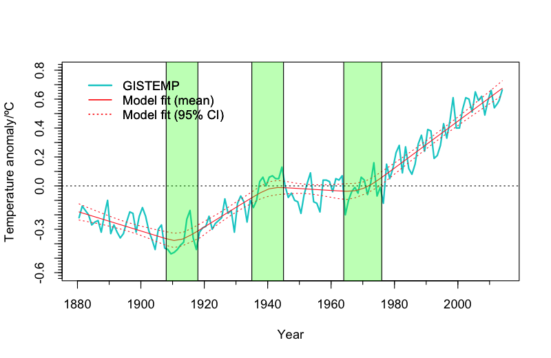
Rahmstorf’s post is based on a mathematical technique known as “change point analysis” (with the kind assistance of Niamh Cahill, School of Mathematical Sciences, University College Dublin) applied to data from GISS (NASA’s Goddary Institute for Space Studies). The result is that the most recent change point (the most recent change in the trend) which is supported by the data happened back in 1970, nearly 45 years ago. As for a change in the trend more recently than that (which is the basis of claims about a “pause”), there’s just no evidence that passes muster.
Of course, the data from GISS isn’t the only well-known data for global surface temperature; there’s also the aforementioned NOAA data, the HadCRUT4 data (from the Hadley Centre/Climate Research Unit in the U.K.), the data from Cowtan & Way (an improved — in my opinion — version of the HadCRUT4 data), the CRUTEM4 data which cover only earth’s land areas (also from the the Hadley Centre/Climate Research Unit), and the land-only Berkeley data (from the Berkeley Earth Surface Temperature project). There’s also data covering, not earth’s surface but its lower atmosphere (often called “TLT” for “temperature lower-troposphere), one from UAH (University of Alabama at Huntsville), another from RSS (Remote Sensing Systems).
With so many data sets to choose from, sometimes those who deny the danger of global warming but don’t like the result they get from one data set will just use another instead, whichever gives the result they want. Then again, some of them might accuse Rahmstorf, in his blog post, of choosing the NASA GISS data because it was most favorable to his case; I don’t believe that’s true, not at all. We can forestall such criticism by determining the result one gets from different choices and compare them. In fact, it’s worth doing for its own sake.
Let me state the issue I intend to address: whether or not there has even been any verifiable change in the rate of temperature increase — and remember, we’re not talking about the up-and-down fluctuations which happen all the time, and are due to natural factors (they’re also well worth studying), we’re talking about the trend. If there’s no recent change in the trend, then there certainly isn’t a “pause” or “hiatus” in global warming. I’ll also apply a different technique than used in Rahmstorf’s post.
First a few notes. Those not interested in technical details, just skip this and the next paragraphs. For those interested, I’ll mention that to estimate the uncertainty of trend analysis we need to take into account that the noise (the fluctuations) isn’t the simple kind referred to as white noise, rather it shows strong autocorrelation. I’ll also take into account that the noise doesn’t even follow the simplest form of autocorrelation usually applied, what’s called “AR(1)” noise, but it can be well approximated by a somewhat more complex form referred to as “ARMA(1,1)” noise using the method of Foster & Rahmstorf. This will enable me to get realistic estimates of statistical uncertainty levels.
I’ll also address the proper way to frame the question in the context of statistical hypothesis testing. The question is: has the warming rate changed since about 1970 when it took on its rapid value? Hence the proper null hypothesis is: the warming rate (the trend, not the fluctuations) is the same after our choice of start year as it was before (basically, since 1970). Only if we can contradict that null hypothesis can we say there’s valid evidence of a slowdown.
Spoiler alert: there’s no chance whatever of finding a “slowdown” that starts before 1990 or after 2008. Therefore for all possible “start of trend change” years from 1990 through 2008, I computed the best-fit statistical model that includes a change in trend starting at that time. I then tested whether or not the trend change in that model was “statistically significant.” To do so, we compute what’s called a p-value. To be called “significant” the p-value has to be quite small — less than 0.05 (i.e. less than 5%); if so, such a result is confirmed with what’s called “95% confidence” (which is 100% minus our p-value of 5%). Requiring 95% confidence is the de facto standard in statistics, not the universal choice but the most common and certainly a level which no statistian would find fault with. This approach is really very standard fare in statistical hypothesis testing.
So here’s the test: see whether or not we can find any start year from 1990 through 2008 for which the p-value is less than 0.05 (to meet the statistical standard of evidence). If we can’t find any such start year, then we conclude that the evidence for a trend change just isn’t there. It doesn’t prove that there hasn’t been any change, but it does lay bare the falsehood of proclamations that there definitely has been.
I’ll also avoid criticisms of using some data set chosen because of the result it gives, by applying the test to every one of the aforementioned data sets, four for global surface temperature, two for land-only surface temperature, and two for atmospheric temperature.
I can graph the results with dots connected by lines showing the p-values for each choice of start year, with the results from different data sets shown in different colors. The p-values are plotted from highest (no significance at all) at the bottom to lowest (statistically significant) at the top, with a dashed line near the top showing the 5% level; at least one of the dots for at least one of the data sets has to rise above the dashed line (dip below 5%) to meet the “Statistical Significance for Trend Change” region in order to claim any valid evidence of that (think of it as “You must be this tall to go on this ride”). Have a look:
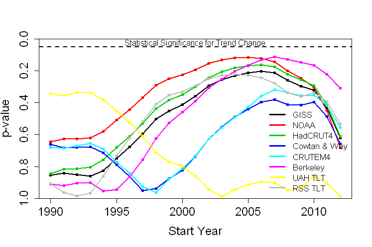
In no case does the p-value for any choice of start year, for any choice of data set, reach the “statistically significant” range. Therefore, for no choice of start year, for no choice of data set, can you make a valid claim to have demonstrated a slowdown in warming. As a matter of fact, in no case does the p-value for any choice of start year, for any choice of data set, get as low as the 10% level. To put it another way, there’s just no valid evidence of a “slowdown” which will stand up to statistical rigor.
Bottom line: not only is there a lack of valid evidence of a slowdown, it’s not even close.
But wait … there’s more! Imagine you roll a pair of dice and get a 12 in some game where that’s the only losing roll. You might suspect that the dice are loaded, because if the dice were fair then the chance of rolling a 12 is only 1 out of 36, or 2.8% (hence the “p-value” is 2.8%). You can’t prove the dice are loaded, but at least you’ve got some evidence.
Now suppose you roll the dice 20 times, and at least once you got a 12. Do you now have evidence the dice are loaded? Of course not. You see, you didn’t just roll once so that the p-value is 2.8%, instead you gave yourself 20 chances to get a 12, and the chance of rolling a 12 if you get to try 20 times is much much higher than the chance of rolling a 12 if you only get to try once. In fact the chance is 43%, so the p-value for all the rolls combined is 43%. That’s way way way higher than 5%. Not only do you have no valid evidence based on that, it’s not even close.
In the above tests, we didn’t just test whether there was valid evidence of a trend change for a single start year. We did it for every possible start year from 1990 through 2008, 19 choices in all. That means that the actual p-value is much higher than the lowest individual p-value we found — it’s just too easy to get results that look “significant” when you don’t take into account that you gave yourself many chances. The conclusion is that not only is there a lack of valid evidence of a change in trend, it’s nowhere near even remotely being close. Taking that “you gave yourself multiple chances” into account is, in fact, one of the strengths of change point analysis.
I repeat: not only is there a lack of valid evidence of a slowdown, it’s nowhere near even remotely being close. And that goes for each and every one of the 8 data sets tested.
A hottest-on-record for 2014 will dampen the enthusiasm of those who rely on “No global warming since [insert start time here] !!!” Yet, in my opinion, this never was a real issue because there never was valid evidence, even of a slowdown, let alone a “pause” or “hiatus.”
Based on the best estimate of the present trend, using the data from NASA GISS (as used in Rahmstorf’s post), this is what we can expect to see in upcoming years:

Of course there will still be fluctuations, as there always have been. But if future temperature follows the path which really is indicated by correct statistical analysis, then yes, Earth’s temperature is about to soar.
Does the data prove there’s been no slowdown? Of course not, that’s simply impossible to do. But the actual evidence, when subjected to rigorous statistical analysis, doesn’t pass muster. Not even close. Those who insist there definitely has been a “pause” or “hiatus” in temperature increase (which seems to include all of those who deny the danger from man-made climate change) either don’t really know what they’re doing, or — far worse — they do know what they’re doing but persist in making claims despite utter lack of evidence.
I will predict, however, with extreme confidence, that in spite of the lack of valid evidence of any change in the trend, and even if we face rapid and extreme warming in the near future, there’ll be no “pause” or even slowdown in faulty claims about it from the usual suspects.


Just eye balling the chart, it looks like things have leveled off since about 2001. OK, only kidding. Getting back to your bet in 2008, GISS data had showed a warming trend of 0.0182 C/yr from 1975 through 2007. You then calculated a flat average value for the 2001 through 2007 period for future comparison. The GISS data have been adjusted since the original post, the values are all a bit higher. The trend from 1975 through 2007 is now slightly higher at 0.0191 C/yr, and the trend since 2001 is almost flat at 0.0031 C/yr. As you demonstrate, no proof of a pause or flattening, but some evidence of one perhaps.
[Response: Given that we know, for certain, that natural variations will never stop and easily lead to what you’ve seen, I’d say that evidence is weak. Far too weak. It just doesn’t pass muster.
I expect that “since 1998” will be replaced by “since 2001” only to be replaced by “since 2005” only to be replaced by …]
The Problem is, that most of skeptic do not realise, that internal fluctuation will aways lead to “Pause” “cooling” “Hiatus” or some named else.
So we can run out some sort of it (like Rahmstorf and Tamio does). So we can take another approaches, but is missed here in the Blog. Everyone at self can do a simple test, to figure out, how internal fluctuations (we have to like its only random) alter shorter Trends.
We take real messurced variance, written 10 or 20 or 50 Series of random noise in the magnitude of the messurced variance. First given a linear Trend (like 0.1K/Decade or 0.2K/Decade) and draw noise on it.
Suprise Suprise, internal (random) fluctuations can lead to “no warming” to timescales obove 10 Year. But, internal fluctuations are directly like random noise, so there can be “no warming” large above 10 Years.
On the other hand, D. A. Ridley et al. (2014) showed up, that aersol forcing from vulcanic erruptions has to be undereastimated since the 00s. Or from the acstract:
“Incorporating these estimates into a simple climate model, we determine the global volcanic aerosol forcing since 2000 to be −0.19 ± 0.09 Wm−2. This translates into an estimated global cooling of 0.05 to 0.12°C.”
This is a strong argument, why models even not wrong in their model physics (often claimed by some “skeptics”) but more to Imput-Forcing (also solar-Forcing). But this is important for the descrepancy between Observation and Model, ENSO anyway is only able to explain “Pause” or whatever.
Using another approach which allows to kick of ENSO (rep. as MEI) back to the 50s. (ive take global Series of Cowtan and Way and corrected by MEI)
Or look here: http://www.directupload.net/file/d/3831/nt4uazse_png.htm
Its easy to see, that ENSO modulates only the form of increase, but less the increase atself.
Oh its getting longer that i want to, so that it.
Hey Grant, but if you connect just the warmest years from 1998 to 2014, it looks almost flat… OK, I’m also just kidding! Excellent post – great you’ve gone to the trouble of working this out for all the different data sets!
[Response: I know your first sentence was a joke, but it’s actually reminiscent of a recent argument from Judith Curry — and that’s no joke.]
It’s kind of funny (and sad) that the whole “evidence” for a pause is completely dependent on the extraordinarily hot 1998. Without that point, it’s really hard to even visually argue for a pause. So think about the logic of that for a minute: “because 1998 was an extremel;y hot year, global warming has slowed/stopped.” Huh? A really *hot* year means global “warming” has stopped? By that “logic” the next time we get a year well below the long-term trend, it must be a sign that runaway warming has started…
It’s kind of funny (and sad) that the whole “evidence” for a pause is completely dependent on the extraordinarily hot 1998. Without that point, it’s really hard to even visually argue for a pause.
Which is easily demonstrated at Woodfortrees.org, with the big caveat that the second part of this figure isn’t going to say anything statistically significant:
http://www.woodfortrees.org/plot/gistemp-dts/from:1967/to:1997/mean:12/plot/gistemp-dts/from:1999/mean:12/plot/gistemp-dts/from:1967/to:1997/trend/plot/gistemp-dts/from:1999/trend
30 years of GISTEMP data up to 1997, a break where 1998 would be, and then the remaining data to date.
The trend lines aren’t very different at all, but again the second one will have no meaningful information to be gleaned about a temperature deviation because the noise overwhelms the signal on that timescale. Still, the best fit is a line that doesn’t deviate much from the original which preceded it.
If someone wanted to show a definitive pause/hiatus, then the second line would have to look very different. Heck, in order to make a statistically significant change over such a short period of time and overcome the noise, there would have to be a very hefty drop in temperatures. I think we would have noticed it happening over the last 16 years, even with the notoriously uncalibrated eye-crometers of the denialists.
I don’t have the math to work it out, but suspect temperatures over the years 1998-present would have had to fall at a comparable rate to the warming over the previous 30 years to sink their way out of the noise and into the territory of a clear and unambiguous signal. It seems a world with a definitive “pause” in warming would need to be very different from the world in which we find ourselves.
Denialists have for years made a big song and dance about how there is no “statistically significant” warming for X years where X is their favorite number. Whenever I point out that there is also no statistically significant slowdown in the rate of global warming they put on a playing dumb act. They don’t like it when they’re hoist by their own petard.
And to your point, they also only focus on the lower bounds of uncertainty, poo poo the the statistically most likely figure, and act as though the highest uncertainty figure wasn’t even part of the calculation.
Total intellectual dishonesty, which wouldn’t even be expected of those ignorant of even a sliver of the science.
And take the Maslowski prediction of an ice-free Arctic *as early as* 2013 as having been falsified–though it was stated as a best estimate of “2016, plus or minus three years.”
Right, and how often have you seen the so called failure of James Hansen’s 1988 (26 year old) projections used as a supposed final nail in the warmist coffin? Just try and explain the nuances of actual vs projected emissions, scenarios boundaries, climate sensitivity uncertainties, and the 26 year old state of climate modeling vs what they know now.
All deniers that “know”, is that Hansen was wrong once, and he is the sole arbiter of all climate science, so by that transitive property, all climate science is bunk.
[Response: Here are some of the things Hansen et al. predicted in 1981, together with what we’ve observed since then:
Double CO2 will warm earth 2.8C (5F) — modern estimate 2 to 4.5
Warm 0.4C (0.7F) by 2010 — observed warming 0.5C (0.9F)
Arctic will warm faster — Arctic warmed faster
Less Arctic sea ice — lots less Arctic sea ice
Possibly even open NW passage during late summer? — NW passage open in late summer
Which of those do they mention?]
I don’t have any nits to pick this time ;-) but I did have a couple of questions:
1) Could you elaborate on the remark “there’s no chance whatever of finding a “slowdown” that starts before 1990 or after 2008.” My guess is that you can’t find anything post-2008 because there are so few data points that the error bars on short trends are going to swamp any chance of significance (right?). Why is it obvious a priori that there isn’t going to be a change point pre-1990?
[Response: Post-2008, yes. Pre-1990, I’ve examined the data and there’s no evidence. Besides, none of the deniers have claimed there was (to my knowledge).]
2) When I look at your first figure (the second figure in the post), I see some obvious clumping: for purposes of this analysis, it looks like GISS and CRUTEM4 are similar, UAH is off on its own, and everybody else is similar to each other. Is this revealing anything interesting about these datasets?
[Response: I don’t think so, except that the UAH data show even less evidence of a slowdown than the others. In part, that’s because there’s not as much data (satellite data don’t start until about 1979).]
I don’t get why one couldn’t conclude or conclude to have proven that a breach of trend did not occur. If 6 independent measurements of the size of a box with content showed it is not large enough to fit an elephant, can’t we state that we have conclusively proven an elephant is not residing in the box?
[Response: Of course. But “slowdowns” come in all sizes, there might be one which simply isn’t big enough or long-lasting enough to have yet risen above the noise level.
The real point of this post is to emphasize that if the box was big enough to contain an elephant, that doesn’t mean there is one. There might be — but claiming that there *must* be without any real evidence of that is foolish.]
Reblogged this on mt's Science Blog and commented:
A clear, detailed analysis on why there hasn’t been a “pause” or even a slowdown in global surface temperature.
You’re on a slippery slope there: it should really be “why there is no evidence of a “pause”…”
Thanks for pointing that out. I corrected that wording on my blog post.
I still get given the “now the world is cooling …” ploy.
I wondered where it came from … so for historic reasons …
http://www.telegraph.co.uk/comment/personal-view/3624242/There-IS-a-problem-with-global-warming…-it-stopped-in-1998.html
We are also talking about your post here: https://twitter.com/AGrinsted/status/542577316795539456
However excellent your argument, it understates the case because warming is all the heat coming into the system; while you only use data on atmospheric sensible heat. The full argument must include ocean warming, ice melt, and more latent heat in the atmosphere.
Just the increase in latent heat in atmosphere means that the conventional weather databases UNDERSTATE the increase in the amount of heat in the atmosphere. The increase in relative humidity in the atmosphere over the time period likely represents more energy in the atmosphere than the increase in sensible heat.
The increase in relative humidity is due to warmer surface sea temperatures allowing greater evaporation and warmer polar conditions causing less condensation. None of this is well tracked in the conventional weather databases. The warmer sea surface temperatures alone indicates an enormous increase in system heat that dwarfs the increase in heat of the atmosphere.
Changes in Arctic Sea Ice suggest that there have been changes in deep water formation. From this, it is prudent to assume that the deep ocean is also warming. This is particularly true during the time period of interest.
We look at sensible heat in the atmosphere, not because it is the best indicator of total heat in the system, but because it is the best data we have. An understatement of total global warming as a result of poor data perverts rational risk assessment, policy, and planning.
“poor data perverts”
Never heard them called that but it’s certainly an accurate label for deniers. ;-)
(Before my question – I’m IPCC-friendly for want of a better term)
The final GISS chart with the tramlines shows an increase of around 1.1 deg.C from 1970 to 2040. I wanted to see how this compares with IPCC AR5 future pathways; looking at Figure SPM7a (WG1 summary for policy makers, global average surface temperature change) at the top of page 21, that level of increase is in the lower half of the RCP2.6 range. Which is rising but doesn’t seem to be ‘soaring’ quite so much.
Is it a dodgy comparison to make – are the datasets for NASA GISS and the RCPs not really comparable enough to be able to overlay one over the other?
[Response: The difference is that this is just an extrapolation of the linear trend. IPCC forecasts are based on model simulations.]
Any chance you could practice your statistical analysis to see if there’s a correlation between the PDSI for California since 800 AD, seen here:
http://tinyurl.com/p6km6da
(taken from http://onlinelibrary.wiley.com/doi/10.1002/2014GL062433/abstract)
and global temperature for the same time period, as seen here:
http://tinyurl.com/lq7tvhl
Visually, I think I can see a trend correlation, once the noise is taken out, in which CA drought drops slightly (PDSI increases) while global temperature drops, but around 1880 as temperature changes course upward, so does CA PDSI, but downward (increasing drought).
The best argument I’ve found for the “no warming since (fill in the year)” is the satellite measured rise in sea level, which is much less noisy and therefore highly significant over shorter timespans. There is simply no way the sea level can rise over a timespan of a few years, absent a warming planet.
This is an easy demonstration that what’s happening at the end of any noisy dataset will always be statistically insignificant, but that in no way implies that there’s no signal in the noise.
Typo alert: “NASA’s Goddary Institute for Space Studies” should of course be “NASA’s Goddard Institute for Space Studies”
FWIW, it would be interesting to structure the problem as a game of craps with the annual average being a throw of the dice and ask the question of what the odds are of throwing a higher number than 6 so many times in a row. Should we shoot Nathan Detroit?
I think that the denial community, especially the politicians, have painted themselves into a closet, and now there is no room to retreat to.
It is now time for them to come out of the closet, and join the reality based community.
So, I’m not quite sure what you’ve shown here. Looks like a somewhat incomplete analysis, it needs FUTURE and PAST data!
1) UAH & RSS start in 1979 not 1970 (so that we have a smaller N problem for these two (N = 11 vs N = 20 for all other time series). We also see that UAH and RSS are the two most divergent time series (? given that both are are the only two using MSU data).
2) The GISS change point trend analysis starts in 1880 and ends in 2014 (tentative for 2014), the trend line change points (p = 0.05 ?) are 1912, 1940 and 1970.
1912 – 1880 = 32 years
1940 – 1912 = 28 years
1970 – 1940 = 30 years
2014 – 1970 = 42 years
Do I detect a trend? Don’t know, but let’s pretend, shall we?
1912 – 1880 = 32 years
1940 – 1912 = 28 years
1970 – 1940 = 30 years
1998 – 1970 = 28 years
2020 – 1998 = 32 years
So what we now see is a pattern (no, not the 32, 28, … pattern). That pattern being the N/2 and/or small N problem, and I would suggest that we are currently in the middle (of a possible) small N and/or N/2 pattern. The current pattern is N = 16, and we can see from your 2nd figure, that both the start and end points tend towards large p values (N = 20 or 11 at the start and N = 3 at the end (assuming 2014 is the last annual point of the annual time series)).
So, in essence your 2nd figure is a “snapshot” at N = 16. Now we have the HadCRUT4 (and C&W adjusted HadCRUT4), GISS and NCDC/NOAA all going back to 1880, a total of 4 time series with ~135 years of data each.
Words like hold back, withhold and double blind come to mind here.
Hypothesis:
Determine trend line change points from all 4 of these longer time series (The resulting patterns are what? Somewhat similar? Let’s assume so for the current discussion.), then conduct the same analysis you have performed for each change point (e. g. GISS 1880 thru 1912 (1st baseline period) then add the period 1913 thru 1940, one year at a time, and plot p vs time, here I would suggest that at ~ the midpoint (or slightly afterwords, say between 1925 and 1930) p < 0.05, now do GISS 1912 thru 1940 (2nd baseline period) … (rinse and repeat), now do GISS 1940 thru 1970 (3rd baseline but with a 42 year period following) … (rinse and repeat)).
Now, I would rather very kindly suggest that for 25 < N < 35 (very roughly speaking, as it depends on the actual series of change points and p value used), what currently looks like a downward ending trend (small N and/or N/2 problem) for N = 16 would continue upwards until the chosen p value was met and again descend close to p = 1 at the end point window (if, and a very big IF, anything like the current hiatus (IPCC AR5 uses that word like 53 times (Greg Laden even counted them for me)) period were to continue for another ~15 years).
Things that I am not suggesting, waiting until 2020 or 2030 or 2040 or 2050 or …
Things that I am suggesting, a more complete analysis would dictate the current p value to use when consideration of the start/end point of a time series may be somewhat close to a real or potential change point.
I would do this exercise myself, but I don't have a PhD. in statistics, I am not an institutionally trained climate scientist and I don't have any peer reviewed publications in the field of climate science. However, whatever the outcome of such an analysis would show, I would think that that might make for a good peer reviewed journal publication.
WTF?
Future data is the gold standard, of course, but boy, is it hard to come by!
That’s why sites like WUWT like to use ‘pasture’ data.
Yes, because they don’t like to do field work.
snarkrates,
The concept that I am very kindly suggesting has been noticed by at least one other person (independent of each other’s (his and mine) observations) over at RC:
http://www.realclimate.org/index.php/archives/2014/12/recent-global-warming-trends-significant-or-paused-or-what/comment-page-3/#comment-620308
We could assume FUTURE data similar to the current ~16 year trendline + white noise (random or gaussian or whatever the pdf) out to say 2030.
But that’s not really the main point, because we can test the longer time series that have PAST data and change point trend lines. Once one determines the change points (e. g. GISS has already been done), one can use that as a series of three baselines (each of the 1st I-1 leg segments is a baseline (or working backwards the last I-1 segments)). Now using the 1st baseline solve all N from the adjacent baseline time series. You will very likely get a run length of M < N that satisfies your p criteria (say p < 0.05), as M approaches N, p must approach 1 (for M = N-1 we have two points, the minimum required to establish any trend at all).
So, one would expect an evolution of the p curves as 1 < M < N, I would then call those p curves partial p curves (between successive change points), and we are currently at M ~ 16 (and may not ever get to higher M as the next change point may not develop due to the selected p < 0.05 (or whatever) criteria.
But that's not really the main point either, the main point is that if a change point trend line were to develop, the PAST data can illustrate this quite nicely. So, for example, chop off 1880-1895 (or on the next leg chop of 1927-1940, so on and so forth), compare that partial p curve for that era with the full p curve for 1880-1912 (or 1912-1940). Does the full p curve have a smaller p score than the partial p curve p score? I will for the moment assume so, unless shown otherwise for all legs from all 4 longer global SAT data sets.
Change point trendline detection, thus becomes a somewhat trickier exercise for the start/end points of a time series (we only have half the information that we do for the middle of the time series, err trendline segments, but we also have the small N problem at either the beginning or end of the next trendline segment, M close to the lower limit and n – m close to the upper limit (lower case n/m used to denote partial trendline segment). My current, somewhat limited understanding, is that one would need to apply a higher p value than one would necessarily apply to the interior trendline segments (given a longer time series that does detect additional trendline segments (in the region of the shorter time series) where none existed originally for the shorter time series)).
So, from that perspective, perhaps a p score of ~0.20 is necessary, and as we can see from the above, that condition appears to already be satisfied.
Another rather longish post, perhaps even more confusion? If so, then perhaps someone else needs to explain this to you all.
[Response: I think you’re confused just as much as those trying to comprehend what you’ve written.]
Everett, Pray, what useful information would such an analysis yield?
snarkrates,
1st, I found a useful GUI used in cancer mortality statistics called Joinpoint:
http://surveillance.cancer.gov/joinpoint/
It’s been around ~15 years, has a fairly nice GUI, several paper have been written up through 2014 using Joinpoint, and the most recent version is dated October 7, 2014, is free, has fairly good documentation and an example (or two) and a FAQ and etceteras, so this “should” serve my needs.
2nd, let’s restrict the discussion to the GISS data set, as shown in the 1st figure above, and even more restrictive, constrain the analysis to just the two middle legs (as these are two interior legs that “may” look somewhat similar to what some are calling the current SAT hiatus):
1940 – 1912 = 29 years (includes both end points), call this M (baseline)
1970 – 1940 = 31 years (includes both end points), call this N and n
N = full 2nd leg, 0 < n < N + 1, where we "could" carry out every n value of the 2nd leg.
This could then be plotted for all n somewhat similar to the 2nd figure above (but with 31 curves for the 31 n values).
I believe, that doing the above plot would show a general evolution of lower p values as one goes from n = 1 to n = N = 31.
Now, with this information in hand, we can inform ourselves of what the lowest p score is for n = 17 versus n = N = 31. I believe that p(n = 17) will be greater than p(n = N = 31). This may be somewhat similar to the current change point leg (using 1998 as a 1st approximation change point).
I believe this procedure could be extended to all legs of the four longest global SAT time series. Which would give us I = 12 ratios of p(n = 17) versus say p(29) (assuming 29 is the minimum number of years between any two change points).
In closing, I'm also wondering (much idle speculation) about the whole range of 0 < p < 1, where there are likely limiting ranges (for a particular time series) where one gets no change points and at the other extreme every point becomes a change point.
Time to find out.
Again, Everett, what are you trying to show? I do not see how the Joinpoint model you cite is at all relevant to the dataset we are discussing here–for example, none of the data here are based on counts, so Poisson variability isn’t applicable.
snarkrates,
Type = Other
“Select this category for all other types of numeric variables that do not fall into one of the previous categories (i.e. temperatures over time).”
Poisson Variance button is grayed out for all except Type = Count and Type = Crude Rate.
As to what I am trying to show … well it’s an attempt at … Raising … err … Lowering the Bar … and I will be playing the parts of … Honey Boo Boo … and … Cartman.
Everett,
So…technobabble, then? Probably not the best audience on which to try that.
snarkrates,
Which part of my very last statement is technobabble?
http://en.wikipedia.org/wiki/Technobabble
Let me guess the “dishonest person” part.
Please remember that you brought up the Poisson variability argument to begin with in the 1st place, while clearly not knowing squat about said software.
If you think the last, err sentence is technobabble, then watch that episode of SP (or better yet read the script).
All the world’s a stage
Fine, Everett,
Publish immediately. Have a nice life.
In my last comment,
“2014 – 1970 = 42 years” should be “2014 – 1970 = 44 years”
“2020 – 1998 = 32 years” should be “2030 – 1998 = 32 years”
Can’t even add or subtract, go figure.
@skeptictmac57 I think we’re seeing the Denier community trying to extricate itself by appealing to esoteric theory which, to people who know very little of climate science, looks indistinguishable. I’m speaking of a recent rash of adverts on technical blogs for chaos-related explanations of warming, notably derived from the papers of Tsonis and Swanson. I know RealClimate has a post someplace about chaos. I’ve dealt with the Tsonis and Swanson resurgence here, focusing on my view that the chaos theory ploy is horrible science because it is not falsifiable (“Not even wrong”. One student of the subject suggested that building a weather forecasting engine with very skill at 90 day ranges would falsify it. I disagree that that was the case under consideration.). I’ve asked proponents to deliver some code and documentation describing what precisely they’re talking about, e.g., to apply it to arbitrary time series, and they are not forthcoming. (“Email Tsonis“, they say.) So, to me, when consequences of forcing start coming in and being unequivocal, they’ll point to this and say “It happens”. Worse, Tsonis and company have begun to point to big events in human history and are offering explanations of them due to chaos, such as collapse of Minoan civilization because of a chaotic excursion in El Niño
Thank you Tamino, I love reading your analysis.
Great analysis, but I’m curious why you didn’t make the distinction (as most climate scientists do) between surface-atmospheric warming and oceanic warming (the latter of which harbors 90%+ of the heat generated anyway). It is my understanding that if you net the two, then no, of course there was no “pause” or “hiatus”, because energy doesn’t just go missing. Rather, the heat simply moved around within the climate system. But if you take a look just at surface-atmospheric warming by itself, you do see a bit of a tapering off in the *rate* of warming since ~2000. Even with the Cowtan & Way kriging interpolation, you still have some slowdown (again, in terms of rate of increase) we need to account for.
This has all been very adequately explained by processes that are already reasonably, if somewhat imperfectly, understood today, such as a cessation of ENSO which, by default, means that the climate system has been more characterized by La Nina phases since 1998; the PDO; Walker circulation which, driven by an increase in Atlantic ocean warming, turbocharged equatorial trade winds across the Pacific basin, pushing heat into the Pacific basin interior; and last but not least, a fair amount of volcanism that’s aerosol-loaded the stratosphere (though this seems to only account for a small fraction of the slowdown in surface warming).
Of course, each of the above fall under internal variability and cancel each other out in the long run. They are the “dog’s tail” and not the “dog” (broader trend).
So, as I understand it, there hasn’t been a slowdown in global warming, only a slowdown in the *rate* of surface warming. We should take care to distinguish between the two. More importantly, we can and have accounted for it, and will incorporate the knowledge we’ve gained of these processes into our GCMs going forward.
[Response: If “rate” refers to the actual trend (rather than the momentary fluctuations in “rate”) then, as this post shows, there really isn’t nearly enough evidence for that. As for the focus on surface/atmospheric data, it’s because that’s what so many (esp. deniers) use to support their claims. When that’s gone bust, they’ll switch to something else.]
“…you still have some slowdown (again, in terms of rate of increase) we need to account for.”
You really *don’t* need to account for noise, which is what the alleged change in trend since 2000 is. If you make a practice of treating noise as signal, you make yourself vulnerable to making bad decisions.
Maybe it would also be good to look at the strawman hypotheses that are implicit in the “no warming since [insert time here]” claims. In other words, the observations since [insert time here] contradict the claim that warming trend is above Y degrees C/year at a certain confidence level. For example, eyeballling it from looking at the top end of the bars your last graph on https://tamino.wordpress.com/2014/12/04/a-pause-or-not-a-pause-that-is-the-question/ , I might guess based on the data since since 2005, one can say the observed warming trend isn’t any more than 4C/century with 97.5% confidence. Or cherry-picking the 1998 bar: no more than 1.75C/century.
That the observed trend is above 4C/century (or 1.75C/century) is a strawman that no one was arguing for–it might be nice to work out these numbers for past years so you can make folks own up to their strawman claims. E.g.: “So you are saying that since 2014 is XXX less hot than than than the hottest year ever, then the global warming trend isn’t more than +50C/century? That the scientists think the trend is bigger than the half-degree per year noise in the process? ‘Cause that’s what you are saying.”
I wish someone who knows the authors of this would invite them over here:
http://www.nasa.gov/press/2014/october/nasa-study-finds-earth-s-ocean-abyss-has-not-warmed
That link is much reposted by a guy who’s, well, got a lot of time to make the rounds hyping his blog full of doubts.
This would be article about this paper:
http://www.nature.com/nclimate/journal/v4/n11/full/nclimate2387.html
Looks interesting enough. I had wondered whether GRACE would allow you to tie down Steric sealevel rise to such a degree.
GRACE data wouldn’t help with the steric component as the steric component is change of volume without change of mass. GRACE can only see changes in mass.
If the mass is redistributed by density changes then GRACE might be able to spot it.
If GRACE told you that there was some redistribution of water mass it would still leave you with the problem of attributing that redistribution of mass to steric effects or other causes (e.g. changes in wind forcing). I don’t think GRACE would be much help in tying down steric sea level rise.
Note also that the paper linked to says that the deep ocean contribution isn’t detectable, rather than that it doesn’t exist.
Or you could do residuals using GRACE to tease out stearic & non-stearic components of SLR.
(Strongly suspect that’s already being done…)
Yes, this has been done – there have been a number of papers in recent years comparing the sea level observations with the sum of mass change (GRACE) and steric estimates. The shortness of the time series and the size of the errors means that this is not terribly helpful. Going back to the comment that started this, GRACE data on its own doesn’t tell us anything about steric changes.
My point was that GRACE helps you tie down the contribution to sealevel from iceloss/land water storage.
That’s what models are for. The fundamental impetus of science is that observations by themselves are number gathering. They provide no meaning. To extract meaning you need a model. Models can be restricted or global. Global models tend to provide little detail, restricted models tend to tell you nothing outside of their limits. Models can be implemented in hardware, software or squishware.
It is astounding that surface temperatures have warmed by seven tenths of a degree in the last 40 years.
Given that forcings are continuing to increase rapidly, we can expect to see an acceleration in the rate of increase (all other things remaining equal). In 2013 forcings were 34% higher than in 1990. In 2014 they will be higher still.
http://www.esrl.noaa.gov/gmd/aggi/aggi.html
To answer the question posed by the title: yes.
One key point is that one cannot test all possible starting points and combinations to look for a statistically significant combination. Clearly, if one found such a value, the p value would need to be far less than 0.05 to make it significant. Searching through large data sets to find a significant value is not a valid approach. Of course, Tamino’s point is that even if we take this approach, we still do not find a single 0.05 value.
Yes, that’s the essence of the cherry-pick fallacy, isn’t it?
Hautbois @ December 10:
Substantial acceleration is required to get near the IPCC middle projections for 2055 and 2090, for the likeliest concentration pathways (RCP6.0 and RCP8.5 are the only ones in play ATM, IMO). However, most of that acceleration is still to come. The small acceleration needed over the interval 1970-2014 is unlikely to be observable above the noise. Even so, “dumb” modest-order polynomial* extrapolations of the observations through late 2014 hit the IPCC middle estimates pretty much spot on:
http://gergs.net/wp-content/uploads/2014/12/Global_monthly_temps_all_long_extrap.png
[* A third order polynomial is the function with constantly increasing acceleration — constant “jerk” as the Apollo program once dubbed it. A fourth order is the function with constant rate of change of jerk, which is so esoteric it doesn’t even have a name … dumb being perhaps apt. A second order poly — the one with constant acceleration — is a rather poor fit to observations as a whole, presumably because the rate of change in forcing has not been constant over the 165 years of data.]
Comments and nitpicks for T:
Berkeley now have a land-ocean series, which might have been a better choice.
Presumably the Cowtan & Way you’ve used is the krige dataset. The hybrid UAH, or even a hybrid of the krige and the hybrid, might have been a better choice.
It’s interesting that RSS-TLT and UAH-TLT are so different, given that they use the same raw data to attempt to estimate the same thing. Troubling, in fact. I think it likely that RSS-TLT has developed an issue of some sort.
Rate of change of jerk is, I believe, called jounce or snap. I have read that rollercoaster designers pay attention to this esoteric derivative for both safety and comfort. Jerk and jounce are both important in motion sickness (whether that is a positive or negative aspect of rollercoaster design, I’m not sure).
I have also seen crackle and pop suggested as names for fifth and sixth order derivatives.
Great post – excellent information and exhaustive! As a visually-oriented person, I’ve assembled a simple video with NASA’s temperature anomalies combined with man-made emission and atmospheric concentration levels since 1850. Simply watching the accumulated effects underscores the linkage between emission, concentration, and climate. The video can be found here for anyone interested: http://www.bluedotregister.org/carbon-copy/2014/12/11/130-years-of-global-warming
“The Pause Is Gone” (perversification of BB King)
The Pause is gone
The Pause is gone away
The Pause is gone Judy
The Pause is gone away
You know you done me wrong Judy
And you’ll be sorry someday
The Pause is gone
It’s gone away from me
The Pause is gone Judy
The Pause is gone away from me
Although, I’ll still live on
But so warmerly I’ll be
The Pause is gone
It’s gone away for good
The Pause is gone Judy
It’s gone away for good
Someday I know I’ll be open ARMA’ed Judy
Just like I know a stat man should
You know I’m free, free now Judy
I’m free from your cold-spell
Oh I’m free, free, free now
I’m free from your cold-spell
And now that it’s all over
All I can do is wish you well
From the “Wait Album”, with Ain’t no Warming on the flip side
The main post makes it easy to see why the recent (10 to 15 yr) trend isn’t statistically different from the 1970-to-present trend. (Nice visuals.) Would the exercise yield similar results if one were to fit a single linear trend to the temp data from, say, 1880 to present? Would the 1940-1970 period, or the 1970-2010 period, be statistically different from that 130 year linear trend? Thanks.
[Response: Yes.]
There are a lot of very good scientists publishing papers that suggest that the flattening is due to stratospheric aerosols. If you look you’ll find papers by Santer, Schmidt, and others that attribute the 1998-present flattening to stratospheric aerosols brought on by volcanism. If you look harder (http://www.atmos-chem-phys.net/11/1101/2011/acp-11-1101-2011.html) you’ll find that around ~2000 anthropic SO2 started climbing, after falling for ~30 years. Although the stratospheric aerosols have been attributed to volcanism I’d expect a measurable negative forcing from coal fired Chinese power plants. The observed cooling from the 1940s to the 1970s is attributed to SO2 (from coal fired power plants). When the US and Europe got tired of acid rain and dealt with it the temperatures started rising. At least this is the standard explanation which I have no reason to doubt. Now consider that the Chinese didn’t crawl past the US in CO2 emissions when they passed us: they blew by us. China’s CO2 emissions are now double the US CO2 emissions which have fallen something like 12% in the last 5 years or so. The fraction of electrical power that the US generates with coal has dropped from 50% to 39% over the last decade (-ish, according to EIA). I”d GUESS that China is generating as much SO2 now as the US did during 1940-1970. I think the story could be boiled down to this: if volcanism is the primary cause of the flattening then your “temperature about to soar” will be right if volcanism drops. On the other hand, if Chinese SO2 (and other aerosols) are responsible for the flattening then the temperature will probably stay down until China gets tired of acid rain, etc. In all the above “China” should be understood to mean China + the rest of the “developing world.”
> China
Not just the quantity and rate — the latitude at which emission occurs also makes a difference in the kind and persistence and fate of the fossil fuel pollution put into the air. Google Scholar turns up much detail about these variables. China and India are emitting differently now than England and the US did early on
Hank, Are you saying (suggesting ?) that anthropically generated aerosols are negligible relative to the past decade’s volcanism? All I know is that Schmidt, Santer, et al seem to agree that the climate models over predicted the warming because the models under-estimated negative forcing due to stratospheric aerosols. They seemed to agree that the aerosols were due to increased volcanism. I don’t know how much they considered anthropic aerosols. I’d be curious if anyone knows how much they thought about the question of volcanic (“natural”) vs anthropic aerosols. I don’t have time to research all the details on google scholar but I’d love to hear a synopsis.
On second thought what does latitude have to do with it anyway? The US and China span similar latitudes. I don’t know what the latitudinal distribution of coal fired power plants is for the two countries but shooting from the hip it sounds like a small effect.
> I don’t know what the latitudinal distribution of coal fired power plants is
Yes, that’s correct. You can look it up. Ohio and the UK were major sources early on; Four Corners is more recent; most of China’s and India’s are closer to the Equator. The photochemistry differs with latitude.
Remember the first major use of coal, with no pollution controls and low stacks, was in Great Britan a century earlier. By the 1960s, the US was using tall stacks to dilute the pollution. All these make some difference — and the error bars are still quite large on all this.
Shindell (2010):
” … photochemical regimes (sunlight and cloud cover, temperature, removal rates, etc.) and background concentrations do vary with geographic lo-
cation, and can lead to differences as large as a factor of 2 in the RF per unit SO2 emission change (Shindell et al., 2008a). Thus our results are specific to emissions from Asia, though typically regional differences are fairly small and well within the uncertainty ranges given here. Hence these results can
also provide a fairly rough estimate for the instantaneous RF of US (or European) emissions during the early 1970s, which were comparable in magnitude to those from China and India in 2000 ….”
Atmos. Chem. Phys., 10, 3247–3260, 2010
http://www.atmos-chem-phys.net/10/3247/2010/
I’m not clear on how you have applied autocorrelation derived from monthly data to annual data. And, if you have applied autocorrelation that is broader than usual are you not masking the possibility for decade scale fluctuations to be detectable in the presence of uncorrelated inter-annual measurement noise? Surely the last green error bar here http://data.giss.nasa.gov/gistemp/graphs_v3/Fig.A2.gif suggests the measurements are becoming sensitive enough to say something about the reality of such wobbles.
Back at the original post, I’ve applied reduced chi-square to see if a ramp plus plateau fits the GISTEMP data beginning in 1979 better than a ramp alone and that appears to be so. But, it does not bring reduced chi-square as close to unity as one might hope so there may be other structure as well.
Finally, I wonder if your null hypothesis is well formed? Your trend determination (from 1970) is based in part on data which you then want to say is not different. That seems to have biased the test towards it not being different through that mixing since it won’t be different from itself.
Since the verb “soar” figures in this post’s title it seems salient to ask all parties :
In which decade of the present century do each of you expect to see GISS rise by :
1: A full tenth of a degree.
2. The 0.18 C needed to get to the lower bound of the IPCC range of estimates for 2100
3. More than a quarter of a degree, as needed on average to get to the center of the IPCC range by century’s end
4. The full half degree decadal rise needed to get to the upper range limit in the 85 years remaining in this century ?
I looked it up. There are coal fired plants all over the US. Certainly 4 corners is a tiny tiny fraction of the total. Ohio is number 2 right behind Texas. http://www.sourcewatch.org/index.php/Existing_U.S._Coal_Plants#State-by-state_output
The Shindell article is consistent with what I was saying in the first place, namely that all those coal fired power plants can give a short term negative forcing until the Chinese get tired of the pollution. The only information I found on the distribution of China’s coal plants doesn’t show a preponderance in the south. http://bittooth.blogspot.com/2012/09/ogpss-chinas-coal-industry.html There are a lot around the Shanghai-Nanjing-Kaifang region but there are plenty further north. I see nothing that indicates a significant difference in the Chinese latitudinal distribution as compared to the US one.
Had an earlier comment that either went missing, or Tamino disallowed (possibly as too tangential?) To summarize it, I think it’s fair to say that China has already become ‘tired of the pollution.’
The rhetoric:
http://www.theguardian.com/world/2014/mar/05/china-pollution-economic-reform-growth-target
Of course, turning the coal-fired ‘ship of industry’ is going to take some time, but I think efforts in that direction are already visible (and will be increased further if, as I suspect, the commitments made in the bilateral US-China emissions deal are real.)
It would be ironic if, as Hank’s comments suggest, the short-term result were to be increased warming.
I’m not sure what Hank or you mean by “short term.” What I meant was that if the flattening is caused by “Chinese” aerosols then the temperatures will stay depressed until China stops generating them + however long it takes for the additional forcing to manifest. I would imagine that the manifestation time is at least a decade. I also think climate science can predict the temperature changes that will occur in response to various stratospheric aerosol trajectories “business & volcanism as usual” or something like that. This might be done to some political advantage.
I’m not sure what I mean by ‘short term’ in this context, either! Far too many unknowns.
But there are two things going on: one is the turn away from coal. That’s still a ‘future thing’ in terms of its completion: the promise is to peak by 2030, with a ‘best effort’ toward an earlier date. The second thing is the deployment of SO2 scrubbers on the existing fleet. This study at least claims that that effort is going well:
Note that that’s a 2011 study. So–just conceivably–Chinese sulfate aerosols and their global cooling effect have been decreasing–or maybe had a downward ‘step’ in the curve, interrupting a longer increasing trend as of a couple of years ago. 2010 was the world’s warmest year in a couple of the major databases–till 2014, apparently. Coincidence?
Well, yeah, it sure could be. But maybe not, too–just maybe! Makes you wonder if there are reliable observations of planetary albedo over the last decade.
“Pausience”
Patience is a virtue
Pausience is a curse
Speculating hurts you
When you must reverse
Make that “Paustulating hurts you”
This one from 2011-2012 could use a few more data points, since Steve Goddard’s spin on global sea ice is widely promoted this year:
CO2 is probably a fair proxy for particulates from point sources; take a look at which plumes go toward the equator:
Photochemical aging is much written about; this may help:
Click to access acp-13-10095-2013.pdf
Comparisons to the early years of coal burning in England and the US aren’t easily made.
This may help a bit: http://www.sciencedirect.com/science/article/pii/S1352231012008722 which points out that photochemistry is different closer to the equator — it’s about aviation, but notes the source of energy for photochemistry is the higher sun angle during winter heating season
and
Click to access odaal09.pdf
Hank, yes more data points on that sea ice post. Check out the Cryosphere Today site. Since 2012, arctic sea ice has increased back up to the long term declining trend line. Antarctic sea ice has had a positive anomaly continually since that 2012 post and has set all time extent records. Global sea ice has averaged positive anomalies for the past two years.
See Eric’s new post over at RC for a discussion on Antarctic sea ice.
Make that “pausechillating”
9wordpress needs editable comments)
As Robert Frost said, “We dance round uncertainty and suppause, but the trend sits in the middle and guffaws.”
“Global sea ice has averaged positive anomalies for the past two years.”
Been much-discussed over at RC recently. As expected, the watties that showed up failed to grasp that the increase in *global* sea ice did not mean what they thought it did.
Today is December 21st. The first day of Winter. However, by May, temperatures will quite higher on average. Therefore, I declare that in May there will be “pause” to winter which disproves this whole “seasons” nonsense.
Connotative Linguistics are a hoot.
The Older and Younger Dryas were actual ‘pauses’ and ‘hiatuses’ during the thawing out of the Wisconsinan Ice Age. Yet despite these pauses, here we are.
Jim Eager: Thanks for pointing me over to RC regarding the Antarctic sea ice. That discussion did indeed clarify the true mechanisms behind the recent ice formation down south. You are correct, the large ice extent did not mean what I thought it did. I mistakenly believed the increase in ice formation resulted from some combination of colder sea water and air. It turns out, however, that changing/increasing winds push the ice away from the pole into warmer water that would otherwise not support ice formation. And here is the thing, rather than that ice melting in the warm water, the open water between the ice actually freezes, creating a larger ice sheet. Further, these areas of open water do not occur near the leading edge of the ice in warm water, they only occur near land in previously frozen areas where air and water are cold enough to re-freeze the open water.
I have already embarrassed myself once here by not seeing what is obvious to others, but I have another question. Being on the southern bottom of a sphere, as the ice gets pushed up north it occupies an increasing area for each northerly incremental increase in extent. Physically, this would have to break up the ice exposing warm water that cannot freeze because it is too warm. The RC explanation makes sense closer to land but not in the warmer water. What am I missing here?