
A fascinating post by Ron Clutz shows how so-called “skeptics” of global warming misuse data, and how they show it.
He discusses sea surface temperature, titling his post “Global Ocean Cooling in September,” and it appears to be categorized under both “Oceans Make Climate” and “Temperature Trend Analysis.” The main thrust is portrayed in this graph:

It shows sea surface temperature according to the HadSST3 data set since January of 2015, not just for the globe as whole, but for each hemisphere, and for the tropics. I’ll focus on the global data, which I’ll plot in a way I think is much clearer:

I’ve also included a straight-line fit to the data, which Ron Clutz didn’t, in spite of the fact that he categorized his post under “Temperature Trend Analysis.”
In fact Clutz talks a lot about how sea surface temperature cooled during September of 2017 in all four regions, and emphasizes how large the decline was. But this isn’t trend analysis. It might be called fluctuation analysis although I think calling it any kind of “analysis” is too generous.
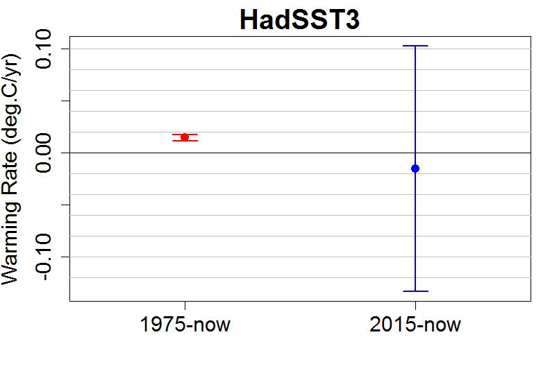
We can go a bit further by showing a likely range in which the trend lies. I’ll do that here with dashed blue lines above and below the estimated linear trend, and I’ll add a red line to show how it compares to the pre-existing trend:

Two things are worth noting. First, the likely range of where the trend really lies is large. That’s because when you estimate a trend with such a short span of time, the uncertainty in your estimate is huge. Second, the pre-existing trend line falls within that large range.
What pre-existing trend? This one:

This shows HadSST3 data since 1975. Note that the pre-existing trend is beyond doubt. A downward “trend” since 2015 is closer to beyond belief, especially since it’s the kind of persistent up-and-down fluctuation that has been happening, without cease, all along. To take a fluctuation which is absolutely nothing out of the ordinary, ignore any kind of actual trend analysis, then classify your post “Temperature Trend Analysis,” seems quite misleading to me.
It’s even better if we come up with some estimate of the level of uncertainty in the two trend rates — the pre-existing trend and the “since 2015” trend. Here you are:
Perhaps if he ever reads this post, he’ll protest that it was just about ocean cooling in September, simply stating facts and showing data. As for the lack of trend analysis, maybe putting it in that category was just a oversight!
My opinion: the whole thing was his attempt to discredit man-made climate change by suggesting that sea surface temperature is trending down. Maybe he even believes that it is — but in that case, my opinion is that he desperately needs either remedial instruction in trend analysis, or any instruction at all.
It’s particularly hard to believe proclamations of purely innocent posting of data and graphs when the “Summary” at the end begins with this:
We have seen lots of claims about the temperature records for 2016 and 2015 proving dangerous man made warming. At least one senator stated that in a confirmation hearing. Yet HadSST3 data for the last two years show how obvious is the ocean’s governing of global average temperatures.
Ron Clutz has taken a less-than-three-year period of a single data set and used it to imply that the idea of “dangerous man made warming” is bunk.
I suppose in the grand scheme of things, Ron Clutz and his blog musings are negligible. What’s really important to learn from his post is how climate deniers can not only come to the wrong conclusion, but how they can present it in a way which is persuasive if you don’t look at it with a critical eye. One of the main techniques, one which happens again and again and again, is to draw sweeping conclusions based on a time span which is way too short for the job.
I strongly suspect that Ron Clutz isn’t competent to do a real trend analysis, or he wouldn’t be making this kind of post. If he is competent at trend analysis, if he does know that the last few years show the same kind of fluctuation we’ve been seeing all along with no serious departure from the trend, then I would suggest that the misleading aspects of his post aren’t innocent.
This blog is made possible by readers like you; join others by donating at My Wee Dragon.


Just another “escalator” denier ?
https://skepticalscience.com/graphics.php?g=47
It’s clear from his article that he is trying to discredit the global warming records set in 2015 and 2016. He is not posting in good faith.
“We have seen lots of claims about the temperature records for 2016 and 2015 proving dangerous man made warming.”
And he doesn’t even provide any links for the assertion that there have been such claims, only mentioning one such claim, without providing a link or enough information to find information on that claim (“at least one senator”). So just more BS.
And he doesn’t even provide any links for the assertion that there have been such claims
Indeed.
The fact is, I never heard a single person claim that the 2015-16 records “prove” global warming.
I don’t know about Senators (being the wrong side of the pond) but I did come across a BBC story that fitted the bill, suggesting the 2016 CO2 rise was a “wake-up call.”
But media stories can be unfortunate, especially when transformed into a TV news item. I came across that story following the dire TV reporting of the release of the latest WMO GHG Bulletin which incorporates the big 2016 CO2 spike. This on-line BBC story was covered in TV news transformed into a ‘Shock-Horror – CO2 is higher that it has been in 800,000 years’ type story. Even after roping in climatologists (I’m not sure one wasn’t actually live from Antarctica), a second attempt in later shows was just as bad. It rather shows the BBC TV news editors are worryingly out-of-their-depth on this rather fundamental aspect of AGW.
“It’s even better if we come up with some estimate of the level of uncertainty in the two trend rates — the pre existing trend and the “since 2015” trend”
–
Without needing to look one would have to say this is a truism based purely on length of time of the two series. Ron has done nothing wrong and neither have you but pointing out that a trend over a long time compared with a trend over a short time with similar fluctuations has a lower level of uncertainty is not an admonishment.
The thing I do not understand is that the pre existing trend you overlay short term seems to be different in slope [trend] to the one in the long time series. This may be just a matter of the scale but I would hope you would give the trend for each graph pre existing trend in actual figures to cure my eyes.
Finally Ron puts up an interesting and opiononed blog covering many topics. He points out a short term downtrend. You can have trends over any time span you like, so it is a [short term] trend. It’s value is much less than a long term trend as you point out eloquently. I am sure Ron knows this and that he is just enjoying a little moment of schadenfreude.
–
BTW thanks for coming back into activity. Not so much in this case but in others it helps to make sure any skeptical views do have to pass a filter to weed out the outrageous claims.
Angech,
Seriously. That post was so bad that it made me embarrassed to be a primate! And his blog is even worse. It is worse than lies. It is bullshit.
I suspect the point of the article was to produce the headline “Global Ocean Cooling”. My reaction is “so what”, the “cooling” is not statistically significant. So the question is why point this non-event out?
Because it allows obfuscation, misinformation, and disinformation to cloud reality?
Given that he doesn’t start and end at the same month of the year, and there is more ocean in the southern hemisphere, the most he could hope to show is that it gets colder in winter.
I’m embarrassed to ask an elementary question about statistics, but I’ll do so nonetheless:
In your graph showing “a likely range in which the trend lies” for HadSST3 since January 2015, wherein lies the uncertainty in the trend?
To clarify my question, each of the monthly temperature readings of which the graph is composed will itself have an uncertainty associated with it.
Is this particular uncertainty in the monthly reading taken into account in the construction of your graph, or is your likely range in which the trend lies constructed on the assumption that each of the monthly readings is precise, i.e. with no uncertainty attached to it?
The latter case would mean that your graph of the likely range in which the trend lies would be identical to that in which each of the monthly figures represented something that was known precisely: for example, the number of golf balls in a bag counted every month.
But in that latter case, if the uncertainty in the monthly temperature readings is not taken into account, then the actual uncertainty in the trend is even larger than that shown in your graph, is it not?
[Response: Not. The uncertainty of a trend estimate depends on the variance of the “noise” — which includes both measurement error and physical stochastic behavior. Both combine to make the residuals, so estimated uncertainty based on those includes both effects. See this.]
Well, Clutz is not only a cherry-picker of an apparently dramatic month to month drop (about 0.2 C), he is also a cherry-picker of datasets.
I checked quick and dirty with KNMI Climate explorer, ERSST5 is down 0.05 and OISSTv2 down 0.04 C from August to September.
Clutz also claims that “HadSST is generally regarded as the best of the global SST data sets,..”
HadSST has incomplete coverage, and Hausfather et al (2017) found that the ERSST product probably is the best in the recent decades.
How many times have we heard that the Spencer/Christy record is “generally regarded as the best of the data sets” since it gives the “best” results?
Well, that was until RSS v3.3 gave more ‘favorable’ results. Then *that* was the best. Or people just used “the satellite series” and then showed RSS v3.3
It seems the only people who say the satellite temperature data set is the “best” are Dr Spencer, Dr Christy and Dr Curry.
Don’t forget that great scientific expert Ted Cruz. And many, many others.
It’s quite simple, really: The dataset that shows the least warming is “the gold standard.”
Until it isn’t.
We all knew that as soon as we were on the backside of the 2015/16 el-nino highs there would be a pile of posts like this telling us that the trend is down/warming stopped etc. Turns out that you can keep doing this on the down-side of every bulge and it still works on people who haven’t been innoculated with some knowledge of the previous times.
Of course, the cherry-picked data of HadSST3’s October 2017 is as irrelevant to the progress of AGW as any of the views of Mr Ron “Forest Gump” Clutz. However, his choice does point out some strange phenomenon at work with global temperatures this year. (See here for graph of recent monthly GISS, NOAA, HadCRUT, BEST, UAH & RSS global temps – usually 2 clicks to ‘download your attachment’.)
Unlike Clutz’s present use of HadSST to illustrate his navel gazing, the usual first choice of deluded folk of his ilk are the TLT satellite data. Yet these have been behaving the exact opposite to the SAT records over recent months. At the start of the year the SAT records recorded a warmth that was absent in the TLT records and since the summer, TLT have been recording a rising warmth that is absent in the SAT data, with HadCRUT showing a distinct cooling for Sept 2017.
This TLT/SAT divergence for Sept 2017 is most dramatically illustrated by looking at the Southern Extra Tropics ocean temperatures. On UAH (data table – Sept 2017’s +0.62ºC is the warmest on record for ‘S ExT Ocean’, the previous warmest month being Aug 1998 at +0.57ºC). On RSS (see their the RSS browser) we see only data for ‘Southern mid-latitudes’ but that too is a dramatic record-breaker – Sept 2017 +1.03ºC, previous record Feb 2016 +0.81ºC). These southern ocean temperatures are what is driving the warm global TLT anomalies of recent months.
Conversely, down at the planet surface, it is those same southern ocean whose SSTs are driving the present drops in global SAT, although with the effect on HadCRUT far greater than that on NOAA or GISS.
So what are strange phenomenon are at work here?
I don’t think there is anything strange going on. The satellites are measuring different things from the surface air temperature/ocean surface temperature blend. And all the data sets are estimates.
I do recall someone pointing out the satellite measurements respond more to ENSO events and the surface air temperature/ocean surface temperature blend respond more to Arctic warming.
I think Al may be on to an interesting question here. To a lesser extent there is a divergence with the instrumental data as well, and though you are certainly correct to point out that the various methodologies are not measuring the same things, it is also true that usually they track relatively well over time.
It may be that the current divergence is random variation among the differing parameters, or it may be that there is something identifiable driving the divergence. It makes me wonder whether there’s anything anomalous in water vapor content associated with the observations we’ve been talking about. But that’s just a stab in the dark.
Harry Twinotter,
I have delayed responding as I was wanting to have a quick look at the TLT southern ocean data as there were a few wobbles/spikes on the TLT southern ocean record (visible on the RSS browser) that looked as though they may have been similar events (particularly a spike at the beginning of 1981).
There is an easy comparison between SAT & TLT in that both UAH & NOAA provide SH Ocean data. Lining the two sets of data up , they match each other wobble for wobble although with TLT is more wobbly and usually with a couple of months delay. There are deviations where the odd wobble may be absent from one record (and a divergence over the last decade with NOAA showing more warming although that will be a UAH calibration thing given RSS TLT is also diverging from UAH TLT). However the absence of the early-2017 SAT warming wobble from UAH (&RSS) and the current opposing trends (cooling in SAT/warming in TLT) together do not appear to be matched by similar divergence over the TLT record (or such a long delay between wobbles if that is the explanation).
It will be worth keeping an eye on what happens in coming months. (In other satellite data like Arctic Sea Ice, such odd readings often preceed instrument failure but for TLT data there is more scrutinising before posting so I don’t see that as at all likely.)
“Finally Ron puts up an interesting and opinioned blog covering many topics. He points out a short term downtrend. You can have trends over any time span you like, so it is a [short term] trend. It’s value is much less than a long term trend as you point out eloquently. I am sure Ron knows this and that he is just enjoying a little moment of schadenfreude.”
Except, as Tamino showed, he didn’t calculate any trend, short term or long term, or show any evidence that he knows what a statistical trend is, or how it differs from a fluctuation. As for enjoying a little moment of pleasure over others’ misfortune, who are the others and what is their misfortune? My best guess is those who read his blog and and are mis-informed by it.
Check out the latest Clive Best rendition.
October looks to be much hotter than September. I’m sure they’ll rush out with blogs about that.
“To take a fluctuation which is absolutely nothing out of the ordinary, ignore any kind of actual trend analysis, then classify your post “Temperature Trend Analysis,” seems quite misleading to me.”
‘Quite misleading’. What a generous fellow you are Tamino.
Clutz is unfortunately named.
Skewered with customary clarity.
All I can add is “cough, cough, ENSO, cough, cough!” (Perhaps Mr. Clutz has heard of it?)
Clutz Central has just suffered a major disinformation malfunction-
Heartland’s Red Team playbook has been exposed.
Might also note that the plots in question are the SST *anomaly*- which is the departure of the measurement with respect to some reference. In this case, I believe the reference is the 1961-1990 mean. Therefore, if the number is >0, it’s still heating!
The positive trend line shows a linear temperature increase of 0.14 degrees per decade. According to models we should be warming at twice this level. Does this post assert that the models are wrong ?
[Response: This post demonstrates that those who claim meaningful “cooling” based on ridiculously short time spans, don’t have even a ridiculously short leg to stand on.
If you want to discuss trends, you can begin by providing a source for the claim that “models should be warming at twice this level.” And you can stay on topic, which is sea surface temperature.
And you can lose snarky statements like “Does this post assert that the models are wrong?” You know it does no such thing, and that kind of statement serves no purpose except to raise the level of insults.]
Tamino,
You did not post the linear slope. From your graph I estimate a slope of 0.17-0.18 C/dec. Bob has underestimated the slope. What is the actual value?
I thought the atmosphere usually warms faster than the sea. This graph shows them warming closer to the same rate than I thought. I will have to look closer at the next yearly temperature report.
A curious claim about what ‘the models’ supposedly say. A quick sanity check on that comes from AR4, in 2007. Therein, you can read that:
“For the next two decades, a warming of about 0.2°C per decade is projected for a range of SRES emission scenarios.”
0.2 C is a lot closer to 0.14 C than to 0.38 C.
And, interestingly, for 2007-present, the linear trends for HADCRUT 4 and for GISTEMP LOTI are, respectively, 0.33 C/decade and 0.36 C/decade:
http://www.woodfortrees.org/plot/hadcrut4gl/from:2007/plot/hadcrut4gl/from:2007/trend/plot/gistemp/from:2007/plot/gistemp/from:2007/trend
Of course, that is only a decades’ worth of data, so not enough to be statistically conclusive.
Omitted the link to AR4:
https://www.ipcc.ch/publications_and_data/ar4/wg1/en/spmsspm-projections-of.html