
Over at RealClimate, reader “Dan H.” insists that there’s no notable increase in worldwide drought. He’s also been pushing his idea that global temperature is following a modest warming trend of only 0.06 deg.C/decade, but we’ve already dealt with that.
When pressed for evidence, Dan H. provided some interesting links. The interesting part is that the evidence he provides against increased drought, isn’t.
He first links to some graphs covering Texas, indicating no long-term trend in drought. Texas covers less than 0.2% (1 part in 500) of the land area of the globe. That’s hardly a characterization of global drought.
Then he links to a paper saying “Rainfall in Australia is largely governed by ENSO.” Knock me over with a feather! We knew that already. What Dan H. fails to mention is that ENSO governs the fluctuations — but doesn’t account for any trend which might be present. Poor Dan.
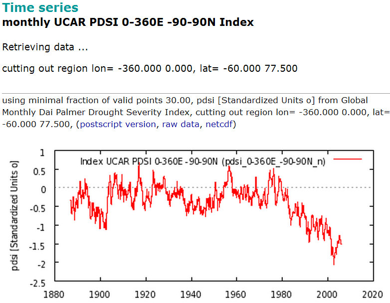
But without a doubt the weirdest “evidence” he provides, and one of the most bizarre things I’ve ever seen in global warming discussions, is a link to this graph:

to claim that drought isn’t increasing. Doesn’t he see that this graph clearly indicates that drought has shown an increase, in fact a dramatic increase, since about 1980, even compared to conditions throught the 20th century? But Dan H. seems to think the opposite. Where could he have gotten such an idea?
The graph comes from the “icecap” website. Here’s what they have to say about it:
A plot of the worldwide data for the Palmer Drought Severity Index shows that there has been an unprecedented decrease in world drought severity over the past 30 years, possibly due to the plant enhancing increase of CO2.
Apparently, “icecap” thinks that more negative values of PDSI (Palmer Drought Severity Index) indicate less drought, so that the precipitous drop in worldwide average PDSI means drought has been decreasing.
Y’know, they really should have read up on this stuff before posting such nonsense. That goes for Dan H. too.
As the website for UCAR (source of the data) states:
It is a standardized index that spans -10 (dry) to +10 (wet).
Yes, folks, those extreme negative values of PDSI indicate more severe drought. The “evidence against drought increase” presented by icecap, regurgitated by Dan H., is the opposite. It’s evidence — immensely powerful evidence — for drought increase.
What’s the important lesson here? That this is what we’re up against. To convince the public that global warming is a real problem, we have to counter arguments from people — and from websites which exist to spread misinformation — who won’t even bother to learn the most basic facts — like, for instance, that negative PDSI means more drought, not less.


And if you didn’t find the UCAR link, then according to NOAA (http://www.drought.noaa.gov/palmer.html),
“The Palmer Index is most effective in determining long term drought—a matter of several months—and is not as good with short-term forecasts (a matter of weeks). It uses a 0 as normal, and drought is shown in terms of minus numbers; for example, minus 2 is moderate drought, minus 3 is severe drought, and minus 4 is extreme drought.”
The link to the UCAR website has these graphs https://climatedataguide.ucar.edu/sites/default/files/key_figures/eof_pdsi-1_0.png
Not sure if im reading these right but are these reading positive (ie wetter conditions?).
[Response: Those aren’t graphs of PDSI, but of the empirical orthogonal functions of PDSI, which have a sign ambiguity.]
Wow. That is an epic fail, both on icecap’s part, and on Dan H.’s part (for trusting icecap).
It wouldn’t shock me if Dan H counters with the argument that the PDSI has trended upwards towards zero in the last few years, ergo less drought. That would be a case of piling the BS higher and deeper.
OK, denialist do not grasp basic physics and basic stat this might be understandable. But, basic reading skill…
Been there a few times myself, too. It could be funny how these guys are attached to ignorance. I’d risk saying that Dan H. will remain as convinced as before about the decreasing droughts, even after his childish mistake is pointed out.
Could be funny, Sad it’s not.
Yeah, contrarians have a bad habit of searching the web, finding a graph they like, and then spreading that graph far and wide without understanding the context of it in the wider scientific literature (or even, sometimes, the ability to even understand what the axes are). Eg, their favorite Scotese/Berner CO2/temperature for millions of years graph (from 2001 research! Without real uncertainty bars or the recognition that some glaciation events are shorter in duration than the resolution of the measurements).
Having said that, I’m not sure that the PDSI plot is the last word on increasing drought, I feel like recently the confidence in past drought trends has decreased – for example, the SREX report seems to indicate only medium confidence for some regions – eg, “There is medium confidence that some regions of the world have experienced more intense and longer droughts, in particular in southern Europe and West Africa, but in some regions droughts have become less frequent, less intense, or shorter, for example, in central North America and northwestern Australia. [3.5.1]”
(Compare to the AR4 statement: “More intense and longer droughts have been observed over wider areas, particularly in the tropics and subtropics since the 1970s”, based presumably in part on the Dai et al. 2004 PDSI analysis)
Well, this is good. Someone who was previously sceptical based on a piece of evidence they misunderstood has had their misunderstanding pointed out to them and so will now realise they were in error. All will be well with the world.
If it weren’t not funny…
I can only imaging the sinking feeling you’d get if you left these folks in charge of a bilge pump.
Forget that I’m wondering how’d they do flying an airplane in instruments conditions. Perhaps there should be a new placard mandated by the FAA: “Blue area on attitude indicator represents sky”
WHY won’t this change Dan H’s mind? Why won’t it bother him at all?
That’s the only thing I ask myself nowadays…
Still can’t get my drought research published. The vast majority of journals I send it to won’t even send it out for peer review. I’m trying outside the US now.
Having fun everyone. Ok, the UCAR graph was a mistake. But I will ask you, why does it differ so from the others? It would appear that it is the only one not showing a large extent of drought during the early 20th century.
[Response: When you thought the UCAR graph supported your idea it was good enough to link to — but when you become aware that it clearly contradicts you, you call it into question. Nice tactic.]
BTW, the Texas and Australia graphs were in reply to Susan Anderson, who brought them up as examples of intensifying drought over areas that routinely experience drought-like conditions.
Also, both the CRU and GISS data show a similar warming trend of 0.6C/century. That covers both land and sea, not just land as the BEST data does.
[Response: Both CRU and GISS show that your theory of an underlying trend of 0.6C/century is nonsense — just as the BEST data does. Rather than just admit you’re wrong you’ll change the subject to another data set. There aren’t enough of them to make you right.]
This is something which Dan H has brought up elsewhere and I still can’t make sense of it. He seems to believe that the warming over the past century has occurred by decree from some higher power, rather than being caused by a proportional physical response to changes in the coupled atmospheric-ocean system, and therefore will continue (presumably indefinitely) at this set 0.06ºC/Decade rate.
One thing I’m curious about is if Dan H has an idea of when (and why) the trend might stop? At this rate the Earth will be 24ºC warmer in just 4000 years, which is quite a bit more than is predicted by conventional physics.
OK, I’ll bite. Texas has been having some recordbreaking drought. Fact? Problems with wildfires. Right? Widespread over southwest and Mexico and water problems as well. Yes, I know, weather isn’t climate, but there has been a whole lot of news about this recordbreaking current drought, and the problems somewhat alleviated by recent rains but problematical nonetheless. I could have phrased it better, but as the little girl (not so) who started the great big war (this time) I stick with drought in Texas and Australia, though I blew it on the continuum. I have a friend near Perth who sent me anecdotal material (water rationing too). So try this for more specifics, quite a range of stuff:
http://bit.ly/xW4sUI
I realize I was trespassing with anecdote in a discussion about science and climate, which requires more than a decade to begin to show trends, but it seems to me that as recent incidents display to some extent climate change under way, it is unwise to ignore the future, which might just accelerate rather than boinging back to neutral.
Dan H, you were just taking advantage of what you perceived as a vulnerable point, but I like you am just one commenter, though I believe I am more interesting in learning, while you are more interested in obscuring.
And this is something I wish our educational system would imitate:
http://www.dpi.vic.gov.au/agriculture/farming-management/weather-climate/understanding-weather-and-climate/climatedogs
q.e.d.
A graph that goes down is just irresistible to a “skeptic” bone-head.
Not sure about OPatrick’s optimism.
After reading Merchants of Doubt, I started thinking about whether the leaders in the denialist camp (call them the denialistas) know they are not tellling the truth, or whether they simply don’t care. There is a difference, between truth, untruth and bullshit, well explained by Harry G. Frankfurt in his slim but deep book “On Bullshit”: “Each responds to the facts as he understands them, although the response of one is guided by the authority of the truth, while the other defies that authority and refuses to meet its demands. The bullshitter ignores these demands altogether. He does not reject the authority of truth, [..] he pays no attention to it. By virtue of this bullshit is a greater enemy of truth than lies are”.
Part of the “strength” of the denialistas is that the alternative knowledge system they have concocted is does not have to be correct. It just has to provide the right spin for the moment. If just proving them wrong was enough, they would have thrown in the towel long ago. The thing is they don’t care if it is true of false. So long as it sounds right.
Anyone who follows the climate change debate for a while must soon notice that when the denialistas have one of their argument proven wrong, or one factual misrepresentation corrected, they just continue as if nothing had happened.
Bullshit is harder to fight than untruth.
Icecap is Joe D’Aleo’s site, so it is unlikely to be untruth, and much more likely to be BS. The guy has a PhD in a relevant field, and STILL he knows far less about some basic climate science than I do.
He has an masters, no PhD. Still, he should be able to read a graph. No special training needed there, besides basic English language competency. This reminds me of John O’Sullivan posting a graph from a satellite data study he thought showed that CO2 emissions aren’t causing the CO2 rise. He actually asked someone on WUWT if they spoke Japanese and could translate the caption – this after he *already* wrote his piece claiming the study showed most CO2 comes from the SH. It never occurred to him that it might be useful to know what the graph’s captions said. D’Aleo’s error is essentially the same.
Whoops, you’re right. Apparently he has been in a doctoral programme, but never finished it.
RM: This reminds me of John O’Sullivan posting a graph from a satellite data study he thought showed that CO2 emissions aren’t causing the CO2 rise. He actually asked someone on WUWT if they spoke Japanese and could translate the caption – this after he *already* wrote his piece claiming the study showed most CO2 comes from the SH.
BPL: Well, as they say in Japan, “O’Sullivan-san wa baka des’.”
Would this be the same Joe D’Aleo who has the same problem with understanding anomalies as Watts?
If so, why would anybody take him seriously?
“Not sure about OPatrick’s optimism.”
Sorry, did that come across as optimism? I was going for bitter sarcasm.
D’Aleo proves once again his competence. I wonder if they are going to keep the graph on. Sure there is the fact that the graph says exactly the opposite of what they think it says but it’s a nice decreasing trend; considering what their public is, it might actually be worth keeping it. I mean, how many more Dan H. are out there who won’t think twice about what that graph actually means? Disinformation is a complex art that requires intimate knowledge of your target audience…
This is really funny, in a way. I’m imagining a Star War spoof involving D’Aleo and master Yoda: “A clue, you have not.”
“This is not the downward trend you’re looking for”
Or how about “Use the Forcing?”
“The Farce is strong in this one”
Beautiful! Still laughing…
Both CRU and GISS show that the underlying trend of 0.6C / century is still intact. No changing of datasets. No snide remarks. Just the data.
http://www.woodfortrees.org/plot/hadcrut3vgl/from:1880/plot/hadcrut3vgl/from:1880/trend/plot/gistemp/from:1880/plot/gistemp/from:1880/trend
[Response: And no analysis — just your confirmation bias.]
No analysis needed. The graph and trend are confirmation enough. Are you agreeing or disagreeing with the established trend? If disagreeing, please state why you feel this graphic is not representive.
[Response: The real trend is most certainly not linear. The linear trend over all the data is not representative of the present rate of warming, nor does it represent the physics at work or indicate what the future will bring. Adding in your “roughly 60-year oscillation” to explain its departure from reality is just mathturbation, and I’ve already illustrated its utter failure not only for BEST data but for GISS and HadCRU as well. It is, however, a convenient fiction.
You really do have an opportunity to change your viewpoint. You might begin by wondering why you choose to get your information from websites like “icecap” which pontificate on the subject of drought when they don’t even know the right sign for the PDSI. Perhaps they’re simply not trustworthy? Do you think Gavin Schmidt would use data to argue for or against drought without even learning the most basic facet of what the data meant?
I suspect you get most of your perspective from untrustworthy sources. Go read this.
As for “no analysis needed” — are you trying to look the fool?]
Dan, I’m not sure which ~60yr cycle Tamino is referring to, but if you are pursuing a line+cycle curve-fit for the instrumental temperature record, you should know that an exponential+sine is a better fit to temps than the line+sine model.
Ron, unless you have some physical reason for preferring the exponential + sine or even the sine+ line it is still mathturbation.
You might let Dan H know that much of Australia is in a long term drying (and heating) trend. South Eastern Australia and south western Australia in particular. ENSO events overlay the long term trend, but don’t change it.
If you’ll excuse the plug to my blog, it highlights sections from a recent Australian Bureau of Meteorology statement:
http://bundanga.blogspot.com.au/2012/02/no-more-normal-australias-big-wet-and.html
This reminds me of the time I mixed uncorrected radiocarbon dates with corrected ones, and got a bit skewed distribution of volcanic events, though I tried to correct for observational bias on earlier and smaller eruptions. In fact, I’ve still not completely corrected that one.
However there is no (statistically significant trend in total precipitation during the satellite era (according to data derived from satellite instruments).
Which leav es quite a puzzle.
Not really a puzzle. Same precip, more evaporation due to warmer surface temps. Result? More and deeper droughts.
It’s not necessarily a puzzle. Drought is generally defined by a length of time with minimal precipitation. It’s entirely possible for a location to see increasing total precipitation and increasing drought. You would just need precipitation events to reduce in frequency but increase in intensity.
Which, be it noted, is a great recipe for accelerated erosion of topsoil.
I made this point over at RC about New Jersey, where I grew up. My family has moved south to be near Princeton, which is a different ecological system (sloppy word will have to do for now). It has always had weeks long droughts and flooding rains in turns. Now the droughts are longer and the floods are bigger, and the erosion is worse. The effects of Irene and the October storm were worse because the trees were already weakened by all that trauma.
(I believe the medical term trauma is useful in this context applied to trees. There is also the increase in ground level ozone, which is not good for plants and other living things.)
(This anecdotal is about 50 years of observation but only 30 in the Princeton area.)
I would regard drought as also being dependent on humidity and temperature. A very hot period without water can be more devastating than a cooler but shorter period.
I rain stops falling where it usually does, and falls where it usually doesn’t, then the place that doesn’t get its usual rain will have a drought, and the place that doesn’t usually get rain – well no one will mention it.
So you can have the same rainfall, but more droughts. Just a thought.
Given the Clausius-Clapeyron relationship, the humidity of saturation increases roughly 8% for every 1°C, doubling for every 10°C, where relative humidity remains roughly constant and therefore absolute humidity increases at 8% per 1°C. From what I understand, the residence time remains roughly constant, although this is likely a modeled result. But assuming this, given a constant residence time for water vapor molecules, the rates of evaporation and precipitation should rise in step with the absolute humidity. So we might expect the rate of precipitation to increase at 8% per 1°C, or 4% for the 0.5 °C increase so far.
But as David Benson recalls, I remember reading a while back that what we had actually observed was an increase of 1-2%, which was not statistically significant. One point that may be of some relevance here is that given the greater thermal inertia of ocean, during a period of global warming, land warms more quickly than water. The absolute humidity will be largely set by the oceans, so water vapor and will increase but relative humidity over land will largely decrease, resulting in less precipitation than one would otherwise expect, given Clausius-Clapeyron and a constant residence time. Furthermore, higher temperatures over land will tend to dry land out through an increase in the rate of evaporation, and as land dries out this will reduce heat transfer to the atmosphere by means of moist air convection, further increasing land surface temperatures.
Now it has been said before that wet areas become more wet and dry areas more dry. I believe this is due to the exponential nature of the functions relating temperature to precipitation and evaporation. If there is a surplus of precipitation, then doubling the precipitation and the evaporation will lead to a larger surplus of precipitation. However, if there were a surplus of evaporation, then the surplus evaporation would double, at least until the soil dries out.
The rain should become more seasonal. Just as the ocean warms more slowly under global warming, it will cool more slowly than land in fall and winter. Therefore, if the absolute humidity were to remain the same as one moves from the coasts to the continental interiors, relative humidity would actually increase.
Of course absolute humidity will actually fall as one moves inland, even in winter, I believe because the water falls out as precipitation, either as snow or rain. But going into spring and summer, soil should dry out more quickly (and it has been) given a decreased warm month precipitation and increased rate of evaporation. Thus just as wet areas tend to become more wet and dry areas more dry, wet months become more wet and dry months more dry. And the dry, summer months are what matter most to agriculture.
However, there is also the expansion of the Hadley Cells where water vapor from tropical ocean evaporation rises, water in the form of rain falls out as the air cools with increased altitude, then dry air descends at poleward edge of the cells in the dry subtropics. As the Hadley Cells expand, the dry subtropics will move poleward, and this should further act to dry out places like the southern United States, and then northern and much of Europe later in this century.
Finally, as Paul S. mentions, even when there is little change in the amount of water, if the rain is becomes more concentrated in downpours and flash floods this will do little to alleviate any drought. There is only so much moisture that land can hold. Much of it will run off, and as I have noted, what doesn’t run off will evaporate more quickly at higher temperatures.
And we have seen an increase in extreme precipitation:
Hot diggety, good reading, thanks.
The part this layperson wants to understand most is the more energy in the system bit. I was told in the 70s (I think) that scientists did not yet know which way things might go, but were reasonable certain that extremes would become more extreme.
Meanwhile, back at the ranch, take a gander at this. Eyecrossing – I wish they would provide a doodus for slowing it down – but fascinating: Remember the middle is the North Pole and what is there from the southern hemisphere is distorted of necessity.
and this for perspective:
http://www.die.net/earth/mollweide.html
I just found out you can get Earth Observatory water vapor on Google Earth, but haven’t figured out how to work it properly yet.
Sorry, broken link on the Rutgers Northern Hemisphere water vapor animation. Herewith:
http://bit.ly/AsjCac
Susan, thanks! That animation from Rutgers is very cool–it reminds you why they talk about ‘fluid dynamics.’
I’ve been trying to get some meteorological ‘chops’ going, so was delighted to find I could tell the cyclones from the anti-cyclones without a score-card–I think.
Susan and Kevin,
The animation I had been bouncing over to when trying to see what pineapple express or snow storm was headed my way was:
http://wwwghcc.msfc.nasa.gov/cgi-bin/post-goes
… but the thing Susan has pointed out with synoptic just blows that away. And yes, Kevin, the turbulence you sometimes see there is pretty impressive, .It reminds me of when Moira and I were headed from Iowa to New Mexico with a snow storm right behind us the whole way. The general motion is counterclockwise, but the turbulence those couple of days had things going the other way on our trip. Years later, when I explained how the storm was behind us the whole way and how we were trying to stay ahead of it, I remember someone assuming I must have been misremembering or something because they thought the weather always tracks from West to East.
Depends on the winds.
Corrections…
The first is relatively minor. I had stated that the humidity of saturation increased by 8% per 1°C, but it appears to be 7%:
The second correction is far more significant. I had stated that globally the rate of evaporation and precipitation increase at the same rate as the humidity of saturation, that is, by 8% per 1°C based on a roughly constant residence time, but this is false:
The residence time actually increases:
For those who may find it of interest, the following article is open access:
Lu, Jianhua, Ming Cai, 2009: Stabilization of the Atmospheric Boundary Layer and the Muted Global Hydrological Cycle Response to Global Warming. J. Hydrometeor, 10, 347–352.
http://journals.ametsoc.org/doi/abs/10.1175/2008JHM1058.1
Dan H “no analysis needed.”
Dude…
You’ve said more with that statement than anyone needs to know about your opinion on any dataset. Enjoy your alternate reality. Your intervention was most amusing indeed. Funniest was your sudden suspicion toward the UCAR drought data once you understood what it meant. That was precious. That people like you could call themselves skeptics is truly a shame, and unfortunately a sign of the times. Funny and sad…
“No analysis needed” means “I don’t understand how science works.” As your blatant blunder with the PDSI highlighted, data (and its graphical representation) is meaningless without proper analysis.
Dan it seems you are struggling with some basic elements of scientific understanding in general, and climatology specifically. While it takes a lot of time studying and practicing to become proficient in doing the work of science, it is not required for someone to gain a better understanding of climate science. If that is your goal, I highly recommend checking out David Archer’s lectures. Just sitting on your couch, you can “attend” a collegiate level course taught by a geophysicist at the University of Chicago. What’s more, it does not require a background in physics, chemistry or even science. Archer is a goofy awesome guy, and although the physics was a complete review for me, I found the course enjoyable.
Should you choose not to educate yourself, and your goal is simply to engage in polemics and prove your superiority, it will only take a simple analysis of your future behavior to see that is the case.
For anyone interested in understand the relevant physics, chemistry and climate processes at play in our world:
http://forecast.uchicago.edu/lectures.html
This comment on ENSO link to rainfall and drought reminded me of a recent WUWT post where they point out how sea levels have a negative trend over (gasp) the last 2 years.
From a quick look, the sea level fluctuations about the trend seem to correspond with ENSO, but I wouldn’t want to conclude anything with my shaky stats. Have you looked into the relationship between ENSO, solar cycle, volcanism etc and sea level in a similar way to your surface temperature analysis?
I’d be very interested in the results.
Idiots and liars!
If Mark Twain were alive today…
“There are four kinds of lies: lies, damned lies, statistics, and global warming denial.”
Is this really about understanding the science? Dan H truly wants to believe that AGW is not a problem. So that is what he believes! Understanding more of the science (or discovering a graph shows the opposite of what he thought it showed) will undermine that belief but not by enough.
The human condition is such that shaking somebody from the comfort zone afforded by a well established belief is not easy. They will latch onto some other piece of evidence that assists their belief (even cling onto the wreckage of what has been show to be wrong) while ignoring the vast pile of well established evidence that says otherwise. They believe in a forlorn hope that will carry them through – one day a crack in the established evidence will appear and the whole lot will be shown entirely wrong. Then the true believers will be vindicated. And soon new evidence structures are built and the belief buoyed along ready for the next crisis in belief.
“No Analysis Needed”
— by Horatio (with a lot of help form Dan. H)
There’s no analysis needed
I can see it with my own eyes
Without a doubt
The graph slants down
And so does drought —
I ain’t no clown —
Your stats are only lies
And Dan H. brings in another interesting graphic to RC. I commented there that the captioned baseline period of 1998-2006 was ‘fairly goofy.’ (Ie., a blatant cherry-pick–though not as blatant, I would think, as 1998-2005 would have been.)
But it did make me curious: what are the ramifications of using such a comparatively short baseline? Some are probably obvious to many here, but perhaps some are unexpected enough to be statistically interesting?
I would guess the point of a baseline interval is to capture enough modes of natural variability that what the map shows is the difference from ‘normal’ in your chosen comparison, rather than simply a mixture of variability from one period superimposed on variability from another.
Reagarding the length of the baseline I checked Jan 2012 against a recent 30-year period (1981-2010). It doen’t seem to be that different from Dan H’s 1998-2006 one so I would suggest it does a reasonable job of capturing the recent ‘normal’.
Spatially similar, yes–but ‘cooler’ and less ‘alarming.’
Sigh. Dan H. is a pipe for this stuff. He’s doing it lots of places.
http://www.realclimate.org/index.php/archives/2012/02/unforced-variations-february-2012/comment-page-6/#comment-228102
Open-mindedness is the wrong(?) approach | Climate Etc.
judithcurry.com/2012/01/…/open-mindedness-is-the-wrong-approac…
Jan 23, 2012 – Open your mind go to http://www.climate4you.com take the HadCRUT3 ….. Dan H. Well put. There are various ways of extrapolating the trend of …
Climate scenarios: 2015-2050 | Climate Etc.
judithcurry.com/2012/01/31/climate-scenarios-2015-2050/
Jan 31, 2012 – Dan H. | February 1, 2012 at 10:43 am |. Anteros, …. http://www.climate4you.com/ you will find the answers to all the rest of your questions.
Dan H., when a scientist finds he is wrong, he backs down. A bullshitter doubles down.
I’m a little confused by the Palmer Index — in a warming world, shouldn’t a global measure of drought be decreasing, because “a warmer world is a wetter world”?
[Response: Certainly the atmosphere will hold more water vapor, a fact which is verified by observations. But drought over land (where it counts) depends on precipitation and evaporation. In some areas precipitation increases, in others it decreases, while evaporation can be expected to increase due to rising temperature.]
One (probably simplistic) way of thinking about it would be, if the atmosphere is holding more moisture, where does it come from? Oceans? Soil? Biosphere? Got to be one (or more) of the three.
Plants have ways of conserving water; and the oceans are warming comparatively slowly. So perhaps this very rough and ready ‘top down’ analysis* would lead us to expect soil to be drying.
*AKA “hand-waving.”
Glancing over the graphs at UCAR’s Palmer Drought Severity Index (PDSI) site, it looks like the index is computed only for land, as Tamino implies, which makes sense. I was imagining that is was for the whole globe.
Yeah, the concept of ‘soil moisture’ kind of breaks down mid-Pacific.
;-)
I’m sure glad I wasn’t drinking anything hot.
lulz
Dan H. is employing that time honored tradition of the anti-science crowd: Only look as far as your conclusion is confirmed.
Dude, SURELY you can realize that there are numerous things going on with the trend that have to be considered. Think about mid-century cooling. You’ve got 30 years of a aerosol forced cooling in the middle of your data series. Ever think that might affect the number you’re eye-balling? The better, and still statistically significant, data series to look at would be the data since 1970. Tell us what you see now for just 30 years of data? (Oh, and you might want to check out how to do offsets at WoodforTrees.)
http://www.woodfortrees.org/plot/hadcrut3vgl/from:1970/plot/hadcrut3vgl/from:1970/trend/plot/gistemp/from:1970/offset:-0.11/plot/gistemp/from:1970/trend/offset:-0.11
“The better, and still statistically significant, data series to look at would be the data since 1970.”
Which by eyeball shows a warming rate of ~0.65 for just the last 42 years, much less per century as Dan H. would have us believe.
> depends on precipitation and evaporation
Maybe more intense storms at bad times,
maybe more long soaking rains at good times, and if we’re that lucky,
maybe enough to turn some depleted aquifers around.
precipitation, and intensity/time, and soil readiness to absorb rain — and much else — are going to affect how much soil moisture increases after the rain’s done, versus how much of that rain ran off somewhere else.
Tangentially related:
The role of the Atlantic Multidecadal Oscillation on medieval drought in North America: Synthesizing results from proxy data and climate models (Oglesby, 2012)
“Wattspeak”
–by Horatio Algeranon
“Wet is dry
And dry is wet”
(As opposite
As it can get)
“Freeze is melt
And melt is freeze
Watterecovery
If you please”
“Rise is fall
And fall is rise
Can’t you see it
With your eyes?”
“Hot is cold
And cold is hot”
The warming globe
Is simply not”
“Down is up
And up is down”
(In nega Wattspeak
We will drown)
@ James Galasyn:
One thing is that the Hadley cells are expected to expand polewards. The centres of the Hadley cells are dry (it’s where the Sahara desert is, for example). As they expand, you expect the dry regions to expand. Meanwhile, TOTAL rainfall increases, in a strip along the equator and at high latitudes.
Neat, thanks for the 411.
The “synoptic” water vapor map is part of a variety of choices from Rutgers Environmental Science. The main satellite site gives you a variety of menus, by location, visible/IR/WV, animation, color (I’d love a key on those colors).
http://synoptic.envsci.rutgers.edu/site/sat/sat.php
For local water vapor, there are a range of sites. Here’s a good one for North America:

Over the few years I’ve been looking at them, the white is becoming more pronounced. The Missouri floods were a study last summer – pounding after pounding after pounding.
One vexed topic is the crossover between weather and climate, and climate science. While scientists tend towards a more reductionist approach (what we can’t describe we steer clear of, or what we can’t describe doesn’t exist, in the worst case) everyone can see weather. With the virtual world taking over people’s consciousness, and less and less world coverage, it is possible to hunker down and not notice, but most people are noticing. I think it is useful to draw parallels between the observable world and the science that describes it.
While I have a good deal more science education that most, a lot of what you guys say is out of my reach. That is the gap that needs to be bridged.
On curve fitting, I don’t have time to find it right now, but there was an excellent short animation of the difference between the continuous trends and the chopped up downward trends identified by the phony skeptics on the temperature record. (I suspect it’s somewhere in OpenMind as well.) There is also the 26 second history of global warming here:
http://www.nasa.gov/topics/earth/features/2011-temps.html
You are probably thinking of this:
http://www.skepticalscience.com/still-going-down-the-up-escalator.html
But if not, it is still a good illustration of the point.
> Over the few years I’ve been looking at them, the white is
> becoming more pronounced.
Yeah, but — our lying eyes are built to detect patterns that _might_ be there.
So what do we need before we can say there’s probably a trend?
Dan H. Geez Dan…if you’re going to post here and over at RC you need to get some of the fundamentals right or you’re going to be the fool. The scientists that figured out some of the fundamentals of “global warming” were really smart; Fourier, Arrhenius, Callendar, Plass, Seuss, Revelle…maybe you’ve heard of them? It’s incumbent on you to figure out what is settled science and what is absolute bunk, you have to be at least smart enough to do that. There are abundant changes in physical and biological systems that reflect a changing, warming climate and real scientists (wildlife and fisheries biologists, hydrologists, foresters, entomologists, geologists…..etc.) are doing fundamental science right now to figure many of these changes out. This isn’t part of some vast conspiracy, its reality. There are abundant resources out there to educate yourself; a good read is Mark Bowen’s book on Lonnie Thompson’s work (Thin Ice), a good view is Richard Alley’s AGU presentation from a couple years ago. The recommendation above for the University of Chicago’s web presentation looks good as well though I haven’t seen it. David Archer and Ray Pierrehumbert of the faculty there are solid physical scientists. The choice is yours.
No sooner had I posted the above than this should appear regarding yet another climate change forestry issue in Southeast Alaska :
http://www.msnbc.msn.com/id/46439567/ns/us_news-environment/#.T0BDdOTvOSo
A bit OT, but in the process of responding to new DotEarth on forestry (slightly off if I understood it properly, as usual) I rediscovered this, which is altogether shocking:
http://www.newyorker.com/reporting/2008/10/06/081006fa_fact_khatchadourian?currentPage=all
“[Raffi Khatchadourian] about illegal logging along the Sino-Russian border and the sale of products manufactured from potentially illegal timber in American stores such as Wal-Mart.”
Closer to home, there are dastardly deeds afoot in Oregon. Google should find it, there’s some activist action.
I assume you refer to the pending legislation regarding O&C (Oregon and California Railroad) lands (taken back by the feds when the O&C was exposed as a criminal fraud and went bankrupt).
It’s a complex issue. I don’t favor the legislation, but I’m sympathetic to its goals. The counties that would benefit are under extreme economic pressure. Best would be to continue the funds that have been granted by Congress to replace the lost revenue due to the virtual end of logging on these federal lands (a portion of revenue paid by the feds to compensate for lost property tax revenue since federal lands aren’t subject to state property taxes). But this isn’t going to happen, thus the problem.
The legislation would split the O&C lands in half, one half to be heavily managed as commercial timberland with the relaxation of many federal regulations on clearcutting etc, the other half to be maintained as conservation lands.
The problem is that the O&C lands in question are largely old-growth, largely protected by the NW Forest plan thus currenlly not being logged. So from the conservationist point of view, the proposed legislation cuts the acreage protected from logging by 1/2, not to mention that the logging regime on the other half would be very intense and detrimental to salmon spawning habitat as well as forest species, etc etc.
States have been trying to grab control of federal forests forever, and thus far have been beaten back. IMO this law would be of terrible precedent, even thought it’s extremely limited (BLM lands, not USFS, and lands with a complex history).
But the affected counties are literally going bankrupt. The loss of timber revenue broke what had been an accepted arrangement between the feds and counties (the money is earmarked for schools). No timber revenue, but still no ability to levy a property tax on the land’s value since it’s federally owned. The replacement revenue balanced that, and has been in place for close to twenty years, but as I mentioned above, Congress isn’t going to continue the payments. If there’s a complete turnabout in composition in the november elections, it’s possible they could be restored, but a future flip of control and they’d be ended again.
This is offtopic for here, but I thought Susan would appreciate a little background.
Thanks Dhogaza, very helpful and informative. I responded not long ago to a plea about this issue and have been following it desultorily ever since, but the idea of selling old growth forests to pay local bills seems of a piece with the many other short-term “solutions” that permanently remove valuable community (in the larger earth-based community sense as well) resources in favor of paying a few bills. The opportunists who set this up are villains in my book, but as you do I sympathize with the locals.
Well, the O&C lands were supposed to be sold by the O&C railroad company – checkerboard pattern, similar to how many other railroads were funded, starting with the transcontinental railroad. The feds granted every other section to the railroads which were to be sold to fund the building of the railroad (without which the lands were valueless at that time). The counties would then be able to tax that land.
So after the lands were taken back, congress passed legislation to manage these sections for sustained-yield timber production, with the proceeds to go to the counties as I mentioned earlier. Note that in the 1930s, when this happened, conversion of old-growth to sustained yield timber production was considered to be best-practice by scientific foresters. The ecological value of old growth wasn’t appreciated at the time, and future pressure for wholesale conversion of old growth to timber production on US Forest Service land wasn’t anticipated.
So you gotta take history into account here. Ignorance, an inability to predict future demand (WWII led to the liquidation of huge amounts of forest, private and then later public) was much more responsible than villainy.
It’s a sticky situation but, as I said, I don’t support the legislation.
In a lame effort to say something on-topic … the O&C lands tend to be wet. Quite wet.
OK, I stand corrected. It is unfortunately that our learning curve on the problem of the commons is so steep, and the pointy heads who are paying attention are so isolated about our common danger when it is already so late. I am handicapped by not being able to find the original post that got me going on this issue – it seems to have been removed.
As to OT, Dan H is OT, but learning is not, and the original subject was drought and floods.
I’m not sure how the problem of the commons applies (which, to be honest, I don’t believe in anyway, the English Commons provided a sustainable lifestyle for English peasants for a very long time, a lifestyle which was destroyed by Enclosure, which ended the Commons system).
But actually, these lands have been subjected to federal oversight for 120 or so years. No “commons” here.
But the O&C counties *do* have a moral claim to the revenue that *could be* extracted from these lands. It was, for all intents and purposes, a contract. Just one that the feds can void at will. That’s not a “commons” issue in the least. Just one of justice. Which the interim 20 years or so of Congress simply saying “we’ll give you that money, so balance the conservation mandate that we now want to apply to the land” recognized. The change in regime wasn’t “commons tragedy” based, but rather based on increased knowledge and science (believe it or not, Congress in the early 1990s was capable of making tough political decisions based on science).
No one could’ve predicted this increase in knowledge 100 years earlier. Sometimes we just have to acknowledge change when knowledge increases (very few, today, suggest smoking has a positive benefit on health, but it was felt to be benign, or in some cases, beneficiary in the past).
Dhogaza, I got a little interested in why you are taking a lot of trouble with the subject, educating us (and me in particular). Of course, you could just be disgusted with my amateurism, but I hope that’s not it. I also thought I’d look up the name Dhogaza, but while I found out you know rather a lot about your field, and it’s worth a delve, there was no association with Buddhism, Tibetan or otherwise I could find. No answer needed, I was just curious.
On :”The Problem with the Commons” it’s a kind of shorthand. It comes from a children’s book by Molly Bang “Common Ground: The Water, Earth, and Air We Share”. I’m not sure the metaphor is invalid, no matter how well you deconstruct it. From the final pages:
“Fresh water, fossil fuels, forests, fish – one by one, we are destroying the natural resources that sustain our lives.
“So then, here is our common question:
“If our country, our companies, and each one of us benefit more in the short run from using as many natural resources as we can, then what will stop us from destroying our whole world – our common ground.
“We need to answer this question together, because today we are different from those long-ago villagers in one very important way …
“Now we don’t have anyplace else to go.”
Susan Anderson:
I stepped back from active participation in the old-growth (and other forest) conservation wars in 2000. The O&C lands issues have been complex for decades, as the relationship between the counties and the feds is unique. Just the fact that these are BLM lands is odd, these would be US Forest Service lands if it weren’t for the strange history (the history of the O&C alone is pretty interesting, if you’re into financial fraud).
I first heard about the proposed legislation a few weeks ago, and began digging into the proposals. I was a bit surprised at first to find DeFazio and Kurt Schroeder, both Dems, behind it.
So my taking the time to talk about it is just a coincidence of my revived interest in the O&C lands story (the NW Forest Plan – about 20 years old, now – supposedly settled things to the 90% level, at least) due to this whacky curveball tossed by DeFazio and the fact that you simultaneously popped up making a comment about the situation.
No judgement of you implied, not the least bit.
From Nineteen Eighty-Four – George Orwell, concerning doublespeak:
“The keyword here is blackwhite. Like so many Newspeak words, this word has two mutually contradictory meanings. Applied to an opponent, it means the habit of impudently claiming that black is white, in contradiction of the plain facts. Applied to a Party member, it means a loyal willingness to say that black is white when Party discipline demands this. But it means also the ability to believe that black is white, and more, to know that black is white, and to forget that one has ever believed the contrary. This demands a continuous alteration of the past, made possible by the system of thought which really embraces all the rest, and which is known in Newspeak as doublethink. Doublethink is basically the power of holding two contradictory beliefs in one’s mind simultaneously, and accepting both of them.
— Part II, Chapter IX — The Theory and Practice of Oligarchical Collectivism”
http://en.wikipedia.org/wiki/Nineteen_Eighty-Four
As someone said in response to Gordon Brown’s policies:
‘It’s a warning, not an instruction manual!’
I was surprised to discover that the 1900-2011 rainfall trend in Australia is upward (except for SW corner of Western Australia).
The trend 1970-2011 is down. According to this interactive map on BOM website.
http://www.bom.gov.au/cgi-bin/climate/change/trendmaps.cgi?map=rain&area=aus&season=0112&period=1900
Yes, I know it is local, not global. I mention it cos of earlier references to drought in Texas and Australia. In Australian living memory, we get the impression that the dries continent is drying out even more. But the 1900-2011 map seems to tell a different story.
Interesting. Yes, I was unfortunate in my example. Take a look:
http://www.users.on.net/~arachne/USA.html
Your link shows this quite well; Australia’s area is quite close to that of the US, and drought and flood are more local than that. If you were American and compared it to the US you will realize that we have deserts, plains, two sets of mountain ranges, one of the world’s largest rivers (not in that particular order) and whatall in that length. I think you would be better off with regional comparisons. The Darling basin was certainly in trouble last I checked, and as in Texas, floods after drought are another kind of hazard.
http://www.abc.net.au/science/articles/2010/10/14/3038385.htm
As I follow up here, I find the problem, as usual, is also social – water hogs and profiteers unwilling to share. What else is new?
As I said, I had been corresponding with a friend during the recent drought, and in any case the alternation of drought and floods is not good for anyone, especially when spiced with cyclones.
“But the 1900-2011 map seems to tell a different story.”
Not necessarily–one has to be a bit careful about interpretation. For instance, I live in the Southeastern US. Here, there is a robust warming trend for the last three or four decades. However, if you calculate trends from further back–say, around the end of the 19th century, or the beginning of the 20th–you find that, OMG, it’s ‘really’ cooling.
What that reflects is that this region was really warm around the turn of the 20th century. As far as anyone knows, that’s just variability–no particular reason known for it; that’s just what happened over a (comparatively) small region of the planet.
It could be that your Australian data have something of the same ‘shape.’ (It’s a bit hard to tell from the maps, without getting serious about the analysis.)
It is interesting to look at them, though–in general it seems that both East and West coasts are drying on almost all timescales shown, but the most northerly portions of the Northern Territories are getting wetter.
That latter makes sense from the viewpoint of general theory: the Intertropical Convergence Zones (the ascending branch of the Hadley cells) are expected to shift poleward with warming. They are ‘wet zones’ and if you compare the map linked below, you’ll see that the affected portion of the NT is just about right under the southerly edge now. So you’d think that Darwin and environs north should be seeing more rainfall than they used to, which is indeed what the maps seem to show.
http://en.wikipedia.org/wiki/Intertropical_Convergence_Zone
It’s also interesting to note how sharp the precipitation gradients are on the 1970-2010 map, compared with the 1900-2010 version. It’s startling at first, but makes sense on reflection: the longer the timescale, the more ‘smeared out’ and ‘flattened’ the gradients figure to be–the more ‘average.’
Kevin, perhaps I can take advantage of your comment to get you and others to clarify some of the ways to generate maps here:
http://data.giss.nasa.gov/modelE/transient/Rc_ij.4.03.html
Try

Map type = Ensemble mean anomaly
Detrend = No
Quantity = Surface Air Temp mean
Time interval = 1995-2011
Base period = 1890-1910
Does it show warming or cooling? Are we talking about different things?
And by the way, to what extent are the maps based on data vs simulations? Of course the future projections are simulated, but what about the non-future maps?
Pete, you may have mistaken me for someone who knows what he’s doing!
However–my reading FWIW is that this is all model output, not observations.
As to your other questions:
Warming or cooling?–warming, except for a couple of neutral areas (and one small patch of cooling in Antarctica.)
Are we talking about the same thing?–maybe not; we were talking about precipitation in Australia, right?
But I have a feeling I’m completely missing your point.
Hi Kevin, obviously I could have been clearer. (: I noticed your remark:
For instance, I live in the Southeastern US. Here, there is a robust warming trend for the last three or four decades. However, if you calculate trends from further back–say, around the end of the 19th century, or the beginning of the 20th–you find that, OMG, it’s ‘really’ cooling.
What that reflects is that this region was really warm around the turn of the 20th century. As far as anyone knows, that’s just variability–no particular reason known for it; that’s just what happened over a (comparatively) small region of the planet.
Your source is surely not the map I indicated, but still, there is too much discrepancy. I don’t know why.
If the maps are generated from a model so quickly it must be a very simple model. And still, if a model generates temperatures for a grid, there still has to be a routine to convert temps to colors. Why not use temps directly where possible? Anyway I hope to stir up enough interest so that someone who knows will clear things up.
NCDC–observations. Hope this link works; I’d selected 2011 Southeast regional timeseries. There’s still a cooling trend since the beginning of the record:
http://www.ncdc.noaa.gov/temp-and-precip/time-series/index.php?parameter=tmp&month=1&year=2011&filter=12&state=104&div=0
Looking anew at the timeseries, I think I mis-stated where the skewing of the long-term trend came in; really, it looks more like a drastic cooling from 1950 or so ’til about 1970 is what did the trick. Aerosols, maybe?
Thanks Kevin! That’s a very different picture than the map link I gave above. I’ll stop using that map link. This calls for a letter to NASA.
Remember that, as I said above, modeling is not yet highly robust at the regional level. There are, I believe, some exceptions: drought in the Med and Mexico/Southwestern US are a couple. But regional modeling is (if I understand things correctly) currently on the ‘cutting edge.’
excellent result! Reto Ruedy replied and cured my confusion.
“If you are interested in observed temperature trends, you picked the proper NOAA site but an improper NASA/GISS web site; the proper choice is
http://data.giss.nasa.gov/gistemp/maps/“
Indeed I have this link as well among my many bookmarks and have used it in the past. I picked the wrong link to check your comment, Kevin. Dr Ruedy informs me that the link I asked about is all modeling, and directs me to this paper
Click to access 2007_Hansen_etal_1.pdf
which I also already have,
“for appropriate interpretations of and conclusions from the results of our climate model experiments.”
Both the NOAA graphs and the NASA maps are good of course, but I prefer the maps to talk beyond the choir. And I’m relieved to find that the map image I have used before is the data based one. Now I have properly labeled those bookmarks and I can use each one without mixing them up. The NASA Modeling link is much more interesting now that I know that it relates to a particular paper.
Thanks Kevin for humoring me while I got this straight.
No humoring required, Pete. And I learned a thing or two as well.
Large amounts of this discussion are useful, interesting and relevant.
Well done!
While I realize this is interchangeable with RealClimate, I thought this part of Kevin McKinney’s comment about Hadley Cell movement was not irrelevant. I’m having a shot at a little formatting – please forgive if it doesn’t come out right, gotta get my feet wet sometime:
There’s a lot more worth a read, but I wanted to keep this shorter:
http://www.realclimate.org/index.php/archives/2012/02/free-speech-and-academic-freedom/comment-page-11/#comment-228718
I’m flattered, Susan. Thanks! (Now I really wish I hadn’t misspelled “asymmetry.”)
Kevin, didn’t you notice I fixed it? The rest of your comment was enlightening as well.
Re Tamino here, I should not have said interchangeable – just that you all work together. This response to Dan H.’s subject has been very rich and the more it gets hashed out the more the real-world interface of climate change is visible.
That’s ok; I believe in creative spellings.
I didn’t! But thanks, you sure did!
Some actually prefer “assymetry”.
Sure, but that’s a discipline, not an adjective.
…er, noun. er…
Oh, well, that didn’t work.
we’re going off the reservation – giggle – a verb, I think.
Some have no reservation.
But reservations are increasing, I’m sure.
Oh dear, backatcha oppo research, at a guess.
Dan H was last seen misinterpreting things starting around
http://www.realclimate.org/index.php/archives/2012/02/2011-updates-to-model-data-comparisons/comment-page-3/#comment-228565
but it’s been a while. I trust he’s spending some time reading.
D’Aleo’s post
http://icecap.us/index.php/go/joes-blog/the_texas_centered_drought_versus_1918_1956_and_1934/
was mirrored at WUWT
Despite several comments pointing out the error and asking for an inline correction the nonsense is still up. Also in the comments section hockeyschtick takes responsibility for the error.
http://hockeyschtick.blogspot.com/2011/07/rising-co2-causes-unprecendented.html
As of just now, comments are closed on the WUWT version of the inverted graph. Several people had commented on the error. No correction.
Horatio has found that if you stand on your head and look in a mirror*, WUWT usually (but not always) makes much more sense. For example, the upward sloping graph of arctic sea ice “recovery” that is often shown at WUWT becomes a downward sloping loss of sea-ice (imagine that).
Some might prefer to just stand the computer on its head in front of a mirror — or to flip and mirror the web page with software — but Horatio is old school (and the grounded feeling you get when you finally return yourself to the upright and locked position is worth having the blood rush to your head for the minute or two that you spend at WUWT every couple years)
*This simple “reality transformation” also works on other blogs as well, with the notable exception of those who focus on short term trends (you know who you are) where not even Olympic gymnastics and Hotel California mirrors will fix things.
Spekin of Hotel California mirrors…
Horatio gives you
“Hotel Wattsuforya”
–Horatio’s rendering of the Eagles’ hit
On Al Gore’s superhighway, computer mouse in my hand
One sip of hot coffee, burned my mouth like a brand
Suddenly, on the flat screen, I saw a shimmering light
My head grew heavy and my sight grew dim
I had to stop for the night
There it stood, Tony’s homepage, I heard the warming death-knell
And I was thinking to myself “this could be Heaven or this could be Hell”
Then my eyes caught a graphic and it showed me the way
There were temperatures on a downward trend, I thought I heard them say
“Welcome to the Hotel Wattsuforya
Such a lovely blog
(Such a lovely blog)
Such a lovely fog
Plenty of denial at the Hotel Wattsuforya
Any kind of smear
(Any kind of smear)
You can find it here”
The posts are definitely twisted, enough to give you the Bends
With a lot of pretty, pretty graphs… showing downward trends
How the data are contorted, on that you can bet
No graphs to remember, just a lot to forget.
So I called up the captain, “Please bring me my whine”
He said, “We haven’t had that spirit here since the year 2009”
And still those deniers are calling from far away
Wake you up in the middle of the night just to hear them say
“Welcome to the Hotel Wattsuforya
Such a lovely blog
(Such a lovely blog)
Such a lovely fog
Plenty of denial at the Hotel Wattsuforya
They’re lying it up at the Hotel Wattsuforya
What a nice surprise
(What a nice surprise)
Bring your climate lies”
Mirrors on the ceiling, recovery of ice
And he said, “We are all just prisoners here of our own device”
And in the master’s chambers they gathered for the feast
Stab warming with their silly knives but they just can’t kill the beast
Last thing I remember I was clicking for the door
I had to find the link-back to the place I was before
“Relax,” said the message box, “We are programmed to receive
You can check out any time you like but you can never leave
FWIW, Horatio would like to aplogize for decreasing the portion of the above discussion that is useful, interesting and/or relevant.
Carry on…
Well, they don’t seem to read their own stuff either, judging by the number of typos contained therein. Of course, that’s not the most damning criticism you could ever make, but there does seem to be a pervasive lack of real effort and/or care.
“‘Dan H.” continues, over at RC, e.g. 28 Feb 2012 at 9:53 PM
Yes, not sure why I’m such a target, but it’s not new. On the whole I find it best to leave it to people who know what they’re talking about. Could it be because they’d like to think laypeople can’t follow the obvious? Are they eager to prevent people from taking an honest look? OTOH, if I left it alone, perhaps they would too, but that’s beyond me sometimes.
Horatio-san,
ROFL!!! I love it.
Hear hear
HA’s ditties are wonderful and humor is always welcome.
Kevin,
A very insightful post. I would like to add Open Mind to FindTheBest’s blog comparison, can you contact me at mfunk(at)findthebest.com so we can discuss further.
Best,
Megan
I’ll see your “most bizarre things I’ve ever seen in global warming discussions” and raise you two:
(1)Weirdest claim: CO2 is a polar molecule and therefore blah blah blah
(2)Funniest claim: CO2 is a gas. Gases are refrigerants and can only cause cooling.
Tamio,
I went to your link (posted above) for UCAR. They have two global drought graphs. EOF1 and EOF 2. EOF1 shows an alarming increase in droughts while EOF2 does not. What is the meaning of these term?
Also the site does inform that the graphs are calculated and may have flaws, they do not account for snow melt or runoff.