
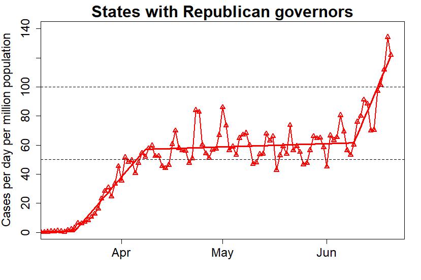
Of the 50 U.S. states, 24 have democratic governors — let’s call them “blue states” — and 26 “red states” have republican governors. The blue states have a considerably larger population, so let’s compare the case load of COVID-19 per capita (specifically, cases per day per million population). Democrat-governor states in blue, republican-governor states in red.


This blog is made possible by readers like you; join others by donating at My Wee Dragon.


Exactly! Nextly, they’ll export it back to us.
I love most of your posts, but there’s a minor but important flaw in this one. As you pointed out, the Democratic states tend to be more populated, with larger metropolitan centers. It’s the nature of any contagion that it will spread more quickly through more densely populated areas. As such, the earlier peak and then trough in Democrat governed states versus the slow burn then late rise in Republican governed states could ultimately simply be a reflection of how any contagion would have behaved, along with the face that the north east and west coasts represented the earliest main points of foreign entry, and therefore the logical starting points.
Of course, it should also be easier to contain a contagion and to prevent a second spike in a less densely populated areas, so the Republican states should have had an advantage in the long run (If they had taken proper, early action).
And we all know that Republican states have for the most part failed to learn the lessons the rest of the world suffered, thumbing their noses at the simple courses of action that would contain the virus. I think one of the saddest observations of human nature, and one that does not bode well for us ever properly addressing climate change, is that every single country, state and city has watched so many before them topple before this virus, and each seems to have thought “it won’t happen here,” until it does. Every single one.
I’m not saying you’re wrong, of course… just that it could be a case of drawing conclusions from a seeming but not necessarily valid correlation.
[Response: I compared rates of states with Democrat vs Republican governors by showing their graphs, but saying nothing at all about it. I didn’t draw any conclusions; the point is to let the reader see what’s obvious. Perhaps that was an “important flaw” — because you have come to some totally mistaken conclusions.
You actually said “the slow burn then late rise in Republican governed states could ultimately simply be a reflection of how any contagion would have behaved.” It’s hard to imagine where you would even get this idea; certainly not from any understanding epidemiology. THIS IS NOT HOW ANY CONTAGION WOULD BEHAVE. Period. You are deluding yourself, big time.]
I’m still trying to figure out the flaw?
The red states never did as well as the blue. However, looks like even the blue states may be getting lockdown fatigue with 6 rising data points in the most recent numbers, when there had previously never been more than 4 rising data points. I’ve no idea if this is significant but I guess even the best performing places (e.g. here in New Zealand) will eventually have rising cases as economies start to grind into action.
By the way, after several days of no increases in Sweden’s numbers, in the two main data sets (worldometers and Johns Hopkins), I eventually found this site which had updates: https://www.covid19insweden.com/en/
I also wonder if the recent six consecutive rising data points in the numbers for the blue states is at least partly a consequence of the rapidly rising incidence of COVID-19 cases in red states resulting in an increased flux of the virus from red states to blue states. That would depend, of course, on how much movement of people there is between red states and blue states in the USA, and since I live in Australia, I have no idea how much interstate movement of people there has been recently in the United States. For instance, has interstate travel been restricted in the USA like it has in Australia? For the sake of the people who live in blue states, I hope that the recent uptick in the number of cases in blue states is just a statistical blip which will soon reverse. Of course, there is little doubt that the (much larger) increase in the number of cases in the red states is due to the premature lifting of restrictions in those states, and unfortunately it almost inevitable that we are going to see a continued increase in the number if cases of, and fatalities due to, COVID-19 in those states. Of course, I have no say in anything that happens in the USA – as Trump supporters have told me online not so politely many times! I can only wish the people who live in red states the best of luck, because they’re definitely going to need it!
Tidbit from Okayama, Japan, a Prefecture with about 1.9 million people (same as Nebraska):
Nebraska– 2,600 cases and rising.
Okayama– 25 cases (all traced), none in past month.
Okayama City and Kurashiki are twin cities with a combined population of more than one million, and population density is greater than any Nebraska city.
All stores except supermarkets and home centers were shut down from mid-March until June 1, bars and restaurants closed, travel discouraged, masks, of course.
Of course, we were also lucky in that measures were begun at the national level before the virus could establish itself here, but the fact that Tokyo people are alarmed that reopening nightlife has resulted in daily counts of 30-50 cases out of a population of 14 million shows that the Japanese people are still taking the pandemic seriously.
“the slow burn then late rise ” === I think that commenter is referring to the urban/rural split, where big cities tend to have the most cases at first but eventually the contagion spreads to and blows up in the lower population density rural areas.
I can’t cite that at the moment, it’s something I recall reading as a truism about epidemics.
[Response: Very real, but the “two curves” — rural and urban — cannot possibly combine to show behavior like we’ve seen in FL and TX. A forthcoming post may shed some light.]
But wouldn’t it rise in the more rural areas of the blue states at the same rate as it’s spreading through the red states? Like the cases should also be rising in rural New York, rural Pennsylvania, etc. but it’s not. It can’t be how the virus behaves if it’s only behaving that way in some areas.
At least one state with a Republican governor, is really a blue state. I’m referring to Massachusetts. Looks like they flattened the curve pretty well, other than a brief spike at the end of May.
Charlie Baker is an old-fashioned Republican and has been keeping a very low profile with the current party. He used to be the CEO of Harvard Pilgrim (forget what it was called), the highest-rated health plan in the US. He’s intelligent and he is completely outnumbered in both houses of the legislature. He gets on with people and does his best. Though I disagree with some of his policies, he’s as good as it gets, and I respect him a great deal. I’m a Warren Democrat.
By the way, if Republicans ever come to their senses and he runs for president, watch out. He’s good at his job and plays well with others, including our deep blue working class Mayor, Marty Walsh.
I agree, Massachusetts is most definitely not a red state.
Maryland is also a blue state with a Republican governor. If you removed Maryland from the red state curve, you would have an even more striking trend.
The HF variability has to do with less reporting/analyzing on weekends?
The OP says “the blue states have a considerably larger population.” With no great knowledge of US politics, I calculated the split and found it to be 178m democrat, 150m Republican. So the difference is not so big.
Were it a significant difference, this ratio would perhaps be an issue as President T Rump excused holding his rally in Oklahoma, a state with now a four-fold increase in the infection rate, because that increase was a big percentage but applied to a very small number. (I would normally track down the actual words of a politician to be sure not to misrepresent them but, strangely for somebody occupying a senior political post, T Rump isn’t somebody who gives a tinkers cuss about what he says. The only thing he seems to remain consistent on is holding a grudge.)
Nationally across both Blue & Red, the second COVID wave is now become 20% the size of the first and without action has the potential to greatly exceed the first. As an observer from across the pond, I have not the first inkling to know whether there is the political will at state level in those Repblican states to tackle Trump’s Plague.
comparing apples and oranges for a number of reasons. Still interesting to look at. Nice work!
As some have suggested above, some states have split executive and legislature between parties. This can result in a Democratic governor calling for stricter measures, but a Republican legislature (or even judiciary) over-ruling the governor (or local regulations). In Pennsylvania, for example, Democratic governor Wolf was coerced to consider gun shops to be “essential” business, thereby allowing them to remain open.
Hi. I’d love to share this, but I know it will get picked apart. I’m not seeing an “about me,” so could you share your background & your methodology, please? Thank you!
Tamino is a professional statistician with a lot of experience analyzing time-series data. He has many publications in a range of fields. The methods are straightforward and sound. I have seen similar analyses from other sources. In one, they even took New York and New Jersey out of the blue-state analysis (they dominated early case loads). The blue-state vs. red state dichotomy persists.
So, does Tamino have a name other than Tamino? (I Googled Tamino and I found a Belgian-Egyptian singer.) Link to one of these publications, perhaps?
[Response: My name is Grant Foster. Try google scholar.]
Data sources, please. I’d like to believe, but there is not a single reference listed.
This is the internet, after all.
[Response: The data are from Johns Hopkins University. If you’re competent to do anything with it, do please check my work. It’ll be easy to confirm both the source, and the correctness of the graphs. Considering that Johns Hopkins’ data is the most referenced and most reputable on the subject … you might have done so already.
But — check yourself, maybe do some work, before commenting … who am I kidding? This is the internet, after all.]
Thanks for that, and I wasn’t being snarky intentionally. I’m a data junkie and big fan of such visualizations, but it’s always important to credit the source, both for actual credibility of the source and for proper follow-up by others. And I *will* look at the data, now that it’s convenient to do so. Moreover, thank you for the incredible visualization. (Confirms so much what I suspected.)
[Response: Mea culpa. I get a lot of trolls. This is too important. People are dying. We’re running out of time. I’m running out of patience.]
we are out of time, zero patience left for me at times. A bit of ptsd for me from growing up in the south where it was always open season on blacks and their white allies. So here I am now in the PNW with this stuff going on: http://www.chronline.com/snaza-says-dont-be-a-sheep-on-mask-mandate/video_57cdca80-b647-11ea-9619-6b7537377c94.html
I live in a red county in a blue state. Count the guns and the masks in the video if you want
I hear you; Lewis County is the reddest county west of the Cascades. Really bad. As with Oregon, if it wasn’t for the one urban blob, the state as a whole would be purple if not outright red.
Oh I get it. I’m now stuck in one of the worst of the red states (Texas), and even being in the bluest oasis (Austin) can’t save us from our governor and his terrible choices. (Or the idiots that support him.) All I can do is try to make sure the data is valid, simple, and documented, and then *attempt* to teach these morons how to look at a chart or do fifth-grade level math, which they obviously can’t do.
This is fantastic! As a citizen of Massachusetts, I would love to see you rerun the analysis treating Massachusetts and Maryland as Blue States as mentioned by previous commenters. I’m sure the results would be even more dramatic, as both have had case rates trending strongly downward of late. Also, it might be interesting to compare case rates against election results from the 2016 presidential election. Not sure if it would be stronger or weaker, but it seems likely that the correlation would still persist in some measurable way.
In Maine, where I live, we have had very small numbers in the state over all, the most being confined to the southern border counties. However there is the yearly influx of summer people from all the red states Florida especially and they are starting to swarm in and open their summer homes. I fear Maine will see a surge by mid July since these people on a non plague year are all in your face and demanding services.
Please cite your source for the covid in red and blue states graphs. Thanks!
[Response: I made the graphs myself. The data is from Johns Hopkins.]
Vermont has a Republican Governor and we are about the bluest lefty state in the country. Way more blue/left than Mass which also has a Republican Governor.
Agree. My point is that if not for a few Blue states skewing the numbers, the Red-Blue contrast would be even more extreme.
I went ahead and did a similar analysis to test the robustness of these results. I changed several variables: I used COVID-19 data from NYT instead of JHU, 2016 election results instead of governors, counties instead of states, and raw # cases instead of per-capita.
Even with all these differences, the trends seen in your analysis are still clearly visible.
https://twitter.com/biiigdata/status/1276679357914898432
[Response: Well done.]
I have been following COVID-19 since December 2019. Posting Data and Analysis everyday. My Posts are driven from the DATA also. This graph is a fairly accurate representation of the Data I have verified as being accurate and made conclusions from. My research data comes from multiple sources from local data, hospitals, city, county, state, National, CDC, John Hopkins, WHO and also Data from outside the United States in forming conclusions and presenting as accurate of information on America’s situation as possible in this pandemic. My last posting for all American States was on June 24th. At that time the data reflected that more states with Republican governors had greater increases in COVID-19 infections than Democratic states. My data over the previous 14 days to my June 24th posting reflected the following states were highly probable to show a swing in higher Covid-19 infections: PA, TX, FL, NC, AZ, WA, AL, MS, SC, UT, AR, NV, OK, OR, WY. My data also reflected the following states had a moderate probability to have higher COVID-19 infections: CA, GA, TN, MO, KY, NM, ID, ND, WV, HI, AK, MT. At that time five states had maintained an overall low COVID-19 Infection rate of 2% or less which were VT, HI, AK, MT and WV. The states leadership in party affiliation is pretty well balanced with 25 Democratic and 26 Republicans. The data had Democratic Governor states doing better in slowing the spread and reducing COVID-19 numbers at approximately a 2 to 1 ratio compared to states with Republican Governors. It should also be noted that WV Republican Governor implemented restrictions, shut downs and controls on the states population before the state identified it’s first COVID-19 case. A great move on Governor Justice’s part which shows in the COVID-19 data. The conclusion from my data has American leadership of our nation performing worse than over 203 other nations and territories in handling COVID-19. This means there is less than 13 other Territories and Nations world wide who is performing more poorly than the United States in COVID-19 Infections and COVID-19 Deaths. The DATA does not lie but our politicians do.
This article has been shared in my FB feed and I’m interested in where you’re data is coming from and who you are. I haven’t been here before and can’t find any about info. Your post satisfies my own biases but I need more.
[Response: As has been mentioned in previous responses, the data are from Johns Hopkins. I’m Grant Foster.]
By this chart, from March to mid May I should vote red. Only 1 month you said I should vote blue, does that make sense?
[Response: No.]
Hint: how long are gubernatorial terms of office?
The heading on the blue graph should say “States with Democratic Governors”, instead of using the GOP promoted epithet.
https://en.m.wikipedia.org/wiki/Democrat_Party_(epithet)
Dave, how long did you have to work on coming up with an interpretation that stupid? Did you need help, or are you a natural talent.
Sorry, Dave. This was directed at Mark.
I hope you don’t mind a nit about the title of the blue graph–it should be “Democratic governors,” not “Democrat governors.” This isn’t a grammar Nazi thing. The use of “Democrat” for “Democratic” is an epithet–a slur.
https://en.wikipedia.org/wiki/Democrat_Party_(epithet)
I would like to see these graphs updated. Maybe weekly?
Other data like this from John Hopkins University are not so noisy. Makes me distrust this data. I am tempted to download the data to show these plots are false.
[Response: If you were able to, you probably would have done so already. You would have to do some work — but other than arithmetic you don’t need any math. Then you could announce your findings.
Instead, you declare your mistrust and threaten to expose it as false, despite the fact that you your only “evidence” is … nothing.
Just a wild guess: you’re a Trump sucker?]
Rene Clabaugh, You clearly have not even looked at the COVID data from JHU or anywhere else if you claim they are not noisy. Maybe you’d find a more receptive audience for your “alternative facts” somewhere with a less numerate audience.
By the way, Rene, it’s Johns Hopkins, not John Hopkins. I tend to think that people who get this wrong (and there are a lot of them) are people who are not seeking to understand.
Dear “Response:” Your bile is showing. You don’t have the courage to post as yourself. I do have a chart, but cannot post it here.
[edit]
[Response: I’ve always posted under the name “Tamino” (the hero of the opera “Magic Flute”) because I’m a fan of Mozart. I’ve never made any secret of my real name. But when trolls come here and get pwned, they often fall back on calling me a coward because I post under a pseudonym. Like you, they resort to ad hominem when they have no evidence.
As for the rest of your comment: there’s a minimum intelligence requirement for comments on this blog. You didn’t make the cut.]
More useful than infection rates is comparing the death rates, as some partisan governors have forbidden or demonized successful Raoult/Zelenko protocols while forcing nursing homes to accept the infected leading to many of the deaths in the USA. There is a very measurable blue/red risk. https://docs.google.com/spreadsheets/d/1vZx4RJ2MitKkpEu-RWb_OSHHnw9T9fQwuJVeIas7K5A/edit?usp=sharing
[Response: The drawback to mortality (vs case) data is the time between detection and death, which delays detecting trend changes. Also, the much smaller numbers come with much larger noise-to-signal ratio.]
“The drawback to mortality (vs case) data is the time between detection and death, which delays detecting trend changes. Also, the much smaller numbers come with much larger noise-to-signal ratio.”
yes, it slows detection but you mention signal to noise and I think there is no better demonstration of signal to noise than infection rate to mortality. Deaths related to covid infection appear to be irreversible. That’s the ultimate signal. Redstaters may only respond to an ultimate signal. As one of them famously said “bring it on.”
Except that it appears to be easier to lie about / understate deaths. See global evidence. Use a little common sense. Follow the news. Cheating is rampant, and for some reason the cheaters are less willing or able to interfere with case numbers than death stats. See Florida and Russia, etc. etc.
SA says “Except that it appears to be easier to lie about / understate deaths. See global evidence.”
Links please? I am not sure what you are referring to. I think it is possible to lie and understate any of the Covid measures. I have been inclined to think that deaths are the best signal. By deaths, I mean excess death numbers processed in an ethical and rigorous manner. Excess deaths in general population is complicated by fall in deaths related to less travel, by death fluctuations related to deferred medical care, etc. But, until we have large number testing of the population, I still think deaths is the best signal to track.
As treatments are developed and maybe improved, as vaccines are tried and maybe work, I expect we would see deaths fall. What is a better measure of our success at working on the pandemic than falling death rates?
Infection level within a population, R naught numbers, etc are all over the place depending on quarantine approach. Death numbers seem like the gold standard to me, but I am starting to think about long term disability post infection as another important measure. Much of that goes away if/when an effective vaccine is widely available. At that point, we might be able to go back to “normal” and resume worrying/planning/acting about the really big crisis of global warming. No vaccine is coming for that one, although I have one friend who thinks benevolent aliens may drop from the sky and fix that for us. I worry that benevolent aliens may be our best hope on global warming.
When you say , “follow the news”, I prefer to follow the data and the math from every angle. Yes, a few C19 deaths go unreported, many are also classed as C19 without being tested or confirmed. The big picture is available in “excess mortality” or “all cause mortality”. It paints a clearer picture by locations. https://ourworldindata.org/excess-mortality-covid
128K mortality is plenty to get beyond noise, but yes, let’s keep following the stats developing. I wish I had data by county level, as people like Zelenko drive down mortality in NY, and blue counties in red states are responsible for almost all red state mortality. Massachusetts is a blue state with a red governor making red states look worse on mortality. Vice versa for Montana. With proper treatments well known including proper dosages (vs. WHO stating in 1979 the potentially lethal dose of HCQ was 1500-2000 mg then attempted a study at 2400 mg in one day, that was designed to both fail and kill.) Lots of treatment data aggregated at c19study.com
[Response: Isn’t it curious how often someone who says “I wish I had county-level data” then proceeds to lecture us on what’s happening at the county level? Is it for the same reason that if we talk about *daily* mortality numbers being small, they point to *total* mortality numbers being big?]
“By deaths, I mean excess death numbers processed in an ethical and rigorous manner.”
And there’s the rub, sbm. If, on the one hand, the processing of whatever data were uniformly being done in such a way, we wouldn’t be concerned about manipulation. On the other, if the caseload data, is being manipulated, then what’s to ensure that excess mortality data won’t be fudged, too?
I’ve been doing a Covid report every day for a couple of months now, and I have to say, the data quality is not good. There have been many inconsistencies, including (perhaps most dramatically) negative numbers of deaths reported. Presumably that was a ‘corrective report’, but obviously it’s a very ugly ‘patch’ which should have been done instead as part of a more far-reaching retrospective adjustment. One imagines there is quite a lot of strain on underfunded bureaucracies whose data throughput has expanded drastically.
But IMO we really need to be responding with the least possible delay, which means we can’t afford to wait weeks for better quality data. I think Tamino’s argument above is correct. Excess mortality studies conducted by independent researchers with the time to audit and analyze in detail will probably be great to improve our understanding ex post facto, but quick if a bit dirty is urgently needed for ‘situational awareness.’
All true, Doc. Also, I have no particular beef with using the quickly available data, but really… don’t we already know what we need to do? We need to
expand testing, fund research for treatments and vaccines, limit indoor activities, wear masks, wash our hands, reduce our movement and contacts to slow the infection rate by keeping our exposure numbers low.
Anyone with good sense can sort these things out, but red state idiots have made covid part of the culture wars and there is no fix for that. We can call it out, or ignore it, or vote with our feet to live in sensible blue communities, but we can’t fix it.
It’s a minor point, but SA said above that death numbers were easier to understate or lie about deaths. I think it’s easy to understate or lie about any of the numbers. I don’t think the death number are easier to skew than the rest.
No worries. Stay safe, be smart, as I trust most of us here will be be and do. Let the redstaters march off the cliff with their stupidity and bravado. We cannot stop them from doing that. They put themselves at risk primarily, but they put us all at risk in the ripple effects of a pandemic. I don’t think we have a fix for that. In that way, it is quite similar to global warming. You really can’t reason successfully with someone who entertains the idea that these problems are hoaxes. These folks are armed and dangerous as well as stupid. I think we can only stand by and let them take it on the chin. That is happening in many red states right now. Republicans (Pence) are now saying we need to wear masks. Late to the party, but welcome to the real world. The trumpsters need to incur more death and disaster before they can read the handwriting on the wall. Step out of their way, they need to march up to the edge of the cliff, you can’t stop them, get out of their way and wish them well on their journey. Death, the ultimate individual signal of misunderstanding and miscalculation, awaits some of these folks.
“…blue counties in red states are responsible for almost all red state mortality.”
Certainly not true in South Carolina, where I live, and especially not adjusted for population. And I very much doubt we are ‘special’ in that regard.
As a quick and dirty ‘sanity check’, I took the 15 SC counties–of 46 total–that went for Hillary in ’16, as listed here:
https://www.politico.com/2016-election/results/map/president/south-carolina/
I then totaled their county death tolls as reported by DHEC, here:
https://www.scdhec.gov/infectious-diseases/viruses/coronavirus-disease-2019-covid-19/sc-testing-data-projections-covid-19
Turns out that those 15 counties have lost 264 people to Covid, from a statewide death toll of 712. It’s probably a bit higher than strictly proportionate–you’d have to look at populations to really know that–but nowhere even close to being a majority, let alone “almost all.”
The racial divide here looms large in this data, because there are strong associations among voting preference, race, and economic status. And not least in the SC ‘black belt’. The six leading SC counties for Covid incidence per capita are:
Lee: 1,681.72 (cases per 100k); 22 dead; 63.4% African American; $23,378 median household income (2010 census)
Williamsburg: 1,261.20; 15; 65.8%; $24,191
Fairfield: 1,252.96; 21; 59.1%; $32,022
Clarendon: 1,206.10; 42 (!); 50.1%; $33,066
Marlboro: 1,140.98; 4; 50.9%; $27,688
Saluda: 991.55; 1; 26.3%; $40,508
One of these cases is not like the others in three respects: Saluda is richer, whiter, and went for Trump. But they all do have one thing beyond high incidences of Covid–they are all small, rural counties:
Lee: 17,606 (42nd in state)
Williamsburg: 31,794 (30th)
Fairfield: 22,712 (38th)
Clarendon: 34,017 (28th)
Marlboro: 27,113 (35th)
Saluda: 20,299 (40th)
Thus far, you might think that the ‘blue counties’ ought to account for most of the Covid mortality. But the 10th leading county in per capita incidence is also the state’s most populous county, at 498,402 (2010 data, once again), and went for Trump over Clinton by a ~25-point margin:
Greenville: 904.03 cases per 100k; 80 dead; 18.1% African-American; $46,830 median household income.
That’s as much mortality, basically, as the six poor counties I listed above.
Continuing this line of thought in slimmed-down fashion, the next most-populous counties, their 2016 choice, and their death tolls so far are, in order:
Richland: (Clinton); 81 dead
Charleston: (Clinton); 23
Horry: (Trump); 44
Spartanburg: (Trump); 44
Lexington: (Trump); 48
As you can see, mortality is roughly even between the 2 Clinton counties and the 3 Trump ones.
One could go on, but the basic picture is clear: there are confounding variables that skew the mortality toward ‘blue counties’, but also very salient examples showing that you don’t by any means have to be a poor, rural, African-American to die of Covid. Fundamentally, the virus doesn’t respect person or position.
However, there is some local reportage suggesting Tamino’s analysis is on the right track, and that policy and public compliance are becoming more important for public health outcomes during this time:
https://www.greenvilleonline.com/story/news/local/south-carolina/2020/06/03/coronavirus-increase-greenville-sc-partly-blamed-poor-social-distancing/3128401001/
Perhaps it is worth noting that most of Richland County, which includes the state capital, Columbia, is under the new mandatory masking ordinance there–though I don’t think that explains the differential above, as there has been insufficient time since its introduction. But Columbia may have been better at social distancing; my observations do show a lot of people taking masks and other measures seriously. (Though still not as many people as I would like.)
smb: “…don’t we already know what we need to do? We need to
expand testing, fund research for treatments and vaccines, limit indoor activities, wear masks, wash our hands, reduce our movement and contacts to slow the infection rate by keeping our exposure numbers low. ”
Yeah, that’s maybe what burns me the worst. It absolutely did not have to be this way.
I have twice submitted the same response to smallbluemike using my technique for actually getting through, and they’ve both disappeared. I’m not going to try again, since I think my points should be obvious. But here’s an effort to let him know I tried. If they are duplicates, I hope Tamino will delete one of them.
Where did you get the numbers of people infected? Would like to use your graphs.
Thanks
[Response: See the update. The graph indicates the data source.]
Could you post your data source so I can share?
Sorry, comments suddenly appeared when I posted one.
Interesting but only part of the picture, did you look at hospitalizations and wealth per capita? Also would be good to weigh economic cost?