
“Everybody complains about the weather, but nobody does anything about it.”
That now-famous saying is often attributed to Mark Twain, but in reality he only popularized it when, in a public lecture, he quoted its originator: his friend and sometime co-author Charles Dudley Warner.
These days there seems to be as much talk about climate as there is of weather, yet we have actually been doing something about it — unwittingly — for quite some time now. One cannot venture out of doors without at least some inkling of what the weather is doing, but few are aware of what state our climate is in, how it has changed, or even the proper statement of what climate is. It is to remedy that situation that we present, for your edification, this brief summary of the state of the climate regarding Earth’s temperature.
To begin our tale with the beginning of our tale, we offer this definition:
Climate is the mean and variation of weather over long periods of time (usually, at least 30 years).
Most of us already knew about the mean part, that climate is some sort of “average weather.” But just as important is the variation; if, for instance, two areas have the same mean temperature but one tends to fluctuate wildly between hot and cold while the other always keeps the thermometer at a steady reading, they have very different climates. To elaborate further, we add this:
Weather is the state of the atmosphere at a given time, especially regarding temperature, pressure, humidity, precipitation, and storminess.
Climate is therefore the mean and variation of all the quantities which characterize weather.
TEMPERATURE
Man-made climate change is often referred to as “global warming,” which underscores that not only is temperature an important part of climate, it’s one of the most prominent aspects of climate change. Although there’s much much more to weather than temperature, and much much more to climate change than warming, the most obvious answer to the question “what’s up?” with the climate is: temperature.
Mankind has recorded temperature in a few places almost since the invention of the thermometer in the 1600s, but only for about the last century and a half have we had enough thermometers over enough of the world to estimate global average temperature.
For the purpose of studying climate change, we’re most interested in how the average has changed and fortunately, the change can be measured more precisely than the average itself (just as we know with far more precision how sea level has changed, than how deep the ocean is). We also want to know how temperature changes apart from the march of the seasons; it’s surely hotter in summer than in winter, but is this summer hotter than summer typically? Therefore climate scientists focus on temperature anomaly: the difference between temperature at a given time, and what is usual (or at least, what was usual) for that time of year.
Here’s the global average temperature anomaly for each month from January 1880 through May 2016, according to data from NASA:

Here’s the same data from 1970 to now, a period during which Earth has warmed steadily:

The red line is the trend. That’s extremely important because it helps us understand what to expect.
It’s obvious from looking at the graph that temperature fluctuates — a lot, and in mainly unpredictable fashion. But there’s more going on than just the fluctuations, the “random noise” that makes up regular temperature variation; there’s also a trend. On the planet we call Earth, that trend lately has been steadily upward. The fluctuations have most decidedly not been steady! Nor can we expect them to be, ever. But we have every reason to believe — from theory, from computer simulations, and from observations — that the trend will continue. Upward.
The fluctuations represent weather change, change that is part of the climate itself (the “and variation” part), not climate change. Fluctuations are the constantly changing face of weather, and we expect those fluctuations to occur. All of which reinforces the old adage that “climate is what we expect, weather is what we actually get.”
But the trend indicates a change in the mean, of what we expect, which is indeed a change of the climate, not just weather. Hence we see the most obvious, and most talked-about, aspect of climate change: that the mean temperature of the Earth as a whole is going up.
The rise is a even clearer if we reduce the noise level by calculating the average over each year:

The temperature-so-far this year (circled in red) is far above what has been observed previously. But this year isn’t over yet; when all is said and done, its average is likely to be less than that extreme value but still the hottest year on record.
Part of its extremity is due to the phenomenon called the el Niño southern oscillation. During its el Niño phase heat migrates from oceans to atmosphere, making our weather a bit warmer overall. When it enters the opposite la Niña phase, as it may well do now that the el Niño is drawing to a close, heat migrates from atmosphere to oceans which makes our weather a bit cooler.
But it’s not the el Niño which made 2015 a record-hot year and is likely to make 2016 break that record. There have been el Niño episodes many times before but this one is hotter than all the previous, and what made it so is the upward climb of temperature which is evident as the rising trend. The trend is because of us.
The world has already warmed 1°C (1.8°F) above what it was before the industrial revolution, usually called “pre-industrial.” The prevailing view is that warming by 2°C above pre-industrial will bring dangerous climate change, although lately many are coming to believe that even 1.5°C above pre-industrial is dangerous. The 1°C we’ve already seen is trouble, in the form of more and more severe heat waves and wildfires, changing patterns of flood and drought, and coastal flooding from sea level rise — but 1.5°C or 2°C is the danger zone. Beyond 2°C is worse yet; many would warn that it brings disaster.
NASA isn’t the only organization that tracks global temperature. There’s also the National Oceanic and Atmospheric Administration (NOAA), the Hadley Centre/Climate Research Unit in the U.K., a modified form from the Univ. of York in the U.K., independent data from a team organized by researchers from Berkeley Univ. in California, and the Japan Meteorological Agency, just to name the best-known. It would be redundant to show you data from all these organizations, because they all tell the same story: lots of fluctuation, record hottest recently, and most important: the trend is going up.
UNEVEN WARMING
Undeniably the planet has warmed, but not by the same amount everywhere. This map (courtesy NASA) shows how much the 2010-2015 average temperature warmed (or cooled) relative to the 1951-1980 average, for various regions of the world:

Overall, the Arctic has warmed more than any other large region of the planet. This is just what was expected; both theory and computer simulations predicted it more than 30 years ago.
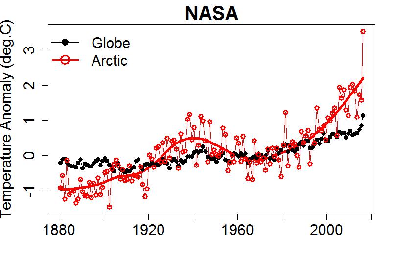
While the globe as a whole has shown an increase of about 1°C (1.8°F), Arctic temperature has risen by 3°C (5.4°F). Once again, the year-so-far 2016 is astoundingly hotter than any previous, but just as with global temperature we expect by year’s end that the Arctic average won’t be quite so extreme, but still a record-breaker.
Although only a few places have cooled relative to the 1951-1980 baseline period, one of those is an area of the Atlantic ocean south of Greenland.

Why would this region cool, in a warming world? It seems related to the fact that Greenland itself has gotten so hot that much of the ice sheet has been melting. The meltwater flows into the ocean, and it’s fresh rather than salty water, so it floats on top rather than sinking to the bottom and helping to drive ocean circulation. This has altered ocean circulation patterns, and some of the heat which ocean currents transported from equatorial regions to the north Atlantic isn’t going that way as it used to. Result: that part of the Atlantic ocean has cooled.
Another big contributor to uneven warming is the difference between land areas and oceans. This is easiest to show using data from NOAA:
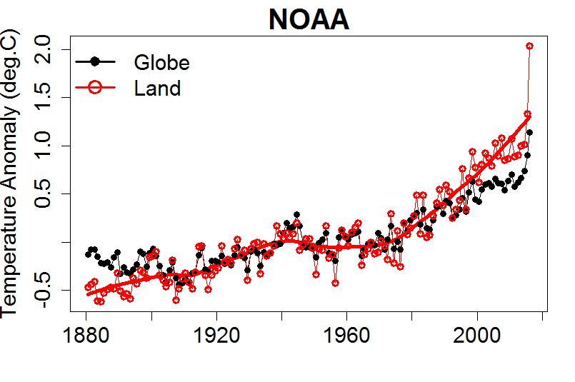
While the whole Earth has warmed about 1°C (1.8°F) since pre-industrial times, the land areas alone have warmed around 1.8°C (3.3°F). This difference is even easier to understand; the oceans have huge thermal inertia, so it takes a tremendous amount of energy to heat them up. As a result they warm more sluggishly, and Earth’s land areas have warmed faster than the global average.
The lesson is that global warming is far more complicated than “every place warms at the same pace.” But overall, averaged over the entire Earth, we’ve definitely gotten hotter.
EFFECTS OF WARMING
What does climate warming do to the planet? One of the most obvious impacts is that much of Earth’s usually ice-covered regions are melting. This includes land-based ice (glaciers and ice sheets) as well as sea ice which covers parts of the Arctic and Antarctic near the poles. But again the real world is a bit more complicated.
The amount of sea ice in the Arctic has dwindled rapidly over the last several decades (monthly averages from the National Snow and Ice Data Center, NSIDC):

The decline is evident, but so too is the annual cycle, with more ice in winter and less in summer. Once more, anomaly to the rescue! We can simply compute the difference between each month’s value, and the long-term average for the given month, yielding this:

Just since 1979 (when satellites began measurements), we’ve lost about 1.77 million km^2 of Arctic sea ice — an area larger than the state of Alaska.
But the Antarctic tells a different story. The sea ice around Antarctica has actually increased, although not as much as it has decreased in the Arctic.

The two poles are dramatically different. The north pole is an ocean surrounded by the world’s greatest land masses, North America, Europe, and Asia; the ice at the very top of the world is sea ice, and has been disappearing rapidly. The south pole is a continent surrounded by ocean; the ice at the bottom of the world is in its land-based ice sheets, the biggest reservoir of frozen water in the world.
Melting of those southern ice sheets may be one of the reasons for the uptick in southern sea ice. The newly released water is fresh rather than salty, and when it reaches the ocean fresh water freezes more easily than salty. Besides that, climate change has altered patterns of air circulation around Antarctica, which may also have contributed to the changes in its sea ice extent.
It’s another illustration of the fact that things are not always so simple and obvious in a warming world. But when it comes to the world’s ice, the melting is outpacing the freezing by a huge margin. This is not just true of the Arctic sea ice, but of the great ice sheets in Greenland and Antarctica, and the vast majority of the world’s glaciers. All told, changes to the cryosphere — the frozen parts of Earth — are some of the most drastic and unambiguous impacts of planetary heating.
Yet another rising trend is of the height of the ocean itself: sea level. The melting of land-based ice puts more water in the oceans, and heating the oceans causes thermal expansion of seawater; both effects have caused the sea to rise. Here’s sea level since 1880, based on measurements by tide gauges around the world (data from leading sea level researchers John Church & Neil White):

In a now-familiar story, you can see fluctuations but there’s also a trend. Upward.
Note that the trend doesn’t follow a straight line. Sea level has risen sometimes faster, sometimes slower, but it’s faster now, and in fact is faster than it has been for at least 2500 years (perhaps a lot longer). Since 1993 we’ve been measuring the height of the sea surface with satellites, which tell this story:

Fluctuations. Trend. Upward.
The effect of sea level rise is already being felt. Coastal cities are now prone to flooding, not just because of storms and torrential rainfall, but simply because of a very high tide. Miami has already spent hundreds of millions of dollars trying to combat it. They’re also threatened by seawater intruding into groundwater supplies, making them unfit for drinking and agriculture. And it’s not just Miami, flooding has increased all up and down the U.S. east coast, from Maine to Florida and beyond.
What’s more, when storms and torrential rainfall do happen, sea level rise makes the flooding at coastal regions worse. A lot worse. The folks who live near the coast in New York, New Jersey, New Orleans, know what I mean.
Many other changes have been seen. Species are migrating to higher latitudes and elevations because areas that used to be the right temperature for them, are no longer. Plants are blooming earlier than before. Some places have become more prone to severe drought, while others are more prone to severe flooding. The list goes on and on; the changes shown include many of the most important, but really only represent the “tip of the iceberg.”
In case you’re wondering why all these changes are taking place, there are many reasons. But the most important, by far, is the fact that we’re adding greenhouse gases to the atmosphere. The one we’re having the biggest impact on is carbon dioxide (CO2). Here’s the concentration of CO2 in our atmosphere, in “parts per million by volume” (ppmv), measured at the atmospheric observatory at Mauna Loa in Hawaii:

There are fluctuations, which are dominated by a seasonal cycle. But again, there’s also a trend. This particular trend isn’t following a straight line; the rate at which CO2 is increasing has been getting faster and faster.
The world is finally recognizing the need to reduce our emissions of CO2 (and other greenhouse gases). But so far, its atmospheric concentration continues to rise at an ever-increasing pace. If we don’t stop burning fossil fuels at the rate we’re going, we’ll be destined to pass that 2°C threshold which is believed to be the “critical limit” for dangerous climate change. If we don’t stop soon, how much danger we’ll face from going far beyond the 2°C limit is something we really don’t want to find out.
This blog is made possible by readers like you; join others by donating at Peaseblossom’s Closet.


very well organized article, it will be very useful to communicators, and to those beginning to study climate change.
[Response: Thanks, that’s what I wrote it for.]
Reblogged this on Don't look now and commented:
#oldBBC won’t “Inform and Educate” properly on global warming. We need #newBBC that will.
A compelling summary.
Reblogged this on mt's Science Blog.
Good stuff. Just a question about the warming since pre-industrial. I’ve seen a couple of articles, since late last year (by Michael Mann, I think) that calculated the earth’s surface had warmed about 1.2C, not 1.0C, since pre-industrial. We hit 1.5C in the first three months of this year, though that didn’t last.
So is it about 1C or about 1.2C of warming, above pre-industrial, so far?
[Response: Of course that depends on what and *when* “pre-industrial” was. Mann uses some paleo estimates to get a lower figure for around 1750 than for the 1850-1900 range I usually use, so he sees more warming since pre-industrial (and seems to me to be right about that). But the ~1750 temperature is less precise, so I tend to use the “very early instrumental” record. Also, of course I compare smoothed values to get the *trend* rise apart from short-term fluctuations. All told, I think 1C is a safe figure to quote (maybe even conservative) so that’s what I tend to use.]
The respectable folk at IPCC used conservative calculations. Now AGW impacts are larger and sooner than they expected, and we are not ready.
For the last few weeks India has had a heat wave where temperatures reached 51C. And, even in the US yesterday some jets that could not land at some airports because it was too hot.
We talk about the hundreds that die in heat waves, but our infrastructure is not designed for the coming heat of AGW, and we will have real problems. For example, CPUs do not like it hot, and everything from power grids to water systems are controlled by CPUs. A serious heat wave, over an extended region could destroy many control systems, for which replacement parts are not readily available.
I am not pointing fingers, I am saying that as a society, we are not ready for the AGW that is already here.
Well, one jet, anyway:
http://www.kitv.com/story/32271388/plane-turns-around-because-weather-was-too-hot
And on the Indian situation, a fairly appalling story (from an Australian perspective, and from late last month):
http://www.news.com.au/technology/environment/climate-change/welcome-to-india-a-country-gripped-by-51c-heatwave/news-story/04d0ded07b8f6303280efc75a8163103
Prime Minister Modi’s rhetoric pointing the finger at developed nations is an interesting aspect, as well.
> the rate at which CO2 is increasing has been getting faster and faster.
Tamino, can you show the folks how you reach that conclusion?
I’ve been waiting for you to post on this, so I can cite your conclusion as the way to test rather than rely on eyeballing.
You wrote two months ago
“… the possibility of faster rise since about 2010, but I don’t have a lot of confidence in that conclusion. I do, however, have a lot of confidence in the conclusion that the rate of CO2 growth has not decreased.”
I know this is something most of us expected to see happen.
Far as I can make out Tamino has said that there is acceleration over the long term, but that this is less statistically certain if you consider only the last 6 years.
PS, between April and this most recent topic, there was also this one
“In 1960 CO2 was only going up by less than 1 ppm/year, but now it’s increasing by more than 2 ppm/year. And, alas, it shows no sign of slowing down — just going faster and faster.”
PPS, this is second-hand and I haven’t found the original, but noteworthy:
________________
“… National Post – (Latest Edition)
24 Jun 2016
LAWRENCE SOLOMON
This week, France’s national observation service, its Climate and Environment Sciences Laboratory, announced a new milestone: Carbon dioxide concentrations of 400 parts per million ( ppm) recorded at its research station on remote Amsterdam Island in the Indian Ocean. Because this island — far from any man-made sources of CO2 — is believed to have the world’s lowest CO2 levels, scientists conclude that the atmosphere of the entire planet now exceeds this landmark level.
Moreover, the French service says, CO2 levels in recent years have been increasing by more than 2 ppm per year, an accelerating rate. …”
———-
That’s found at a site called “pressreader.com”
Thanks, Hank. That’s an interesting find. The original is here, in French:
http://www.lsce.ipsl.fr/en/Phocea/Vie_des_labos/Fait_marquant/index.php?id_news=2541
There are two additional bits that I glean from this:
1) The seasonal cycle at New Amsterdam is unusually weak–less than 1 ppm.
2) “Le taux de CO2 atmosphérique est mesuré depuis 35 ans sans discontinuer à l’Île Amsterdam. Il est passé de 339 à 400 ppm et cette hausse s’accélère depuis quatre ans.”
Which means:
“The atmospheric CO2 burden has been measured continuously for 35 years at Amsterdam Island. It has increased from 339 to 400 ppm, and this rise has accelerated in the last four years.”
Lawrence Solomon, a notorious AGW denier, actually cited that?
Yes, he indeed did…
It’s published here, too: http://business.financialpost.com/fp-comment/lawrence-solomon-hooray-theres-reason-to-celebrate-that-co2-levels-are-still-rising
and as the title indicates, Solomon is celebrating the rise in CO2.
I believe part of the heat surge we are seeing this year will track back to reduction of aerosols associated with burning coal. The transition from relatively high carbon emission fuels to lower carbon emission power generation is essential, but global temps will rebound and rise to the extent the temp has been damped by aerosols associated with higher CO2 emission fuels, specifically coal.
http://www.nature.com/nclimate/journal/vaop/ncurrent/full/nclimate3058.html
seems like we painted ourselves into a corner to some extent.
Interesting abstract, mike. Thanks.
Thank you for the cite and translation, Doc.
So I think much of the confusion about whether the rate of change is increasing (and how) arises because comments refer to different time spans — “last four years” or “recent years’ or “about 2010” or “1960”
How many data points do we need? I guess first we need to know if and how much the variation year to year is changing — and subtract the bumps explainable by El Nino.
This “rate of change is increasing” thing is like arctic summer sea ice, everyone knows it’s changing, everyone can see where it’s going, but the signal may or may not have emerged from whichever data set is being referred to (sigh).
the use of a small or artfully selected set of data points is a favorite tactic of folks who want to misrepresent what a complete set of data points shows. My suggestion is to do as others have done with this question and use the complete NOAA decadal set of data points as a jumping off point. Once you have exhausted your review and analysis of the complete set of data points, you can start using smaller sets of data points if you want to study the potential impact of certain events – like a volcanic eruption, or the transition from coal to wind and solar in China, etc. El Nino is a normal cycle event and probably good for a 1 to 1.5 ppm and easy to factor/smooth into the work with the longest data set available.
Or, everyone complains about plate tectonics, but nobody does anything about it.
Well, we’ve certainly been ‘doing something’ about temperature, haven’t we?
> … plate tectonics, but nobody does anything about it
Oh, I dunno. Visualize feeding a gross quantity of plastics into the subduction trenches over a geologically brief interval. Once that hits the slidey parts, is it going to glue them? lubricate them? Hilarity may ensue.
What i found most interesting (because a new bit of information for me) is the difference between sea and land temperature of about 0.8 K.
I am often thinking about how to explain the higher probability and severety of droughts to expect, given the fact, that higher temperatures mean a faster turnover of water in the evaporation – precipitation cycle and thus in general more precipitation.
Now knowing, that warming concentrates on the land mass, it seems plausible to me, that the percentage of precipitation over sea area is growing, and that over land area shrinking – maybe even fast enough to cancel out the increasing overall precipitation.
I would really appreciate any educated comments or knowledge on this…
Drought is complicated.
First, there are generally considered to be four general types of drought: meteorological, agricultural, hydrological and socioeconomic. They are explained here:
http://drought.unl.edu/DroughtBasics/TypesofDrought.aspx
All four types are defined differently, not only from each other, but in different regions and climates.
Second, the pattern of precipitation under warming is not expected to be uniform. (Apologies if you already are aware of this.) For example, in the US, a warmer future climate is expected to produce less precipitation in the Southwest, but more in the Northwest and Northeast. See, for example, Figure 2A here:
https://www.wunderground.com/EarthWeek/2013/increased_risk_of_drought_under_global_warming
Third, it isn’t only precipitation that is important. It’s also soil moisture, which is strongly affected by wind and temperature. See, for example, the flow chart in the first link (“Types of Drought.”) Obviously, in a warming world, temperatures will generally be increasing, which means that generally, so will evaporation. That means more drying of soils, and more drought. It’s not unusual for researchers to calculate ‘precipitation minus evaporation’–indeed, that’s a parameter in some drought indices, such as PDSI.\
Hope that’s helpful.
http://www.carbonbrief.org/bp-global-coal-use-fell-by-largest-recorded-margin-in-2015#
a few questions come to mind:
Can we replace the global cooling of coalburning aerosols with aerosols from forest fires?
What are the implications of relying on forest fires for global cooling aerosols?
http://www.climatecentral.org/news/western-wildfires-climate-change-20475
Do we really need a weatherman to know which way the wind blows?
Warm regards
Mike
Geoengineering is a risky business. (Kinda how we got here in the first place, unwittingly for a long time).
Trees are a carbon sink. Less tree more carbon. And eventually you’d have to stop burning them, so the warming effect is delayed temporarily at best.
Not an option for a number of reasons.
Recent studies indicating a slight greening of the planet from CO2 fertilization are a bit more hopeful, but not nearly enough added sink to offset AGW. Add to the mix more wildfires, per your link, and limits on how much greening can happen and the uncertainties on offer point back to curtailing the current, unplanned geoengineering experiment rather than try another to circumvent it.
My gut agrees with you, barry, for whatever that may be worth.
I’m thinking that intentional geoengineering is a ways off; after all, denialism still isn’t a spent force, though I do think it’s waning. That accelerated warming could help finish it off, with luck.
I can’t think of a geoengineering solution that isn’t temporary, more expensive than CO2 mitigation, or invites unintended consequences. Maybe sequestration, but how that avoids the first three pitfalls…
Only as a last ditch effort when things go, or are clearly about to go deeply South. Maybe. Won’t be politically feasible any time soon, and it could let mitigation off the hook. Sometimes that seems to be the implicit purpose of such notions.
we are already attempting deliberate geoengineering. Watch the insurance company geoengineering solution in this video at 1:30
yes, it’s a very small scale. and yes, it’s driven by an insurance company trying to reduce financial impacts, it’s not a project of a state-like entity, but I think we should expect more of these type of ad hoc geoengineering projects as rainfall patterns impact agriculture, etc.
I make a distinction between deliberate geoengineering designed to reduce impacts or to manipulate the climate and the wholesale inadvertent, unplanned global geoengineering project that is the lasting legacy of our species. I think our unplanned global geoengineering project started in the same way that we will proceed with deliberate, intentional geoengineering – as an ad hoc process that will not be reasonable, or align with any scrutiny or due process, and that will have a lot of unintended consequences. Home sapiens really needs to be renamed home consequentias ignorata.
All that said, the world is an breathtakingly beautiful place and we are infinitely lucky to have had the opportunity to enjoy our moment in the sun.
> All told, I think 1C is a safe figure to quote (maybe even conservative)
Er, would you rephrase that as “a likely figure” and “maybe on the low end”?
I don’t think either “safe” or “conservative” mean what you mean there.
I don’t think Tamino is saying 1C is safe, in the sense that that amount of warming is safe for our environment but that it’s a figure that cannot be challenged as being too high, whilst 1.2 or more could be argued about.
Personally, I don’t think 1C is environmentally safe but that’s a little academic since there is definitely more warming built in. We’ll soon be finding out if Hansen was right about the dangerous limit. Or maybe we already have found out?
I know Tamino’s not using “safe” that way. I just think the audience is not always clearly understanding how the science works.
Mike at RC says “… the rate of the rise is increasing. Look at simple raw decadal numbers from NOAA to see the rate of rise increasing….”
Eyeballs.
from https://www.co2.earth/co2-acceleration
Decadal Average Annual Growth Rates
Mauna Loa Observatory (MLO)
1958 – 2014
Decade Atmospheric CO2 Growth Rate
2005 – 2014 2.11 ppm per year
1995 – 2004 1.87 ppm per year
1985 – 1994 1.42 ppm per year
1975 – 1984 1.44 ppm per year
]1965 – 1974 1.06 ppm per year
1959 – 1964 (6 years only) 0.73 ppm per year
ppm = parts per million
Decadal changes calculated by CO2.Earth
with NOAA-ESRL annual mean CO2 concentrations at Mauna Loa.
from http://www.noaa.gov/record-annual-increase-carbon-dioxide-observed-mauna-loa-2015
“The annual growth rate of atmospheric carbon dioxide measured at NOAA’s Mauna Loa Observatory in Hawaii jumped by 3.05 parts per million during 2015, the largest year-to-year increase in 56 years of research.
In another first, 2015 was the fourth consecutive year that CO2 grew more than 2 ppm, said Pieter Tans, lead scientist of NOAA’s Global Greenhouse Gas Reference Network.
“Carbon dioxide levels are increasing faster than they have in hundreds of thousands of years,” Tans said. “It’s explosive compared to natural processes.”
Uni of Colorado have released latest seas level results.
http://sealevel.colorado.edu/
Looks like el Nino + other variability has kept sea level hovering at the highest levels in the satellite record.
I question that it will ever relax below the trend line. We will soon know.