
Reader “fiq” recently asked some questions about sea ice, in particular, whether or not Arctic sea ice decline can rightly be called “staggering.” That’s fine, they were good questions. But when he didn’t find the answers to his liking, he spent “a few minutes looking at the data” and decided to accuse climate modelers of institutionalized incompetence, liken me to a monkey who “sees a short stack of bananas on the next tree and reports to the other monkeys that all the bananas are going extinct,” and refer to my regular readers as “fawning uncritical thinkers,” the kind who “believes you without demanding evidence“.
Regular readers might well take offense at that. Regular readers also know my regular approach.
Let’s look at the data.
The question:
Let’s be crystal-clear what the question is:
I was looking at the Daily Sea Ice Extent Time Series chart at NSIDC this morning and thinking about what I learned from a statistics course. For the Arctic the chart depicts a current extent about ~1.5 sigma under the median. As a static data point, isn’t that quite normal? If so, how do we have a staggering decline if we seem to have a perfectly acceptable value in a normal distribution?
Here’s another take on it:
if the actual current data in the series appears to be within statistically normal boundaries why is it being characterized as staggering — using the relevant data (http://nsidc.org/data/seaice_index/ 1980-2010 average, +/- 2SD).
First things first
Let’s put that “~1.5 sigma” idea to bed. Here’s some artificial data (yes, this is directly relevant to the question):

No “staggering decline” there! And, none of the data points is more than 1.73 standard deviations from the mean (or median for that matter) so by the method of “fiq” all is within statistically normal boundaries.
But wait — I randomized the time order of the artificial data in that graph. How tricksy of me! Here they are in proper time order:

There’s a clear trend. But it’s still true that none of the data points is more than 1.73 standard deviations from the mean (or median for that matter) so by the method of “fiq” all is within statistically normal boundaries. Me, I’d call it “staggering decline.”
The presence of a trend invalidates the “within statistically normal boundaries” argument. Are we over that “~1.5 sigma” idea now?
Extent measured by satellites
Here’s the daily sea ice extent data from NSIDC (National Snow and Ice Data Center):

The two most visible features are a large seasonal cycle (more ice in winter/spring, less in summer/fall) and an overall decline (plainly visible even without the seasonal cycle removed!).
The annual cycle is so much larger than the secular trend that it makes the trend harder to see, although it is still visible. A common (nearly universal, in fact) approach is to remove the annual cycle to transform sea ice extent (or area or volume or whatever) into sea ice extent anomaly. As it’s almost always done, first we choose a baseline period (a “reference period” to define “climatology”), then we compute the average seasonal cycle within the baseline period, then we subtract the average seasonal cycle from the actual data values to define anomaly values. NSIDC doesn’t actually provide the numerical data for their anomalies (which they base on a 1980-2010 baseline), so I computed them myself. I chose the entire time span for my baseline (it’s not going to make any substantive difference, really), which gives us this:

Now the decline is rather plain to see. I’ll delineate the multi-year trend by smoothing the data with a modified lowess smooth. I’ll even add in the likely range of the multi-year trend with dashed red lines above and below the trend line (solid red):

Yes, the trend line is for real. Yes, there are other ways to do it (other choices of “time scale” for the smoothing, and gobs of other smoothing methods), but if you think you can erase the trend by doing so you’re mistaken.
One can even test the reality of the trend to find out whether or not it’s “statistically significant.” It is (99.9999% confidence). As a matter of fact, not only is it trending downward, the rate of decline has increased (99.9% confidence).
Here’s just the (quite real) trend:

Since satellite observations began, Arctic sea ice extent has declined by an area larger than the states of Texas and Alaska combined. For foreign readers, I’ll mention that those are the two largest states of the U.S. and could certainly be described as “big-ass.”
A decline that large is big deal, a huge deal, especially in light of sea ice extent before the satellite era (more about that, soon).
September minimum
The sheer size of the decline is not the only big deal. Sea ice varies strongly throughout the year, and change in the annual minimum value (which happens in September) has dramatic consequences, for ocean circulation, for atmospheric circulation (are we enjoying the havoc the jet stream has been wreaking lately?), for climate feedbacks (ice albedo!), for living things (polar bears, human beings), for coastal erosion along shorelines in the Arctic (which native Alaskan town is it that has to move — the whole town — because of erosion caused by summer sea ice loss?), even for commerce (opening the “northwest passage” and “northeast passage” to commercial ship traffic). It’s a big deal.
And what has happened to the annual minimum sea ice extent since satellite observations began? This:

Let’s graph that, not in millions of square kilometers but as the fraction of the 1979 value:

The 2013 minimum was 26% less than the 1979 minimum. Every year since 2007 has been lower than every year prior to 2007. In 2012, the annual minimum was less than half its 1979 value. I’d even say the decline is “staggering,” especially in light what happened before the satellite era (more about that, soon).
Volume
Of course ice is 3-dimensional, so also of interest are sea ice thickness and volume. In fact there’s a good argument to be made that sea ice volume is the most relevant metric physically, but I regard that as a matter of opinion — but then, I’m not a physicist.
As far as I know, we only have thickness data for the Arctic (not the Antarctic) and even that is spotty (I suspect, but I don’t know, that there’s more data from the military, specifically submarines, which hasn’t been made public yet). What is clear from the available data is that in addition to covering less area, and less extent, Arctic sea ice has also been getting thinner. Quite a bit. Because of that, volume has declined even faster than area or extent.
As for volume, despite the lack of continuous direct thickness measurements there is very good volume data — the PIOMAS data — from models which incorporate large quantities of observations and make a complete estimate throughout the satellite era, and has been verified with detailed data from the relatively new CryoSat mission. But, volume data throughout the satellite era is also only for the north, I don’t know of any volume data (not even model estimates) for the south.
Anyway, here’s sea ice volume (monthly averages in thousands of cubic kilometers) for the Arctic since 1979 according to PIOMAS:

Again there’s an obvious annual cycle. Again there’s a clearly visible decline. In fact “clearly visible” doesn’t quite capture just how obvious it is.
Here’s the annual average Arctic sea ice volume:

And here it is as a fraction of the 1979 value:

Look closely. The annual average (in spite of the very large annual cycle) last year was 47% less than its 1979 value, and in 2012 it was only half its 1979 value (in spite of the very large annual cycle).
As for the annual minimum, which is extremely important for many reasons (some already mentioned), here ’tis:

And here it is as a fraction of the 1979 value:

Last year’s value was 70% lower than the 1979 value. The 2012 value was 80% lower than the 1979 value. Is 80% decline “staggering”?
Before the satellite era
In addition to satellite measurements since about 1979, sea ice extent has been estimated more than a century into the past by careful study of historical records. There’s a surprising abundance of such data because of its importance to the safety of marine navigation. It is hardly as precise as satellite data, and the amount of information declines the further back in time one goes, but what we do have is nonetheless well documented.
Here’s one such estimate: Arctic sea ice extent at its annual maximum and minimum from Kinnard et al. 2008 (GRL 35(2), L02507, DOI: 10.1029/2007GL032507):

It illustrates the unusual nature of the recent decline. Here’s another such estimate, probably the most oft-used data set for this time period, the Walsh & Chapman data, which extends from 1870 through 2006. Here is annual average sea ice extent anomaly, which I’ve aligned with satellite data (shown in red):

This too illustrates the unusual nature of the recent decline, which emphasizes the magnitude of the difference between what we’re seeing now and what has happened in the recent past.
Before that
Estimates of Arctic sea ice extent have been extended even further back using proxy data to reconstruct sea ice. Here’s one of the most recent efforts, a proxy reconstruction of late summer Arctic sea ice extent for the last 1450 years by Kinnard et al. 2011 (Nature, 479, 509-512, doi:10.1038/nature10581):
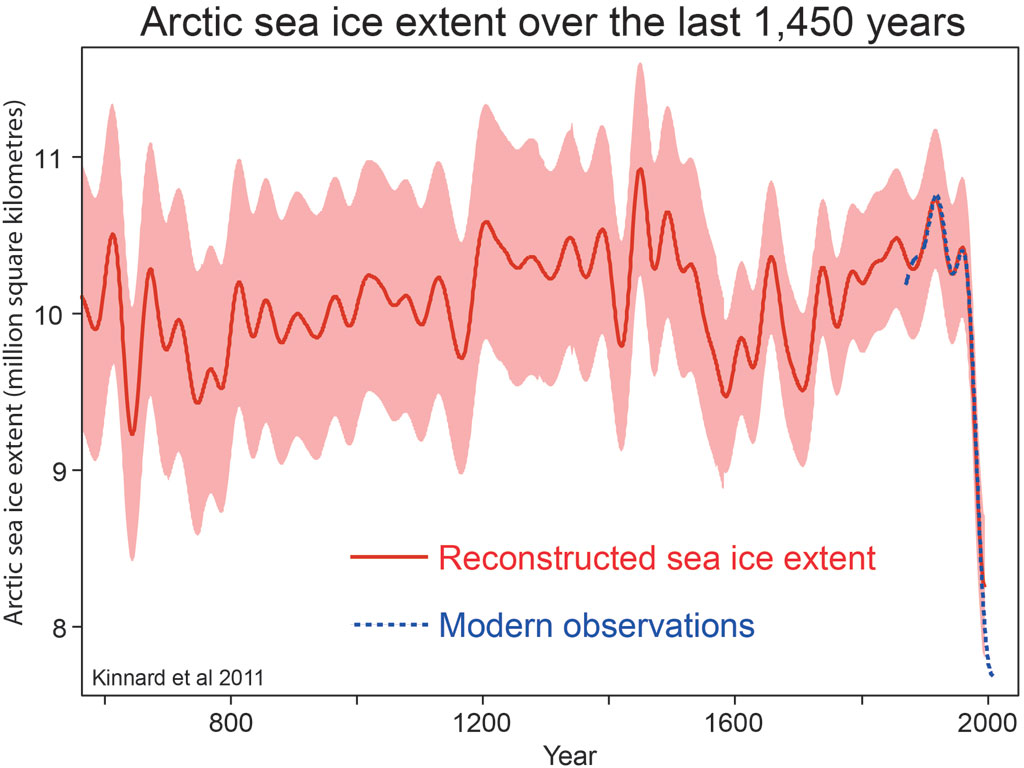
There are clear variations over time, but the precipitous decline in the modern era sticks out like a sore thumb.
This is in accord with a thorough review of Arctic sea ice variations over a wide variety of time scales by Polyak et al. 2010 (Quaternary Science Reviews, 29(15–16), 1757–1778), who say “On suborbital time scales, ice distributions varied in the Holocene, but no evidence exists for large, pan-Arctic fluctuations.” Not, that is, until the last several decades:
The current reduction in Arctic ice cover started in the late 19th century, consistent with the rapidly warming climate, and became very pronounced over the last three decades. This ice loss appears to be unmatched over at least the last few thousand years and unexplainable by any of the known natural variabilities.
Have another look at the 1450-year reconstruction. Staggering?
Questions for “fiq”:
1) Of course “staggering” is a subjective term, and no matter how much Arctic sea ice has declined one could argue it’s not that. But given the evidence I’ve provided, I think it’s not at all unfair or misleading for me to apply that adjective. Agree? Yes or no?
2) For some unfathomable reason, this isn’t the first time I’ve been insulted by someone who disagrees with me. I’m a big boy, and I wouldn’t be blogging if I didn’t have a thick enough skin to take it. But my regular readers are not “fawning uncritical thinkers“, and rare indeed is the one who “believes you without demanding evidence“. In fact, when I trip up or get too lazy, they rake me over the coals. So: I think you owe them an apology. Agree? Yes or no?
They’re yes-or-no questions, and I’d appreciate straight answers before you elaborate on your reasons.


Staggering is a great word for it. Thanks…
also astonishing, astounding, mind-boggling, shocking, stunning.
Since you’re directing this at regular readers, here’s my 2 cents. There’s another sense of the word “staggered”, meaning step-like. When “fiq” looked at the annual cycle, he maybe felt that Arctic sea ice decline was not staggered – because it looks saw-toothed, rather than step-like.
The readers here are kind and charitable. Perhaps others could pick up on the other meanings of “staggering”?
http://thesaurus.com/browse/staggered
Or maybe he took “staggering” to mean “moving erratically”, and couldn’t understand how his “static data point” could be so described?
You state that
“But volume data throughout the satellite era is also only for the north, I don’t know of any volume data (not even model estimates) for the south.”
Isn’t the mass loss in the continental Antarctic ice sheets, as measured by the GRACE satellites, equivalent to a measure of volume? Here is the latest paper on that:
http://www.sciencedirect.com/science/article/pii/S0012821X13005797
Figure 5 shows a “staggering” ice volume loss in West Antarctica, coupled with a gain of volume in the East Antarctic ice sheet. Combined, they show a loss of mass (volume) for the continent as a whole.
[Response: Yes, but that’s for landfast ice. The current topic is sea ice.]
Nothing like a good beating by data!!!
I would think that ice volume measures are more powerful to demonstrate staggering loss of Arctic sea ice in such a short time as the past few decades. Think of it this way: To decide when it’s no longer safe to walk on a frozen lake that is melting over the spring, which measure would be better to use? Is it the extent of the surface that is still frozen? Or is it the thickness – which is tied to the volume – of the ice? It would be the latter since ice melts from the bottom up. That is, as the volume trends toward 0 volume (allowing for some ups and downs around the trend), the extent of the frozen lake surface doesn’t necessarily do much until close to the end of the melting when it very quickly drops to catch up to the volume as it closes in on 0 volume. It seems to me that volume tells the whole story (for not just lakes but for global warming) much better.
I hope that everyone sees this:
This video shows very well that the summer Arctic sea ice volume over the past few decades has dropped a good majority of the way to 0 volume. This much drop in such a short time is staggering.
And I especially hope that everyone sees this second video:
This second video very nicely shows both winter and summer measures with some nice rotations of the image. Very interesting. This shows that even the winter Arctic sea ice volume over the past few decades has experienced a staggering drop: It dropped at least roughly a fourth of the way to 0 volume. Yes, such a drop for the winter measure in such a short time is staggering.
After all this, are the deniers going to try to argue that ups and downs around the trend toward 0 – such local ups and downs to be expected – somehow means that there is no such trend?
Thanks for mentioning my visualizations!
Updated ones are here:
Arctic Sea Ice Minimum Volumes 1979-2013
Arctic Sea Ice Collapse 1979-2013
and an evolving Death Spiral, with a soundtrack produced directly from the data. Notes are from average monthly values, comb-filter from average yearly values.
I’ll be producing more as new data arrives, and my programs evolve.
Nice work Andy! I especially like the ‘ice cube’ version,and posted it on my Facebook,but sadly no one ‘liked’ it. It really disappointed me,since I know that my FB friends are both pro and anti AGW, so it bugged me that the pro side did not step up and ‘share’ or ‘like’ the visualization. But maybe it made some viewers think at least. Baby steps….
Tamino, you are right there are military data (partially made public) on arctic ice thickness. See e.g. here:
The decline in arctic sea-ice thickness: Separating the spatial, annual, and interannual variability in a quarter century of submarine data
By:Rothrock, DA (Rothrock, D. A.)[ 1 ] ; Percival, DB (Percival, D. B.)[ 1 ] ; Wensnahan, M (Wensnahan, M.)[ 1 ]
JOURNAL OF GEOPHYSICAL RESEARCH-OCEANS
Volume: 113
Issue: C5
Article Number: C05003
DOI: 10.1029/2007JC004252
Published: MAY 3 2008
Abstract
Naval submarines have collected operational data of sea-ice draft (93% of thickness) in the Arctic Ocean since 1958. Data from 34 U. S. cruises are publicly archived. They span the years 1975 to 2000, are equally distributed in spring and autumn, and cover roughly half the Arctic Ocean. The data set is strong: we use 2203 values of mean draft, each value averaged over a nominal length of 50 km. These values range from 0 to 6 m with a standard deviation of 0.99 m. Multiple regression is used to separate the interannual change, the annual cycle, and the spatial field. The solution gives a climatology for ice draft as a function of space and time. The residuals of the regression have a standard deviation of 0.46 m, slightly more than the observational error standard deviation of 0.38 m. The overall mean of the solution is 2.97 m. Annual mean ice draft declined from a peak of 3.42 m in 1980 to a minimum of 2.29 m in 2000, a decrease of 1.13 m (1.25 m in thickness). The steepest rate of decrease is -0.08 meters per year (m/a) in 1990. The rate slows to -0.007 m/a at the end of the record. The annual cycle has a maximum on 30 April and a peak-to-trough amplitude of 1.06 m (1.12 m in thickness). The spatial contour map of the temporal mean draft varies from a minimum draft of 2.2 m near Alaska to a maximum just over 4 m at the edge of the data release area 200 miles north of Ellesmere Island.
[Response: I blogged about that here. Somehow I think there’s a lot more military data than has been released, but I don’t really know.]
Fiq is fuqed.
Given the ‘staggering’ amount of data/graphs, etc you’ve provided to make your point, I’d say you’ve used a sledgehammer to drive an upholstery tack. Game, set and match!
Tamino, I’ve been reading your posts for several years now and they’re always great. I’m not a scientist but I am highly interested in our Climate situation and have learned a great deal on my own from reading blogs like yours. I don’t understand why some people have to be so rude simply because they don’t understand or disagree with the data. I think there’s an element of fear involved when folks suspect the data to be correct. They don’t want to admit we’re in serious trouble or that they could possibly be wrong.
Even if there were no charts to look at, any simpleton can tell that we’re seeing some severe weather extremes happening in rapid succession and that something isn’t right. I’m wondering about the PDO and ENSO and when it might happen and how bad it could get? Do you have any thoughts on that?
Thanks for all you do!
I don’t want to be fawning or uncritical, but I think you nailed this one, Tamino. If fiq is interested in more info, Kevin McKinney and I tried to explain in this 2012 blog post why the staggering decline could be important to human civilisation: Why Arctic sea ice shouldn’t leave anyone cold.
Yes, we’re all “fawning uncritical thinkers” – which is why, when Tamino published something a bit startling, I accepted it without question. Nope:
http://edavies.me.uk/2014/01/what-hiatus/
What saddens me is not that fiq makes an elementary mistake (not understanding that a trend produces variance about the mean even when there is little deviation from the trend) but that s/he sees fit to declare himself more expert than you and your readers before s/he has even identified the nature of his/her mistake. Too many people these days think they are only five minutes away from being an expert. It is particularly sad because your readership is generally quite sophisticated when it comes to statistics and maths compared to the rest of the internet (and generally humble about it, too) and fiq didn’t even notice that before launching into insults. DK effect again.
P.S. Occasionally I ask people who don’t follow climate blogs to guess how much of 1979 summer arctic sea ice has gone. They “know” that climate change is still being debated so they assume the ice must have only melted a few percent – usually <10% (otherwise, there'd be no debate, right?). They almost never guess the ~80% decline shown by the evidence (in 2012 – obviously some regression to the mean has happened since). When they find out the truth they are usually "staggered", meaning surprised and alarmed.
Expressing that 80% loss in terms of sigmas without noting that the sigmas themselves have been scaled by the staggering decline is clearly an exercise in obfuscation. Fiq would do well to wonder at the honesty of the blogs that have fed him/her this line, and also to wonder whether s/he is the one guilty of uncritical reading.
Actually in Norway there is a somewhat new green political party (MDG) climbing the polls where they during the last election campaign handed out pamphlets about the great loss of volume in Arctic sea ice. I had a lot of discussions with people on new comments fields that said this party (MDG) was lying about sea ice loss and that this “alarmism” did them no favors. I spent days posting all the knowledge and science we do know including the staggering decline in ice volume – and I believe many were in fact surprised to learn how bad it was. As you say, many go around with wrong mental images about the Arctic, and its important to repeat this over and over until it sinks in that there is a staggering change to our biosphere and the state of the planet. But still there is just too many people who still needs to see their homes falling down on their heads before they notice. So keep hammering this one in! Staggeringly obvious science, staggeringly well explained by Tamino!
I suspect fiq will be a driveby and won’t show up again. He made it clear what his motivation was–countering the unease engendered in his in-laws (and therefore him) by what is happening to our planet.
So, he looked at precisely the wrong statistic–daily/monthly variability–where he found enough noise that he could draw whatever conclusion he wanted. Problem solved. He gets to play the manly man, quieting the alarmist fears of his family, and he doesn’t have to confront the reality of the world he is leaving to his children. He does what cowards do when confronted with unfolding disaster–look away.
The reality that we as scientists are asking our fellow humans to accept is frightening and disheartening. We are asking them to accept that unless we take meaningful action, our progeny will face severe consequences. And what is more, our failure to act up to now means that we will have to be very lucky as well as proactive to avoid such consequences. We’ve accumulated a 6 wins and 9 losses record in the first 15 games of the regular season, and we have to not only win our last game but wait for 3 other teams to lose for us to squeak by into the playoffs. Faced with the odds we face, it is tempting to abandon hope–to either give up and wait for the disaster to unfold or to look away, to embrace either hopelessness or self-delusion.
Both options define madness. Neither option is courageous. Rather, we must be conscious of the odds against our success, but realize that improbability is not the same as hopelessness. Every concrete act we take now to address our current predicament improves the situation for our progeny–and more important, it buys time for us to get lucky–maybe–and develop technology that will solve the problem.
Embrace courage.
[Response: If all you wanted to do was allay fears of global warming, there are way eaiser ways to do that than coming here!]
“Fiq-Leaves”
— by Horatio Algeranon
When data rears it’s ugly head,
Cover it with Fiq-leaves.
That’ll put the fawns to bed
And give the monkeys heaves.
Wouldn’t be the first “drive-by” either. I think he had a Steven Goddard blog drive-by on the global temperature trend post. Complaining about Tamino starting from 1979, claiming it was cherry picking, even though the point was to directly compare all the temperature datasets, and, as educated persons already know, you can only do that starting in 1979.
Ah, but the point wasn’t just to allay fears of warming. The point was to be the manly man in front of his family, doing battle against those Nervous-Nellie Alarmists. I’m thinkin’ Barney Fife here, and similarly lightly armed when it comes to mathematical and statistical reasoning–let alone physics.
Memory says that above what is generally available, the US Navy has made additional ice thickness data available to the Polar Science Centre for assimilation into their PIOMAS model. That’s just from memory though.
One thing to note about Kinnard 2011 (the last figure in the OP) is that it only uses data up to 2002 (?). From the end-point of that curve, the drop continues for another 0.75 – 1.0 million km^2 over the following decade – including updated data (as done in the immediately preceding figure) would have the line disappearing off the bottom of the graph.
I’d like to say I can’t believe anyone would be stupid enough not to accept that the changes in the Arctic are immense, sadly the evidence stands against such a belief, as fiq shows.
Hmm, Chris, there are 1000s of such people on Twitter every day, yapping about how Arctic sea ice is up 50% in just the last year, clearly indicating that global warming is a socialist hoax to impoverish the world. You need to get out more.
“Fiqets and Wickets”
— by Horatio Algeranon
Bushwacking thru fiqets
On twitter every day
Like navigating wickets
With blindfold in croquet
Chris said he’d like to believe, not that he does believe, as “evidence stands against such a belief”.
If “sea ice extent” refers to the area that is at least 15% covered by ice, what is the average coverage of the extent area? If most of the extent area is 15% covered, that must be a lot worse than if most of the area is 50% covered and only the fringe is 15% covered. Is the average percent coverage of the extent area also falling?
Martin Smith,
A graph here (usually 2 clicks to ‘download your attachment’) showing the record of monthly Arctic Sea Ice Area & compares the Area running annual average with that of Arctic Sea Ice Extent.
The monthly values for Area are roughly dropped 2m sq km lower than Extent & otherwise mainly differs in that, in comparison with August to September drops is far bigger on the Extent record (as graphed here).
Thanks for that. Now I’ve run into another confusion. This is in the wikipedia article on measurement of sea ice: “To estimate ice area, scientists calculate the percentage of sea ice in each pixel, multiply by the pixel area, and total the amounts. To estimate ice extent, scientists set a threshold percentage, and count every pixel meeting or exceeding that threshold as “ice-covered.” The National Snow and Ice Data Center, one of NASA’s Distributed Active Archive Centers, monitors sea ice extent using a threshold of 15 percent.[1]”
My background is software engineering, so to me a pixel is just a color value; there is nothing “in” a pixel to count. e.g., on CSI, when they blow up the photo of a car where the license plate was 1 or 2 pixels, they can’t then read the number on the license plate, because the information isn’t there to begin with — unless the original image wasn’t showing all the pixels.
Is that what the wikipedia statement means, that each pixel is a zoomed out area of actual pixels?
[Response: My (imperfect) understanding: for each pixel there are *multiple* values which correspond to irradiance in different frequency bands. So, it’s kinda like having multiple images with an “intensity” value for each. The sea ice concentration for a single pixel is estimated by using the absolute intensities and the differences between intensity at the different frequencies.
As for CSI, they sometimes zoom in so much that they ought to be looking at a pixellated image but then they apply the magic “enhance” button … but it’s just a TV show.]
A pixel is an element in a grid, so it has contents. In 2d graphics we think of it as being xy coordinates mapping to an rgba value, but it’s quite natural to think of a pixel in a picture of Earth as denoting a geographic area.
Martin,
It’s high, usually above 90%. You can check it yourself by comparing “extent” data with “area” data. The real differences are around the edges of the pack, as the interior is always virtually 100% covered.
Well, it *used* to be “always virtually 100%.” Seems like it’s getting to be “mostly virtually 100%”–the summer pack doesn’t look like it used to. One suspects that that, too, is just the beginning of a trend.
If I may add…
Here’s a graphic showing a regional breakdown of September PIOMAS volume which demonstrates the massive nature of the decline and the role of thinning and loss of mutli-year ice in the Central Arctic, as also shown by submarine ULS transects and ICESat & Cryosat 2.

The time bands are taken from Lindsay & Zhang, 2005, “The Thinning of Arctic Sea Ice, 1988–2003: Have We Passed a Tipping Point?” Preconditioning – the early period where undeformed ice undergoes thinning. Trigger – the positive AO of the early 1990s. Feedback – the commencent of self acceleration* due to ice albedo feedback, augmented by processes such as the failure of the Beaufort Gyre Flywheel. *Notz & Marotzke found no evidence of self acceleration in Extent, but they did not consider volume.
The regions used are taken from Cryosphere Today. The data is from PIOMAS gridded data available here:
http://psc.apl.washington.edu/zhang/IDAO/data_piomas.html
“S
twaggering”— by Horatio Algeranon
The sea ice loss is staggering
Much like Wall Street quants
Whose acolytes are swaggering
With “Bambi Bimbo” taunts
I think we should perhaps congratulate fiq on developing such a powerful statistical method. I was so impressed, I created a projection of Arctic Sea Ice Extent into the 2040s and then applied fiq’s marvelous statistical method. The lowest SIE remains at just -1.73 sd below the mean. And that’s not much different from the 2013 value (which may be why fiq described the 2013 value as a “static data point.”)
So no need to panic, no staggering is required, coz even when Arctic Sea Ice has melted away to nothing, it’s only at -1.73 sd. This of course proves conclusively that beneath the troll’s bridge (but not elsewhere) an ice-free Arctic Ocean will be “quite normal” as this result is “a perfectly acceptable value in a normal distribution.”
On second thought, forget the congratulations. I think fiq has earned one of those bananas.
Hmm, tough to argue with this one. Let’s change the subject! Back on 9/20/12 you stated:
“Wow! Stop the presses! Extra!!! Extra!!! Read all about it!!! Antarctic sea ice reaches record high for this day of the year! What a shame for that poor, poor, unimpressive Arctic sea ice. All it managed to do this year was set the record for lowest sea ice extent for a single day of the year for every day since July 28th. Yes, that’s the last few days of July, the entire month of August, and the entire month of September — so far. All it did was break the all-time record. All it was able to do this year was go below the pre-2012 all-time record 26 times — so far.”
Hey, how about that antarctic sea ice now! Pretty much setting daily and all-time records all over the place for the past year.
http://arctic.atmos.uiuc.edu/cryosphere/antarctic.sea.ice.interactive.html
Tamino,
Your posts are always informative. Separating out what seems obvious to the eye and documenting what is actually statistically important. How do you find the time to read all these different subjects that are not your day job?
Fiq insisted on a specific question where he wanted a specific answer. I think you told him why Arctic Sea Ice was important, but he also asked why the Antarctic was not important.
He said:
“We’ve seen a *staggering* decline of Arctic sea ice””
I was looking at the Daily Sea Ice Extent Time Series chart at NSIDC this morning and thinking about what I learned from a statistics course. For the Arctic the chart depicts a current extent about ~1.5 sigma under the median. As a static data point, isn’t that quite normal? If so, how do we have a staggering decline if we seem to have a perfectly acceptable value in a normal distribution?
At the same time, the Antarctic extent is 2.0+ sigmas high but nobody seems to talk about it or describe a *staggering* increase in Antarctic ice.”
You might want to add a paragraph to the end to explain why a small variation during the winter in the Arctic (the season of least change) is more important than a similar variation in the Antarctic during the summer, the time of greatest change. Or perhaps you feel that it is more important to consider all of the data and not just a single data point of December 30, 2013 (or whatever day it was). I think Fiq will claim elsewhere that you have not addressed his question about that specific point. Why is that “static point” not important?
Since Fiq appears to be a financial analyst, you have to keep in mind that he has limited statistical knowledge and only cares about today.
[Response: I thought I’d do a separate post about Antarctic sea ice.
As for “fiq” — who among us hasn’t overstimated his own knowledge, then been obstinate about it? Let’s see his response before we rush to judgement.]
Fiq. Speaking of ice; Glacier National Park, Northwest Montana
How bout this, http://nrmsc.usgs.gov/repeatphoto/
Staggering? Or not?
I went back and read the comments that prompted Tamino to blog about commenter fiq’s ‘questions’. I think I saw the problem, as Tamino rightly pointed out with his response:
“This isn’t the stock market, it’s thermodynamics, and as such is subject to some very fundamental constraints (e.g. conservation of energy) but is not governed by human psychology (rather chaotic).]”
Physics does not care about making billions of dollars on a ‘bet’ in the stock market,or panic about being in the wrong investment in it’s 401k.
The inputs to our climate are challenging to model and predict,but they are rational in a way that markets will never be,and conflating the kind of uncertainty that comes from irrational markets to the uncertainty of climate, may be why so many free market fundamentalists,especially Libertarians are also AGW skeptics/denialists. Just a thought.
Aside for later; I’ve speculated that more glacial meltwater may lead to more sea ice. This modeling paper describes how an increase in fresh meltwater could stabilize crevasses in the sea ice:
http://onlinelibrary.wiley.com/doi/10.1002/2013JC009208/abstract
Modeling ice-ocean interaction in ice shelf crevasses
DOI: 10.1002/2013JC009208
>”As for “fiq” — who among us hasn’t overstimated his own knowledge, then been obstinate about it? Let’s see his response before we rush to judgement”
I very much look forward to reading his/her response. As you suggest, everyone makes those kinds of errors; what separates “skeptics” from skeptics is how accountable they are when subsequent discussions show that your analysis has been suboptimal.
Overlaying NSIDC data on the Walsh and Chapman data = staggering/worrisome/significant/noteworthy decline since the mid to late 70s.
A new paper in JGR on the magnitude of the instantaneous forcing from sea ice and snow cover for past, present and future.
Tamino,
Your Antarctic post will be interesting. I have seem a smattering of data and you always seem to find the best papers to summarize.
I am working a few of your recent posts into a plan for my AP Chemistry class in High School. We have three weeks after the AP test where I can use your stuff. I am hoping to compare your posts with some at WUWT (which I do not read) or possibly with Curries blog. Since you refer to the posts there that you comment on I do not have to search long to get the information I need. It will be interesting to see student comments between the different sources of information.
B Buckner: That is indeed interesting about the Antarctic sea ice.
Something else that is interesting: according to the ”skeptic” run UAH satellite dataset, Antarctica as a whole was a whopping 2.5F warmer than normal during 2013.
So: could the growth of sea ice partly be due to landfast ice melting, running off and decreasing the salinity of the sea water around Antarctica, thus increasing the growth of sea ice
One would think that ”skeptics” use the Antarctic sea ice as a proxy of the Antarctic temperature, but one wonders why these same ”skeptics” don’t also mention the actual average temperature, as measured by their friends at UAH, no less.
Seems strange.
First, I don’t see where you get 2.5F anomaly for 2013. Zero warming trend at south pole and southern extra tropics. Data please. Second, 2.5 degrees warmer than very very cold is still very cold and does not equate to “melting”. The south pole is not melting.
It is unlikely that you really are unaware of the inconvenient UAH Antarctic data, but here goes:
The temp info comes straight from Dr. Roy:
”The warmest areas during the year
were over the North Pacific and the Antarctic, where
temperatures for the year averaged more than 1.4 C (more
than 2.5 degrees Fahenheit) warmer than normal.”
Click to access dec2013GTR.pdf
This flies straight in the face of the popular denier narrative about the growing Antarctic sea ice indicating Antarctic (and global) cooling, so I would not be surprised if the denialiati throws the UAH guys under the bus this year, as it happened to Dr. Muller after the BEST data was published.
The Souh Pole does not represent the entire Antarctic continent. What we are talking about is the coastal areas of the continents losing mass (ice), causing stratification and growth of sea ice, as well as sea level rise.
Tell that to GRACE that has uncovered massive ice loss from the continent.
The UAH Antarctic data shows a +0.24ºC/decade warming 1993-2013. This is significant to 2.5sd. The period 1979-1999 gives a cooling trend of similar proportions. So over the full record the data is flat.
The UAH data is further split into land and ocean. The land has the greater trend and wobbles giving a 1993-2013 trend of +0.43ºC/decade significant to 3sd.
According the GRACE satellites, Antarctic *land ice mass* is decreasing.
Antarctic sea ice is increasing slightly, as the water freshens, and the higher wind speeds, higher humidity (+5%, since 1980), and warmer temps increase precipitation.
Finally, a bit more sea ice in the dead of Antarctic winter isn’t going to do a thing to offset the loss of 80% of the sea ice, in Arctic summer.
True, and this relates why some areas of the Antarctic have increasing ice as a result of enhanced humidity precipitating, after having moved down from the tropics.
However, “very cold” and even “very very cold”do not preclude increased melting in certain locations when there is increased warming, and the water from melted ice is cold and fresh. Cold, fresh water is buoyant and floats near the ocean surface, and the coldness and relative freshness of the resulting sea surface enables enhanced refreezing when winter comes and it’s once more “very very cold”.
Result: increased ice in some parts of the Antarctic is not a surprise.
Lesson: complex systems responses are not necessarily fractal on different time scales.
Caveat: the Arctic and the Antarctic are profoundly different systems – one sits on a continental land mass, the other atop an ocean. Spurious comparisons should be avoided…
Here’s my simple question I would pose to fiq regarding the standard deviation argument:
At what slope do you first start to obtain any values on a line segment that are outside of the ±2-sigma range?
Take, for instance, this R code:
t = seq(0,10,by=0.01)
x = -t*A
s = sd(x)
4*s
x[1]-x[1001]
Now modify A as you please, to very large or very small numbers, and see when “4*s” is not larger than the range of the x values (which would indicate that the ±2-sigma range cannot span the full range of values, hence some lie outside).
I’ll give a hint: I’ve checked up to at least A = 10,000.
Also aside for later:
Research Letter
Freshening drives contraction of Antarctic Bottom Water in the Australian Antarctic Basin
DOI: 10.1002/2013GL058921
Where’s all that fresh water coming from? Rogue desalination plants?
A last tangential tidbit: purely my speculation, but this may show that an increased amount of fresh water is not only due to warm ocean water melting the bottom of sea ice, but rather coming from under the glaciers (fresh water is less dense than the cold salt water, floats on top for a long time before mixing)
http://onlinelibrary.wiley.com/doi/10.1002/2013GL058947/abstract
Complex network of channels beneath an Antarctic ice shelf
DOI: 10.1002/2013GL058947
Now it would be great if only the models pick up that trend, volume of course.
Arctic sea ice decline https://en.wikipedia.org/wiki/Arctic_sea_ice_decline