
Back in mid-2011, Chip Knappenberger treated us to his brand of shallow thinking about temperature data for the U.S.A. We discussed it soon after. In spite of the fact that 2011 wasn’t even over yet, Knappenberger said this:
… 2011 will mark the continued return of U.S. national temperatures to conditions much closer to the 20th century mean, down from the unusually elevated temperatures that characterized the 1998–2010 period.
Chip began with this graph:

Despite its being mid-2011, Knappenberger left out everything after 1997 — because what came after didn’t fit his conception of the US temperature trend.
What came after was higher temperature in the USA. When he showed this, his version included the average anomaly for the first half of 2011 only:

He also put in his estimated likely range, and a pair of trend lines — one using data through 2007, the other omitting everything after 1997 (because what came after didn’t fit his conception of the US temperature trend). He also concluded that the decade of elevated US temperature was just a fluke:
Now, after three relatively near-normal years, the 10-yr warm period from 1998-2007 was starting to look to be out of place, rather than the new norm…But the last three years, 2008–2010, and now the projections for 2011, lie much closer to an extension of the 1895–1997 trend line than the 1895-2007 trend line (Figure 6).
Let’s sum up: Knappenberger prefers a trend estimate which leaves out the recent hot years. He justifies this by saying that three years is enough to conclude that the trend without the hot years is the “real” one. Curious that 3 years reveals the true trend but 10 years is just a fluke.
Knappenberger reiterates:
If 2011 ultimately turns out to come in in-line with the central projections in Figure 5, it will strengthen the suggestion that the unusually high temperature that characterized the 10-yr period from 1998–2007, were just that, unusual, and do not best represent either the expected trend or the climate state of the U.S. for the next several decades to come.
It turned out that 2011 did not conform to Knappenberger’s expectation of being cooler than 2010 in the USA.

The really telling part of all this is that even if it had, that doesn’t justify leaving out the hot years when estimating a trend. That’s not just cherry-picking, it’s wishful thinking of the worst kind — the kind that puts other folks (you and me) in danger.
There’s no doubt that fluctuations occur — real data are the combination of trend and fluctuations. Hot years might be a fluctuation, nothing more. That’s why we apply statistics to get the best estimate. One of the important rules of honest statistics is you’re not allowed to leave out data just because it contradicts what you want to believe. Yet that is exactly what Chip Knappenberger did.
Knappenberger not only considered it possible, he actually stated as a conclusion that the hot years were just due to fluctuations. He never mentioned the possibility that the three-year period 2007-2010 might be cooler because of fluctuations. According to Knappenberger, when temperature fluctuates up it’s “unusual” but when it fluctuates down it’s “near-normal.”
That’s one of Chip Knappenberger’s brands of shallow thinking. I was originally going to append the adjective “unique,” but that would be a mistake. This kind of so-shallow approach to looking at what has been happening to the world is pervasive among the fake “skeptics” who deny the danger of global warming. Like Anthony Watts crowing about record December snow cover without even mentioning the real trends. Or even worse: Watts and co. have now decided to crowdsource their cherrypicking under the fake name “analysis.”
Fluctuations can go both ways, down and up. When a “down” fluctuation combines with an “up” trend, it gives what Chip Knappenberger and Anthony Watts and lots of other fake skeptics call “normal.” But when an “up” fluctuation combines with an “up” trend, you get USA temperature for 2012:

The impact of this year’s heat and drought on our corn crop was not pretty.
The temperature fluctuation in 2012 was quite high, but by no means extraordinary:

It was the combination of fluctuation and trend which made 2012 so bad. Fluctuations will continue to come, some up, some down. The “up” ones will bring about a repeat of disastrous conditions. And since the trend keeps rising, those future disasters will be even worse.
The “down” fluctuations will bring about a repeat of fake skeptics crowing about “return to normal.”


Nice. It’s always good to thave someone truly competent to run the numbers. It looks like the combination of fluctuation plus trend is really playing a number on the Australian summer. The BoM had to create a new color for their temp maps to represent large areas of temp well in excess of 50 degrees Celsius (up to 54!). Of course wildfires are there to boot. I am looking forward to an in depth analysis (such as the one you made for the Moscow heat wave) when all the numbers will be in, although I have an idea what the result will be…
Just to clarify. The new +50º colours were required for their modelled forecasts, not measured temps. They may yet be temps.
The BoM actually introduced two new colours to their maps to account for increasing temperatures. Some denialists are bleating that we’ve had thos sort of temperatures before, but I would counter by asking why there appears to be no necessity to introduce two new colours for cold extremes.
It was so hot here last Friday that hundreds of tons of apricots here were literally cooked on the trees. In fact many trees are now losing their leaves, and some are dying – it looks like autumn now, and it’s still a few months before the true leaf fall should start. Some of our roads were so hot that the tar was like treacle.
And this is in a climate that was traditionally like England’s…
I don’t know about Australia, but given the strange things that are happening with the jet stream a few places in the Northern hemisphere may be needing to add some new colours on the cold end of the spectrum.
Welcome back Tamino, and a good post to return on now that NOAA has made it official.
How many “unusual” upward fluctuations does it take to question “normal”?
I’d think a few underestimated predictions should make someone rethink their models.
Well, he’s a professional — he sells New Hope advocacy ‘science’ on which companies and their lobbyists can base an arguably arguable argument that allows them to be publicly, defensibly wrong for another year or two when setting policy, or payments, or taxes, or zoning, or whatever other criteria they’d have to change were they to adopt reality as a principle for making decisions.
I’m sure he’s well worth whatever they’re paying him for these opinions — they must save much more than it costs them, in delay and avoidance of costs they’d otherwise have to acknowledge.
He’s a businessman, he sells a product, ‘advocacy science’
If you were looking for military music, down the hall on Aisle C
[With a little rearranging]
“This isn’t an argument; this is just contradiction.”
“No it isn’t.”
“Yes it is.”
“No it isn’t.”
“Yes it is.”
…
“Oh, I’m sorry, is this a five minute argument, or the full half hour?”
“Ah!”
[Full source: http://www.montypython.net/scripts/argument.php%5D
I was thinking something more like this
Well, while we’re posting video links (and I have some spare time to argue in), here is the Argument Sketch on video…
Monty Python’s Argument Clinic
It really does sound a lot like some of the “arguments” with fake skeptics…
Meanwhile, here in Oz we’ve had our hottest day ever, with an average maximum across the country of 40.33C. I’m sure the death statistics will show a significant increase over the past two weeks.
There are probably worse, but my favourite temperature observation was Coober Pedy airport, with a temp of 40.1C at 2:30am on 8th January. http://www.bom.gov.au/products/IDS60801/IDS60801.95458.shtml
Chip would have fun randomly selecting 6 rocks from the surface of the Earth and then trying to derive from them the Earth’s age and fossil history. What an interesting geology and paleontology would result.
That would be particularly enjoyable if I get to select the rocks….
I’m sure he’s well worth whatever they’re paying him for these opinions
I’d love to know what he’s making, and other fake skeptics too. I have read what Joe Bast and his wife make per year, Morano receives at least 100K a year from CFACT, Watts gets 88K for some website and who knows when he would have told his loyal followers.
In 10 years AGW will have turned out either to be a hoax or undeniable. Then everyone will know whether fake skeptics are heroes or criminals.
No idea what the totals are, but see http://www.youtube.com/watch?v=fguJod_voPc for a percentage from 2010.
ZAKARIA: Can I ask you what percentage of your work is funded by the petroleum industry?
MICHAELS: I don’t know. 40 percent? I don’t know.
Advocacy science == lobbyist, in my opinion.
My apologies, that was an interview of Patrick Michaels, who along with Chip Knappenberger is or was a principal employee of New Hope Environmental Services, an “advocacy science consulting firm” (http://www.sourcewatch.org/index.php?title=New_Hope_Environmental_Services, http://web.archive.org/web/20110216212051/http://www.nhes.com/). They continue to be authors/publishers of the denial blog World Climate Report (http://www.worldclimatereport.com/index.php/personnel/).
Again, in my opinion, lobbyists.
Welcome back, indeed, Tamino.
One small quibble: to me, the second- or third-largest fluctuation in the record presented would qualify as “extraordinary.” (I’d have said “not unprecedented.”)
But of course that doesn’t alter the point materially. All humans are susceptible to confirmation bias/wishful thinking/cherry-picking/self-deception.
Some, however, have become so adept at these forms of pseudo-thought as to qualify as “virtuosos.”
The Maraschinoso
— by Horatio Algeranon
Maraschinoso
Limber licker
Virtuoso
Cherry picker
How I love the smell of a good neologism in the morning…
(Or pretty much any time.)
Remembering Australia’s Black Saturday 2009
I eagerly await Chip’s response to your takedown, Tamino: Though, I’ll admit up front, I’m not holding my hand on my butt, lest it *grow* there…;)
Well-done, and to the point: Reality is really beginning to bite the denialati hard in their ignorant buttocks.
IMO, one of the biggest problems in Climate Science today is everybody jumps the gun and nobody listens to each other. I don’t know anything about Mr Knappenberger. I did come across this breaking, well documented story on WUWT that seems to support his position. In any event, it illustrates my point. The rational thing to do is give the issue some time for coverage and comments from scientists on both sides to develop. In other words, let’s investigate a bit further before we draw hard lines about who is right and who is wrong..
[Response: You are mistaken.
The problem is that when deniers say idiotic things they are given credence. It takes so little effort to expose Watts’ claims as false — but you’re unwilling or unable to do so.
Time and time again fake skeptics like Watts and Knappenberger have been shown not just to be wrong, but to be disingenuous. Yet fools continue to insist that all their claims be given consideration. Global warming is getting worse, real scientists have precious little time to discover what the consequences of our actions will be, but you insist they waste their time serving as baby-sitters for every hair-brained idea and dishonest propaganda regurgitated by deniers. Shame on you.]
No surprises here. Tony et al., having nothing concrete, had to misrepresent the Met Office’s statement in order to fit their ideology. This is what the Met Office is on the record saying in response to the deliberate attempt by fake skeptics to sow confusion and doubt:
“The latest forecast suggests that global temperatures over the next five years are likely to be a little lower than forecast from the previous prediction issued in December 2011.
However, both versions of the forecast are consistent in predicting that we will continue to see near-record levels of global temperatures in the next few years.
This means temperatures will remain well above the long-term average and we will continue to see temperatures like those which resulted in 2000-2009 being the warmest decade in the instrumental record dating back to 1850.”
In the original text accompanying the updated experimental forecast they state:
“The forecast of continued global warming is largely driven by increasing levels of greenhouse gases.”
Now why would Gerald take Tony’s word for something given how many times he has distorted, mislead and perhaps even lied? Moreover, why would Gerald not bother to go to the source to validate the claims made by someone like Tony Watts who is so notoriously inaccurate?
So there is a reason why we listen to certain people (e.g., the UK Met Office) when wishing to obtain reliable and accurate information. Knappenburger, Watts and fellow fake skeptics are certainly not included on that list and for good reason.
Since when did Tony and his fellow fake skeptics have any faith in model predictions, never mind experimental ones such as this? Now suddenly what fake skeptics like Pielke Senior liken to flushing money down the toilet suddenly becomes “truth”– well, with a bit of distortion of course as shown above.
There is the parable about the boy who cried wolf. I think it only took 3 false cries of “wolf” before the boy was ignored, much to his detriment.
We are not as smart as the people who ignored the boys cries. We look at every claim by “skeptics”, not so much to see if it has merit, but to see why it is wrong. If only everybody, especially the media, would ignore any new utterance by the “skeptics”, based solely on their past record.
“hair-brained”
I quite agree, but I believe that the term is “hare-brained”
Actually, I kind of like “hair-brained”–I sort of envision their brains looking like something my cat threw up.
“The Harebrain Fraction”
— by Horatio Algeranon
The harebrain fraction of CO2
Is on the increase, this is true
The partial pressure in the brain
That makes a person go insane —
Think the CO2 amassing
Is simply due to ocean gassing
Believe that upward trends are down
And act just like a circus clown.
I once spent several days going through a couple of posts on WUWT, examining every reference and link used. Anthony had pulled out quotes that seemed to support his positions, while omitting everything else that didn’t. Call this what you like, but it falls far short of what I would deem as a scientifically skeptical process – evaluating the evidence carefully to see where it takes you. I posted the results in the actual threads, but when I checked back later, most of my comments had mysteriously disappeared.
Gerald,
The problem is that the analyses carried out by Willard Tony and Chip are invalid, and they continue to make the same mistakes over and over and over again despite having been shown they are wrong. That is explainable only by malice or abject stupidity. But that is not the real problem. There are always dishonest shills and fools. No the real problem is the eagerness of people like you to believe them over and over and over again. Now we might all wish we weren’t confronting this crisis–particularly since there are no easy solutions. But we cannot continue to delude ourselves indefinitely. Eventually, we have to face the truth–we face a crisis that could threaten human civilization itself, and we don’t yet have a solution. That is scary, but if people like you don’t wise up, we’ll never get a solution.
“Fluptuations”
— by Horatio Algeranon
The fluptuation is extreme
A symptom of a rising mean
As global warming feeds the fire
Temp extremes move ever higher
Vroomie, I agree. Reality has actually been biting the denialati for some time now, it is now just biting them that much harder. Now we get to watch them dance likes cats on a hot roof.
Good read.
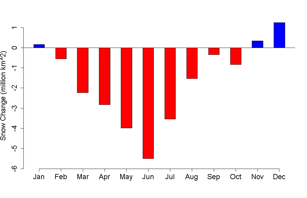
The sad thing is that the moderately high spike in fluctuation above the trend means we will probably have 15 years of “warming stopped in 2012!” to look forward to. (With no mention of the fact they are only looking at the US lower 48)
“Warming never starts”
— by Horatio Algeranon
Warming never starts
It only ever stops.
Though lower in the past
The temperature always drops.
Global warming is a lot like my father in law’s weight. He was always announcing that he was “down to xxx”, but each “xxx” was larger than its predecessor.
Brilliant.
Gerald Wilhite looks to be a time waster and reads a little like a paid shill. A couple of his recent comments can be found here on pushing the “No increase in rates of historic sea level rise” and “No global warming for 16 years”, concluding “The AGW hypothesis has been falsified”.
I think something has been said on those two issues here recently; indeed, one issue is covered so recently it hasn’t had a comment as I type and post this.
And it is getting easier and easier to recognise these people. I’m reasonably sure that you could train some piece of software to accurately identify if a comment is written by a fake skeptic.
Or actually make comments like fake skeptics
Given that ELIZA pretty much possessed the necessary level of “sophistication” shown by most fake skeptics — looking for keywords, generic ripostes, repetition — nearly half a century ago, how do we know the comments at WUWT and elsewhere on the web are not really computer generated? (“POE ELIZA”s)
Hmmm…my memory neuron–lonely l’il thing it is–tingled when I saw Gerald’s post….I wonder if it’s THIS Gerald Wilhite
http://www.linkedin.com/pub/gerald-willhite/b/996/345
Not that it makes a “flup” of a difference, but Tamino, your response to his ‘lukewarmer-ism’ was appropriate. Anyone–ANYONE–who uses the terms “well-documented” and “WUWT” in the same sentence *ain’t* done their homework.
I am constantly amazed at how good Horatio is.
It was deep thinking, it is not fake skepticism but deliberate revisionism. And it works like the charm it is.
J’accuse.
/cRR
You have such a nice plot of solar irradiation (insolation) over latitude in different months in Your post tamino.wordpress.com/2012/10/01/sea-ice-insolation. (Sorry, I somehow did not find a comment input field there.) I would be obliged if You revealed the source, and also if You did clarify the unit: I suppose you mean kW/m² “monthly mean” but I might be wrong. I guess the curves are midsummer, midwinter and 5 monthly steps in between – am I right?
— Thank You!
kinimod, start here
code here produces a similar chart as daily ave TOA insolation
although you might have to replace the greek characters if your R version doesn’t support them
> the same mistakes over and over and over again
> despite having been shown they are wrong.
You misunderstand “advocacy _____” — the point of paid advocacy is to provide something that can arguably be argued by a congressperson, who is not expected to go beyond the talking points provided, and who is allowed to enter absolutely anything no matter how bogus or provably wrong into the Congressional Record.
They don’t have to be right.
They don’t need to be defensible.
The indefensible is still _arguable_.
That’s how the business model works.
You buy access to a Congressperson and you
provide something he can wave and enter in the Record.
Accuracy does not have a place in this process.
New Hope isn’t selling _information_ there.
The conclusion is obvious. For us here in the US, global warming stopped in 2012.
The teeth of global warming are the extreme events that damage our crops, transportation, infrastructure and all the activities of civilization. These extreme events are hot (Russian 2010, Texas, Australia) and cold (NYC 2009), wet (Isaac, Irene, Sandy) and dry (US mid-west 2012). To average these events with non-event conditions into a trend is to diminish the impact of the events.
Denialists push our buttons by miscalculating these trends, and then we are plying their game as we talk about trends. It is their game, because discussion of global warming in terms of trends diminishes the impact of the events.
The Denialists got help on this from the IPCC reports that talk of trends rather than significant events with impacts and effects
.
Events are not noise on a trend line, they are the teeth of global warming. Do not let the Denialists (or the IPCC) dismiss them. When the Denialists cherry pick a start date for a trend line, point out that the class of events established at the start date are still occurring and intensifying. (e.g., Yes, after 2012, we can expect more hurricanes like Sandy.) Global warming means always more heat, but not always higher (air) temperatures. For example the heat can go into melting ice. More heat means more teeth, longer teeth, and sharper teeth. Global warming has teeth. Do not be a Denialist by trying to average those teeth out.
Aaron,
The problem is that the statistics of extreme events is a fraught proposition–especially when the system is changing rapidly. Trend is at least something that belongs without question to climate rather than weather. The link between trends and extremes comes via modeling–and that is why the denialati try their best to discredit the modeling. It does no good to decry the IPCC for sticking to science–that is their purview. What is needed is good engineering and risk management that starts with the science. Understand the problem and understand the tools we have developed over time to deal with such problems.
Aaron.
I’d say that extreme events are the canines.
Working after them are the incisors and the molars that are the intolerable changes in bioclimatic envelope baselines for most of the biosphere’s species.
One way or another though a whole lot of the biosphere is going to be chewed up…
Relationship between sea level and climate forcing by CO2 on geological timescales
http://www.pnas.org/content/early/2013/01/03/1216073110.abstract
Many meters of SLR to come…
“you’re not allowed to leave out data just because it contradicts what you want to believe.”
hehe.
I only just today found and read
Global temperature evolution 1979–2010
FEATURED ARTICLE
Grant Foster and Stefan Rahmstorf
Environ. Res. Lett. 6 044022 doi:10.1088/1748-9326/6/4/044022
and I am impressed! Well done.
But a question: The autocorrelation discussed in the appendix refers to monthly data?
[Response: Yes.]