
In the discussion of climate change, a lot of people show a lot of graphs. I’m probably one of the more prolific blog graphers myself. There’s one fault with graphs which I think sabotages their very purpose: creating a plot in which the y-axis is so small that all the variation is squeezed into a tiny space. This makes variation a lot harder to see, which is rather nonsensical since the real purpose of graphs is usually to make the changes which are present visible.
A recent example is this graph from a post by Willis Eschenbach at WUWT about UAH TLT temperature data (from UAH, the Univ. of Alabama at Huntsville, for the lower troposphere). He “divided them at the Arctic and Antarctic Circles at 67° North and South, and at the Tropics of Capricorn and Cancer at 23° N & S.” But he decided to put all five latitude bands on the same graph, by stacking them, which requires a very small y-axis for each:

That certainly makes the changes a lot harder to see.
What would you think if I portrayed UAH TLT data for the southern extratropics with this graph?

Even some of the “fawning uncritical thinkers” who visit often might accuse me of trying to hide something. Yet, apparenly on the basis of this graph, Eschenbach says:
“Southern Extratropics? No trend.”
I’d rather look closer (here are annual averages):

I often like to add a bit of analysis:
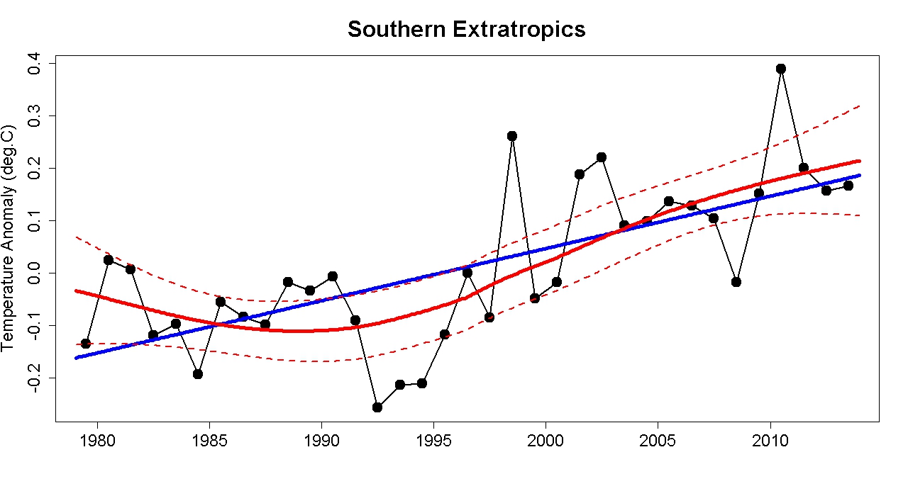
As it happens, the linear trend is statistically significant at a warming rate of 0.01 deg.C/yr. With that in mind, read Willis Eschenbach’s summary again. True or false?
I’m far less interested in poking holes in Eschenbach’s post (they’re already gaping) than in objecting to the practice of tiny graphs. I know it takes work to make a lot of graphs (boy do I know it!), and I know it takes some care and experience to develop good habits which help readers by making things clear. But, helping readers by making things clear is the point.


“But, helping readers by making things clear is the point.”
Well, Tamino, it is obviously the point for you. That’s why we like to read your stuff.
Not too sure, though, that it’s the point for everybody…
Your point about making things clear is well-taken, but I don’t think that really is the point for some other people. Given the venue, ‘squeezing’ the Y axis might seem like a good idea– it makes all the graphs look like flat-lines, which, for the audience, just is ‘making things clear’…
“But, helping readers by making things clear is the point.”
Well, maybe for you and other reality-based types. But for Anthony, obfuscation is the point. The *only* point…
Making things clear has never been the point of anything posted on WUWT, but to obfuscate and mask the truth while trying to make the text seem like scientific information. Its basically what a high school student does for his paper when he haven’t got a clue what it all means, and just feels he needs to put in a graph somewhere to make it look good. Ofc the teacher (or in our case the climate scientist) quickly spot this fault – as it is about the information it contains and not about appearances. This is where most denier posts fail as well, since its often about appearing to convey information and not actually having any substantial to add to the discussion. Thank you Tamino for taking the time to show us information to back up the theories you cover. A good analysis for significance also helps us separate the signal from the noise. Unfortunately for many this whole field of science is considered “noise” so I am not sure you will come through with many active participants on WUWT even if they were spoon fed factual information.
So Eschenbach declining to use appropriately sized graphs make his conclusions fall flat.Literally
Edward Tufte’s “Envisioning Information” comes to mind. Inexperienced students often prefer this type of presentation, because it prevents them to make conclusive statements. The presentation shown here is worse, as the presenter does not want to avoid a conclusive statement, but make one not supported by the data. That is just dishonest.
Good old Willis Eschenbach. Always willing to put his foot in his mouth to raise a laugh, if not a cheer.
What do they say? Hire monkeys and get plenty of banana skins to slip up on.
Willis says “I’ve divided them (the UAH data) at the Arctic and Antarctic Circles at 67° North and South, and at the Tropics of Capricorn and Cancer at 23° N & S.” Steady on, Willis. You didn’t do that. The UAH data is published in that form, as near as damn it.
Well, perhaps Willis hadn’t noticed. And that would explains why he presents his conclusions thus:-
“To start with, the tropics have no trend … Southern Extratropics? No trend. South of the Antarctic Circle? No trend … Northern Extratropics? A barely visible trend, and no trend since 2000. Now, that leaves the 4% of the planet north of the Arctic Circle. It cooled slightly over the first decade and a half. Then it warmed for a decade, and it has stayed even for a decade …”
But if this is all about ‘trends’ over the full period of the UAH data, no analysis is actually required. Trends are presented with the UAH data, although being at the bottom, Willis may not have noticed – he’s such a dunderhead. If he had noticed, he would have seen that the Lower Troposphere Temperature trend for the whole planet is 0.14ºC/decade and if the Arctic were the only part of the globe with a trend worth talking about, wouldn’t that make the Arctic, being just a teeny weeny 4% of the globe, have to be warming at a trend of 0.14ºC x 25 = 3.5ºC/decade? If it alone is responsible for the warming as declared by Willis Eschenbach? Now that’s a lot of amplification, a very loud signal. Watch out for that banana skin, Willis!! Sadly, with all the noise he’s generated, I don’t think he can hear me.
As Hamlet liked to say “The graph’s the thing, wherein I’ll catch the conscience of the King”, especially the “King of the uniformed”
“There are lies, damned lies and statistics.”
Mark Twain
[Response: The quote is often attributed to Twain, but he himself attributed it to Benjamin Disraeli, who actually got it from someone else (perhaps Charles Wentworth Dilke).]
And before that there was “There are lies, damned lies and cave paintings”, a comment about Meandertale Man, who liked to brag about this hunting exploits
or maybe it was Meandertall tale man.
It was a long time ago that I took physical anthropology.
I prefer:
Any fool can lie with statistics–and if they are really foolish use them to lie to himself. What takes skill is using statistics to tease out the pearl of truth.
Or again … He uses statistics the way a drunk man uses a lamp-post – more for support than illumination … though I don’t know who said it. Amusingly I recall covering material akin to the subject of this post in school. When I was 15. In English class. Part of my GCE which covered how to present information and how the way it is presented can mislead – for example by the scale and start point you use on your y axis. Sometimes what I find depressing is not how little climatology some deniers seem to know but little of ANYTHING they give the impression of knowing.
I prefer “While it is easy to lie with statistics, it is even easier to lie without them.” (apparently Fred Mosteller) and to paraphrase slightly ” ‘skeptics’ use statistics like drunkards use lampposts: not for illumination, but for support.”
> A barely visible trend
Mmmmhmmmmmm. Own goal ….
Selecting the scale and aspect ratio for a figure are critical. As a rule of thumb, a 2:1 (x:y) aspect ratio usually yields the best results. But that is not written in stone, sometimes using 3:1 provides more insight.
Not just the size of the graph, but the range it shows. You can blow up his graph as big as you want, you’re not gonna be able to eyeball deviation of +/- 0.3 when he plots the y-axis from -3 to 3.
Totally agree on your main point that axes should be scaled to highlight the variation. There seems no good reason to do otherwise in a blog or a Powerpoint, where the real estate is free. But we often see squashed y axes in published articles, too, for a better (though still unfortunate) reason — you’re allowed only so many figures! That constraint drives the highly compressed multi-part images you see in Science, GRL and so forth.
You cannot accuse Eschenbach for just trying to make a comprehensive graph. His point would be even better made if he used a 100 ºC grid.
Keeping the y axis the same in all three plots does serve the useful purpose of showing that variability is much higher in higher latitudes, and the trends larger. However, it’s easy to eyeball a trend in the tropical data: the data on the left is mostly below zero, and on the right it’s mostly above zero.
In some ways, it’s not a “bad” graph: it puts regional change of T on the same (small) scale for every latitude band. So, if the point you want to make is that the Arctic is warming faster than more southern latitudes, it’s okay. The bigger problem is that the contribution to global-averaged warming scales by area, so the small trend dT/dt hidden in the scale choice for extra-Arctic regions is critical. Obviously the text context for any figure determines what you need.
It’d be educational to see how Tamino would present the same data: still show T but with different scales for different zones, or T*Area on the same scale, or more lines on a single panel, or something else?
Suggestion to Willis Eschenbach: Convert anomalies into absolute temperatures in Kelvin, and set the baseline at 0.
If Thalb’s verbal description of this process isn’t enough, Denial Depot had a post back in 2010 that shows this step by step, with graphs…
http://denialdepot.blogspot.ca/2010/11/how-to-cook-graph-skepticalsciencecom.html
Does anyone know what happened to Dr. Inferno? Any hope of new posts from him?
There was me thinking the world needs crash cuts in CO2 emissions to prevent massive species loss and serious threats to agriculture etc. I never realised it was just a matter of making the y-axis smaller.
One suggestion for all those creating graphs (or any graphic) for the web:
Turn on a text box. Type (so the text becomes part of the picture):
Who did the graph, the original URL, and what source data.
Captions typed before and after graphics get left behind.
Is this an example?
Judy likes that graph. So does Chief Hydrologist.
[Response: Some of the changes are visually evident. It looks to me, more like a journal article graph which has been stacked to align the times, and is a bit squeezed because journals like to save space.]
I’ve seen Roy Spencer do the same thing over and over. It’s one of the easiest denier tactics; you get to use real data but represent it as insignificant.
Q: What would you think if I portrayed UAH TLT data for the southern extratropics with this graph?
A: I’d consider it is still showing warming trend. The shift from baseline on the right is still visible, as you can see most values on the left side are below 0 mark and most values on the right side are above it. And shift is somehow larger than short term varitions. For a trained eye, this can still be visible. But as for representation ? It sucks. It minimizes the information about a difference and a signal. Yes, I can easily agree that it is obfuscating graph.
And by a trained eye, I’ve been informed that trend is positive during this time, so I can concentrate on details.
There’s a different scaling trick that I sometimes see in multi-graphs. “Skeptics” often link to this one, making the completely erroneous claim that atmospheric humidity is decreasing:
Look! Humidity is decreasing at 9km and 4km! It’s increasing at the surface but not nearly as much!
They don’t seem to notice (or they pretend not to notice) that the scales of the three graphs are wildly different. In fact, humidity has increased at the surface far more than it has decreased at higher altitudes. This would be really obvious if the scales were the same.
Jesus, I can’t believe that’s even a thing. So blatantly and inherently misleading.
That is Norwegian/Danish denier Ole Humlum’s site, so it is designed to mislead for a purpose. It certainly seems to work in a gullible population like the Norwegian. He is the guy even otherwise respectable newspapers go to for comments on climate. No wonder this country is infested with diehard denialism even as climate change currently wreaks havoc.
Indeed, and in Norway we still have representatives in a flat-earth party popping up in the media saying that our CO2 emissions has no impact on climate change. The last one (yesterday) was from the environmental spokesperson from that party… and this party is actually in government now! (they are called FrP – the F is for Fremskritt which means “advances”, an oxymoron in itself as they are more about standing still than moving forward). Our agriculture minister (Sylvi Listhaug) does also not embrace AGW and she seems to do anything in her hand to make it hard to even run any form of agriculture in Norway. No doubt someone should teach her a thing or two about the carbon cycle.
We also have a couple of busy bee “experts” in the media telling how much money we loose on putting up wind power. Both of these “experts” are part of the group that told the Norwegian government to embrace carbon trading (which basically does not work and is just a way for a country to buy themselves out of their responsibility to cut CO2 emssions). Its basically a bunch of people in the pockets of the Norwegian fossil fuel business.
I wouldn’t be too critical of Humlum for the vertical axes of his graphs being different. If that is a crime, I too am guilty of it when graphing the same data here (usually 2 clicks to ‘download your attachment’) & my axes are not exactly easy to read, either.
And the real place that criticism should be leveled at, the text that accompanies the graph on the web-page, that isn’t a patch on Humlum’s normal work of cherry-flavoured curve-fitting and famously, his failure to understand how to carry out a mathematical analysis (although I prefer my own debunk (usually 2 clicks to ‘download your attachment’))
Still, the comments here will likely prompt me to revisit my humidity graphs. It isn’t a straightforward graphing task – presenting the relative size of the annual cycle alongside the interannual variation for 3 quantities so different in size – something has to give. And regarding vertical axes, just because there is only 2% of the humidity at 300mb compared with 1000mb; that doesn’t in itself mean 300mb humidity won’t have significant climatic impact. The big question is more whether the 16% drop for 300mb humidity in 35 years is real or whether it’s due to dodgy radiosonde data (something Humlum does grudgingly point to). And also what of the 40% drop in the 300mb annual cycle’s amplitude.
The criticism isn’t for the scales being different, it’s for using different scales to make one trend look larger than another when it’s really the opposite.
The temperature of the first decade and the last decade differ by about 4 standard deviations. (In this data set for this area.)
That is enough to put our engineered infrastructure at risk
Actually, it does not matter which data set or which area you look at, Our engineered infrastructure is at risk from global warming – even things like the Dutch Sea Walls that we thought were massively over engineered to endure any weather. In the case of the Dutch Sea Walls the problem is tsunamis from Greenland Ice Sheet. Super glacial lakes or aquifers are never stable.
Considering how 2013 turned out in the UAH data, I’ve got a feeling that 2014 will quite possibly register as the warmest year on record in that dataset.
For the others (CRU, GISS, etc) we’ll probably have to wait until 2015. If that happens and UAH being the only one setting the record in 2014, the irony will be absolutely priceless. Some certain folks will not be amused.
There’s already a quiet shift in denialist cherry-picking to RSS from UAH; quiet, I suppose, because Wentz, Mears & co. are regarded as ‘warmists’ and therefore supposedly in on the ‘conspiracy.’ Inconvenient, yet their dataset is showing the lowest warming trend, so it should be true…
Oh that’s been happening ever since RSS started showing a lower trend for the full record and from 1998 etc. I doubt there’s any consciousness around the switch, just the usual reflex appropriation and discarding of anything that supports an ideological view. Steve Goddard recently posted about RSS being the “more accurate” data set between it and GISS. No mention of the other data sets, and, of course, the largest divergence (0.03C/decade – wow!) is between those two.
Maybe so, Barry. But it was just so much more convenient for them when UAH was lower; they had noble truth-seekers to be celebrated, then–truth-seekers finding a lower warming trend. Now, not so much.
Effective Writing, improving scientific, technical and business writing by Turk and Kirkman says exactly the same. And also makes a mockery of all the ‘hide the decline’ nonsense from a few years back.
Clear communication is key, and that is done by making precise, manageable statements (whether words or pictures) and your choices should be governed by considering your aim and audience.
Though if I was a cynic ~ and I’m not saying I am ~ I might think that for Watts and Willis it’s job well done.
With the multiple-graphs repeated on Eschenbach’s graphic, the only clear story it shows is that the polar regions are more variable than the others — which might be partially explainable by the fact that the area of the segment of a sphere within 27 degrees of the poles is much smaller than the areas within +/-23 degrees of the equator, or the area of each 44 extratropic segment.
Using A=2piRh from https://en.wikipedia.org/wiki/Spherical_segment, the area of the polar segment compared to the area of the extratropics is:
(1-sin(67*pi/180))/((sin(67*pi/180))-(sin(23*pi/180))=0.15
If he moved the parallel up to 70, the ratio would go to 10%, and I’d expect the polar variation to increase, and he’d have to reduce the scale of the y axes further.
Good point. I hadn’t thought of that.
On the other hand, if you wanted compare the variation among equal size samples, you’d split at latitudes of +/-11.54 and +/-36.87 degrees. (That makes 5 slices (2/5)R thick, with the equatorial band between at +/-arcsin(1/5) and the polar/mid-latitude parallels at +/-arcsin(3/5))
Non-trig-looking: Five equal area bands would have about 102 Mkm^2 each, while Eschenbach’s polar caps have 20Mkm^2 of area each, the mid lat bands have 135Mkm^2, and the equatorial band has 200Mkm^2.
For what it’s worth, Eschenbach posted a link to the R code and source data he used to generate the subject plot so it’s straightforward to test this theory. More as an exercise to familiarize myself (to a small degree) with R and the tools for reading climate data sets than anything else, I did exactly that. Splitting the globe into 5 equal area latitude slices as Dave X suggests results in approximately equal noise amplitude in the monthly temperature anomaly plots across the 5 zones.
As an additional exercise, I computed trends, which one would have thought relevant to his topic. For the Arctic region as he initially defined it, it was something over 5 C/century which is sufficiently large that it can not be hidden even on a tiny graph.
Thanks MarkB. That the variance/noise amplitude was approximately the same indicates the distinctive feature on Eschenbach’s graph is mostly due to unequal sample size. IOW, it is a poor graph. I’d expect the noise would be similar to the mid-lat range, so all three y scales would fit on a +/-1C scale.
I just noticed he has the relative areas of the bands listed on the graph. Eschenbach knew *exactly* what he was doing when he chose this graph.
[Response: In Willis’s defense (never thought you’d hear that, eh?) there are natural reasons to choose the tropics of Cancer and Capricorn, and the Arctic and Antarctic circles, as lines of demarcation. Too bad he completely botched the trend analysis.]
I realize there are natural/physics-based reasons for the tropics and arctic region demarcations. I was surprised that the difference in variances seems so related to the sample size, rather than the natural demarcations. In the future when I hear the “larger variability or sensitivity in the poles” I’m going to think more in comparison to the area of Austrialia 7Mkm2 or China 9.7Mkm2–Yes it the poles are more variable than the non polar regions, but you should expect an area the size of China to be more variable than the rest of the world.
The graph highlights the (predictable) variability at the expense of the ostensible “real purpose of graphs.”
Another common option for hiding trends is using data with more scatter. For example, using monthly averages instead of annual averages. Saturating a plot with overlapping dots can also obscure trends.
You very often see the tiny graph trick with raw ice extent data as well.
Here’s another example, from Japan’s NHK news page: http://www3.nhk.or.jp/nhkworld/english/news/update/images/20140210_33_02_n_s.jpg
So similar they might have used the same template or graphics tool.
One of my favorite examples of that sort of graphical obfuscation was (if my memory serves) by Lubos Motl graphing average global temperatures in Kelvin as actual values rather than anomalies with the y-axis starting at zero! Priceless. But I could not find it last time I tried, I would have liked to have it handy…