
There’s a new reconstruction of past temperature covering the last 11,300 years by Marcott et al. (2013, A Reconstruction of Regional and Global Temperature for the Past 11,300 Years, Science, Vol. 339 no. 6124 pp. 1198-1201, DOI:10.1126/science.1228026). Data for their reconstructions, and the proxy data on which they’re based, are part of the supplementary materials.
The Marcott reconstruction has been joined to the Shakun reconstruction prior to that, and the HadCRUT4 global temperature data since, and the projected temperature change under the A1B scenario for the future, by Jos Hagelaars, in order to show us some perspective on climate change past, present and future.
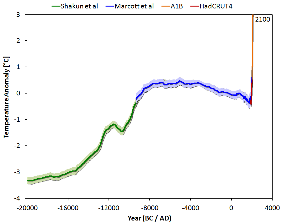
This graph has been dubbed the “wheelchair.” Compared to the past, what’s happening in the present is scary. The future is scary as hell.
Marcott et al. took 73 proxy data sets distributed around the globe and combined them to form an historical temperature reconstruction. Their approach differs from that of others in some important respects. First, the proxy data were already converted to temperature estimates before being combined into a reconstruction. Second, since most dates were estimated by radiocarbon dating, dates were re-computed using the most up-to-date calibration (the “Calib6.0.1” program using the “IntCal09” data). Third, most of their proxy data sets are ocean-based rather than land-based, making for a more representative global picture.
Fourth, since their purpose is to understand what happened in the past 11,300 years their data have a time coverage concentrated on the past rather than the present. In fact the data coverage is much better for the distant past then the last century, since all 73 proxies overlap in time during the period from 5500 to 4500 years ago (a.k.a. “BP” for “before present”, where “present” is the usual choice in such studies, the year 1950) but only 18 proxies extend all the way to the year 1940 (the final year of the reconstruction).
This is in sharp contrast to other reconstructions, for which it is usual that data coverage shrinks to ever smaller numbers of proxies the further back one goes in time; for the Marcott et al. reconstruction data coverage shrinks as one gets closer to the present. But that’s not such a problem because we already know how temperature changed in the 20th century.
The proxy data sets were aligned to match during their common period of overlap, 5500 to 4500 BP (calendar years -3550 to -2550). Then they were combined in a number of ways. The “main” method (if there is one) was to use the data to estimate gridded temperature on a 5×5 degree latitude-longitude grid, then compute an area-weighted average. The same procedure was also applied using a 30×30 degree latitude-longitude grid. They also estimated averages over latitude bands covering 10 degrees, and area-weighted averages of that. In addition, they applied RegEM (regularized expectation maximization) to infill gaps before computing the area-weighted gridded averages. They also computed a simple average of all the proxy data (without area weighting), both for the unadorned proxy data and after infilling with RegEM, giving results similar to the area-weighted averages (which argues for good geographic distribution of proxies). They also computed averages by the “jackknife,” where multiple reconstructions with randomly chosen proxies omitted are averaged.
That’s a lot of reconstructions!
And as if that’s not enough, in order to get a handle on some of the uncertainties they actually perturbed the data, both the temperature estimates and the times at which they apply, according to their uncertainties, doing so randomly 1000 times for each method. This “Monte Carlo” approach yields an ensemble of estimates, which was averaged to create the reconstruction for each method and gives important information about its inherent uncertainty.
I carried out the “simple average” procedure myself, and got this result (in red, labelled “Calib6.0.1 Ages”) compared to the Marcott et al. simple average result (in black):
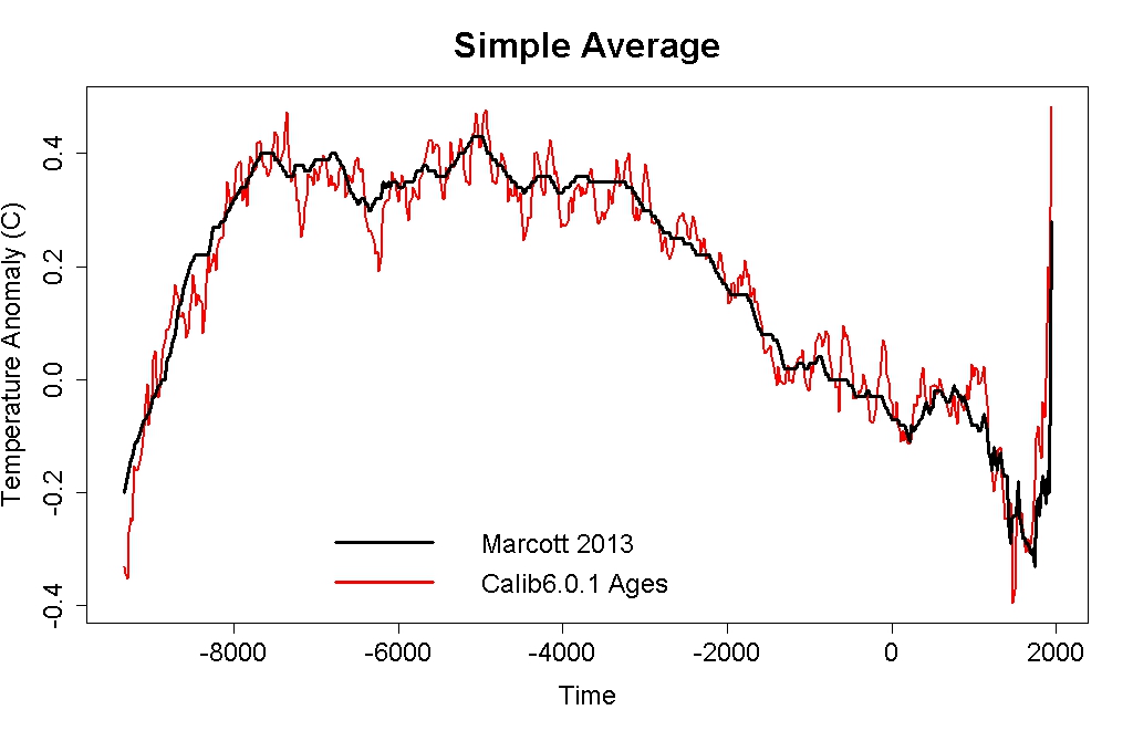
Note that my simple average shows more fluctuation than theirs despite both being based on a straight arithmetic average. That’s because theirs is “smoothed” by the process of generating 1000 perturbed data sets and averaging the results of each. This tends to “smear out” the uncertainty both of temperature and of time, which is appropriate because the very rapid small fluctuations in the simple average are unreliable — we just don’t know the times at which measurements apply with sufficient precision. But note also that my simple average follows the overall pattern of changes in the Marcott et al. reconstruction with outstanding fidelity. This is what the data show.
The sharp uptick at the end — which the straight average shows even more strongly than the ensemble average of perturbed series — is probably not correct. This is clearest if we paste a temperature time series onto the end of the reconstruction. Here I’ve added the HadCRUT4 series (20-year averages centered on the times of the Marcott reconstruction) aligned to the data leading up to the 1940 spike (which I think is a necessary step, more about that later):

The too-large uptick is an “artifact” of the fact that as proxies drop out of the reconstruction (because they don’t go far enough forward in time), if “cooler” proxies drop out it makes what follows artificially warm, if “warmer” proxies drop out it makes what follows artificially cool.
In fact the RegEM reconstructions (which infill missing data) don’t show such a large uptick, they have a much more modest one:

Because of this discrepancy between the different reconstruction methods, Marcott et al. themselves say that they do not consider the large uptick at the end of the reconstruction to be “robust.” In my opinion (for reasons we’ll elaborate soon) I agree. There is an uptick — but it’s not as dramatic as their “main” reconstruction (the “Standard 5×5”) suggests.
I’ll deal with several issues in future posts, including the recent uptick, the impact of proxy drop-out on the temperature reconstruction, the necessity for alignment with modern instrumental data, and the effect of re-calculating the ages of the proxy data (an issue which Steve McIntyre really doesn’t get — and in my opinion willfully so). Right now I’d just like to review what the Marcott et al. reconstruction is really telling us.
Let’s take the RegEM reconstruction and add the HadCRUT4 data on the end of it, aligning the records during their period of overlap:

Look at the spike at the end. The big, and most importantly the steep, scary spike at the end. That’s not an artifact of the way proxy ages were computed, or how the reconstruction was done, or the effect of proxy drop-out as records become more sparse in the later period. It’s what the thermometers say. Ignore them at your peril.
As scary as that is, what’s far more frightening is that it’s not going to stop.
The last deglaciation ended about 10,000 years ago. There followed a period of nearly 5,000 years when global temperature was surprisingly stable. In the 5,000 years following that, up to about 1800, global temperature declined a total of nearly 0.7 deg.C, culminating in the depth of the “little ice age.” From then until 2000, it rose by about 0.8 deg.C, and now exceeds temperature during any prior period of the holocene.
Marcott et al. claim differently, saying “Our results indicate that global mean temperature for the decade 2000–2009 has not yet exceeded the warmest temperatures of the early Holocene (5000 to 10,000 yr B.P.).” I disagree, because their reconstruction is not optimally aligned with instrumental data.
Whoever is right about this, modern temperature is surely close to the warmest temperatures of the early Holocene. The dangerous part is that it has happened so fast. In the span of a century or two, man-made changes to the atmosphere wiped out 5,000 years of natural climate change. People can argue about the uptick at the end of the Marcott reconstruction — I’ll do so myself — but for most who do so, it’s just an attempt to divert attention from the fact that global temperature really has increased in the last century, at a speed not seen in at least the last 11,300 years. We know this, thermometers have made it plain, only those in denial still deny it.
We are changing the climate rapidly — on the geologic time scale, in the blink of an eye. This is exactly the kind of rapid change which has caused extinction events in the past. What’s far more frightening is that it’s not going to stop.
Don’t let human civilization be the next victim of climate-induced extinction.
In the next post we’ll look at the effect of using re-calculated proxy ages on the recent uptick.


Yes, right through the Anthropocene, and heading straight up into the Dumbassic…
Note: I know there’s an image showing this, sorry I can’t lay hands on the link at the moment. I claim no credit for this statement, just agreement.
“The Consumologic Time Scale”
— by Horatio Algeranon
The Mallocene was “sales” and “buys”
The Oiligocene, a trend-setter
The Plastocene was very nice
But the Payocene will be deader.
…and those are all part of
“The Carburniferous Period”
— by Horatio Algeranon
Humans ruled
And fossils fueled
During the Carburniferous.
Climate warmed
And weather stormed
But we could not deliver us.
Fossils returned
For no one learned
And time will not forgive for us.
Excellent–again. I’d read about this reconstruction, but the additional detail is most welcome.
With that much proxy data, I’d think that the ‘deep past’ bits are likely to be pretty robust. How independent are they? To what extent are they distributed in physical (rather than methodological) space?
Hmm, maybe I should just ask if there’s a link to the paper that isn’t paywalled…
Great explanation Tamino. I understood and it and I am not that o fey with this stuff, so what’s McInt’s problem?
[Response: Mainly, that he decides what he wants the result to be first, then tortures the data until it “says” what he wants.]
I would rather say he did not exhibit fantastic auditing skills. Tamino tested the reconstruction by building his own curve using “simple average”. McIntyre as usual screamed for the code, and did not produce any curve. So Tamino managed to do better in one post, and I bet without having spent “painstalking hours …”
I would suggest to paleoclimatologists to take into account the McIntyre need for a code, and release it.
In Python/C++.
With standard libraries like GSL or Numpy.
Just to see the reaction.
Damn, I am even tempted to become a paleoclimatologist just for that.
Then how is this:
“To compare our Standard5×5 reconstruction with modern climatology, we aligned the stack’s mean for the interval 510 to 1450 yr B.P. (where yr B.P. is years before 1950 CE) with the same interval’s mean of the global Climate Research Unit error-in-variables (CRU-EIV) composite temperature record (2), which is, in turn, referenced to the 1961–1990 CE instrumental mean (Fig. 1A).”
…Not “deciding what you want the result to be first…”
No,it’s comparing the reconstruction with modern climatology,and explaining how…is that unreasonable?
I’d say the clue is in the word “compare.” But hey, maybe that’s just me.
just scroll down
You have to remember the resolution of the proxies is an important consideration. They are unable to unresolve periods of time as short as the instrumental records you are comparing them to. I don’t think its appropriate to align a high frequency (mind you 20 year averaged) Hadcrut dataset with a dataset that has a proxy resolution of around 200 years and then draw any major conclusions from the data. Not that I have any major issues with the study but you have to remember what you’re aligning there when you fuse together a dataset that can resolve 20 year temperature perturbations with one that can’t.
The resolution argument is nothing but a smokescreen. The native resolution of Marcott data is 20 years. So take the HADCRUT4 data and make 20-year (non-moving) averages, you have the same data resolution. You can do the same with Anderson’s data too. Then align Anderson so it matches HADCRUT4 during the period of overlap (and the match is nearly perfect in the 20th century, less so in the 19th), and align Marcott’s RegEM so it matches the adjusted Anderson in the period of overlap. That gives you a complete record at 20-year resolution. Here’s what it looks like:

Still scary, and no time resolution issues.
I’d also like to point out that it’s simply impossible to hide a rise of 0.7°C per century, even if the underlying data has 200 year resolution. You’d still see it sticking out like a sore thumb, if it were there.
There was a comment in the NYTimes that there was an issue with the resolution of the data ie it was mainly 100 year averages except in the modern period. This would hide any blips which might have occurred in the past. There is a mixture of low and high granularity data which could be an issue if one were making inferences about them.
Go over to our changing climate for a discussion of why this is not an issue. It basically is the same as the argument about whether there can be enormous changes in CO2 over ten years or so. OK, it goes up, what makes it come down. For anything huge like that to happen there will be obvious footprints in the sand. Friday did not visit the Earth over this time period. There are no footprints
Signal Processing much?
the denialosphere is up in arms about Marcott’s clearly manipulating the data in all sorts of fraudulent ways. WUWT, has some hank Guy, and Curry has Istvan pointing out the blatant fraud deception and probably bad breath of the authors who were clearly strong armed into moving the actual dates of the proxies close to the modern readings in order to create the nonexistant hockey stick (which they all seem to agree actually exists but not in the proxies, although they all say that the resolution is too vague to make any statements about current temps using proxies, and it all just gets too confusing, excpet that it is downright fraud, if I didn’tmention that
I of course don’t understand their reasoning but apparently they beleive this is even WORSE fraud than Mann’s paper.
What I don’t understand is how these “skeptics” notice and point out this horrible obvious fraud and yet the thousands of scientists who are qualified to analyze this stuff don;t seem to notice these horribkle perversions of science.
I ESPECIALLY like that Curry has Istvan make a whole psot about this and then she categorically refuses to comment on the “science” of his post or the original article. Isn’t she supposedly a climate scientist? Shouldn’t she be qualified to comment on such an important issue, ESPECIALLY if it is a case of blatant fraud?
I did once,very briefly, have a quick look at what was happening over somewhere and it was very silly. Wondering why proxies for specific locations differed to global averages etc.
I’m inclined to think that the argument that there’s different resolutions of data between the proxy and the instrument record isn’t unreasonable – compare with care (though the 21st C projected temps seem to be off the dial any which way). But the fact that ice core data gives us super high resolution at least for the icy bits and the development agriculture strongly suggests not a huge lot of fluctuating happening in the green bits all makes me think they’re scraping the barrel. Forsooth.
Not that I know anything.
It’s throwing red meat to the crowd, while mitigating personal risk by remaining silent. Seen it before.
Tony Duncan: “Isn’t she supposedly a climate scientist?”
Could have fooled me.
I’d also like to draw your attention to the recently-published Anderson et. al. (2013) “Global warming in an independent record of the past 130 years”, GRL 40:1, 189-193. http://onlinelibrary.wiley.com/doi/10.1029/2012GL054271/abstract
… which uses proxy temperature data to determine global temperature for the period 1730-1995. (The paper is paywalled, but the data, in the SI, isn’t.) Not surprisingly, they find the proxy temps agree well with thermometer temps.
In analyzing the Anderson data, I hit upon an interesting (and computationally rapid) non-gridded way to geographically weight the data. For each location in a given epoch, find the great-circle distance between it and every other location in that epoch’s data. Square the distances and sum the squares to give the final weight for that location for that epoch, then do a standard weighted average. Those locations that are near a lot of other locations will have the lowest weights, those which are far from others will have the highest weights. Squaring the distances mimics the proportional area covered by each location.
Just a follow-up note on Anderson vis-a-vis Marcott: Anderson’s data also shows the uptick at 1760. In Anderson’s data, the smoothed peak of that uptick is (by my analysis) 0.27° below the smoothed 1940 value, which is about what Marcott’s RegEM shows for the same two epochs.
Watts does the same with people, decides what he wants and…: http://davidappell.blogspot.fi/2013/03/how-deniers-enfore-solidarity.html
@KR, “Yes, right through the Anthropocene, and heading straight up into the Dumbassic… Note: I know there’s an image showing this, sorry I can’t lay hands on the link at the moment.”
It’s on Neven’s blog, March 14th entry, “Crack is bad for you (and sea ice)”, image posted by A-Team in the comment section, March 20th.
The re-dating step was essential but not optimally implemented. It will have induced errors, mainly in the last century, rendering the already fragile uptick very doubtful. These errors in re-dating will not have had a material affect on the rest of the reconstruction, as such re-dating is an irrelevant diversion, a mud-throwing exercise.
The Marcott reconstructon plus Hadcrut and Projections, but without Shakun, is also referred to as Scythe:
http://climatecrocks.com/2013/03/10/old-the-hockey-stick-new-the-scythe/
Eli prefers teh wheelchair. Shameless.
Excellent post. I look forward to the others!
Hi,
Unrelated post – simply looking to mine your statistical expertise for a moment.
I’ve seen this graph posted on several forums giving the minimum years needed to achieve statistical significance at the 95% confidence level for the past few decades. However I’ve tried reproducing it on the skeptical science trend calculator without much luck – I can always achieve significance earlier than most of the figures (early 2000s, mid 1990s, for example).
http://postimage.org/image/yx7055ant/
If you have a quick moment, could you let me know how the authors of this graph might have reached these figures?
Much obliged,
Steve
The comments by “R” and “Romanoz” above about the resolution of the proxies being different from the instrument record echoes a common remark seen in the comments over at Watts’ blog. It sounds like this is trying to imply that the current temperature spike could just be some sort of “blip” of natural variability that is nothing unusual, but similar such blips in the past wouldn’t be seen in the proxy reconstructions because of lower temporal resolution. Because of this, grafting an instrument record onto a proxy record is considered invalid, ie, there’s no “hockey stick”…
Intuitively this seems like a stretch. Looking at a plot of reconstructions such as this one
http://www.globalwarmingart.com/wiki/File:2000_Year_Temperature_Comparison_png
with the recent temperature trend going literally off the chart, it is hard to imagine that if a similar event existed earlier in the record it could have been “smoothed” out of the reconstructions simply by undersampling.
This isn’t saying different uncertainties at different time scales are not important considerations. See, for example,
Click to access MobergEtAl2005.pdf
But I don’t see how that makes joining HadCRUT4 global temperature data to the reconstructions somehow invalid. Maybe someone has more rigorously demonstrated that it is/isn’t a valid thing to do? Beyond pointing out that there are different temporal resolutions and leaving an implication hanging in the air, that is…
Given that we confidently expect CO2 levels to remain elevated for many millennia, it is also to be expected that this current ‘spike’ is much more than that. From that perspective, it may well show up in any similar reconstructions made by human (or other) scientists in the far future.
Tamino,
Thank you, that is a very fine explanation of an interesting and valuable publication. It is good to see you got the same result as the authors, when making the comparison with their Standard 5×5.
On thing I’m unsure about: Marcott et al. ‘preferred’ the Standard5x5 to the RegEM version (but they offered them both in the paper, together with all the other versions). To my mind the Standard5x5 is slightly preferable to the RegEM, because the infilling during an episode of obvious change is questionable. Would like to read your opinion on this. :)
For the final result, it is a moot point because the authors say about the difference between Standard5x5 and RegEM: “However, considering the temporal resolution of our data set and the small number of records that cover this interval (Fig. 1G), this difference is probably not robust.“
Good analysis, thanks!
As per my comment at Stoat:
Statistics of low-resolution proxies might allow for equivalent of modern temperature spike (followed by an equivalent drop) to hide earlier in the Holocene, but:
1) As Shakun noted, if so, it didn’t show up in any fo the high-resolution proxies.
2) And even stronger, somebody needs to give a physics explanation for how a strong up and strong downspike happen, and then explain why that doesn’t show up in any of the proxies. That requires a big change in Ocean Heat Content … which one would think that marine proxies would notice better than land-only.
Also relevant is that this curve actually meshes well with Ruddiman’s newest.
which says that human agriculture kept CO2 (and CH4) higher than one would expect from past interglacials. His work also argues that a major contributor to *fast* CO2 jiggles pre-1850 was human plague/reforestration for downward dips … but the fast dips only happened when there were enough people.
Put another way, the “wheelchair” curve further reduces the uncertainty about what happened … and Ruddiman & others have developed a very good model for *why*. as it no only explains why the Earth wasn’t down to 240-250ppm CO2 pre-IR and why there have been some unusually strong CO2 jiggles in last 2000 years.
All in all, a better approximation for a longer history, and I like the fact they computed it every which way and the answers are sill close.
Thank you Richard Telford.
Scythe, op. cit.
Given it’s association with agriculture and with the grim reaper and the shape of the Marcott + instrumental curve which corresponds with the development of agriculture, the scythe seems particularly apt
“Double-edged Scythe”
— by Horatio Algeranon
For ten millenia, temp was stable
Which put the food upon our table
The final temp may be unknown
But we will reap what we have sewn
for Bowsie — ask the guy who posted that graph originally, it’s in a comment here:
http://www.skepticalscience.com/argument.php?p=5&t=237&&a=11#89115
and he explains how he did it in the following response:
http://www.skepticalscience.com/argument.php?p=5&t=237&&a=11#89116
Found that by using Google– starting by searching q=minimum+number+of+years+required+to+establish+warming+trend
then clicking on “Image” (it’s the first image returned) and then looking for where it appeared.
Thanks Hank. Much obliged.
While the ‘skeptics’ are making claims about possible ‘blips’ in the Holocene, <200yr up/downs, it's important to note that such a blip has little in common with current warming. Temperatures are rising at a rather amazing rate compared to natural variability, but due to the atmospheric lifetime of increased CO2 levels (as per Archer et al 2009, http://forecast.uchicago.edu/Projects/archer.2009.ann_rev_tail.pdf), the current rise event will last 10’s of thousands of years before returning to previous conditions – plenty of time to show up in all kinds of proxies, of whatever resolution.
So – even if there were blips (and I’ve yet to hear a suggested physics for such events aside from leprechauns and wishful thinking), given the Marcott et al data a warming event like the present one is just not possible during the previous Holocene record.
Tamino:
1) Marcott et al conclude that early twenty first century temperatures (2000-2009) where higher than 72% of Holocene temperatures based on the analysis related to Figures 3 and S22. In Figure three they show a statistical distribution of temperatures based using various reconstruction methods, and compare them with 2000-2009 temperatures. The statistical distribution is, I believe, derived by jittering proxy values within their error margins and to generate multiple reconstructions. In supplementary material,this is extended by increasing the variability of the reconstruction to match that of Mann 2008 by adding either white or red noise, and determining the statistical distribution of reconstructed temperatures accordingly.
It appears to me that such a method resolves any issues about overestimating how much current temperatures exceed previous temperatures due to lack of resolution in the reconstruction; and that they are likely to give a best estimate of the relative temperature of the modern period compared to holocene temperatures. It is certainly superior to your method of:
I would also say that their method of aligning reconstructed holocene temperatures with Mann 2008, which is in turn aligned with the instrumental record is superior to directly aligning with the instrumental record because the high rate of drop out of proxies prior to 1880 (and the large geographical bias of HadCRUT4 prior to 1880) make direct alignments dubious.
Would you care to comment?
2) Did you perform the Calib6.0.1 recalibrations yourself, or rely on Marcott et al?
[Response: They aligned their reconstruction with the Mann reconstruction over the time span 510-1450 BP. That’s not the same as aligning it with the modern era, any difference between the two reconstructions of changes from then to now can lead to offset of the Marcott reconstruction relative to the instrumental record. I think aligning directly with the instrumental data is a better idea. You’re entitled to believe differently.
What would be foolish is to take any comfort from the idea that we might not yet have exceeded previous holocene maximum temperatures. The danger is the rapid rate of increase, which according to the Marcott reconstruction is plainly unprecedented, and its inevitable continuation as a result of the laws of physics.
No, I didn’t recalibrate the proxy ages myself.]
Since Mann is NH only, a better procedure would be to align Marcott to Anderson (which is global, and matches HADCRUT4 almost perfectly in the 20th century.) I’ve posted one such realization in this thread.
Of course, you could align to the BEST reconstruction which goes back past 1800.
And is as worthless prior to 1880 as the HadCRUT series. The north atlantic is not the Earth, and no amount of pretending will make the North Atlantic temperature records (effectively all that is available prior to 1880) an adequate gobal temperature reconstruction. NCDC and GISS are exactly write in terminating their reconstructions at 1880.
One might think so, but take a look at how it aligns to the metadata in some of the few cases where we do have useful information back past 1860-80.
Several commenters above have mentioned this, but it bears repeating. OK, so the mean temporal resolution of the proxies was something like 120 – 200 years. There could well be other ‘blips’ in the past that we can’t see. Marcott et. al. co-author Shakun admits this in his interview with Andy Revkin, who is a bit of a lukewarmer, so the interview was creepily confrontational:
Anrew Revkin interviews Shakun
(and Shakun shows himself to be incredibly inexperienced/naive/nervous when dealing with the media. You just want to shake him. He should have been better prepared. Unfortunately, outreach is not the forte of most scientists, especially one so young)
But anyway… what would be the *physical basis* for these blips? Fairies? The Marcott detractors cannot answer this question, of course. There is no known forcing that could create an up-tick of say, .5C over 100 years, that would also produce a correspondingly rapid down-tick to ‘hide’ it. Thus, this ‘blip hypothesis’ becomes yet another manifestation of the creationists’ god-of-the-gaps. Or as McIntyre himself likes to call it, a spitball.
Given that the Heartland Institute considered Andy worth “cultivating,” I fail to see how he can claim any credibility–even of the most vestigial variety. Andy believes in that ol’ fashioned balanced journalism–which contends that TRUTH is found by balancing evidence with lies.
I was leaning on the side of charitability there, alluding to Revkin as a ‘bit of a lukewarmer’. Personally I think he’s pretty much an outright AGW denier, but I can’t find any concrete evidence of it. Just the continual rolling out of the of false balance, as you say. But maybe that’s enough in itself?
What Andy is is a bullshitter. He believes in letting other people do the work of understanding an issue and then trying to appear reasonable by “splitting the difference” between them. Sadly, his attitude and laziness are typical of those who call themselves journalists now that journalism is dead.
“The Interpretation of Dreams”
— by Horatio Algeranon
The journalist said
“It’s plain to see
There is no actual reality”
“Only dreams
Of Left and Right
Appearing in the black of night.”
“My job is not
‘Truth’ revelation,
But balanced dream interpretation.”
But reality will always win;
It’s what’s still there that you don’t believe in;
Especially in the black of night;
when you’ll stub your toe for lack of sight.
Andy Revkin is a crypto-denialist, only slightly more crypto than Curry or Pielke Jr. whose attacks on scientists he quotes with approval.
As T sez, the alarm is (a) the rate of climb; (b) it’s anthropogenic and (c) because of (b) there is nothing to naturally drive the limb to decline.
I just looked briefly at WUWT … and the magnitude of the freak-out over there about Marcott et al is incredible. They are really, really mad about this, and just want to rule the whole subject out-of-bounds forever.
On RealClimate, one commenter just asserted that the Younger Dryas was a 15C spike (yes, 15C!) despite the fact that the entire LGM-Holocene transition is now believed to be about 4C. And they followed that up with the assertion that Marcott et al. wouldn’t be able to detect a 15C (!) spike like the Younger Dryas, despite the fact that the Younger Dryas is known specifically through its appearance in the proxies.
Yeesh.
Yes, there truly is a freak-out occurring in ‘skeptic-ville’. When I last looked WUWT alone was up to 20 posts attempting to discredit Marcott et al 2013, ClimateAudit at 8, at least a dozen at ClimateDepot (didn’t bother to count closely) – via a shotgun of ad hominem attacks, bad statistics, arguments from incredulity, side attacks on Mann et al 2008, multiple (mis)comparisons of global temperatures to single locations, etc.
This is the level of reaction seen to the Lewandowsky et al papers on the ties between conspiracy theories and climate denial.
And don’t forget the many invocations of gremlins – spikes in the record that might have been missed by the Marcott procedures. Despite the complete lack of evidence for such spikes, the lack of any physics for such spikes, the evidence against them having occurred (ice core records), or the fact that the current warming will last thousands of years, and would show on a Marcott style analysis (meaning such gremlins are irrelevant anyway) – anything, IMO, to create the impression that current warming might not be due to our actions or under our control.
I do hope sociologists are taking good notes of this phenomena.
Tamino,
Thank you for providing some clarity in this post; after reading your argument, it makes perfect sense to align the reconstructions to HadCRUT4 as Marcott et. al. did. However, there’s one piece that I’m still missing, and it may be because I’m simply ignorant of the published literature. Can you (or anyone else) point me to a good discussion comparing the temperature derived from these proxies to our existing instrumental record? What is the resolution on the proxies, and if possible, once the link has been established, how does the temperature record compare against the proxy going forward?
Given the timeline associated with some of these proxies, it may be that this information doesn’t yet exist, but I’d appreciate any help you could provide.
Tamino – I’m having trouble making the leap that you do from proxy data to instrumental data. You splice one unto the other (without showing how you do it) with the assumption (at least in this post) that the two lines are comparable. I’m returning to the climate debate after a few years away, and I’d be interested in data or papers explaining why this type of splicing is a good idea.
Second – I read through the Marcott FAQ at RC, and they state this talking about 20th century warming “this particular feature is of shorter duration than the inherent smoothing in our statistical averaging procedure.”
You mentioned that you would delve into this in future posts, but it seems like you’re splicing apples and oranges together in the last chart in this post. There could be similar spikes (or dips) in the pre-1900 data that are smoothed out by their statistical procedures, correct? Or am I missing something.
Finally – in several posts at RC, Gavin Schmidt has asserted that this spike is “irrelevant” and a “molehill.” However, you appear to make it central to your thesis. It can’t be both. Either there is a spike or there isn’t (Steve M apparently disagrees that the spike exists in the data). And either that spike is relevant or it isn’t (Gavin apparently thinks that it’s irrelevant). So you appear to be along in staking out the position that it is real, relevant, and important (the authors don’t even go that far).
So color me a little confused about what I’m supposed to take away from this paper in your opinion.
[Response: We know the 20th century spike is real. It’s as plain as can be in instrumental data (thermometers). It’s relevant. It’s important. We don’t need any paleoclimate reconstruction to show it.
Yet for some reason, when it does show up in a paleoclimate reconstruction people are up in arms about it!
Indeed the spike in the Marcott reconstruction is based on far fewer proxies than most of the last 11,300 years, and their original spike is inflated by proxy drop-out. Using the “differencing method” to avoid that problem, it’s still there but not as big. Which is interesting, because their original spike is larger than seen in the instrumental (thermometer) data.
And it’s not even what this paper is about — it’s about the changes over the entirety of the holocene. We don’t need Marcott or any other reconstruction to show us the spike. It’s in the thermometer record. It’s there. No doubt about it. You bet your ass it’s relevant.
Short-term features are smoothed by their procedure, but smoothing doesn’t make changes disappear, it just reduces their size. The recent increase is so big, and sufficiently long-lived (it’s been happening for over 100 years now), it would take an unbelievable conspiracy of coincidences for it to leave no trace in the Marcott reconstruction, including some that defy what is plausible in terms of the laws of physics. But there’s no trace.
And as has been pointed out at least a dozen times in many places (not just here), there are proxies (including some used by Marcott) which have plenty of time resolution to show such an event. It’s not there either.
Perhaps the most interesting result of this paper is the reaction of deniers. They’ve gone berserk over a temperature uptick which is not just supported, but is outright proved to be real, by modern thermometer records. Yet they cling desperately to the possibility that the same has happened in the past but by some congruence of miracles it deftly avoided leaving any trace anywhere.]