
It’s been a while since Foster & Rahmstorf (2011) took global temperature time series and removed our best estimate of the changes due to known fluctuating factors, the el Niño Southern Oscillation (ENSO), aerosols from volcanic eruptions, and variations in the output of the sun. After removing fluctuations of known origin, what was left over was a very steady rise in global temperature.
I’ve improved (I believe) the method by allowing for more detail in the response to ENSO. I now allow both a “prompt” (not necessarily immediate) and “more delayed” response, as well as a seasonal pattern to the ENSO response. I’ll probably expound on those details at some point, but not now. Now, let’s look at the results.
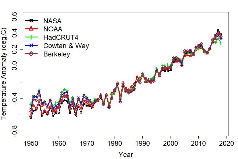
I studied temeperature since 1950 (when we have MEI, the Multivariate el Niño Index), for all the datasets studied in Foster & Rahmstorf: five surface temperature data sets and two satellite sets for lower-troposphere temperature. They are:
NASA: from NASA’s Goddard Institute for Space Studies
NOAA: National Oceanic and Atmospheric Administration
HadCRUT4: Hadley Centre/Climate Research Unit in the U.K.
Cowtan & Way: New method for HadCRUT4 base data
Berkeley: Completely new method, all-inclusive data
RSS TLT4: Lower-troposphere temperature from RSS
UAH TLT6: Lower-troposphere temperature from UAH
Let’s begin by looking at what these data sets say before “adjustment” to remove known fluctuations. Here are annual averages for the five surface temperature data sets:

Clearly the different data sets are largely in agreement. They show temperature just fluctuating, not really going anywhere, until about 1975 when it starts to increase. Of course it keeps fluctuating too; the most notable, to my eye at least, are the peak in 1998 (due to the strong el Niño of that year) and the peak in 2016 (due to the strong el Niño of that year too).
Removing my best estimate of the influence of known fluctuating factors, the annual averages show less fluctuation so the trend becomes clearer:
To each surface temperature data set I fit a model consisting of two straight lines, one for the early standstill, the other for the rise since about 1975. I actually found the best-fit “turning point” time for each series. Then I recorded the recent rate and its uncertainty. For the satellite data sets, I just fit a straight line. Here are the rates I found, with error bars (2σ):

Most of the data sets agree on the recent rate with the notable exception being the UAH TLT data, clearly an outlier. The NOAA data give a slightly lower rate, while NASA, Cowtan & Way, and Berkeley give a higher rate, and the RSS TLT data slightly higher still.
We can use the five surface data sets to define an average, then look at how each individual series deviates from that average. Without further ado, here they are:

For the most part the deviations stay between -0.1 and +0.1 °C. Relative to the others, HadCRUT4 and Cowtan & Way started high while NASA and NOAA started low. Most recently (2018), NASA is high and HadCRUT4 is low.
When we compare the lower-troposphere satellite data to our five-set surface average (from 1979 when the satellite data begin) the deviations are quite a bit larger, reaching about 0.3 °C.

The deviations are bigger for UAH than for RSS, and UAH seems to show a sizeable downward trend (relative to the surface average) while RSS might show a slight upward trend.
If we study deviations from the five-set surface average, but using adjusted rather than raw data (for both the satellites and the surface data), the deviations are meaningfully reduced:

We conclude that even after removing the influence of known factors, the lower-troposphere temperature series show more fluctuation than the surface temperature data sets, and while the RSS TLT data show a slight upward trend relative to the surface, the UAH TLT data show a big downward trend with a more complex pattern. In terms of modern warming rates, UAH TLT is an outlier.
This blog is made possible by readers like you; join others by donating at My Wee Dragon.


Does UAH still deserve status as a scientifically credible effort. Given its history and persistent apparent bias, and the apparent politically-mediated bias of its primary authors Chrisy and Spencer, both of whom are on record with statements at odds with virtually all scientific consensus, I wonder if UAH still qualifies as a primary temperature data set.
Christy not Chrisy
Would love to learn about the new method.
It’s worth noting that the discrepancy between UAH6.0 and RSS4.0 develops over just a few years: https://virrevandring.raaen.org/wp-content/uploads/2018/12/rss-uah-compare.gif
(Data downloaded from Wood for Trees December 2018, 12 months running mean.)
Arne Raaen,
That’s an interesting & informative way to compare the two RSS & UAH TLT. Yet it does suggest that the pair have been running step since 1979 with exception of the years 1997-2005.
That isn’t the whole story.
If you take the difference between the these monthly records and plot a rolling 12-month average it is evident that, bar the very first couple of years, there is continual divergence.
More precisely, throw a regression through 12-year sections of it and the result shows that UAHv6 is running below RSSv4 over the entire period Sept-1979-to-date. From 1982-1997 the rate is +0.05ºC/decade with the big divergence of +0.17ºC/decade 1997-2005. Post-2005, the divergence within this analysis does reduce quickly towards zero but has bottomed out with a divergence of +0.02ºC/decade remaining.
I presented a paper at the 2017 AGU meeting in which I compared the TMT and TLS data from UAH, RSS and NOAA STAR satellite data over the Arctic. This paper was an update to my earlier peer reviewed paper on the subject. I found that the UAH TLS product was relatively warmer than the other two before about 1985 and the UAH TMT product was warmer than the other two data sets before about 2004. I noticed what appeared to be a step change in the UAH data which appeared in the TLS cross plots, possible evidence of a problem with the merging of data between the different satellite instruments.
I did not analyze the UAH TP product, which is included in the calculation of the UAH LT product, since the corresponding RSS product doesn’t begin until 1987. I was thus unable to compare the UAH LT versus the other two. That said, if there is a problem with the UAH MT and LS calculations, the resulting LT calculation derived from them will also be in error.
My humble contribution to this eternal discussion about UAH6.0 LT vs. the rest of the world.
Here is a graph comparing UAH6.0 LT with UAH 6.0 MT and NOAA STAR TMT:
https://drive.google.com/file/d/1km5oY1S3ytu7NgOK0GdPvvzTjkG0OXan/view
We clearly see that the UAH and STAR projects have a thoroughly different meaning about what ‘mid troposphere’ really is!