
Suppose I wanted to convince people that temperature in the USA wasn’t going up, it was going down. What would I show? Let’s try yearly average temperature in the conterminous U.S., also known as the “lower 48 states” (I’ll just call it “USA”):

Well that won’t do. It shows that temperature has been rising, not falling. By the way, I’ve included two trend estimates. The blue straight line is a linear trend estimate and it’s going up. The red curvy line is a nonlinear trend estimate, it has gone up and down and up, and is now rising fast. Scary fast. That definitely won’t do.
But wait! The temperature shown is the mean temperature, which is the average of the high and low temperatures. What if I tried just low temperatures?
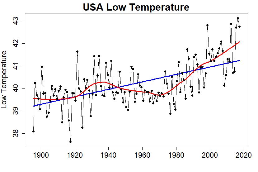
That won’t do either. Scary fast.
How about high temperatures?
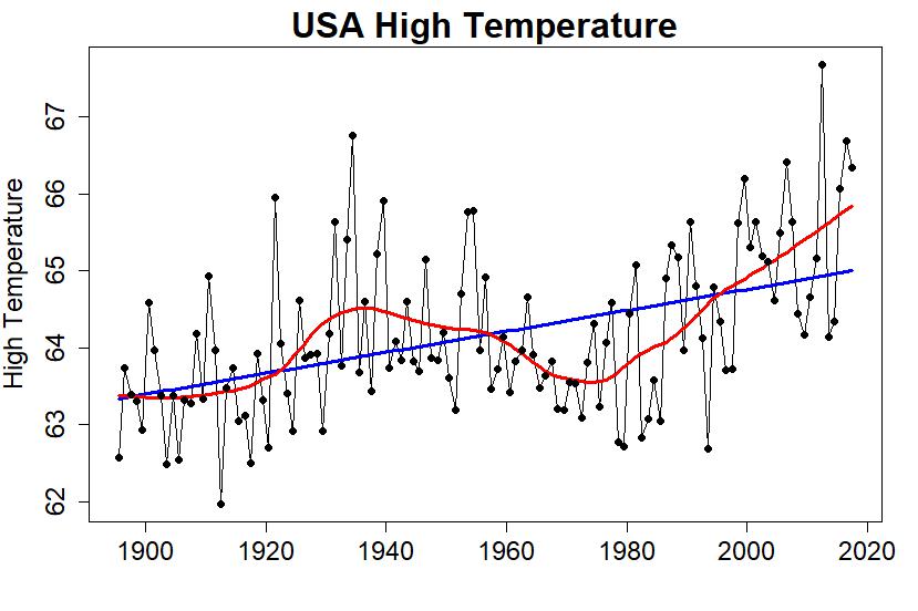
That still won’t do, but it’s a little better. There’s a more pronounced hump in the 1930s — that’s the dustbowl era. Could I maybe make the most of that?
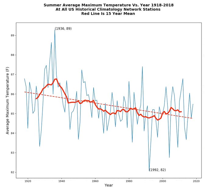
Let’s try this: look at high temperature during the different seasons of the year. After all, we know winter has been warming faster than summer, maybe summertime only — or maybe at least one of the seasons — will give a more useful “sucker people” picture. Here are the average high temperatures for all four seasons separately:
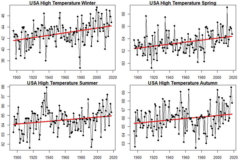
Now we’re getting somewhere! Summer high temperature has still been increasing overall, but that hump during the 1930s (the dust bowl era) is far more pronounced. Maybe I could make something of that?
Perhaps I could just get rid of some of the data I don’t like. I can’t get rid of the most recent stuff — then people will figure out I’m trying to sucker them. How about I get rid of some of the early stuff? I’ll start with 1918, instead of starting when the data actually start (1895). That leaves this:
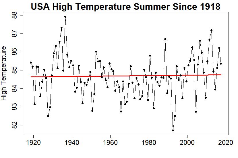
Finally! I’ve got a graph that looks like there’s nothing to worry about, where the linear trend is so small you almost can’t tell it’s still (barely) rising, and I only had to pick one of 12 possible combinations (mean/high/low temperature over winter/spring/summer/autumn) and leave out the early data to get it. Clever.
Even so, the trend is still going up even if just barely. And that’s the linear trend; the nonlinear trend looks like it might be rising noticeably lately, maybe even getting close to as hot as the summer of the dust bowl era. Could I fix that?
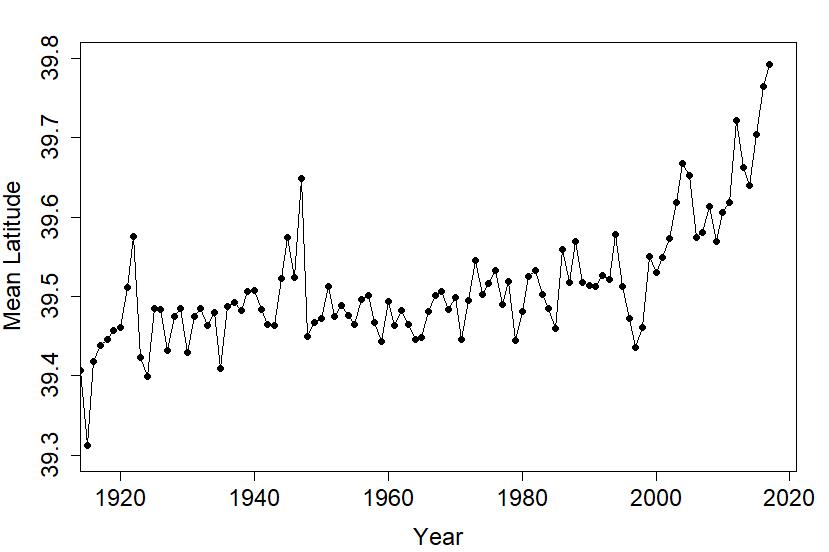
Of course I can! Instead of using the USA temperature data from the “experts,” those people at NOAA (the National Oceanic and Atmospheric Administration) who think they’re so good at it just because they’ve spent decades studying all that “math” and learning how to do it “right,” I’ll just take the raw data and form a simple average. Those NOAA people will tell you that isn’t right, that over the years new stations have come online and old ones have retired so you have to take that into account. They’ll talk about fancy-schmancy math stuff like “area weighting.” That’s all just NOAA tricks, aren’t they just a bunch of frauds? We can completely ignore the fact that over the years the average location of all the contributing stations has moved slightly northward to colder territory:
Heck we can completely ignore everything that they’ve learned about how to do it right … mainly because if we just take a simple, naive average we’ll get what we want.
There’s a graph going around the internet from Steve Goddard a.k.a. Tony Heller, claiming to show that temperature in the U.S. has been declining, using only high temperatures, using only summertime temperatures, using only data since 1918, based on a simple average without taking into account new stations coming online or old stations retiring or area-weighting or any of that “expert” stuff:
Imagine that.
This blog is made possible by readers like you; join others by donating at My Wee Dragon.


I did the exact same analysis, got the same answer as you and pointed out to Tony that he was full of bullchit on twitter. Needless to say he blocked me, these guys are really lazy.
[Response: LOL!]
He blocked me too. He kept posting graphs with original data and corrected data on the same graph and calling it fraud. He never calls it corrected data. He writes a diatribe accusing NOAA or NASA or the NSIDC of fraud for “fiddling” with the data or “cooking” the data, and then he shows a graph of the original and adjusted data as his only evidence. I always tried to expose this in the comments, and his followers would swarm to his defense. I think a few of them sort of got it, so they would try to support his fraud claim by alleging that the adjustments always lowered early data and increased later data to increase the warming. So I posted the graph of the recent NOAA adjustment that increases the early data, reducing the warming trend. That’s when I was blocked. But it is fascinating to argue with people like Heller’s followers. It’s like arguing with an artificial intelligence. You have to become an Australian Border Collie herding sheep toward a pen. You think you are making progress, but then you look up and see there is no pen. You can’t trap them. The best you can do is to get them to abandon their argument and attack you personally.
He blocked me because I did not buy is Mars canal consensus theory. It took me 30 s to find a paper about the Mars canal controversy from the scientific litterature.
No kidding. Except using manipulated and calling conspiracy they very little understanding of what is going on.
Do you?
Actually, much better than all those weirdo who claim that GHE do not exist.
Where can I go to get said raw data? I went to https://www.ncdc.noaa.gov/cag/national/time-series/110/tmax/3/8/1895-2018?base_prd=true&firstbaseyear=1901&lastbaseyear=2000&trend=true&trend_base=10&firsttrendyear=1895&lasttrendyear=2018
and got a graph for June-August where the trend increases
Some recent Dust Bowl studies:
Extraordinary heat during the 1930s US Dust Bowl and associated large-scale conditions
Factors Contributing to Record-Breaking Heat Waves over the Great Plains during the 1930s Dust Bowl
No Access Land-Cover Change and the “Dust Bowl” Drought in the U.S. Great Plains
I am glad to see you show how science works. The most interesting graph is the mean latitude. Now the mean latitude of reporting stations reflects the mean geographic latitude of the US.
Stand-up applause. That was just brilliant in so many ways.
Good post. Shared on FB and Twitter.
As well as his 100-year 1918-2018 summer average 48-state high analysis featured at the end of the OP above, Heller/Goddard also dug out the data for the single day 7th August through 1918-2018 to produce a string of similar looking graphs with a cooling trend. Mind, such analysis will look a bit silly if it isn’t reproducible for every day of summer and not just alternate Tuesdays through August.
But then, the man Heller/Goddard is a mad as a bag of live cats. He has been blogging to the world that apparently August 6th also saw “the fifth highest Arctic Sea Ice Volume for the date since 2003” and a later post reported August 7th !is third highest for the date since 2003″. The significance of such a finding for the global climate is truly staggerling.
How are you calculating these temps? I’m wondering because the NCEI & USHCN time series for US mean temp. have 2012 as the warmest instrumental year, but you have a later spike that’s higher.
[Response: Thank you so much for noticing, because in the first three graphs I computed 1-year averages from August through the following July (in order to be more up-to-date) and didn’t even mention it. Of course it can be confusing, so I’ve replaced them with January-through-December 1-year averages (as people would expect).]
Then again, there is always the well-known Urban Heat Island effect, so obvious on this picture of the Paris Montsouris station (active since 1872) :
http://www.apc-paris.com/system/files/styles/insert_moyen/private/file_fields/2016/11/30/stationmeteomontsouris.jpg?itok=q8e-CP7r
[Response: If you don’t want your email address posted, then stop entering it into the “name” field of your comments.]
mighty big BS ! … just reaching the temps from middlwage 1200 – 1400 , before the little #iceage
[Response: I hope this is sarcasm … ’cause if it’s not, your an even bigger sucker.]
0.4° of latitude is only 44 km. It’s not immediately obvious to me that’d cause a 1.1 °F drop in mean temperature even if temperatures where otherwise stable. Could it be that the average *altitude* of the stations has increased, too?
Or there are more stations in areas with more moderate summer/winter temperature swings? You could add a lot of stations in northern California without tweaking the average latitude much while still dropping the average summer temperature, I’d guess.
[Response: There are many possibilities, and altitude seems most likely to me but I don’t really know. Of course the *point* is that if you ignore the issue altogether, your answer will be WRONG. That doesn’t seem to bother Steve Goddard/Tony Heller, or the suckers who follow him.]
Only 44km but it would still make a significant difference.
Consider in the summer you have a temperature gradient from the summer tropics 23°N at 30°C to the summer high Arctic 80°N at 0°C. So that is 0.53°C/°latitude or 0.38°F/0.4°latitude The 1.1°F drop is thus only some three-times a broad-brush average.
A bit more pertinent perhaps, Berkeley Earth provide monthly climatology for average daily high temperature. So consider the JJA average daily high down Mexico way 31.4°latitude is 34.5°C while the JJA average daily high up by Canada 45.8°latitude is 28.6°C. That works out at 0.41°C/°latitude or 0.30°F/0.4°latitude. Mind, if you do the same for other times of the year, it would suggest a greater cooling would feature through winter months. So the northward migration of stations cannot be the only reason for Heller/Goddard’s fake cooling trend.
It’s an interesting result.
Apparently, using the same logic and computing the mean location of the US from all of the stations in use in each year, the US has drifted about 3 degrees East. It’s cooler over there.
Reblogged this on Don't look now and commented:
Genius stuff.
As you well know, “Goddard’s” whole schtick is to publish highly selected factoids from which to draw an “obvious” inference. The factoids are often true enough but he is careful to remove ALL surrounding context.
Many teenager–including me, sadly–learned this trick to lie without lying (supposedly). It’s expectable in a teenager lying to deny behavior parents would not approve of. It’s disgusting in an adult supposedly communicating “science”.
His century old article detailing little ice around Svalbard on year some 100 years ago is another good example. We are supposed to “infer” the “obvious”–that this means Arctic ice extent across the whole Arctic was comparable to today. BS. I guess it pays the bills, though.
From 1920 to 2000 the average station moved only about 0.01 in lattitude (eyeballing your graph). Which is about 1km. Way to exaggerate the Y-axis!
[Response: First of all, your eyeball doesn’t seem to be functioning properly.
Far more important, you fail to get the point: that when new stations come online and old stations retire, if you completely ignore that you’ll get the wrong answer. It’s not just latitude, it’s many factors of which latitude is probably one of the less important. Stations have different latitudes, different longitudes, different altitudes, different instruments. What the latitude graph really emphasizes is that things have *changed*. That’s why the folks at NOAA have invested so much time, effort, and expertise into their estimates of national averages.
If you really believe that Steve Goddard/Tony Heller’s way is right, the I’ll opine that your brain isn’t functioning properly either.]
Has Canada been warned it is heading towards the North Pole according to this Goddard/Heller mathturbation?
Oh, it’s quite intentional–the alternative to building a ‘Trumpian’ border wall.
Looking at the US-Canada border treaties: parts of the border are defined as sitting on various parallels. So, according to Goddard/Heller mathturbation, Canada must have acquired large chunks of formerly US territory and no one has noticed. Someone should be told!
:-) –or maybe not?
Andy…
As tamino is certainly aware there actually is a bit of a border fight over the lobster grounds off Maine! With the northeastern migration, the USA’s claim is likely stronger now given the original international law facts, I guess.
Back in 2014 (Goddard’s been doing things wrong for a long time!) I took a look at how the latitude, elevation, and climatology of USHCN stations has changed, both for stations that continued reporting temperature and stations that shut down. You can find it here in case its helpful: http://rankexploits.com/musings/2014/how-not-to-calculate-temperatures-part-3/
The loss of old stations from the network, and the addition of new more northerly stations may also have been accompanied with the adoption of the standardised Stevenson screen design and different times of observation.
http://variable-variability.blogspot.com/2016/02/early-global-warming-transition-Stevenson-screens.html
Without allowing for changes in measurement method is looks like the oceans warmed a lot more than scientists claim around the time measurement changed from canvas buckets to engine intakes.
In some respects you are being a bit harsh on Mr. Heller. He posted the subject graph in response to this new article:
https://www.washingtonpost.com/news/capital-weather-gang/wp/2018/06/29/denver-just-tied-its-all-time-temperature-record-and-this-heat-wave-is-just-getting-started/?noredirect=on&utm_term=.70c4ab53e991
So he wasn’t cherry picking summer high temperatures, he was addressing the summer heat wave claims in the article directly. Also choosing a round 100 years through the present for an interval is reasonable and certainly representative of long term trends.
[Response: Were you not paying attention? I already showed that even if you use only summertime high temperatures, the long-term trend is still upward.
I also have to wonder: exactly what “summer heat wave claims in the article” did he address directly?
My opinion: Steve Goddard/Tony Heller didn’t choose a “round 100 years” because it was a round number, he did it because it places the dust bowl outburst near enough the start of his interval to give the wrong trend impression. Then he applied a plainly faulty method to compute national average temperature. Also my opinion: he chose summertime high temperatures because it was the only combination that would give him a “sucker graph,” even allowing cherry-picking a time interval and using a faulty averaging procedure.]
Buckner: Apparently you are proposing that Goddard is an honest broker of scientific information. To not put too fine a point on it you are utterly and completely wrong.
His MO is and always has been (1) to cherrypick out-of-context factoids, (2) to remove any trace of the surrounding context, (3) to ignore/to invoke a conspiracy of fraud about any additional science surrounding his factoid, and (4) to publish and republish the same misleading scientific lies over and over again. For example he still is on about Mann 1998 even after it has been confirmed by independent groups using independent measures a score or more of times. And I cannot begin to count the times I have seen him invoke a low ice year in Svalbard a century ago to imply ice extent around the entire Arctic was low then.
Don’t forget the complete refusal to admit error, ever, under any circumstance! Back in 2012, when the ‘Great Arctic Cyclone’ hit, causing a marked late-season drop in ice extent and augmenting the still-record seasonal low that year, he opined as the storm began that that would mark an end to the melt season. Never admitted that that was a huge blown call, just let it recede into the mists of history. (I pushed him some on it, to no avail, but hey, at least I didn’t get banned.) You can probably find it archived somewhere, but he’s so prolific that it wouldn’t be at all easy.
Thanks, Doc. Exactly. Actually, I meant to say “over and over again even after having been clearly shown to have been in error” but got sidetracked somehow.
Doc Snow, you have to admit, it’s not scientifically accurate to attribute arctic ice loss due to storms as ‘melt’. In fact, most of the perennial ice loss in the arctic isn’t from melting at all, it’s the result of the clockwise motion of the ice pack, which pushes the ice into the Greenland sea between Svalbard and Greenland:
The clockwise motion of the ice pack is the result of storm activity.
Based on Mr. Heller’s behavior, apparently I don’t have to admit anything, ever!
I don’t disagree in general with your point about the importance of ice advection, but I also don’t think it’s very germane to the exchange I was talking about. The point is (and was) that the cyclone exacerbated ice loss rather than the reverse. It doesn’t matter how much of that ice loss was due to actual melt (more or less) in place–though it’s my impression that a significant portion of the loss was increased melting, due to dispersion and its attendant effects–and how much was due to advection into warmer waters (where, of course, it does end up eventually melting, just somewhere else). Either way, it was gone–but not, apparently, in Hellerworld.
B Buckner,
It is incorrect to say that Heller/Goddard published his fake temperature records in response to a Washington Post article on heat waves. The substance of the Washington Post article was that the summer of 2018 was shaping up to be a scorcher citing daily maximum temperatures in various Colorado locations. It was published at the end of June.
The Heller/Goddard post that you allege can be excused as being a response to the Washington Post article only appeared ar the beginning of August. Why, if the WP article needied rebutting, did Heller/Goddard only respond a month after the WP publication? And why did ignore the substance of the WP message? And Heller/Goddard shortly after used the same fake analysis without the fig leaf of being a perveyor of correctness. making any excuses you can dream up to lessen the severity of Heller/Goddard’s lies somewhat irrelevant.
thank you Tamino, your analysis really helps layman like me – keep it up
Hi, could you link the NOAA datasets? i want to try that, but i do not know, where they are.
[Response: ftp://ftp.ncdc.noaa.gov/pub/data/cirs/climdiv/]
Give me raw data, and only from the stations that have been online for the entire period – no new ones, none that have been retired during the period. I’ll do my own analysis and arrive at my own conclusions thanks.
What analysis will you do?
Apparently you think that ‘raw’ means completely accurate, reliable, and artifact-free. News flash: if that were the case, nobody would bother with homogenization adjustments.
Testing my meat thermometer in iced water and boiling water (I live at sea level) I found that there was a largish error which was ending up overcooking things. Now I correct the reading by subtracting 5 degrees and my meat turns out just fine.
Perhaps I should go back to using that artifact-free, wonderful raw data. Or, perhaps not.
Reblogged this on Life and Physics and commented:
An instructive example of the bad kind of data mining.
Actually it is _precisely_ the kind of data “mining” Goddard performs all the time. He’s made a career–literally–out of such mining efforts.
Thanks for posting this. It’s very valuable to have things like this that I can link to.
Reblogged this on Swiss Coaching Partners.
> The temperature shown is the mean temperature, which is the average of the high and low temperatures.
No, that’s wildly wrong.
[Response: Perhaps you’re simply not aware that the standard climatological definition of a day’s “mean” temperature is the average of the day’s high and low temperatures. I know it’s not in agreement with the statistical definition of “mean” but it’s still the standard nomenclature.]
The climatological definition is sufficiently odd that it would be worth qualifying it in the post, because it is not the “mean” in the sense that most people read the word. The climatologists (or meteorologists) who invented this usage did not do the world a favour.
In the old days it was, I believe, fairly common for there two be only 2 observations, using thermometers that registered max and min. So climatological ‘mean’ is in such a case actually is the arithmetic mean of the available data. Obviously, with automatic reporting and/or data logging, that is rarely if ever the case anymore. But, ‘homogeneity’…
https://en.wikipedia.org/wiki/Six%27s_thermometer
Can’t wait to laugh my ass off when the lower 48 are covered in ice and snow. You global warming freaks are as bad as the Flat Earth Society.
[Response: как погода на российской фабрике троллей?]
Happy to give you odds on that, TIG. How long do you expect to wait?
Hi Tamino,
Thank you for your analysis.
You made the point that NOAA’s adjustments are all made for good reasons. I think a reasonable person would accept that until some contrary evidence was shown, and then they’d ask for an explanation.
I saw an analysis of difference between raw and adjusted temperatures, plotted against time. The trend was from negative to positive. I think that is Goddard’s major contention: that the adjustments represent 100% of the temperature increase.
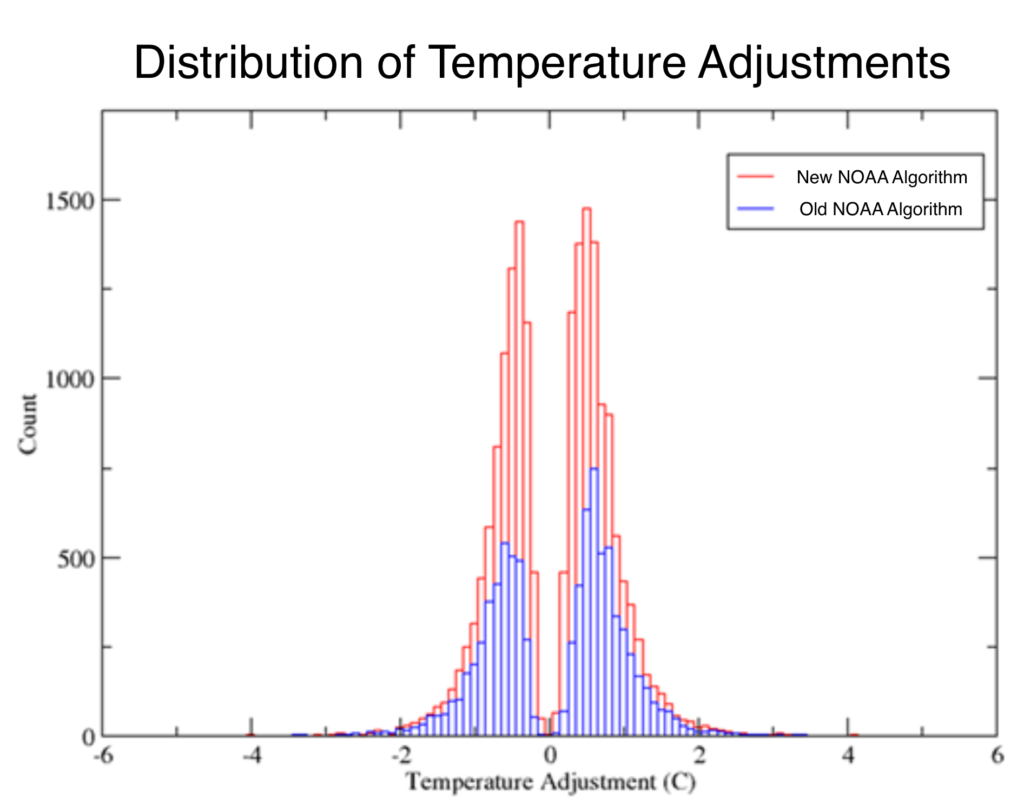
That may be completely wrong, but the chart of adjustments vs time is interesting and bears closer scrutiny. I hoped that Zeke Hausfather would refute it in one article but he did not because he showed a histogram of adjustments showing the mean to be around zero, but the question is: Are more of the negative adjustments earlier and more of the positive adjustments more recent?
It also does no good to simply explain how each adjustment is totally valid and should be made, because the hypothesis is that there is some otherwise undetected or unintentional bias in the adjustment mechanism. The only way to argue against an inference that NOAA’a methods somehow produce a bias in the adjusted data, is to demonstrate that the adjustments do not show a positive gradient over time.
Has anyone done that?
Alternatively, can anyone suggest a solid reason for a positive gradient of adjustments that is anything other than an ‘appeal to authority’ argument.
If not, I still don’t think we all jump to some conspiracy theory about NOAA. Scientific history is replete with cases where honest, well-meaning methods introduced some kind of bias that was not detected until later.
For example, an explanation might go along the lines of: Yes, the gradient is positive, but that is because more recent stations need more positive adjustments, or something like that. I’d be really grateful if anyone can address this specific question.
Deltaeus wrote: “I think that is Goddard’s major contention: that the adjustments represent 100% of the temperature increase.”
I haven’t seen him say that. I have seen Goddard/Heller say that the adjustments always increase the slope of the warming trend, which is false.
Deltaeus wrote: “It also does no good to simply explain how each adjustment is totally valid and should be made, because the hypothesis is that there is some otherwise undetected or unintentional bias in the adjustment mechanism.”
You’re saying that the actual, peer-reviewed scientific explanations for the adjustments are not enough? If you won’t accept those, then what else is there? And whose hypothesis is it that there is an undetected or unintentional bias in “the adjustment mechanism?” Goddard/Heller?
Well, I agree that a website publishing all the science behind each adjustment would be useful for me. It’s too hard to find explanations for the individual adjustments.
Why exactly–for what valid scientific reason–should adjustments show no gradient over time? Among other things, data adjustments remove bias which easily includes trends. Correcting trend bias requires correction by adding in a compensating countertrend.
BTW: Lecturing practicing scientists with a sophomoric “appeal to authority is bad” argument is pretty silly. Scientists realize that ALL of science is based on appeals to authority. At base, the scientific method is a way–and the best known way w.r.t. the study of nature–of identifying which authorities constitute the very best ones to appeal to.
“that the adjustments represent 100% of the temperature increase.”
This argument, that the proportional magnitude of the adjustment relative to the magnitude of the final trend (all relative to zero) is preposterous, and he knows it. If the raw data showed a trend of –0.001 C/year, and the adjusted data was +0.0001 C/year, he’d have to flip his sh*t that NOAA was getting away with an adjustment that was 1100% of the temperature increase. Snake oil salesmen like Heller try to sell this incoherent idea to ignorant people.
If you knew there was some known, unrelated process changing your data, you would adjust for it. All of the known processes affecting temperature which need to be corrected for, like time of observation bias, have been documented and reported for the public. Don’t like that there’s a time of observation bias? Too inconvenient that it has to be corrected for? Too bad.
Some unit of the temperate should be mentioned on the axis of the ordinate. Not all people in the world are using degree Fahrenheit.
I answered Tamino’s claims in my most recent blog post.
Changes in station latitude have very little impact on the trend, and it is trivial to demonstrate this. But Tamino is making progress, admitting that my graph is an accurate representation of the data.
If readers of “Open Mind” actually have an open mind, they will read my blog post.
https://realclimatescience.com/2018/08/tamino-admits-that-my-graphs-are-accurate/
No one said your out-of-context, very delimited factoid isn’t true. Tamino goes to great pains to show that it is. And further just how very out of context and how very delimited your point is. He shows all the things you have to select for and ignore in order to make it “work”. He shows what you say is nonindicative of the whole truth.
You misdirect, misinform about the entire truth, and deceive. For my part, given your history and given how hard you had to work to find this one factoid, I think you have the specific intent to deceive here rather than mere delusions. But only you can know that for sure.
You could, of course, publicly commit to getting this “analysis” published in the peer reviewed, non-vanity science literature and keep us informed of reviewers comments. But you also know it would be laughed out of the house and so will not.
Didn’t your mother ever tell you that lies of omission/misdirection/deception are lies every bit as much as any other kind of lie? Mine did.
Actually, I was pretty good at lying to my parents as a kid without telling a direct lie. But I gave it up when I grew up. Apparently you did not. Plus, most of the time, they really knew I was lying, and they knew that I knew I was lying. (Just like any scientifically-aware person knows what you are–likely intentionally–doing here.) They just figured I’d grow out of it or turn into a con man as they knew moral growth at that point had to come from within.
Oh…and low ice one year off of Svalbard a century ago is indicative of low ice around Svalbard one year a century ago. Not that Arctic extent was low everywhere a century ago.
Thanks, I’ll drop by if I really need a laugh!
what is wrong with that:
…”using only data since 1918, based on a simple average…” ???
Well, one of the points Tamino mentions is area-weighting. Temperature stations are not equally distributed over the US – or the world, for that matter. Just adding all stations together significantly skews the measured temperatures to the areas where there is the highest density of temperature stations.
It’s like measuring the temperature in a large room by taking the numerical average of one thermometer located in the middle of the room, and nine right next to the open fire. Your friends in the middle of the room will wonder why it doesn’t quite feel like the 100 degrees Fahrenheit that this simple numerical average indicates…
Indeed Marco- as Picotech say-
“Consider what you are trying to measure the temperature of. An example that seems simple at first is measuring room temperature to 1°C accuracy. The problem here is that room temperature is not one temperature but many.
Figure 1 shows sensors at three different heights record the temperatures in one of Pico Technology’s storerooms. The sensor readings differ by at least 1°C so clearly, no matter how accurate the individual sensors, we will never be able to measure room temperature to 1°C accuracy”
ok, so what is wrong again. What seam to be the best method to find a US Tmax summer Trend? Using data from stations never really changed or try to find the best homogenisation with new stations and instruments? I do not see big problems with the different graphs shown and at the end you will have some problems to explain all the variations by today’s oversimplificated climate claims.
[Response: Good luck finding stations that “never really changed.”. Even stations that have been in continuous operation have changed methods of observing, which can have a profound effect, in fact time-of-observation bias (TOB) is one of the most important. By the way, by its very nature this bias introduces a trend into the data which, if not corrected for, creates a spurious cooling trend in raw data. Stations have also changed instruments, including the switch from liquid-in-glass thermometers to max/min temperature sensors (MMTS). The people at NOAA do their best to account for all these factors. Of course they haven’t got it perfect, but their efforts represent the best that can be done with present knowledge, based on decades of analysis and experience.
Tony Heller/Steve Goddard does none of this. Rather, he consistently accuses those who do of perpetrating a fraud.]
Tony looked only at stations continuously operational for 100 years and saw the same decline in summer max temps. He has previously looked only at stations that took afternoon readings all along to see if TOBS explained it, but that subset of stations also showed the same trend. Tamino pretends like there is some simple explanation involving some erroneous mistake that Tony has overlooked, but that is not the case.
So the real question is if global warming is real and CO2 is the cause, then why has CO2 induced a decrease in summer max temperatures?
I think the scientifically minded would be intrigued by this, not annoyed or upset.
KTM: people here are upset because Heller is trying to cast doubt on AGW (note the G) by using a subset of a subset of a subset of a subset of a subset where there *may* be a negative trend. I say “may”, because there is more to consider than just “continuous operation” and “only measuring in the afternoon”. Note that this also goes even further into subsets of subsets. There still is the area-weighting, which may further move the focus to just that part of the US that happens to have indeed seen a decreasing trend in Tmax, and there still is the question of instrumental changes. And considering Heller’s history, I doubt he did or even considered any of these corrections.
From a scientific point of view it can indeed be interesting to see why a specific small part of the world has an opposite trend to global expectations. Thing is: we *expect* that local trends can differ from global trends, even giving cooling. It does not cast any doubt on AGW, you’d need quite a bit more than that. Also, Heller isn’t framing this as something scientifically interesting.
Heller *claims* that he’s done such things. In the posts that I’ve seen, there has not been sufficient information to verify what he says, often even not enough to really follow the process. And there has also been ample internal evidence, historically, of strong political motivation (eg., in the form of numerous blog posts ridiculing then-President Obama, often for trivial reasons). He looks, from the evidence of his own work, like anything but a truth-seeker.
Personally, I think that some of his stuff is made up from whole cloth. Just my opinion.
For starters, arbitrary cut-off (or should I say ‘cut-in’) dates are dangerous in principle, because they are often a gateway to conscious or unconscious cherry-picking. If there’s a rationale for picking a particular date (ie., keeping some available data out of the analysis), it should ideally be explicitly stated. It’s important context, often, and allows examination of any assumptions made.
maybe you are the “starter”…
Apparently I’ve ‘started’ you off down some strange byway. Did you have a point you wanted to make?
I would imagine a real problem being Africa, one fifth of the world’s land mass, where the WMO flag up that due to a lack of temp stations the temps have to be estimated.
Reblogged this on Jennifer Macaire and commented:
How fake news is used to give “scientific” proof to the masses. Masses, beware.
Fascinating and scary to see how science can be manipulated to fit certain viewpoints.
The basic problem is that Heller/Goddard and his sockpuppets are looking to protect against the wrong type of error. They think that the danger is with researchers intentionally inserting a bias. That is simply batshit crazy. It would be easy to detect. It would tarnish the reputation of the researcher involved to the point where they’d never work in the field again. Finally, the data have been looked at eight ways to Sunday–including by a team funded by the frigging Koch Bros–and the results are all consistent. Anyone who envisions a massive “warmist conspiracy” is either an idiot or so ignorant of how science works that the only proper response is to point and laugh.
Hi Martin,
Peer-reviewed scientific explanations are great and I do accept them – that’s just what I’m asking for, if anyone can offer one. Specifically, an explanation for the adjustments showing a positive gradient over time.
Absent a good explanation, people will supply their own, which is unhelpful. Conspiracy folks will imagine its all a government plot. I find that highly unlikely. What I find quite plausible is some kind of methodological defect that results in a trend. What it might be I couldn’t say. But we all know that researchers spend endless hours trying to identify sources of implicit bias introduced by their methods, and to correct for them. Maybe they didn’t catch them all?
jgnfld asks a very good question: Why should adjustments show no gradient over time? I don’t insist that they should show no gradient. I note that they do show a gradient, and I ask if anyone has explained it yet. Aren’t you also curious?
[Response: If you search the websites of data providers, you’ll usually find links to the peer-reviewed literature describing their methods. It’s a lot of work to find them and read them, but if you really want the answers that’s kind of what you need to do.
One example of a correction which definitely shows a trend is “time-of-observation bias” (TOB). Uncorrected, it introduces a spurious cooling trend into the data, and it’s one of the larger sources of systematic error in USA temperature records. I mention it as an example of an explanation of part of the trend present in corrections to raw data.
Also, bear in mind that Tony Heller/Steve Goddard’s estimates of everything, including the difference between raw and corrected data, are unreliable. He consistently ignores everything that should be done even with raw, un-adjusted data, such as proper alignment of records with different time coverage and proper area weighting. Those are two particularly glaring examples; he simply refuses to do things that *must* be done in order to get it right. Understanding the reasons for corrections is a worthwhile effort; taking Heller/Goddard’s word for what the differences actually are is a fool’s errand.]
Consider work flow. Suppose you’ve created a time series for something–it doesn’t matter what, but let’s say it’s the price of aneroid comptometers in England over the last century. That’s step one.
But is it accurate? Does it contain any hidden biases that would distort the true cost as it evolved over time? So you scrutinize all your data sources with elaborate care to determine whether or not there are problems. That’s step two.
When you think you are done, you’ve identified several issues, the chief ones of which are that some sources include tax in the the reported prices, and some do not. Also, some sources report original prices, and some report corrected prices which have been corrected for inflation by applying an index of prices. But the question is, what is the net effect of all these inconsistencies? Do they create a systematic bias? Or are the negligible, or mutually cancelling? So you have to do the math, and see what falls out. Computing the effects of these inconsistencies is then step three.
Let’s suppose that you find that the effect of tax inconsistencies is distributed over time such that correcting for them results in insignificant changes to your estimates, but that that is not true for original versus indexed prices.
I’d think that a researcher faced with this situation *might* (depending upon the purpose at hand) be inclined not to adjust data where it doesn’t much matter, but will not likely fail to make adjustments where it *does.* Which would also lead me to think that adjustments with very small ‘gradients over time’ might be less common in research generally than ones that have significant gradients. Why bother to make an adjustment if it doesn’t matter anyway?
Deltaeus: Zeke wrote a good explanation last year: https://www.carbonbrief.org/explainer-how-data-adjustments-affect-global-temperature-records.
Deltaeus: Scott Johnson also wrote a good explanation: https://skepticalscience.com/truth-about-temperature-data.html
Deltaeus: Roz Pidcock compared satellite to surface observations: https://skepticalscience.com/explainer-how-surface-satellite-temp-records-compare.html
Deltaeus writes: “Peer-reviewed scientific explanations are great and I do accept them – that’s just what I’m asking for, if anyone can offer one. Specifically, an explanation for the adjustments showing a positive gradient over time.”
First, by “positive gradient,” I assume you mean that the net effect of all the adjustments is to increase the slope of the global warming trend line. Is that correct?
If that is correct, then you say above you accept the peer-reviewed scientific explanation for each adjustment. But that is the explanation for the adjustments showing a positive gradient over time.
Deltaeus wrote earlier: “The only way to argue against an inference that NOAA’a methods somehow produce a bias in the adjusted data, is to demonstrate that the adjustments do not show a positive gradient over time.”
No. The net effect of all the adjustments can be a positive gradient over time, if by “positive gradient” you mean an increase in the slope of the trend line.
Finally, this article discusses a recent study that I think does explain what you want explained (i.e. it isn’t happening): http://www.theguardian.com/environment/climate-consensus-97-per-cent/2016/feb/08/no-climate-conspiracy-noaa-temperature-adjustments-bring-data-closer-to-pristine
Tom, Martin, Thanks for taking the time to reply.
I reviewed the articles links, some of which I had read (I referred earlier to Zeke’s in an earlier comment). I understand the various techniques and rationales for adjustments and they are all well-explained.
Sorry I was not clear enough when I used the term “positive gradient”.
No, I did not mean “the net effect of all the adjustments is to increase the slope of the global warming trend line”.
I was referring to the chart of adjustment differences (published temperatures minus raw temperatures).
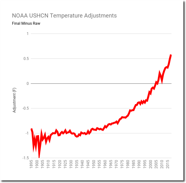
As far as I can tell, this specific question has not been addressed: why are older temperatures adjusted down and more recent temperatures adjusted upwards (for the most part) as shown in the chart? I think it is agreed that it is the case – a chart in Zeke’s article shows it (raw and adjusted land temps).
We have raw data and a set of good reasons for adjusting it, and then when we look at the adjustments on Zeke’s histogram, we see a balance between positive and negative adjustments and that is not surprising – it increases our confidence that we have not introduced any bias through our methods.
But when we plot the same adjustments as a time series, we see a clear trend after 1910, which is surprising (to me at least). If there was no discernible pattern, it would increase our confidence that we have not unintentionally introduced some bias somewhere.

Wouldn’t we expect the adjustments over time to show the kind of natural variation we see in lots of data sets? What does a statistical test of the time series say about it? Aren’t you curious why this time series of adjustments shows such a mostly positive gradient?
[Response: Consider time-of-observation bias (TOB). Taking readings the old way makes your thermometer readings too hot. To correct for it, you lower the temperatures done the old way and leave alone those done the new way. As stations switched from the old to new method, each time one does that’s another station whose early data gets cooler. Over time, more and more stations switched from old to new so the total correction got bigger, and always in the same way. Result: the TOB *error* itself shows a trend, so of course the correction shows the opposite trend. Bottom line: the corrections show a trend because the errors show a trend. It can’t be any other way.]
Deltaeus, Tamino’s response should be sufficient, but here is a sidebar. Your NOAA USHCN png is from Heller/Goddard’s blog, not from NOAA. I looked for the graph at NOAA.gov but could not find it. Maybe it is there, and I just didn’t do the right search, but given Heller/Goddard’s earned reputation as a Pied Piper of deception, you can’t use graphs from his blogs. I always try to fact check everything I see from him. Did you fact check this png, or did you just assume it is correct?
Second sidebar: FWIW, during the early period of long temperature records, nobody was much concerned about the various issues causing ‘homogeneity problems’, because the intended purpose of the data wasn’t to study climate at all; it was simply gathered as the necessary foundation to create an operational weather analysis, AKA ‘weather map’. (Some few time series go back before that period, and there it’s harder to say what the folks who made those records thought.) Accordingly, changes were made without concern that the observed long-term trend would be biased–often enough, made with such an absence of concern that the change in methodology or instrumentation wasn’t even documented, leaving future climatologists to infer them from the data themselves. A really illuminating book that treats this issue at some length is “The Vast Machine”.
A second-order sidebar: A landmark in the use of temperature time-series
to study climate change was Guy Callendar’s “Artificial Production of CO2′ paper from 1938. It’s a very ‘synthetic’ paper, in that it draws together many different disciplines; to make his case that human fossil fuel consumption was warming the climate, he had to create reliable time series of both CO2 mixing ratios and temperature, as well as revisiting infrared spectrographic research, which had advanced considerably since the last burst of interest in CO2 and climate at the end of the 19th century. Notably, already in that effort account was made of what we now call the “Urban Heat Island effect.” Callendar’s bottom-line conclusion was wrong–the 1930s warming was more natural than human-caused–but he got so much right, and asked so many good questions, that he restarted the whole CO2-climate research topic, bringing it into the 20th century.
https://hubpages.com/education/Global-Warming-Science-And-The-Wars
Hi Tamino, That is the explanation I was looking for. Thanks!